


Color Contrast Testing
Color contrast is a simple concept, yet it remains one of the most persistent barriers on the web. When text color is too similar to its background, it becomes difficult or impossible for people with visual impairments to read. Have you ever wondered if your website’s colors are shutting people out? The data suggests they probably are. Good color contrast isn’t just a technical requirement; it’s a fundamental part of inclusive design. It ensures that everyone, regardless of their visual ability, can access your information, use your services, and engage with your brand. This article explains the WCAG 2.2 color contrast rules in plain language, introduces tools to test your colors, and shows you how to fix common problems for good.
The Color Contrast Crisis: Why Most Websites Still Fail
Despite years of awareness, low contrast text is the most common accessibility error on the web. It’s an issue that plagues websites across all industries, from small blogs to massive e-commerce platforms. This isn’t just a minor inconvenience; it’s a critical failure that blocks millions of users from accessing digital content. The numbers paint a clear picture of a widespread problem that needs immediate attention.
WebAIM Million Report 2025 Findings
Each year, WebAIM analyzes the homepages of the top one million websites, and each year, the results are startlingly consistent. The 2025 report found that 79.1% of homepages had low-contrast text. This makes it the most frequent accessibility failure detected. On average, each homepage had nearly 30 instances of low-contrast text.
While there has been a slight improvement over the years, the failure rate remains incredibly high. With 94.8% of homepages having detectable WCAG 2 failures overall, color contrast is a leading contributor to the web’s inaccessibility. This data tells us that designers and developers are still routinely choosing color combinations that don’t work for everyone.

WCAG 2.2 Color Contrast Requirements Explained
The Web Content Accessibility Guidelines (WCAG) provide the standards for color contrast. They aren’t arbitrary rules but are based on how people perceive differences in light. Understanding these criteria is the first step to designing and building more accessible websites. The guidelines offer two levels of conformance: AA and AAA. Level AA is the generally accepted standard for most websites, while Level AAA represents a higher standard for accessibility.
Success Criterion 1.4.3 vs 1.4.6 Differences
WCAG has two main success criteria for text contrast:
- 1.4.3 Contrast (Minimum): This is the Level AA requirement. It asks for a contrast ratio of at least 4.5:1 for normal-sized text and 3:1 for large text. Large text is defined as 18 point (or 14 point bold). This standard applies to all text and images of text that users need to read.
- 1.4.6 Contrast (Enhanced): This is the more stringent Level AAA requirement. It calls for a contrast ratio of at least 7:1 for normal text and 4.5:1 for large text. While not always mandatory, meeting this higher standard is particularly helpful for users with more significant vision loss.
4.5:1 and 3:1 Ratios in Practical Terms
What do these ratios actually mean? A contrast ratio measures the difference in perceived brightness (luminance) between two colors. It ranges from 1:1 (white text on a white background) to 21:1 (black text on a white background).
- A 4.5:1 ratio provides enough contrast for most people with moderate visual impairments to read standard-sized text without needing assistive technology to enhance it.
- A 3:1 ratio is the minimum acceptable contrast for larger text because the bigger size and thicker strokes make it easier to read. This 3:1 ratio also applies to graphical objects and user interface components, like icons and the borders of input fields.
Think of it like this: the lower the ratio, the more the text blends into the background. The higher the ratio, the more it stands out. Don’t try to judge it by eye, always use a testing tool to get an accurate calculation.
New WCAG 2.2 Contrast Requirements
While WCAG 2.2 didn’t change the core contrast ratios for text, it brought more clarity to non-text contrast. It reinforces that interactive elements like buttons, form controls, and meaningful icons must have a contrast ratio of at least 3:1 against their adjacent colors. This also applies to the different states of these controls, such as when they are in focus, hovered over, or selected. For instance, the focus indicator (the ring that appears when you tab to a link or button) must have sufficient contrast so keyboard-only users can see where they are on the page.

Common Contrast Failures and Automated Solutions
Certain color contrast problems appear so frequently that they have become predictable. From faint gray text to buttons that fade into the background, these common issues can often be solved systemically. By identifying these patterns, you can create automated fixes and design system rules to prevent them from recurring.
Light Gray Text Problems and Fixes
One of the most common design trends is using light gray text on a white or light background for secondary information, like dates, bylines, or helper text. While it may look elegant, it almost always fails the 4.5:1 contrast requirement. Users with visual impairments find this text nearly impossible to read.
The fix is straightforward: darken the gray. Use a contrast checker to find the lightest shade of gray that still passes the 4.5:1 ratio against your background. Document this color in your design system as the “minimum-contrast gray” for body text to ensure designers and developers use an accessible shade by default.
Button and Interactive Element Contrast
Buttons and other clickable elements present two contrast challenges. First, the text on the button must have a 4.5:1 ratio against the button’s background color. A white text on a yellow button, for example, often fails this test. Second, the button itself needs a 3:1 contrast ratio against its surrounding background so users can identify it as an interactive element.
To fix this, ensure your brand’s primary button colors have accessible text pairings defined. For example, specify that if a button uses “brand-blue-500,” its label must use “white.” Also, check hover and focus states. Don’t make the button fade or lighten so much that it loses contrast.
Form Field and Label Visibility Issues
Forms are another hotspot for contrast failures. Placeholder text inside an input field is often a light gray that fails contrast requirements. Even worse, some designs use placeholder text as a label, which disappears once the user starts typing. Additionally, the border of the input field itself should have a 3:1 contrast ratio with the background to be easily seen.
The solution is to always use a separate <label> element for every form field, and ensure its color has a 4.5:1 contrast ratio. Make sure input borders are visible. If you use custom-styled radio buttons or checkboxes, ensure their boundaries and checkmarks meet contrast requirements in both their selected and unselected states.
Design System Integration for Consistent Contrast
The most effective way to address color contrast is to solve it systemically. A design system with accessibility baked in prevents one-off mistakes and ensures that every new page and feature starts with a compliant foundation. This approach moves contrast from an afterthought to a core principle of your design language.

Advanced Scenarios: Dynamic Content and Dark Mode
Standard text on a solid background is one thing, but modern web design often involves more complex situations. Text overlaid on images, gradient backgrounds, and theme-switching functionalities like dark mode all introduce unique contrast challenges. Addressing these scenarios requires a more nuanced approach to testing and design.
Text on top of images or gradients is tricky because the background is not a single color. A section of text might pass against a dark part of the image but fail against a lighter part. To solve this, you can’t just hope for the best. A reliable method is to add a semi-opaque overlay behind the text to create a more consistent background. Alternatively, placing the text inside a solid-colored container ensures readability. Always use a pixel-sampling tool like the TPGi Colour Contrast Analyser to check the worst-case spots.
Dark mode is another area needing special attention. You can’t just invert your colors and assume they will work. A color combination that passes in light mode might fail in dark mode. For example, a dark blue that works well with white text might become nearly invisible on a black background. You must define a separate, fully compliant color palette for your dark theme. Test every component, including all interactive states (hover, focus, active), in both light and dark modes to ensure a consistent and accessible experience.

Measuring and Maintaining Contrast Compliance Over Time
Achieving color contrast compliance isn’t a one-time project; it’s an ongoing commitment. Websites are dynamic, with new content and features added regularly. Without a process for maintenance, old accessibility issues can easily creep back in. A sustainable strategy involves a combination of automated checks, periodic manual audits, and team education.
Integrate automated accessibility scans into your continuous integration/continuous deployment (CI/CD) pipeline. Tools like axe-core or Pa11y can run every time a developer commits new code, automatically flagging any new contrast violations. This acts as a safety net, preventing regressions from making it to your live site.
Business Impact of Contrast Failures
When a large portion of your audience can’t read your content, it directly affects your bottom line. Users with low vision, color blindness, or even just those viewing a screen in bright sunlight will abandon a site they can’t decipher. This leads to higher bounce rates, lower engagement, and lost sales. A call-to-action button that’s hard to see won’t get clicked. A price that’s unreadable won’t lead to a purchase.
Beyond lost opportunities, inaccessible color choices increase legal risk. Most digital accessibility lawsuits cite violations of the Web Content Accessibility Guidelines (WCAG), and color contrast is a primary checkpoint. Fixing contrast is a proactive step toward meeting ADA and Section 508 requirements and protecting your business from legal challenges. Improving readability isn’t just about compliance; it’s about creating a better user experience that benefits everyone and encourages them to stay on your site.

Ready to Make Your Website More Accessible?
Schedule regular manual audits of your key user flows, such as checkout, login, and account management. Automated tools are great, but they can’t catch everything, especially issues in complex user interactions or with text on images. Finally, make accessibility part of your team’s culture. Hold brief training sessions to show designers and developers how to use contrast-checking tools and where to find approved color pairings in the design system. When the whole team shares responsibility, maintaining an accessible site becomes much easier.
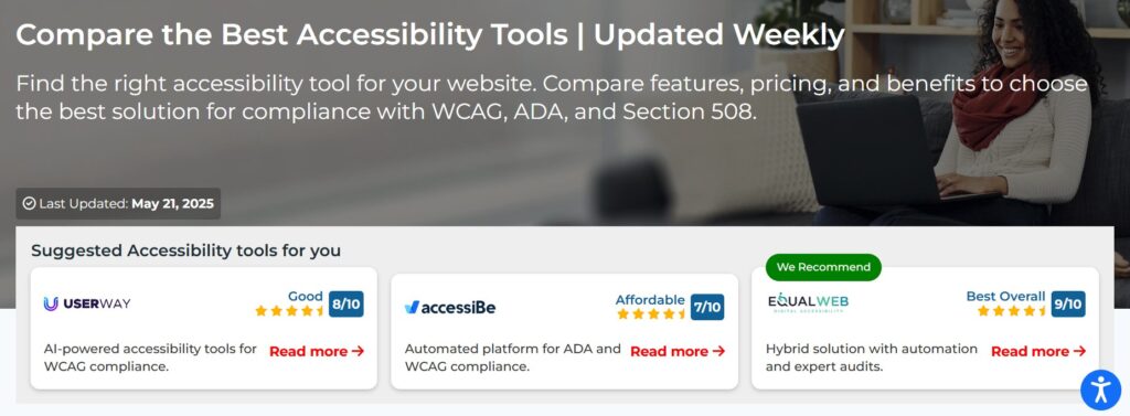
Using Automated Tools for Quick Insights (Accessibility-Test.org Scanner)
Automated testing tools provide a fast way to identify many common accessibility issues. They can quickly scan your website and point out problems that might be difficult for people with disabilities to overcome.
Visit Our Tools Comparison Page!
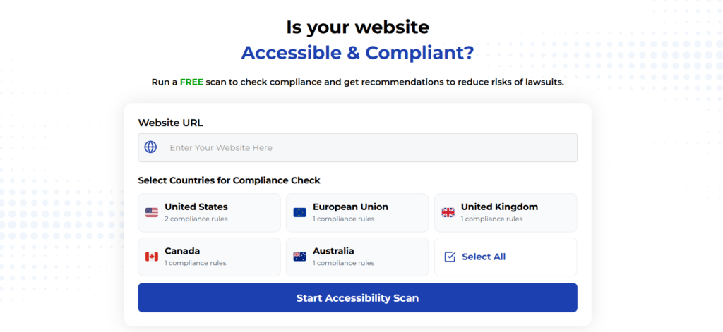
Run a FREE scan to check compliance and get recommendations to reduce risks of lawsuits
Final Thoughts
Ready to see where your website stands? Run a free scan with the Accessibility-Test.org website scanner to get instant feedback on your color contrast and other accessibility issues.
Start your compliance journey, update your accessibility statement, and keep EAA top of mind in every project going forward.
Run a Free Scan to Find E-commerce Accessibility Barriers
Want More Help?
Try our free website accessibility scanner to identify heading structure issues and other accessibility problems on your site. Our tool provides clear recommendations for fixes that can be implemented quickly.
Join our community of developers committed to accessibility. Share your experiences, ask questions, and learn from others who are working to make the web more accessible.