Why Your Small Business Website Might Be Turning Customers Away
You’ve poured your heart and soul into your small business. You’ve tweaked your products, perfected your services, and spent countless hours making your website look just right. You think your digital front door is wide open, welcoming everyone. But what if it’s not? What if, without realizing it, you’ve locked it for one in five potential customers?
That’s the reality for many businesses when it comes to web accessibility. It’s a topic that can feel big, complicated, and frankly, a bit scary. You hear phrases like “ADA compliance” and immediately picture expensive lawyers and complex coding projects. It feels like one more thing on a to-do list that’s already overflowing.
But let’s set the jargon aside for a moment. At its core, web accessibility is simple: it’s about making sure that anyone, regardless of their physical or cognitive ability, can use your website. It’s about being truly open for business. And here’s the good news: getting started is far more straightforward than you think. You don’t need to be a tech wizard or have a massive budget.
This article is designed to be your first step. It’s a plain-language walk-through of how to check your own website for the most common barriers that frustrate users and kill sales. We’ll skip the dense technical talk and focus on practical actions you can take right now. By the end, you’ll have a clear picture of how your site is performing and a real plan for making it better.
Changing Your View: From Legal Chore to Business Opportunity
Before we roll up our sleeves, let’s talk about mindset. For years, the conversation around accessibility has been dominated by fear; the fear of lawsuits. And while legal risk is a real consideration, focusing only on that makes accessibility feel like a punishment or a chore you have to do to avoid getting in trouble.
That’s a draining way to approach it. Let’s flip the script.
Making your website accessible isn’t just about avoiding bad things; it’s about inviting good things. It’s an opportunity to connect with a wider audience, to build a better product, and to strengthen your brand’s reputation. When you make your site easier for people with disabilities to use, you often make it better for everyone. Think of the last time you tried to watch a video in a loud room; you were probably grateful for captions, right? Captions were created for people who are deaf or hard of hearing, but they benefit countless others.
This is known as the “curb-cut effect.” When sidewalks were first designed with sloped ramps for wheelchair users, it turned out they also helped parents with strollers, travelers with wheeled luggage, and kids on skateboards. Improving access for one group created benefits for all. The same thing happens online every day.
So as we go through this checkup, try to see it not as a hunt for mistakes, but as a search for opportunities. Every issue you find is a chance to make your business more welcoming and your website more effective.
The Five-Step Accessibility Checkup for Your Website
Ready to get started? You don’t need to examine every single page of your site right now. That’s a recipe for feeling overwhelmed. Instead, pick 3-5 of your most important pages. A good list to start with is your homepage, a key product or service page, your contact page, and your checkout or booking page if you have one.
Grab a notepad or open a document to take notes. Let’s begin.
Step 1: Can You Use It Without a Mouse? The Keyboard Test
This is the single most important test you can do, and it’s also one of the easiest. Many people cannot use a mouse due to motor disabilities. Others, like people who are blind and use screen-reading software, rely almost exclusively on the keyboard to navigate the web. If they can’t use your site with a keyboard, they can’t use it at all.
Here’s what to do:
- Go to one of the pages you selected.
- Put your mouse aside. Seriously, don’t touch it.
- Use the Tab key to move forward through the interactive elements on the page; links, buttons, menu items, form fields.
- Use Shift+Tab to move backward.
- Use the Enter key to select something, just like you would click it.
As you tab through the page, ask yourself these questions:
- Do you ever get stuck? This is a critical failure called a “keyboard trap.” You might tab into a video player, a pop-up window, or a chat widget, and then find you can’t tab out. No matter how many times you hit Tab, you’re stuck in a loop inside that one element. For a keyboard user, this is a dead end. Their only option is to leave your website.
- Can you see where you are? As you press the Tab key, a visible outline or highlight should appear around the element you’ve landed on. This is called a “focus indicator.” If there’s no visible focus, you’re navigating blind. It’s like trying to find a light switch in a dark room. You have no idea where you are or what you’re about to activate.
- Is the order logical? Does the focus move through the page in an order that makes sense? Usually, this means moving from top to bottom, left to right; from the header and navigation down to the main content and then to the footer. If the focus indicator jumps erratically from the top of the page to the bottom and back again, it’s disorienting and confusing.
- Can you reach everything? Are you able to get to every single link, button, and form field? Sometimes, navigation menus or “Read More” links are built in a way that keyboard users can’t get to them.
Step 2: Are Your Images Invisible? Checking Alt Text
Images make your site visually appealing, but for someone who is blind or has low vision, they are just blank spaces without something called “alternative text,” or alt text. Alt text is a short, hidden description that is read aloud by screen readers, telling the user what the image shows. It’s also what appears if an image fails to load.
Here’s what to do:
You don’t need special software for this. In most browsers, you can right-click an image and select “Inspect.” A panel will open showing the website’s code. Don’t be intimidated by it. You’re just looking for one thing: find the part that starts with <img and look for an alt=”…” attribute.
What to look for:
Is text part of the image? This is a common mistake. Businesses often post flyers for events or sales as a single image file. A screen reader can’t read the text inside that image. All of that information; the date, the time, the offer; is completely inaccessible. Any text should be actual text on the page, not trapped inside a picture.
Is alt text missing entirely? Every image that conveys information needs alt text. If an image is purely decorative; like a swirly background pattern; it should still have the alt attribute, but it should be empty (alt=””). This tells the screen reader it’s safe to ignore this image. If the alt attribute is missing completely, the screen reader might read out the entire confusing file name, like “IMG_4825_final_v2.jpg.”
Is the alt text actually useful? Writing good alt text is a skill. Bad alt text is just as unhelpful as no alt text. For a photo of your team on your About Us page, alt text that says “team photo” is lazy. Better alt text would be “The four-person team at Smith’s Bakery smiling in their kitchen.” Be descriptive but concise. If your company logo is a link to the homepage, the alt text should be “Smith’s Bakery Home,” not “logo.” It should describe the function, not just the image.
Step 3: Can People Actually Read Your Text? A Look at Colors
Designers love subtle shades of gray. But light gray text on a slightly-less-light-gray background might look sleek and modern, but it can be impossible to read for people with low vision or color blindness. The difference in brightness between your text and its background is called “contrast.” And low contrast is one of the most widespread accessibility problems on the web.
Here’s what to do:
You’ll need an online tool for this, but they are free and easy to use. The WebAIM Contrast Checker is a popular one. You’ll need to find the specific color codes for your text and background (you can often find these using your browser’s “Inspect” tool). You put those two codes into the checker, and it tells you whether you pass or fail the accepted standards (WCAG).
What to look for:
Color as the only signal: Are you using color alone to show that something is a link? Or that a form field has an error? People who are colorblind may not be able to see the difference. Links should always have another indicator, like an underline. Error messages should include an icon or text, not just a red border.
The gray text trap: Go through your site and be suspicious of any text that isn’t black or a very dark color. Pay special attention to footer text, photo captions, and form labels, as these are often styled in a light gray that fails contrast checks.
Text on top of images: Placing text directly on a background image is a big risk. The text might be perfectly readable over one part of the image but disappear into another part. For example, white text might look great on the dark part of a photo but become invisible when it crosses over a cloud. A much safer approach is to put a semi-transparent solid color block behind the text to ensure consistent contrast.
Step 4: Does Your Page Have a Skeleton? Understanding Structure
When you look at a webpage, you instantly understand its structure through visual cues. You know the big text at the top is the main title, and smaller bolded text indicates different sections. Sighted users can scan a page in seconds to find what they want.
Screen reader users can’t do that. Instead, they rely on the underlying heading structure (H1, H2, H3, etc.) to get an “outline” of the page. They can use a command to list all the headings and jump directly to the section that interests them. But this only works if the headings are used correctly.
Here’s what to do:
There are free browser extensions, like “HeadingsMap” for Chrome and Firefox, that will show you the heading outline of any page with a single click. Install one and run it on your key pages.
What to look for:
Are headings being used for looks instead of structure? A common mistake is to just make a piece of text bold and large to make it look like a heading. But if it’s not coded as an actual <h2> or <h3> tag, it’s invisible to a screen reader’s outline function. It’s just a random bit of big text. Headings are for structure, not just for style.
Is there one (and only one) H1? The H1 is the main title of the page’s content. There should only be one. It should be unique and descriptive.
Is the heading order logical? Headings must not skip levels. You should go from an H2 to an H3, not straight from an H2 to an H4. Think of it like a document outline: you wouldn’t skip from Chapter 2 to section 2.1.1 without a section 2.1. When heading levels are skipped, it creates a confusing and broken outline for screen reader users.

Step 5: Can People Give You Their Money? A Quick Form Checkup
Your contact form, newsletter signup, or checkout process is where a visitor turns into a lead or a customer. If your forms are confusing or unusable, you are actively turning away business.
Here’s what to do:
Go to a page with a form. Go through the process of filling it out, but pay close attention to the mechanics.
What to look for:
- Are all fields clearly labeled? Every single box, button, and dropdown menu needs a visible label telling the user what it’s for. “First Name,” “Email Address,” “Credit Card Number.” These labels must be programmatically linked to their fields (which most standard form builders do automatically).
- Don’t rely on placeholder text. Placeholder text is the light gray text you often see inside a form field that disappears when you start typing. It is not a substitute for a proper label. Once you click in the field, the placeholder vanishes, and users (especially those with cognitive disabilities) can forget what they were supposed to enter.
- Are error messages helpful? If you forget to fill out a required field and hit “Submit,” what happens? A good form will highlight the exact field that has the problem and give a clear message like, “Please enter your email address.” A bad form might just show a vague “An error occurred” message at the top of the page, leaving the user to hunt for the problem. Even worse, some forms do nothing at all, leaving the user clicking the submit button over and over with no idea why it’s not working.
The Big Trap: Why “Quick-Fix” Overlays Are a Waste of Money
When you start looking for accessibility help, you will inevitably run into ads for “accessibility overlays” or “widgets.” These are tools that promise to instantly make your site compliant with just one line of code. They add a little icon to the corner of your site, and when clicked, they offer users options to change colors or font sizes. For a busy business owner, it sounds like a miracle.
Here’s the hard truth: they do not work.
These overlays use automated scripts to guess what’s wrong with your site and try to patch it on the fly. But web accessibility is far too nuanced for an automated script to solve. Overlays frequently miss critical issues (like the keyboard traps we discussed) and can even interfere with the assistive technology a person is already using, making your site less accessible.
Relying on an overlay gives you a false sense of security. Hundreds of lawsuits have been filed against companies that were using these widgets, and the courts have consistently found that they are not an adequate defense. They are a bandage that doesn’t stop the bleeding. The only real way to fix accessibility issues is to address them in your website’s actual code and content. Don’t waste your money on these modern-day snake oil products.
Okay, I Found Problems. What Do I Do Now?
If you’ve gone through this checkup and your notebook has a few items on it, congratulations. No, seriously. You have just taken a massive, proactive step that most of your competitors haven’t. You’ve identified real opportunities to improve your business.
Don’t panic. The goal isn’t to fix everything overnight. The goal is to make progress.
- See what you can fix yourself. If you use a platform like WordPress, Squarespace, or Shopify, there are many things you can fix without needing to be a coder. You can almost certainly edit alt text for your images, rewrite your page headings to be in the correct order, and adjust your text colors.
- Prioritize. Some issues are more severe than others. A keyboard trap that prevents someone from completing a purchase is a “blocker” and should be your top priority. An image with mediocre alt text is less urgent. Look for the big things that create dead ends for users.
- Talk to your developer. If you work with a web developer or agency, you are now in a fantastic position. Instead of sending a vague email saying, “We need to work on accessibility,” you can send a specific, actionable list. “I found a keyboard trap on our checkout page. Also, the color contrast on our footer links fails WCAG standards, and the H1 is missing from our services page.” This gives them a clear, concrete list of tasks.
Using Automated Tools for Quick Insights (Accessibility-Test.org Scanner)
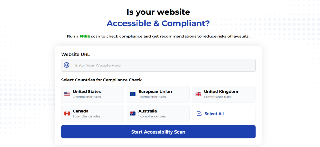
Automated testing tools provide a fast way to identify many common accessibility issues. They can quickly scan your website and point out problems that might be difficult for people with disabilities to overcome.
Visit Our Tools Comparison Page!

Run a FREE scan to check compliance and get recommendations to reduce risks of lawsuits
Final Thoughts
Making your website accessible is not a one-and-done project. It’s a practice. It’s something to keep in mind every time you add a new product, publish a new blog post, or update a page. Over time, thinking about these issues will become second nature.
The checkup we just walked through is a starting point, but it’s a powerful one. By investing this time, you’ve moved from worrying about accessibility to actively doing something about it. You’ve started the process of opening your digital doors wider, creating a better experience for every single person who visits your site. And that’s just good business.
Run a Free Scan to Find E-commerce Accessibility Barriers
Curious about where your site stands? An automated scan is a great first step to identify potential accessibility issues on your e-commerce platform. Run a free scan on our website today to get an initial report on your site’s accessibility health.
Want More Help?
Try our free website accessibility scanner to identify heading structure issues and other accessibility problems on your site. Our tool provides clear recommendations for fixes that can be implemented quickly.
Join our community of developers committed to accessibility. Share your experiences, ask questions, and learn from others who are working to make the web more accessible.


