


Why Your Online Forms Are Turning Away Users (And How to Fix Them)
We’ve all been there. You’re trying to buy something, sign up for a newsletter, or just contact a company. You land on a form, and the frustration begins. You click on a field, and the label inside it vanishes, forcing you to rely on memory. Hit “submit,” and a vague “error” message appears at the top of the page, leaving you to guess what you did wrong. After a few minutes of confused clicking, you give up and leave. That’s a lost sale, a lost lead, and a lost opportunity, all because of a poorly designed form.
Now, imagine that same frustrating experience, but amplified. For people with disabilities, a poorly constructed form isn’t just an annoyance; it’s a brick wall. A missing label means a screen reader can’t announce what a field is for. A hidden focus indicator means a keyboard user has no idea where they are on the page. These aren’t minor inconveniences. They are barriers that can completely prevent someone from completing a purchase, applying for a job, or accessing a service.
And the responsibility for these barriers falls squarely on the website owner. Online forms are one of the most common sources of accessibility complaints and lawsuits. The good news is that making them accessible isn’t magic. It’s about clear communication, logical structure, and a little bit of empathy. This article will walk you through the most common form pitfalls and show you how to build forms that work for everyone.
It All Starts with a Label: The Unsung Hero of Form Fields
If you get one thing right with your forms, make it the labels. A label is the short piece of text that tells a user what information to enter into a form field; “First Name,” “Email Address,” “Password.” It seems basic, but it’s astonishing how often this goes wrong. A clear, persistent, and correctly connected label is the foundation of an accessible form. Without it, many users are left completely lost.
The biggest mistake people make is relying on placeholder text as a label. Placeholder text is the light gray text that sits inside a form field and disappears as soon as you start typing. Using it as your only label is a terrible idea for several reasons. First, it vanishes, forcing users to remember what they were supposed to be typing. This puts an unnecessary cognitive load on everyone and is especially hard for people with short-term memory or cognitive disabilities. Second, placeholder text typically has poor color contrast, making it difficult for people with low vision to read. And third, some screen readers don’t treat placeholder text as a true label, so they may not announce it at all.
Floating labels, a design trend where the label starts inside the field and “floats” up when you click, can also cause problems. While they are often better than placeholder labels because the text doesn’t disappear entirely, they can be difficult to implement correctly. Often, the floated text is too small or has poor color contrast, and if not coded properly, the connection to the input can be lost. In most cases, the simplest and most effective approach is the best one: a clear, visible label that sits directly above or next to its form field.
Tying Them Together: Making the Label-Input Connection
It’s not enough for a label to just be near its input field visually. It needs to be programmatically linked. This invisible connection is what allows assistive technology to understand the relationship between the text and the field. When a screen reader user navigates to an input field, it’s this link that allows the screen reader to announce the label’s text, telling the user exactly what information is needed.
This connection also benefits mouse users. When a label is correctly linked to its input, you can click on the label itself to place your cursor in the field. This creates a larger target area, which is helpful for people with motor impairments who may have difficulty clicking on a small input box. Think of it as a small but meaningful improvement to the user experience for everyone.
When a Visible Label Isn’t an Option
There are rare occasions in design where a permanently visible label might feel redundant. The most common example is a search bar that consists of only a text field and a “Search” button. In this case, the button’s text and the visual context make the purpose of the field obvious.
For these specific situations, it’s possible to provide a label that is “heard” by screen readers but not seen on the screen. This is done using a specific styling technique that hides the label visually without completely removing it from the page’s structure. This should be used very carefully. In almost every other case; from contact forms to checkout pages; a permanently visible label is the best and safest choice. Hiding labels should be the exception, not the rule.

Don’t Make Me Think: Grouping Related Form Fields
Long forms can be intimidating. A page with twenty different fields can feel overwhelming and lead people to abandon it before they even start. One of the best ways to make a form feel more manageable is to break it down into logical groups. Grouping related fields together helps users understand the structure of the form and process the information in smaller, more digestible chunks.
This isn’t just about visual design; it has real accessibility benefits. For people with cognitive disabilities, a well-organized form is much easier to process. For screen reader users, proper grouping provides important context that might otherwise be missing. It helps them understand the relationship between different controls.
Radio Buttons and Checkboxes: A Group Effort
The most common place where grouping is essential is with radio buttons and checkboxes. Imagine a question on a form like, “What is your preferred method of contact?” followed by three radio buttons: “Email,” “Phone,” and “Text.” A sighted user can see that these three options all belong to that single question.
A screen reader user, however, needs that relationship to be defined in the code. Without proper grouping, the screen reader might just announce “Email, radio button,” “Phone, radio button,” and so on, without ever stating the question they are answering. This is where a programmatic grouping container comes in. By wrapping the question (the “legend”) and the options (the “inputs”) together in a single container (a “fieldset”), you tell the screen reader that they all belong together. As a user tabs through the options, the screen reader will announce both the question and the specific choice, like “Preferred method of contact: Email, radio button.”
When You Have Multiple Sections
The same principle applies to larger forms with distinct sections. A checkout form, for example, is much easier to handle when it’s broken down into “Shipping Address,” “Billing Address,” and “Payment Information.” These sections can be created using headings that introduce each group of fields.
This structure allows a screen reader user to get a quick overview of the form by navigating through the headings. Instead of having to listen to every single field label, they can jump directly to the “Payment Information” section if they need to. This makes navigating a long and complex form much faster and less frustrating. Clear visual and programmatic structure turns a daunting task into a series of simple, logical steps.
Setting Expectations: Giving People the Information They Need Upfront
No one likes to fill out a form twice. One of the most common frustrations for users is getting to the end of a form, hitting submit, and then being told they missed something or filled it out incorrectly. You can prevent a lot of this frustration by providing clear instructions and setting expectations before the user even begins.
This starts with clearly marking which fields are required. The most common way to do this is with an asterisk (). However, an asterisk by itself is not enough. You need to include a note at the top of the form that explains what it means, such as “ Indicates a required field.” This ensures that everyone, including screen reader users who might not have the asterisk announced, understands which fields are mandatory.
It’s also helpful to provide instructions for any fields that have specific formatting requirements. If a username must be between 6 and 20 characters, say so next to the label. If a date needs to be entered in a specific format (like MM/DD/YYYY), show an example. Don’t make people guess. Providing this information upfront makes the process smoother and reduces the chance of errors.

Oops, Something Went Wrong: A Better Way to Show Errors
Even with clear instructions, people will still make mistakes. How you handle those errors makes a huge difference in the user experience. A bad error-handling process can be confusing and discouraging, while a good one can guide the user to a quick and easy solution.
The worst way to show errors is with a single, generic message at the top of the page, like “Please correct the errors below and try again.” This forces the user to hunt through the entire form to find their mistake. For a person with low vision or a cognitive disability, this can be an impossible task. It also doesn’t give them any information about how to fix the problem.
Pinpointing the Problem: Inline Error Messages
A much better approach is to display the error message right next to the field that has the problem. If the email address is invalid, a message saying “Please enter a valid email address” should appear directly below the email input field. This immediately draws the user’s attention to the problem area.
A good error message does two things: it clearly states what is wrong, and it explains how to fix it. Instead of just saying “Invalid input,” say “Your password must be at least 8 characters long.” The message should be helpful, not scolding. Changing the field’s border color to red can also be a helpful visual cue, but it should never be the only way you indicate an error, as color-blind users may not be able to see it.
Alerting Everyone to the Error
When an error occurs, it’s important that all users are made aware of it. For screen reader users, this means the error messages need to be programmatically associated with their respective input fields. This link ensures that when the user navigates back to the field, the screen reader will announce both the field’s label and the specific error message, giving them all the information they need to correct it.
A good practice upon form submission with errors is to do two things. First, display a summary of the errors at the top of the page, with links that jump the user directly to the problematic fields. Second, move the keyboard focus to the first field that contains an error. This saves keyboard-only users from having to tab through the entire form again just to get back to where the problem is. This combination of a summary and a focus shift creates an efficient and user-friendly error recovery process.

Ditch the Mouse: Making Forms Work with a Keyboard
A large number of people cannot use a mouse. This includes people with motor impairments, people with repetitive strain injuries, and many screen reader users. They rely entirely on a keyboard (or a device that emulates a keyboard, like a switch control) to navigate the web. If your form cannot be fully operated with a keyboard, then you are blocking these users from your content.
Keyboard accessibility isn’t an advanced feature; it’s a fundamental requirement. Every single interactive element in your form; from text inputs and checkboxes to dropdown menus and submit buttons; must be reachable and operable using the Tab key, the Enter key, the Spacebar, and the arrow keys.
The Logical Path: Tab Order
When a keyboard user navigates a form, they press the Tab key to move from one field to the next. The sequence in which the focus moves through the fields is called the “tab order.” By default, the tab order follows the order of the elements in the source code. For a form that is laid out logically, this usually works just fine. The focus will move from “First Name” to “Last Name” to “Email,” just as you would expect.
Where this breaks down is when designers use clever layout tricks that change the visual order of elements without changing their order in the code. This can lead to a “drunken” tab order, where the focus seems to jump around the page randomly. It’s also important to avoid the temptation to manually control the tab order. While it is possible to force a specific tab order, it is very easy to get it wrong and create a confusing mess. The best approach is to ensure your form has a logical structure in the code that matches its visual appearance.
I Can See Clearly Now: The Focus Indicator
How does a keyboard user know which field they are on? They rely on the focus indicator. This is the outline or border that appears around an element when you tab to it. Most browsers provide a default focus indicator (often a blue ring or a dotted outline). It is an absolutely essential part of keyboard navigation.
Unfortunately, many designers and developers decide they don’t like the look of this default outline, so they write a small piece of code to remove it completely. This is one of the most damaging and common accessibility mistakes on the web. Removing the focus indicator is like making the mouse cursor invisible. A keyboard user has no way of knowing where they are on the page. They can still tab through the elements, but because nothing changes visually, they are navigating blind. Always ensure that a clear and visible focus indicator is present on all interactive elements.
Beyond the Basics: Handling Custom Controls
The challenges of keyboard accessibility become more complex when you use custom-made form controls. While standard HTML inputs have keyboard accessibility built-in by the browser, a “dropdown” menu built from scratch using non-standard elements does not.
If you create your own custom components, you become responsible for adding all of the keyboard interactions that a user would expect. This includes making it focusable, making it respond to key presses (like using arrow keys to move through options), and managing its state so that assistive technologies can understand it. This is a lot of extra work and is easy to get wrong. Whenever possible, it’s better to style the standard, built-in form controls rather than building your own from the ground up.

Don’t Guess, Test: Putting Your Forms Through Their Paces
You can’t just assume your form is accessible because you followed a few rules. The only way to know for sure is to test it. Testing helps you find the gaps you might have missed and understand how your form actually behaves for people using different technologies. A combination of automated and manual testing will give you the most complete picture of your form’s usability.
The Keyboard Test: The Simplest Check of All
The easiest and most important test you can perform requires no special software. Simply unplug your mouse and try to use your form with only your keyboard. Ask yourself these questions:
- Can I get to every single form field using only the Tab key?
- Does the order in which I move through the fields make logical sense?
- Is there always a highly visible focus indicator so I know where I am?
- Can I select options in dropdowns and check radio buttons or checkboxes using the arrow keys and spacebar?
- Can I submit the form using the Enter key?
- If there are errors, can I easily navigate to them and fix them?
If the answer to any of these questions is no, you have found an accessibility barrier.
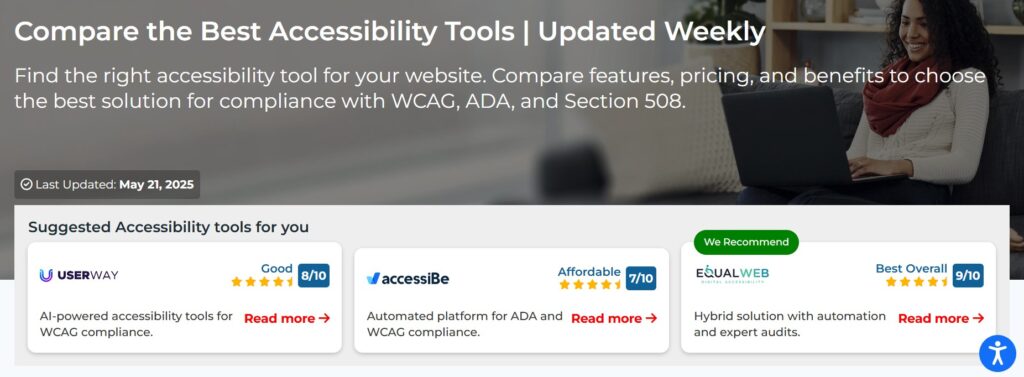
Automated Tools: Your First Line of Defense
Automated accessibility checkers, like the scanner here at Accessibility-Test.org, are great for doing a quick health check on your forms. These tools can crawl your page and instantly flag common technical problems, such as missing labels, insufficient color contrast on text, or inputs that don’t have a programmatic connection to their labels. Running an automated scan is a great first step that can help you catch a lot of the low-hanging fruit quickly and efficiently.
A Human Touch: Testing with Screen Readers
Automated tools can’t tell you if the experience of using your form makes sense. For that, you need to test with assistive technology. The best way to do this is to have experienced screen reader users test your site. If that’s not possible, you can perform some basic testing yourself.
Turn on a free screen reader like NVDA on Windows or VoiceOver on a Mac. Try to navigate your form. Listen to what it announces. Are the labels read out correctly? When an error appears, is it announced? Is the grouping of radio buttons and checkboxes clear? This kind of manual testing can be eye-opening. It helps you move beyond a technical checklist and understand the real-world usability of your form for someone who experiences the web differently.
Using Automated Tools for Quick Insights (Accessibility-Test.org Scanner)
Automated testing tools provide a fast way to identify many common accessibility issues. They can quickly scan your website and point out problems that might be difficult for people with disabilities to overcome.
Visit Our Tools Comparison Page!
Run a FREE scan to check compliance and get recommendations to reduce risks of lawsuits
Final Thoughts
Have you ever abandoned a website out of frustration with its forms? You can prevent your own users from having that same experience. Making your forms accessible is not just about compliance; it’s about good design, clear communication, and respect for all of your users.
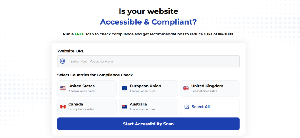
Don’t let your forms be a barrier. Start by running a free scan with the Accessibility-Test.org scanner today to find and fix accessibility issues on your website.
Run a Free Scan to Find E-commerce Accessibility Barriers
Curious about where your site stands? An automated scan is a great first step to identify potential accessibility issues on your e-commerce platform. Run a free scan on our website today to get an initial report on your site’s accessibility health.
Want More Help?
Try our free website accessibility scanner to identify heading structure issues and other accessibility problems on your site. Our tool provides clear recommendations for fixes that can be implemented quickly.
Join our community of developers committed to accessibility. Share your experiences, ask questions, and learn from others who are working to make the web more accessible.