Practical Look at Cognitive Accessibility
Have you ever tried to fill out a complicated form online while also keeping an eye on your kids or listening to a meeting? You get halfway through, a new pop-up demands your attention, you can’t find the “next” button, and you finally give up in frustration. That feeling of being overwhelmed and unable to process information is a temporary state for most of us. But for millions of people, that’s what using a poorly designed website feels like all the time.
When we talk about web accessibility, we often think of solutions for people who are blind, like screen readers, or for people who can’t use a mouse, like keyboard navigation. These are critically important. But there’s another, often invisible, side to accessibility that affects how people think, learn, and process information. This is cognitive accessibility.
It’s about designing digital experiences that are easy to understand and use for everyone, including people with learning disabilities, attention disorders, or memory impairments. But the a key point is that when you design for the mind, you create a better experience for every single person who visits your site, no matter what’s going on in their life. This article will show you why it matters and give you practical ways to make your website more brain-friendly.
Why Cognitive Accessibility Is the Frontier We Often Ignore
Most accessibility work focuses on tangible barriers. An accessibility scanner can detect if an image is missing alt text or if the color contrast is too low. These are technical problems with technical solutions. It’s much harder for a tool to tell you if your website’s navigation is confusing or if your instructions are full of jargon that makes people anxious.
Cognitive disabilities are incredibly diverse and often unseen. They include conditions like dyslexia, ADHD, and autism spectrum disorders, as well as age-related memory loss or difficulties from a brain injury. Because these conditions aren’t as straightforward as “cannot see the screen,” the solutions are less about code and more about thoughtful design and clear communication. A developer can’t easily put themselves in the shoes of someone who finds large blocks of text overwhelming or gets lost in a process with too many steps.
Because of this, many of the best practices for cognitive accessibility are simply labeled as “good user experience.” But this framing misses the point. While a clear layout is nice for everyone, it is essential for someone with an attention disorder. Simple language helps all users, but it’s a requirement for someone with a learning disability. Treating these as optional “nice-to-haves” instead of core accessibility needs means we leave a huge portion of the population behind.
Who Really Benefits From a Brain-Friendly Website?
The easy answer is “everyone,” but it’s helpful to understand the specific ways different people benefit. Designing for cognitive differences isn’t about a small, niche group; it’s about acknowledging the wide spectrum of human experience.
- People with permanent disabilities: This group includes individuals with learning disabilities like dyslexia, who struggle with dense text, or dyscalculia, who find numbers challenging. It also includes people on the autism spectrum who can be overwhelmed by sensory-rich or unpredictable interfaces, and people with memory impairments who need simple, clear processes.
- People with temporary limitations: Your brain doesn’t work at 100% when you’re sick, in pain, grieving, or under extreme stress. In these moments, a person’s ability to process complex information and make decisions drops significantly. A website that requires a high cognitive load becomes an impossible barrier.
- People in situational limitations: This is a context that affects everyone. Think about trying to use a website on your phone in bright sunlight, with a spotty internet connection, in a noisy train station. Or the new parent trying to order diapers online at 3 a.m. with a crying baby in their arms. Their attention is divided, and they have zero patience for a confusing checkout process.
- The aging population: As we get older, our memory, vision, and information processing speed can naturally decline. A website designed with simplicity and clarity is far more usable for seniors, a rapidly growing demographic of internet users.
When you design to reduce cognitive load, you are not just meeting WCAG compliance; you are practicing radical empathy that makes your website more resilient, effective, and welcoming to all.
Core Ideas for Building a More Thoughtful Website
Before diving into specific techniques, it helps to understand the main ideas behind cognitive accessibility. These four principles should guide your design and content decisions. They are less of a checklist and more of a mindset.
- Clarity and Simplicity. Your website should not feel like a puzzle. From the words you choose to the layout of your pages, the goal is to remove unnecessary complexity. This means avoiding jargon, using plain language, and presenting information in a straightforward way.
- Predictability and Consistency. Users feel more comfortable and confident when they know what to expect. Your navigation should be in the same place on every page. Links and buttons should look and act the same way across your entire site. This consistency reduces the mental effort required to use your site, as users don’t have to re-learn how things work on each new page.
- Focus and Guidance. The modern web is full of distractions. A cognitively friendly website helps users focus on their task. This means minimizing clutter, avoiding auto-playing media, and guiding people through complex processes one step at a time. Help them concentrate on what’s important without overwhelming them with pop-ups and notifications.
- Forgiveness and Support. Everyone makes mistakes. A forgiving design makes it easy to undo actions, like removing an item from a shopping cart, and to recover from errors. When a user makes a mistake in a form, for example, the site should provide clear, helpful instructions on how to fix it without making them start all over again.
Practical Steps for Clearer Content and Language
The words you use are the foundation of your website’s experience. If your content is confusing, no amount of clever design can fix it. Making your writing clearer and more structured is one of the most impactful things you can do for cognitive accessibility.
Write for Easy Reading
Your goal is to communicate, not to show off your vocabulary. People online tend to scan pages, so making your text easy to digest is vital.
- Use simple, direct language. Avoid corporate jargon, technical slang, and overly formal words. A good rule of thumb is to write as if you’re explaining something to a friend.
- Keep sentences and paragraphs short. A paragraph should ideally contain one main idea. Breaking up long thoughts into smaller sentences and limiting paragraphs to 3-4 sentences makes text much less intimidating.
- Write in the active voice. “You should complete the form” is clearer and more direct than “The form should be completed by you.”
- Explain acronyms the first time you use them. For example, “Web Content Accessibility Guidelines (WCAG).”
Structure Content for Skimming
No one reads a web page from top to bottom like a book. Users scan for keywords and headings to find what they need. A logical structure makes this scanning process easy for everyone, including people using screen readers.
- Use descriptive headings and subheadings (H1, H2, H3) to create a clear outline of the page. A user should be able to understand the page’s content just by reading the headings.
- Use bullet points and numbered lists to break up information. Lists are far easier to scan and process than a dense block of text.
- Put the most important information first. This applies to the whole page, each section, and even each paragraph. Don’t make users hunt for the main point.
Make Text Visually Easy to Follow
How text looks on the page is just as important as the words themselves. Poor visual presentation can make even the simplest text difficult to read.
- Avoid justified text. While it might look neat, the forced alignment creates uneven gaps between words, forming “rivers of white” that can make it hard for people with dyslexia to track lines of text. Left-aligned text provides a consistent edge for the eye to follow.
- Choose clean, readable fonts. While there’s no single “best” font, sans-serif fonts like Arial, Helvetica, and Verdana are generally considered more readable on screens.
- Use a large enough font size. A minimum of 16 pixels for body text is a good starting point.
- Provide good spacing between lines (line height). A line height of at least 1.5 times the font size gives text room to breathe.
Designing Intuitive Layouts and Navigation
A confusing layout can make a user feel lost and anxious. The goal is to create a visual environment that is calm, clear, and predictable, helping users find what they need without unnecessary effort.
Keep It Consistent, Everywhere
Consistency is the bedrock of intuitive design. When users don’t have to guess, they can focus their mental energy on their goals, not on figuring out your interface.
- Your site’s main elements; logo, navigation menu, search bar, and footer; should be in the same position on every single page. A user should never feel like they’ve landed on a completely different website.
- The visual design of interactive elements should be consistent. All buttons should look like buttons, and all links should look like links. Their appearance should not change from one section of the site to another.
- The way things work should be predictable. If one button opens a new tab, all similar buttons should do the same.
Reduce Clutter and Remove Distractions
- A cluttered page is a cognitively demanding page. Every element on the screen competes for the user’s attention, making it harder to focus on the primary task.
- Limit the use of pop-ups. They interrupt the user’s flow and can be disorienting. If you need to use one, make sure it is easy to dismiss with the keyboard or a clear “close” button.
- Embrace white space. Generous spacing between paragraphs, images, and sections helps to group related content and creates a less overwhelming layout.
- Be very careful with elements that move or make noise. Auto-playing videos or sound should be avoided. Image carousels or sliders that move on their own are often distracting and can move too fast for some users to read. If you must use them, always provide clear pause and stop controls.
Design Clear Pathways Through Your Site
Good navigation is like good signage in a building. It helps people understand where they are, where they’ve been, and where they can go next.
- Offer multiple ways to find information. A good search function is essential, but so is a clear, logical main menu. A sitemap or an A-Z index can also be helpful on larger sites.
- Use breadcrumb navigation. This trail of links (e.g., Home > Services > Web Design) shows users their location within the site’s hierarchy and allows them to easily move back to previous levels.
- Write descriptive link text. Link text should make sense out of context. Instead of vague phrases like “Click Here” or “Read More,” use text that describes the destination, such as “Read our case studies on e-commerce accessibility.” This helps all users, but it is especially critical for screen reader users who often navigate by pulling up a list of links on the page.
Building Forgiving Forms and Processes
Forms are often the most important; and most frustrating; part of a website. This is where users sign up, buy products, or contact you. A small amount of friction here can lead to complete task abandonment. Making your forms and multi-step processes clear and forgiving is essential.
Make Instructions Impossible to Misunderstand
Never assume a user knows what you’re asking for. Every part of a form or process should be explained with absolute clarity.
- Place labels right next to their form fields. The connection between the label (e.g., “First Name”) and the input box should be obvious.
- Clearly indicate which fields are required. An asterisk is a common convention, but it should be explained on the page (e.g., “* = Required Field”).
- For complex information, provide instructions or format examples. For a date field, show the user the expected format, like “DD-MM-YYYY.”
- Break long, complex processes into smaller, manageable chunks. A checkout process with five short steps feels much less intimidating than one giant form. A progress bar can show users where they are in the process and how much is left.
Handle Errors with Grace and Guidance
Error messages are a common source of frustration. A good error message is helpful, not scolding. It should empower the user to fix the problem and continue.
- When the user submits the form, display a summary of all errors at the top of the page with links that take them directly to the fields that need fixing.
- Clearly identify where the error occurred. Highlighting the field with a border is good, but you must also provide a text-based explanation.
- Explain the problem in plain language. Instead of “Error: Invalid Input,” try “Please enter a valid email address.”
- Do not clear the information the user has already entered. Forcing someone to fill out the entire form again because of one mistake is a sure way to lose them.

It’s About Empathy, Not a Checklist
Thinking about cognitive accessibility pushes us beyond technical compliance and into the realm of human-centered design. It’s about recognizing that clarity, simplicity, and predictability aren’t just aesthetic choices; they are functional requirements for a large part of the population.
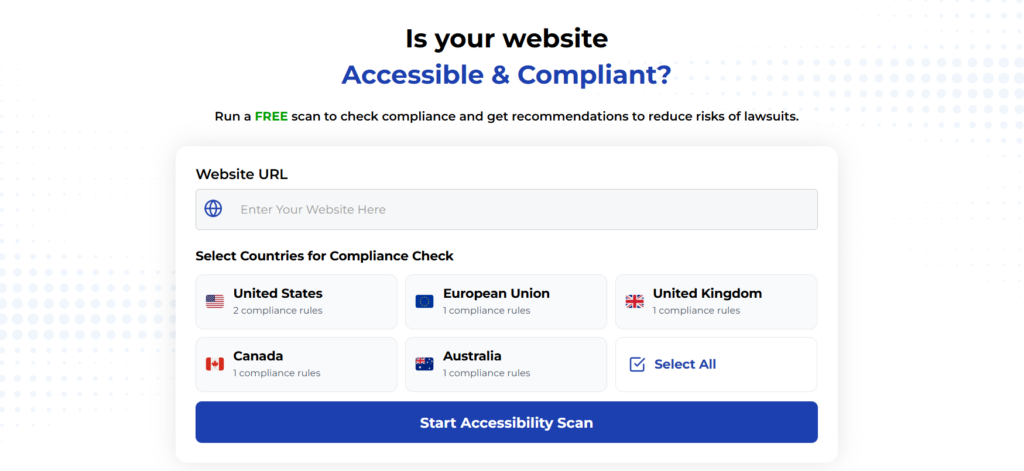
Using Automated Tools for Quick Insights (Accessibility-Test.org Scanner)
Automated testing tools provide a fast way to identify many common accessibility issues. They can quickly scan your website and point out problems that might be difficult for people with disabilities to overcome.
Visit Our Tools Comparison Page!

Run a FREE scan to check compliance and get recommendations to reduce risks of lawsuits
Final Thoughts
This isn’t about “dumbing down” your content. It’s about removing unnecessary hurdles so that people can engage with your ideas and your business. The practices that help someone with a cognitive disability also help a distracted parent, a stressed-out executive, and an older adult navigating the web. They make your site more effective for everyone.
You don’t need to rebuild your website overnight. Start small. Pick one page or one form and look at it through this lens. Is the language as clear as it could be? Is the layout simple and focused? Every small improvement you make is a step toward a more inclusive and effective web.
Run a Free Scan to Find E-commerce Accessibility Barriers
Curious about where your site stands? An automated scan is a great first step to identify potential accessibility issues on your e-commerce platform. Run a free scan on our website today to get an initial report on your site’s accessibility health.
Want More Help?
Try our free website accessibility scanner to identify heading structure issues and other accessibility problems on your site. Our tool provides clear recommendations for fixes that can be implemented quickly.
Join our community of developers committed to accessibility. Share your experiences, ask questions, and learn from others who are working to make the web more accessible.


