Why Are We Still Getting Web Accessibility Wrong in 2025?
We talk a lot about web accessibility these days. With regulations like the European Accessibility Act coming into full effect and a greater awareness of digital inclusion, you’d think we’d have the basics figured out by now. Yet, here we are in 2025, and a staggering number of websites still fail at the most elementary parts of accessibility. A recent WebAIM study found that 94.8% of the top million homepages had detectable WCAG 2 failures.
That figure is frustrating, isn’t it? It feels like we’re running in place. We have more accessibility testing tools and more information than ever before, but the same problems pop up again and again. It’s clear that just having a checklist isn’t working.
So, what’s the real story behind these persistent failures? It’s not just about developers being lazy or businesses not caring. The reasons are more complex and often rooted in deep-seated misunderstandings about what accessibility truly means. It’s time we moved past the technical jargon and had an honest conversation about the human side of digital inclusion. This isn’t just about compliance; it’s about people.
The Stubborn Problems That Won’t Go Away
If you run an accessibility scan on a random sample of websites today, you’ll likely see a familiar pattern of errors. These aren’t complex, obscure issues buried deep in the code. They are foundational problems that have been part of accessibility conversations for years, yet they continue to plague the web.
The Never-Ending Story of Low-Contrast Text
One of the most common accessibility issues is low-contrast text. This happens when the color of the text is too similar to the color of its background, making it difficult for people with visual impairments like color blindness or low vision to read. But it doesn’t just affect them. Have you ever tried to read your phone screen in bright sunlight? That’s a situational accessibility challenge that good contrast helps solve.
This issue is so prevalent because design trends sometimes favor subtle, low-contrast aesthetics. A designer might choose a light gray text on a white background because it looks “clean” or “minimalist,” without considering its readability. They aren’t trying to exclude people, but without the right awareness and accessibility testing tools, these design choices create real barriers. It’s a classic case of aesthetics trumping usability, and it happens every single day.
Missing Alt Text: An Easy Fix That’s Often Missed
Images are a huge part of the modern web, but for someone using a screen reader, an image without alternative (alt) text is just a silent void. Alt text is a short, descriptive sentence that gets read aloud, explaining what an image shows. According to WebAIM, missing alt text for images is the second most common failure. Alt text accessibility is not difficult to get right, so why is it still such a widespread problem?
Often, it’s a workflow issue. A content creator might upload images in a hurry and forget to add the descriptions. In other cases, they might not know how to write good alt text. They might stuff it with keywords for SEO or write something unhelpful like “image1.jpg.” Getting alt text right requires a small but conscious effort to think about the experience of someone who cannot see the image.
Confusing Links and Empty Buttons
“Click here.” We’ve all seen it. Vague link text like this is a nightmare for screen reader users. When they pull up a list of all the links on a page to get a quick overview, a list of twenty “read more” links gives them zero context. Descriptive links that explain where a user will go; like “Read our 2025 WCAG compliance report”; are far more useful.
This problem, along with empty links and buttons that have no text at all, remains incredibly common. An empty button might be a clickable icon, like a magnifying glass for search, but without a programmatic label, a screen reader can’t announce its function. These are not tricky coding challenges. They are oversights that can make a website completely confusing for someone who relies on assistive technology.
The Maze of Missing Form Labels
Have you ever tried to fill out a form where the labels were unclear? Now imagine you can’t see the form at all. That’s the experience for someone using a screen reader on a form without proper labels. Accessible forms need to have a clear, programmatically linked label for every input field. Without it, the user hears “edit text” or “checkbox” but has no idea what information is being requested.
Missing form input labels are another one of the top failures found across the web. This often happens when developers use placeholder text (the light gray text inside a form field) as a replacement for a visible label. While it might look clean, that placeholder text often disappears once the user starts typing and isn’t always read by screen readers. It’s a simple mistake that can prevent someone from buying a product, signing up for a newsletter, or contacting a business.
So, Why Does This Keep Happening?
If these common accessibility problems are so well-known and relatively straightforward to fix, why are they still so widespread? The answer lies less in the “what” and more in the “how” and “why” of website creation. The root causes are often procedural and cultural, not just technical.
The Over-Reliance on Automated Checkers
Automated accessibility testing tools are incredibly useful. They can scan a site in seconds and catch many common issues like low contrast or missing alt text. But they are not a silver bullet. The problem is that many organizations run a scan, fix the flagged issues, and believe their work is done. They see a “100% compliant” score from a tool and assume their site is perfectly accessible.
However, research suggests that automated tools can only catch a fraction of all potential accessibility barriers. They can’t tell you if your alt text is actually meaningful or if your page structure is logical. They can’t understand context. An over-reliance on automation without manual testing creates a false sense of security and leads to websites that are technically compliant but practically unusable.
“Accessibility is Just for a Few Users” – A Costly Misconception
Another persistent issue is the myth that accessibility is a niche concern that only benefits a tiny fraction of users. This often leads businesses to de-prioritize it, especially when facing tight deadlines or budgets. But the numbers tell a different story. Over a billion people worldwide live with some form of disability. That’s hardly a niche audience.
Furthermore, accessibility benefits everyone. Closed captions help people watch videos in noisy environments. Good color contrast works better for everyone in bright sunlight. A clear and logical layout helps users with cognitive disabilities, but it also helps anyone who is stressed, tired, or multitasking. Viewing accessibility as a requirement for “others” ignores the immense benefits it brings to all users.
The “Set It and Forget It” Mentality
Many teams treat accessibility as a one-time project. They perform an accessibility audit, fix the identified problems, and check it off the list. But websites are not static. New pages, features, and content are added all the time. Without an ongoing process, a perfectly accessible site can become riddled with barriers in a matter of months.
True digital inclusion requires continuous effort and accessibility monitoring. It needs to be part of the everyday workflow. Every new design should be checked for color contrast. Every new image should have alt text. New features should be tested for keyboard navigation. Without this sustained commitment, entropy takes over, and old problems creep back in.
Misunderstanding ARIA and Semantic HTML
Sometimes, developers trying to do the right thing can accidentally make things worse. This is often the case with ARIA (Accessible Rich Internet Applications). ARIA can be used to make complex web applications more accessible, but when misused, it can create more problems than it solves. For instance, a developer might add an ARIA role to an element that already has a clear meaning in HTML, confusing screen readers.
The best practice is almost always to use standard, semantic HTML first. A <button> element is already understood by assistive technologies. You don’t need to add role=”button” to it. These mistakes often stem from a lack of deep knowledge and demonstrate that good intentions are not enough. Proper training is essential to prevent these well-meaning errors.
Moving from Compliance to True Usability
Passing an automated accessibility scan is not the finish line. A website can be technically compliant with WCAG standards but still be a frustrating and difficult experience for a person with a disability. The real goal should be usability; creating digital experiences that are not just accessible but are also efficient and enjoyable for everyone.
Thinking Beyond the Checklist
The checklist mentality is one of the biggest hurdles to meaningful accessibility. It encourages teams to focus on ticking boxes rather than understanding the human experience behind each guideline. For example, a checklist item might say, “All images must have alt text.” A team might use an automated tool to add the filename as the alt text to every image just to pass the check. They’ve met the technical requirement, but they’ve completely failed the human user.
To move beyond the checklist, we need to ask “why” a guideline exists. Why do we need accessible headings? Not just for SEO, but so a screen reader user can quickly skim the page to find the section they need. Why do we need descriptive links? So a user doesn’t have to guess where a link will take them. When we focus on the “why,” our solutions become more thoughtful and effective.
The Power of Manual Testing
If you really want to know if your website is usable, you need to test it manually. This means trying to navigate it using only a keyboard. It means listening to it with a screen reader. And most importantly, it means involving users with disabilities in your testing process. Their lived experience is an invaluable source of truth that no automated tool can replicate.
You might discover that while all your buttons are technically accessible, the tab order makes no logical sense, forcing keyboard users on a wild goose chase around the page. You might find that your cart update announcements aren’t read by screen readers, causing users to abandon their purchases. These are the kinds of show-stopping issues that manual testing uncovers.
Making Accessible Design Part of Your DNA
The most effective way to achieve digital inclusion is to make it a core part of your process from the very beginning. Accessibility shouldn’t be something the QA team worries about at the end of a project. It needs to be on the minds of designers choosing color palettes, developers writing the first lines of code, and content creators uploading articles.
This “shift-left” approach saves time and money. It’s far easier and cheaper to build an accessible feature from scratch than it is to go back and remediate an inaccessible one later. It requires training your entire team on accessibility principles and making it a shared responsibility, not just the job of one person or department. When accessibility is part of your culture, it becomes second nature.
What’s Next? New Approaches for Old Problems
While the core issues of accessibility remain stubbornly persistent, the way we approach them is beginning to change. Emerging technologies and evolving standards offer new ways to tackle these old problems, moving us closer to a web that works for everyone.
Can AI Help or Hurt?
Artificial intelligence presents both exciting opportunities and potential pitfalls for accessibility. On one hand, AI-powered tools are getting better at automatically generating image descriptions and creating live captions for audio content. These accessibility solutions can help fill some of the gaps left by human oversight, offering a baseline level of access where there was none before.
However, we must be cautious. AI-generated descriptions can be inaccurate or lack context. If we become too reliant on AI, we might abdicate our responsibility to create thoughtful, human-centered experiences. The best approach is to view AI as an assistant, not a replacement. It can handle some of the heavy lifting, but human oversight and judgment remain essential to ensure quality and accuracy.
The Move Toward Personalization
A one-size-fits-all approach to web design doesn’t work. What’s usable for one person might be a barrier for another. This is leading to a trend in accessible design that focuses on personalization and customization. This means giving users more control over their experience.
Imagine being able to adjust a website’s font size, change the color contrast to a mode that works for you, or turn off animations that you find distracting. This level of personalization is particularly helpful for people with cognitive disabilities or neurodivergence, but it benefits everyone. By allowing users to tailor the interface to their own needs and preferences, we can create more flexible and inclusive experiences.
WCAG 3.0’s User-Centered Approach
The next major version of the Web Content Accessibility Guidelines, WCAG 3.0, is currently being developed and signals a significant shift in thinking. While previous versions were based on a pass/fail system for technical criteria, WCAG 3.0 aims to be more focused on user outcomes and will introduce a scoring model.
This change reflects a broader understanding in the community that technical conformance alone does not equal usability. While its final release is still several years away, the direction is clear: the future of web accessibility standards will be less about rigid rules and more about measuring the actual experience of users with disabilities. This aligns perfectly with the need to move beyond the checklist and focus on creating genuinely usable websites.
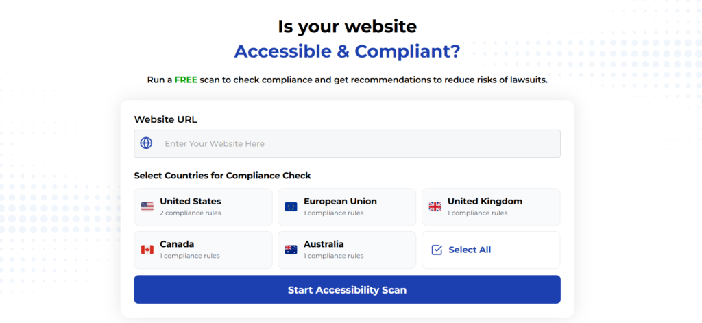
Using Automated Tools for Quick Insights (Accessibility-Test.org Scanner)
Automated testing tools provide a fast way to identify many common accessibility issues. They can quickly scan your website and point out problems that might be difficult for people with disabilities to overcome.
Visit Our Tools Comparison Page!

Run a FREE scan to check compliance and get recommendations to reduce risks of lawsuits
Final Thoughts
The fact that we are still battling basic web accessibility issues in 2025 is a clear sign that our old approach isn’t working. We can’t just rely on automated tools and technical checklists. The path forward requires a fundamental shift in mindset; from viewing accessibility as a technical chore to embracing it as a human-centered design philosophy.
It means making accessibility a continuous, shared responsibility across entire teams, requires us to talk to and, more importantly, listen to people with disabilities. It demands that we prioritize real-world usability over a superficial compliance score. The problems may be stubborn, but they are not unsolvable. By focusing on the human experience behind every design choice and line of code, we can finally start making meaningful progress and build a web that is truly open to all.
Ready to find out where your site stands? Run a free scan with our accessibility checker to identify the stubborn problems that might be holding you back.
Run a Free Scan to Find E-commerce Accessibility Barriers
Curious about where your site stands? An automated scan is a great first step to identify potential accessibility issues on your e-commerce platform. Run a free scan on our website today to get an initial report on your site’s accessibility health.
Want More Help?
Try our free website accessibility scanner to identify heading structure issues and other accessibility problems on your site. Our tool provides clear recommendations for fixes that can be implemented quickly.
Join our community of developers committed to accessibility. Share your experiences, ask questions, and learn from others who are working to make the web more accessible.


