Grammarly vs. Hemingway: Which Tool Best Aids Accessible Writing?
Have you ever landed on a webpage and felt immediately overwhelmed? Walls of dense text, long sentences that twist and turn, and jargon you’ve never seen before. It’s a common experience, and for many people, it’s a significant barrier. When content is hard to understand, users get frustrated, and they leave. This is especially true for people with cognitive disabilities, but the truth is, clear and simple writing helps everyone.
This is where writing assistant tools like Grammarly and Hemingway Editor come in. They are often seen as tools for catching typos or polishing an essay, but their real power lies in their ability to make digital content more accessible. By helping us simplify our language, shorten our sentences, and structure our ideas clearly, they directly address some of the biggest hurdles in cognitive accessibility. This isn’t about “dumbing down” content; it’s about opening it up to the widest possible audience. Let’s look at how these tools work and how you can use them to make your own content more inclusive.
How Writing Clarity Connects to Cognitive Accessibility
The link between clear writing and accessibility isn’t just a nice idea, it’s a core part of creating truly inclusive digital experiences. The Web Content Accessibility Guidelines (WCAG) include principles that directly address the need for understandable content. When we talk about cognitive accessibility, we’re thinking about users with a wide range of conditions, including learning disabilities, memory impairments, and attention-related challenges. Simple, direct language reduces the mental effort required to process information, which makes a world of difference for these users.
But the benefits don’t stop there. Clear content is better for non-native English speakers, users who are multitasking or in a stressful environment, and anyone scanning a page on a mobile device. Essentially, when you make your writing more accessible for people with cognitive disabilities, you make it better for all of your users.
Reading Level Impact on Task Completion
Did you know the average adult in the U.S. reads at about an eighth-grade level ? Yet, a surprising amount of web content is written at a much higher level, filled with academic language and complex sentence structures. When a user has to struggle to understand your text, their ability to complete a task, whether it’s filling out a form, buying a product, or finding information, drops dramatically.
High cognitive load leads to fatigue and frustration. If a user has to re-read a sentence three times to understand it, they’re more likely to give up entirely. This is a huge accessibility barrier. Tools that measure reading grade level, like the Hemingway Editor, give content creators a concrete metric to aim for. By targeting a 7th or 8th-grade reading level, you can ensure that most of your audience can understand your message on the first pass. This simple adjustment can have a massive impact on user engagement and task success rates.
Clear Instructions vs. Abandoned Forms
Forms are one of the most common points of failure on the web. Unclear instructions, confusing labels, and unhelpful error messages can turn a simple task into an impossible puzzle. Think about the last time you saw a generic error message like “Invalid input.” What does that even mean? How are you supposed to fix it?
For someone with a cognitive disability, vague instructions can be a dead end. This is where writing tools can be a great ally. By running your form labels, placeholder text, and error messages through a tool like Grammarly or Hemingway, you can spot and fix unclear language. For example, instead of a label that just says “Name,” you might be prompted to write “Full Name” for clarity. Instead of an error that says “Error,” you can write “Please enter a valid email address, like name@example.com.” These small changes provide clear, actionable guidance that helps users succeed and prevents them from abandoning the task in frustration.
Grammarly’s Features for Accessibility-Focused Writing
Grammarly has become one of the most popular writing assistants available, known for its powerful grammar and spelling checks. But beyond the basics, its features offer some excellent support for creating more accessible content. It works across many platforms, from web browsers to desktop apps, allowing you to maintain consistency wherever you write. Its real-time feedback helps you catch potential issues as you type, making accessible writing a part of your natural workflow.
While not a dedicated accessibility checker, Grammarly’s focus on clarity, correctness, and tone aligns well with the goals of inclusive communication. For content teams, its style guide features can help ensure everyone is following the same standards for readability and voice.
Sentence Length and Complexity Suggestions
One of the quickest ways to improve readability is to shorten your sentences. Long, complex sentences with multiple clauses are difficult to parse, especially for readers with attention or processing challenges. Grammarly’s clarity suggestions are particularly helpful here. The tool flags sentences that are wordy or convoluted and often suggests ways to split them into shorter, more digestible pieces.
For example, a sentence like “Our innovative software solution, which was designed to streamline your workflow, can be implemented across your entire organization to drive efficiency” might get flagged. Grammarly may suggest breaking it into: “Our software solution streamlines your workflow. You can implement it across your organization to drive efficiency.” This change makes the information much easier to process without losing the original meaning. This real-time feedback trains you to become a clearer writer over time.
Jargon Detection That Actually Helps
Technical jargon and corporate buzzwords are major accessibility barriers. They exclude anyone who isn’t already an expert in your field. Grammarly’s premium version includes vocabulary suggestions that can help you replace complex words with simpler alternatives. This feature is fantastic for catching those moments when you might be using overly formal or technical language without realizing it.
For instance, if you write the word “utilize,” Grammarly will likely suggest the simpler word “use.” If you write “leverage,” it might suggest “use” or “take advantage of.” These may seem like minor changes, but they add up to create content that is far more approachable. By systematically replacing jargon with plain language, you make your content welcoming to a broader audience, including people with learning disabilities and those for whom English is a second language.
Tone and Inclusivity Checks
Communication is about more than just the words you choose; it’s also about the tone you convey. Grammarly’s tone detector and inclusive language suggestions are powerful features for accessibility. The tone detector analyzes your writing and tells you how it might be perceived by a reader, for example, as “formal,” “confident,” or “friendly.” This can help you ensure your tone matches your intent and is appropriate for your audience.
The inclusive language feature is even more directly related to accessibility. It flags words or phrases that could be exclusionary or offensive and suggests more inclusive alternatives. For example, it might suggest using “person with a disability” instead of “disabled person” or “team” instead of “guys.” These suggestions help you create a more respectful and welcoming environment for all readers, which is a fundamental part of inclusive design.
Hemingway Editor for Plain Language Goals
Unlike Grammarly, which is a jack-of-all-trades writing assistant, the Hemingway Editor has a single, focused mission: to make your writing bold and clear. It doesn’t check for grammar or spelling. Instead, it highlights issues that get in the way of readability. Its minimalist interface and color-coded feedback system provide an at-a-glance analysis of your text’s clarity.
The tool is built on the writing philosophy of its namesake, Ernest Hemingway, who was famous for his direct and unadorned prose. By encouraging you to write shorter sentences, use simpler words, and avoid common pitfalls like passive voice, the Hemingway Editor is an excellent tool for anyone serious about plain language and cognitive accessibility.
Reading Grade Level Targets That Make Sense
The standout feature of the Hemingway Editor is its readability score, which tells you the lowest grade level of education someone needs to understand your text. This is an incredibly practical tool for accessibility. As mentioned earlier, aiming for a general audience reading level (around 8th grade) is a great starting point for most web content.
Having a concrete target takes the guesswork out of writing. You can paste your text into the editor and immediately see if you’re hitting your goal. If your grade level is too high, the tool’s other suggestions will guide you on how to lower it. This feature is directly tied to WCAG Success Criterion 3.1.5, which states that content should be written at a lower secondary education level (a Grade 7-9 reading level) to meet the AAA standard. Hemingway makes it easy to work toward this goal.
Passive Voice Reduction for Clearer Action Steps
Passive voice can make sentences confusing and unclear. It often hides who is performing an action, which can be a problem in instructional text. For example, “The button must be clicked” is less clear than “Click the button.” The first sentence is passive, while the second is an active, direct command.
Hemingway is aggressive about flagging passive voice, highlighting every instance in green. This encourages you to rephrase sentences in the active voice, which makes your writing more direct and easier to follow. Clear, active instructions are vital for users with cognitive disabilities who may struggle to interpret ambiguous language. By consistently using the active voice, you make your action steps and calls-to-action much more effective for everyone.
The Power of Bold and Clear Highlighting
One of the best things about the Hemingway Editor is its visual simplicity. It uses a color-coded system to highlight different issues :
- Yellow sentences are hard to read.
- Red sentences are very hard to read.
- Purple words have a simpler alternative.
- Blue words are adverbs, which can often be removed.
- Green phrases are instances of passive voice.
This visual feedback is immediate and intuitive. You don’t need to be a grammar expert to understand what’s wrong. You can simply look at the colors and start editing. This approach helps writers internalize the principles of clear writing over time. After using Hemingway for a while, you’ll start to spot long sentences and passive voice in your own writing before you even paste it into the tool. It’s a great way to train yourself to become a more accessible writer.
Content Checklist for WCAG 2.1/2.2 Compliance
While writing tools are not a substitute for a full accessibility audit, they can help you meet several key WCAG success criteria, particularly those related to the “Understandable” principle. Creating a simple checklist that incorporates these tools can significantly improve your content’s compliance. Before publishing any new content, run it through this quick check.
This process helps you move beyond just checking for errors and starts building accessibility into your content creation from the beginning. It shifts the focus from fixing problems after the fact to preventing them in the first place.
Headings and Labels That Screen Readers Navigate Well
Well-structured content is essential for screen reader users, who often navigate a page by jumping between headings. Your headings should be descriptive and follow a logical order (H1, H2, H3, etc.). While tools like Grammarly and Hemingway don’t directly check your heading structure, they do encourage you to write clear, concise text.
Apply this principle to your headings. A heading like “Our Services” is less descriptive than “Our Web Accessibility Auditing Services.” Clear, descriptive headings provide a much better experience for screen reader users and also benefit SEO. Similarly, use these tools to simplify the language in your form labels and button text to ensure they make sense out of context.
Error Help Text That Users Can Actually Use
WCAG has specific requirements for helping users identify and correct errors. For example, Success Criterion 3.3.1 (Error Identification) requires that errors are clearly identified, and Success Criterion 3.3.3 (Error Suggestion) recommends providing suggestions for correction.
This is where plain language is absolutely critical. A user can’t fix an error if they don’t understand the message. Use Hemingway and Grammarly to simplify your error messages.
- Instead of: “Submission failed. Please try again.”
- Try: “Your message could not be sent. Please check your internet connection and try again.”
The second option is much more helpful. It explains what happened and gives a concrete suggestion. This kind of clear communication reduces user frustration and helps people successfully complete tasks on your site.
Meeting WCAG 3.1.5 Reading Level (AAA)
For organizations that want to achieve the highest level of accessibility, WCAG offers the AAA conformance level. Success Criterion 3.1.5 at this level requires that content be written at a reading level that doesn’t require more than a lower secondary education (typically grades 7-9). This is a high standard to meet, but it provides a much more accessible experience for people with cognitive and learning disabilities.
The Hemingway Editor is the perfect tool for this job. Its grade-level score gives you a clear, measurable target. You can work on your text until you bring the reading level down to the 7th or 8th-grade mark. While not every piece of content needs to meet the AAA standard, it’s a great goal for important informational pages, instructions, and any content targeted at a general audience.
Team Workflows That Keep Reading Levels in Check
Putting these tools to use isn’t just an individual effort; it’s about building a team culture that values clarity and accessibility. By integrating readability checks into your team’s existing workflows, you can ensure that all content, no matter who writes it, meets a consistent standard. This creates a more predictable and accessible experience for your users across your entire website or product.
The key is to make these checks a routine part of the process, not an afterthought. When readability is treated with the same importance as spell-checking or brand consistency, it quickly becomes second nature for the entire team.
Editorial Review Processes That Catch Barriers
A formal editorial review process is a great place to introduce readability checks. Before any content is published, it should be reviewed by at least one other person. This review should include a specific step to check the content in a tool like Hemingway.
You can set clear, objective standards for your team, such as:
- All public-facing content must have a Hemingway grade level of 8 or lower.
- There should be no instances of passive voice in instructional text.
- No sentences should be highlighted as “very hard to read.”
By making these checks a mandatory part of your definition of “done,” you ensure that no content goes live without being reviewed for clarity. This process catches barriers before they ever reach your users.
Template Language That Works Across Content Types
Many websites and applications use repeated text for things like buttons, calls-to-action, form instructions, and confirmation messages. This is a perfect opportunity to create a library of pre-approved, accessible “microcopy.”
Your team can work together to write and test this template language, running it through readability tools to ensure it is as clear as possible. For example, you can decide on standard button text for “Submit,” “Cancel,” “Learn More,” and “Download.” Once this language has been vetted, it can be stored in a shared document or design system for everyone on the team to use. This not only improves accessibility but also creates a more consistent user experience.

A Human-Centered Approach to Writing
In the end, tools like Grammarly and Hemingway are just that, tools. They can’t replace the critical thinking and empathy of a human writer. However, they are incredibly powerful aids that can help us spot issues we might otherwise miss and train us to become better, more accessible writers.
By focusing on clear language, simple sentences, and direct communication, you can break down significant barriers for users with cognitive disabilities. And in doing so, you’ll create a better, more usable experience for every single person who visits your site. The next time you sit down to write, ask yourself: Is this as clear as it can be? A few minutes with one of these tools might just give you the answer.
Using Automated Tools for Quick Insights (Accessibility-Test.org Scanner)
Automated testing tools provide a fast way to identify many common accessibility issues. They can quickly scan your website and point out problems that might be difficult for people with disabilities to overcome.
Visit Our Tools Comparison Page!

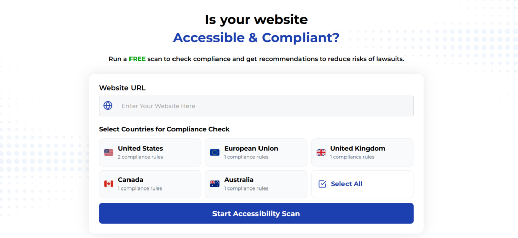
Run a FREE scan to check compliance and get recommendations to reduce risks of lawsuits
Final Thoughts
Ready to find more ways to improve your site’s accessibility? Explore our other articles on accessibility testing tools and best practices to continue your journey.
Start your compliance journey, update your accessibility statement, and keep EAA top of mind in every project going forward.
Run a Free Scan to Find E-commerce Accessibility Barriers
Want More Help?
Try our free website accessibility scanner to identify heading structure issues and other accessibility problems on your site. Our tool provides clear recommendations for fixes that can be implemented quickly.
Join our community of developers committed to accessibility. Share your experiences, ask questions, and learn from others who are working to make the web more accessible.


