


Testing and Fixes That Actually Work
Have a hunch that your color contrast might be off? You’re probably right. Color contrast sits at the top of the most common accessibility failures, and it blocks users every single day; especially those with low vision or color vision deficiencies. The good news: it’s fixable, and you can bake it into your design system so it stays fixed.
This article breaks down WCAG 2.2 color contrast requirements in plain English, shows how to test with the right tools, and explains how to resolve the issues you’ll bump into on real projects. It follows Accessibility-Test.org’s content standards; for clear structure, plain language, and SEO with intent; so it’s easy to scan and even easier to act on.
Understanding WCAG 2.2 Color Contrast Requirements
Success Criterion 1.4.3: Contrast (Minimum)
SC 1.4.3 requires a contrast ratio of at least 4.5:1 for normal text and 3:1 for large text (typically 18pt regular or 14pt bold), including images of text, except for incidental or decorative text. This applies to text and text-in-icons over backgrounds, gradients, and images; if users must read it, it must meet contrast.
Success Criterion 1.4.6: Contrast (Enhanced)
SC 1.4.6 raises the bar to 7:1 for normal text and 4.5:1 for large text for users who need stronger contrast to read comfortably. While it’s Level AAA and not required for most policies, aiming higher on critical content (navigation, forms, errors) helps users who struggle even at minimum thresholds.
What the 4.5:1 and 3:1 Ratios Really Mean
A contrast ratio compares relative luminance between foreground and background colors on a scale from 1:1 (same color) to 21:1 (black on white). Normal text must hit 4.5:1; large text and non-text UI components like icons that communicate meaning must hit at least 3:1 for their visual boundaries and states. Don’t eyeball it; test with a tool that calculates the ratio for the exact pixels users see.

Why Color Contrast is the #1 Accessibility Issue
WebAIM Million Report: 95.9% of Sites Fail
Year after year, WebAIM’s Million study has shown color contrast issues on the majority of homepages tested, with failure rates near 96%; it’s the most frequent detectable error on the web. That means almost every team has work to do here, regardless of industry or size.
Impact on Users with Visual Impairments
Insufficient contrast makes text harder or impossible to read for people with low vision, color vision deficiencies, cataracts, glare sensitivity, and for anyone in poor lighting or on low-quality displays. Users miss instructions, error messages, and labels; they abandon forms; and they can’t complete tasks without zooming or assistive adjustments; if they can complete them at all.
Testing Color Contrast: Tools and Methods
Good testing mixes quick checks, targeted analysis, and automation inside the CI/CD pipeline; then backs it up with manual review for context.
Browser Extensions for Quick Checks
- WAVE Evaluation Tool: flags low-contrast text inline and helps spot clusters of issues fast.
- axe DevTools: runs in the browser, reports contrast failures, and links to guidance for fixes.
- Accessibility Insights: fast automated checks with on-screen annotations for contrast and more.
Use these during design reviews and while inspecting UI states in dev tools to catch issues early.
Professional Color Contrast Analyzers
- WebAIM Contrast Checker: enter foreground/background colors, get pass/fail for AA/AAA and font size thresholds.
- TPGi Colour Contrast Analyser (CCA): sample on-screen pixels (even in images, gradients, and overlays) to get accurate results for the exact spot users see.
- Stark (Figma/Sketch/Adobe XD): checks contrast in design files, shows suggestions, and helps designers adjust palettes before handoff.
These tools give precise ratios and help you iterate on colors until they pass.
Automated Testing Integration
- axe-core in CI: run contrast checks during builds to stop regressions before release.
- Pa11y/Lighthouse: include contrast rules in automated audits; report failures as part of quality gates.
- Visual regression with contrast-aware checks: if your pipeline includes screenshots, add assertions for contrast in critical templates to catch subtle drift over time.
Automation catches the obvious mistakes at scale; manual checks catch context-specific misses like text over images and hover/focus states.

Common Color Contrast Failures and Solutions
Light Gray Text on White Backgrounds
Problem: Body copy or helper text uses a pale gray (#BFBFBF on #FFFFFF), which often falls below 4.5:1.
Fixes:
- Darken the text color (e.g., drop lightness until ≥4.5:1 in your contrast checker).
- Increase font size/weight to qualify as large text where appropriate (but don’t use size as a crutch for long paragraphs).
- Avoid text overlays on white with low-opacity text; opacity affects perceived contrast.
Button and Link Contrast Issues
Problem: Links rely solely on color to distinguish from body text, and button text fails on brand-color backgrounds.
Fixes:
- Ensure link text color meets 4.5:1 relative to surrounding text/background; add an underline by default or on hover/focus to avoid color-only reliance.
- For buttons, check both text vs. background and focus/hover states; use stronger text color or darken the background until the ratio passes.
- Verify disabled states meet UI component contrast (3:1 for boundaries/states) if the state communicates status; avoid ultra-low-contrast grays that look “invisible”.
Form Field and Label Problems
Problem: Placeholder text is too faint, labels appear in low-contrast colors, and error messages fail contrast on red backgrounds.
Fixes:
- Use real labels with sufficient contrast; don’t rely on placeholders as labels.
- For inline validation, ensure error text and icons meet contrast against field backgrounds; add a border or background badge with adequate contrast.
- For focus indicators, ensure a 3:1 contrast against adjacent colors (helps with SC 2.4.11 too).
Designing with Accessible Color Palettes
Choosing Colors That Meet WCAG Standards
Start with a palette that accounts for text on light and dark surfaces, UI states, and elevation layers; then validate every combination you intend to use with a contrast checker. Include multiple tints and shades for each brand color so designers and developers can pick a passing pair without guesswork.
Brand Colors vs Accessibility: Finding Balance
Keep brand recognition while making small, tested adjustments: deepen saturation or reduce lightness for text on brand backgrounds, or introduce an accessible “on-brand” neutral for text/icons on vibrant fills. Document approved pairs (e.g., “Primary 600 on White passes for body text”) and show examples as tokens in your design system.

Advanced Color Contrast Considerations
Gradient Backgrounds and Overlays
Text over gradients and images changes contrast from pixel to pixel; one section might pass while another fails. Add a semi-opaque overlay behind text, increase shadow (not as a sole fix), or place content in a solid container that guarantees 4.5:1 across the full area. Test with an on-screen sampler in the spots users will read.
Dark Mode and Theme Switching
Dark mode needs its own passing pairs; don’t invert colors blindly. Watch for low-contrast grays on near-black surfaces and neon accents that vibrate on dark backgrounds. Test default, hover, active, and focus states in both themes; store tokens per theme so engineers don’t mix incompatible values.
Dynamic Content and User-Generated Colors
If users choose colors (dashboards, branding, charts), provide guarded presets that pass contrast and warn on low-contrast selections. When users add images behind text, enforce overlays or text containers by design so content stays readable without constant moderation.
Testing Your Entire Site for Color Contrast
Don’t test one component in isolation and call it done; scan templates, states, and content types across the site.
- Crawl key templates with automated audits (axe-core, Pa11y, Lighthouse) and export issues by page and selector.
- Manually spot-check complex areas: hero images with text overlays, cards with gradient fills, charts/infographics, and custom components with multiple states.
- Test responsive breakpoints; some CSS layers shift, and contrast can fail only at tablet width or in compact UI.
- Validate error states, focus states, and disabled states in real flows (logins, signups, checkout, account settings).
- Re-test after content or marketing updates; new brand banners and seasonal themes often reintroduce old issues.
Maintaining Color Contrast in Design Systems
Bake contrast into your system so designers and developers don’t have to think about it every time they ship a screen.
- Tokenize colors with semantic names (text-primary, text-on-primary, surface, surface-contrast) and include pass/fail notes next to each intended pairing.
- Bundle accessible pairings in component defaults: buttons ship with passing text colors and borders; badges ship with approved combinations; alerts ship with accessible red/green sets for text and icons.
- Add lint rules or Storybook/a11y checks for contrast on components; fail PRs that drop below thresholds.
- Train the team: run a quick session to show common pitfalls and how to pick passing pairs with real tools designers already use.
Practical Fix Patterns You Can Reuse
Don’t rely on shadows to reach contrast targets; use them as enhancement, not the primary fix.
- Strengthen text color slightly instead of cranking the background to extremes; users still want a pleasant UI, just readable.
- Provide a “utility high-contrast” text color token that designers can switch to when a layout creates risk (e.g., text over brand imagery).
- Prefer underlines for links in body text; color alone won’t help everyone, and it often misses contrast requirements next to surrounding text.
- For charts and infographics, pair color with patterns, labels, or markers; check contrast for labels against chart backgrounds and gridlines.

Step-by-Step: Fix Low-Contrast Text on a Card
- Sample the exact text color and background from a screenshot using a contrast analyzer that supports pixel sampling.
- Check the ratio against AA (normal text) and AAA if you aim higher for critical UI.
- Darken the text color first; if that breaks brand, try darkening the background slightly or switch to a brand-approved neutral for text-on-brand.
- Validate the new pair for default, hover, and active states; don’t forget disabled and focus styles for interactive text.
- Update color tokens in the design system; ship the fix across all components that use those tokens to avoid one-off patches.
- Add a visual regression snapshot and an automated contrast check for that component to prevent future regressions.
How Contrast Ties to ADA and Section 508
Most legal standards point to WCAG for technical criteria, so passing WCAG 2.2 AA contrast targets supports ADA website requirements and Section 508 obligations in practice. Teams that treat contrast as a non-negotiable baseline reduce legal risk while improving everyday usability for a wide range of people.
SEO Angle: Why Contrast Helps Search
Readable text reduces bounce, increases time on page, and helps more visitors complete tasks; signals that support healthy performance over time. Accessibility and SEO work together: accessible content structure, strong contrast, and clear affordances help both people and search engines understand content.
Testing Toolkit: What to Add to Your Workflow
Maintenance: quarterly accessibility audit focused on high-traffic pages and reusable components; track fixes in your backlog just like performance issues.
- Design phase: Stark or built-in contrast plugins in Figma/Sketch; document passing pairs in component specs.
- Dev phase: axe DevTools and Accessibility Insights during implementation; verify states in the browser.
- CI phase: axe-core or Pa11y in the pipeline; fail builds on contrast regressions in templates and components.
- Release phase: Lighthouse checks in staging; manual sampling of tricky screens with the CCA pixel picker.
Avoid These Common Traps
- Thin fonts at small sizes: even if the ratio “passes,” thin strokes can be hard to read; consider weight and size together.
- Text on busy images: use overlays or containers; don’t count on perfect image placement.
- Low-contrast focus rings: keyboard users miss them; ensure 3:1 against adjacent colors for focus indicators.
- Disabled states that vanish: users think controls are broken; choose a state that communicates clearly without dropping below contrast targets where the state conveys meaning.
- “We’ll fix later” thinking: contrast issues spread across templates; fix at the token level or component level to stop the leaks.
Color Contrast Checklist for Teams
- Define AA targets in your design system (4.5:1 normal text, 3:1 large text/UI parts) and mark where AAA is required (errors, navigation).
- Provide approved color pairs for light and dark themes, including states (hover, active, focus, disabled).
- Add tool links and “how to check” steps inside your component docs so no one guesses.
- Run automated checks in CI and block merges on contrast failures for core components and templates.
- Schedule periodic audits of real content; not just component catalogs; to catch marketing banners, seasonal themes, and UGC issues.
Extra Tips for Designers
- Start with contrast-friendly palettes: pick brand hues, then immediately craft darker/lighter partners you can pair for text and surfaces.
- Test early inside Figma with realistic content and stress cases (long headlines, two-line labels, multi-state buttons).
- Document do/don’t examples with screenshots next to tokens so people can see the difference at a glance.
- Provide an “emergency readable” token set for time-sensitive campaigns where the creative pushes the limits.
Extra Tips for Developers
- Centralize tokens and avoid hard-coded hex values sprinkled across components.
- Write unit tests for token usage in critical components and integrate a11y checks in Storybook.
- Avoid dynamic alpha tricks that create unpredictable contrast based on whatever sits underneath.
- When theming, compute text-on-surface dynamically from approved pairs; don’t invert blindly in dark mode.

FAQs
- Do icons need contrast?
If the icon conveys meaning (status, action), treat it like non-text UI and ensure at least 3:1 against the background; if it’s decorative, contrast doesn’t apply, but don’t let decoration overwhelm readable content. - What about logos?
Logos and brand marks have exceptions in SC 1.4.3, but text that users must read in your app or site still needs to pass; don’t hide behind the logo exception for interface text. - Can I “pass” with an outline or shadow only?
Shadows help but shouldn’t be the only fix; aim for text/background pairs that meet the ratio without relying on styling gimmicks. - Large text rules; what counts as “large”?
Roughly 18pt regular or 14pt bold (about 24px regular or 18.66px bold in CSS terms), but always confirm how your stack renders sizes and weight on different devices.
Final Checks Before Publish
- Skim every page template for low-contrast text, links, buttons, tabs, and form states using both automated and manual tools.
- Review dark mode separately and check gradients, overlays, and hero sections with real images and copy.
- Lock in passing pairs as tokens and update component defaults so fixes persist across the product.
- Re-run audits after any brand or campaign update, and keep contrast checks in your release process.
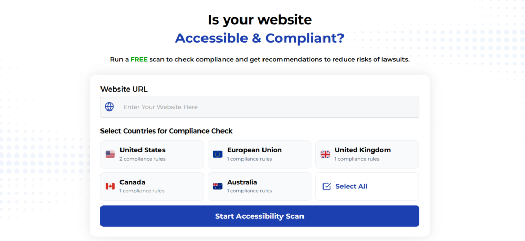
Using Automated Tools for Quick Insights (Accessibility-Test.org Scanner)
Automated testing tools provide a fast way to identify many common accessibility issues. They can quickly scan your website and point out problems that might be difficult for people with disabilities to overcome.
Visit Our Tools Comparison Page!
Run a FREE scan to check compliance and get recommendations to reduce risks of lawsuits
Final Thoughts
Ready to clean up contrast across the site? Start with an accessibility audit focused on high-traffic templates, then add automated checks in your CI to stop regressions. If the design system doesn’t include approved color pairs and tokens yet, make that the first task; one change there prevents dozens of issues downstream.
Have questions about a tricky gradient hero, a stubborn brand color, or dark mode tokens? Send the exact colors and screenshots, and let’s work through a passing, on-brand solution that sticks.
Start your compliance journey, update your accessibility statement, and keep EAA top of mind in every project going forward.
Run a Free Scan to Find E-commerce Accessibility Barriers
Want More Help?
Try our free website accessibility scanner to identify heading structure issues and other accessibility problems on your site. Our tool provides clear recommendations for fixes that can be implemented quickly.
Join our community of developers committed to accessibility. Share your experiences, ask questions, and learn from others who are working to make the web more accessible.