


Mobile-First Accessibility for Progressive Web Apps
When you’re building a Progressive Web App, or PWA, you’re creating something special. It’s like blending the best parts of a website with the useful features of a mobile app. Think about it: a PWA can work offline, send you notifications, and feel really quick, just like an app you download from a store. But here’s the kicker, it all runs right in your web browser. This blending of worlds means we have a big opportunity to make sure these powerful tools are available to everyone, no matter how they access the web.
Starting with a “mobile-first” mindset for PWAs isn’t just a good practice for speed and user experience; it’s a fundamental step towards better accessibility. Our phones are often our primary connection to the internet, and making sure a PWA works well there, for every user, sets the stage for a truly inclusive digital product. It’s about ensuring people with varying abilities can use your PWA with ease, from keyboard users and screen reader users to those who might have different motor skills or cognitive needs. Let’s dig into how we can make PWA development shine for all.
PWA Architecture and Accessible Design Choices
The way you structure a PWA has a direct impact on how usable it is for people relying on assistive technologies. It’s not just about what a PWA looks like; it’s also about what’s happening behind the scenes, and how that is presented to a screen reader or a keyboard user.
The PWA Manifest – Your Accessibility Blueprint
Every PWA starts with a Web App Manifest. This small JSON file is a bit like your app’s ID card for the browser. It tells the browser what your PWA should be called on the home screen, what icon it should use, and how it should behave when launched. It’s a foundational piece for how your PWA is presented, and getting it right helps set an accessible tone.
When you define your PWA’s name in the manifest, choose something clear and descriptive. This is the name people will see on their home screen or in their app switcher. Think about someone using a screen reader; a confusing or overly short name might make it hard to tell what the app does. You can also specify display modes, such as standalone or fullscreen. Giving users control over how the app displays itself helps them choose what works best for their viewing needs. For instance, a standalone mode can offer a less cluttered experience, which can be helpful for users who get distracted by browser UI.
Shell Architecture – Keeping Core Interactions Accessible
Many PWAs use an “app shell” architecture. This means the basic user interface (like headers, footers, and navigation) loads quickly and gets cached. Then, the content inside that shell loads dynamically. This creates a speedy, app-like feel. However, this dynamic loading needs careful thought for accessibility.
Imagine a user with a screen reader. If the content changes without clear signals, it can be disorienting. When your PWA loads new content into the shell, make sure you properly manage focus and use ARIA live regions if necessary to announce significant updates. This way, assistive technology users are aware that new content has appeared and can interact with it. Loading states are also important. Show clear visual feedback (like a loading spinner) and provide accessible text alternatives for these states. This tells users that something is happening and they need to wait.
Routing and Navigation in PWAs – Smooth Paths for All
PWAs often behave like Single Page Applications (SPAs), meaning navigation happens without full page reloads. This can be super fast, but it also means you need to be intentional about how accessible navigation works. One of our main goals is to create “accessible navigation” for everyone.
When a user moves between different “pages” or views within your PWA, make sure keyboard focus follows them logically. If a new section loads, move the focus to the main heading of that new content. This prevents keyboard users from getting lost or having to tab through the entire page again. Using ARIA attributes like role=”main” on your main content areas can help screen reader users jump directly to the most important part of the page, even as the content changes.
Also, think about how your PWA handles its history. Just like a regular website, users should be able to go “back” using their browser’s back button or gestures. Make sure your routing updates the URL history appropriately. This helps users with cognitive disabilities, or anyone who just wants to backtrack, without getting stuck.
Making Offline PWA Features Accessible
One of the coolest things about PWAs is their ability to work even without an internet connection. This offline capability can be a lifesaver for people in areas with spotty service or those who are trying to save data. But for this to be a truly beneficial feature, it needs to be accessible.
Caching Strategies and Content Availability
Your PWA uses something called a service worker to cache content. This means it can save parts of your app directly on the user’s device. When they go offline, the PWA can serve that cached content instead of trying to download it.
When planning your caching strategy, consider what content is absolutely essential for an offline experience. Don’t just cache everything; think about what a user might need to do or access without a connection. What if a user tries to access content that isn’t cached? Provide a clear, polite message explaining that the content isn’t available offline. Avoid generic “no internet” messages. Instead, say something like, “You’re offline right now. This specific article isn’t available, but you can still access your saved drafts.”
User Feedback for Offline States
When a PWA goes offline, or detects it’s back online, clear communication is essential. An abrupt loss of functionality without explanation can be frustrating for anyone, but especially so for users who rely on consistent feedback.
Give users visual and auditory cues when their connectivity status changes. A small banner at the top of the screen that says “You are currently offline” is good. For screen reader users, use an ARIA live region to announce this status change. Similarly, when they regain connection, let them know. This helps set expectations and informs them that features requiring a connection are now available again.
Accessible Forms in Offline Mode
What about forms? If your PWA has “accessible forms” and someone fills one out while offline, what happens? Ideally, the data should be saved locally and then synced to the server once the connection is restored. This requires careful planning.
First, make sure your forms are fully usable offline. All validation (like checking if a field is empty) should happen on the client-side, so users get immediate feedback even without a server. Second, clearly communicate that their data is being saved and will be sent later. A message like “Your submission has been saved and will be sent when you’re back online” is much better than just leaving them wondering. When the data syncs, provide feedback again, saying “Your submission was successfully sent.” This process needs to be very clear to ensure users don’t think their efforts were wasted.

Crafting Accessible Push Notifications
Push notifications are a powerful way for PWAs to grab a user’s attention, even when they’re not actively using the app. From breaking news to messages from a friend, these little alerts can be incredibly useful. However, if not handled carefully, they can also be disruptive or inaccessible.
Content Considerations for Notifications
The content of your push notifications needs to be clear, concise, and direct. Get straight to the point. Screen reader users will hear the entire notification, so avoid jargon or overly lengthy text. If there’s an action required, make it obvious. For example, “New message from Alex: ‘Are you free for lunch?’ Reply now.” is better than just “New message.”
Think about the purpose of each notification. Is it purely informational? Does it require an immediate response? Tailor the language and included actions accordingly. Unnecessary or overwhelming notifications can lead users to disable them, meaning they might miss truly important information later.
Notification Types and User Preferences
Users have different ways they prefer to receive information. Some might want a sound, others a vibration, and some might want only visual alerts. Respect these preferences. Modern operating systems allow users to manage notification channels, giving them fine-grained control over what kind of alerts they get from your PWA.
When you send a notification, consider how it appears to assistive technology. Ensure that the notification’s title, body, and any associated actions are properly exposed to accessibility APIs. This ensures that screen readers can accurately convey the information to the user. For instance, if you have a “Like” button in a notification, its purpose should be clearly announced.
Dismissal and Interaction with Notifications
Users need a straightforward way to dismiss notifications, or to act on them. For keyboard users, this means making sure that notification actions (like “Reply” or “Dismiss”) are reachable and actionable using keyboard navigation. Don’t rely solely on touch gestures for dismissal.
Also, consider how many notifications you send. Flooding a user with alerts can be overwhelming, especially for someone who takes longer to process information or interact with their device. Allow users to customize their notification settings within your PWA, giving them control over what kind of alerts they receive and how often.
Service Workers – Accessibility Behind the Scenes
Service workers are the silent heroes of PWAs, handling things like caching, offline access, and push notifications. They run in the background, separate from your web page. While they don’t directly control what a user sees or hears, their behavior can certainly affect accessibility.
Managing Network Requests for Accessibility
A service worker can intercept network requests, deciding whether to fetch something from the network or serve a cached version. This is fantastic for speed and offline capabilities. For accessibility, it means that essential content and resources are always available quickly.
Make sure your service worker prioritizes caching of critical assets that form the basic structure and functionality of your PWA. This helps ensure that even with a slow connection, the “screen reader compatible” elements load first. What if a network request fails? Your service worker should be set up to handle these failures gracefully, perhaps by serving an older cached version or a clear error message. This prevents users from hitting a dead end or seeing broken parts of your application.
Updating Content and User Awareness
Service workers can also manage updates to your PWA. When you push out a new version, the service worker can download it in the background. But how do you let users know about these updates in an accessible way?
Sometimes, a silent update is fine. For small changes, users don’t need to be interrupted. For larger updates that change functionality or user experience, it’s a good idea to inform the user. You could display a small notification: “A new version of the app is available. Please refresh to update.” This allows users to update at their convenience, avoiding disruption, especially for those who might be in the middle of a task or relying on specific functionality.
Impact on Screen Readers and Assistive Technologies
Since service workers operate in the background, their actions might not be immediately obvious to a screen reader user. However, their influence on what gets loaded and when can definitely impact the user experience.
Ensure that your service worker’s caching logic doesn’t inadvertently serve stale content or cause abrupt content changes without warning. If an old page is served from the cache, but a new page is available, consider how this might be confusing. Generally, changes to the displayed content should be managed within the main application’s JavaScript, using ARIA live regions or focus management to announce updates, rather than relying on the service worker to trigger unexpected content shifts. The goal is a smooth and predictable experience, especially for users who rely on audible cues to understand what’s happening on screen.
Optimizing PWA Performance for Assistive Technologies
Performance isn’t just about speed; it’s about responsiveness. And responsiveness is a cornerstone of accessibility. A slow-loading PWA, or one with janky interactions, creates barriers for many users, not just those on older devices or slow networks. It impacts users with cognitive disabilities who might get lost or frustrated by delays, and users with motor impairments who need precise and immediate feedback from their interactions.
Speed and Responsiveness – More Than Just a Number
When we talk about performance metrics like First Contentful Paint (FCP) and Largest Contentful Paint (LCP), we’re often thinking about how quickly something appears on the screen. For users with cognitive disabilities, long delays can make it hard to keep track of what’s happening or to understand that content is on its way. They might assume the page is broken and leave.
Similarly, input delay – the time between a user interaction (like a tap or a key press) and the visual response – can be a significant problem. For users with motor impairments, a slow response means they might accidentally tap multiple times, or miss their target, leading to errors and frustration. Fast, immediate feedback is essential for a good user experience and is a fundamental part of “accessible design”.
Lazy Loading and Accessibility
Lazy loading is a technique where parts of your PWA (like images or components) only load when they’re needed, usually when the user scrolls them into view. This can make initial page loads much faster. However, there’s an accessibility consideration here.
While lazy loading saves bandwidth, ensure it doesn’t break the “content structure” for screen readers or keyboard navigation. Screen readers typically build an accessibility tree based on the loaded DOM. If content is added much later, it might not be immediately available to the screen reader. Plan your lazy loading carefully so that the essential structural elements are present from the start, and dynamically loaded content is injected in a way that assistive technologies can detect and announce appropriately. For example, if you lazy-load a large image gallery, ensure there’s a textual placeholder or a clear indicator that more content will appear.
Resource Prioritization for Accessibility
When your PWA loads, it’s downloading many different files: HTML, CSS, JavaScript, images, fonts. Not all these resources are equally important, especially for accessibility. Prioritizing the download of certain resources can dramatically improve the initial experience for users with assistive technologies.
Consider loading essential UI elements, fonts (especially if they impact readability), and any JavaScript files necessary for keyboard navigation or ARIA functionality first. Accessibility scripts or polyfills that ensure broader compatibility should also be high priority. You want the core interactive and “screen reader compatible” parts of your PWA to be ready as quickly as possible, even before non-essential images or styling have finished loading. This focuses on delivering a usable experience first, then enhancing it with visual flair.
Checking Your PWA for Accessibility (WCAG 2.2)
Building a PWA that aims for accessibility means putting in the work to check it. We need to be sure that what we think is accessible truly is. This is where testing comes into play, and understanding the “WCAG 2.2 requirements” is key.
Understanding WCAG 2.2 and PWAs
The Web Content Accessibility Guidelines (WCAG) are the international standard for web accessibility. WCAG 2.2, the latest version, includes criteria that are particularly relevant to mobile and touch interactions. For PWAs, this means paying close attention to things like target size for touch elements.
A PWA should meet all WCAG 2.2 principles: perceivable, operable, understandable, and robust. This means content must be presentable in ways users can perceive (like with text alternatives for non-text content), user interface components must be operable (e.g., keyboard navigable), information and the operation of user interface must be understandable, and content must be robust enough that it can be interpreted reliably by a wide range of user agents, including assistive technologies. Specific to PWAG 2.2, this often means checking minimum target sizes for buttons and links, ensuring consistency in how actions are performed, and making sure dynamic content updates are communicated clearly.
Automated Testing for PWA Accessibility
Automated accessibility tools can scan your PWA’s code and identify common accessibility issues. These tools are fast and can be integrated into your development workflow. They can catch things like missing alt text for images, insufficient color contrast, or incorrect ARIA attributes.
However, automated tools have their limitations, especially for dynamic PWAs. They can’t always understand the context of an interaction, or simulate complex user flows. For instance, an automated tool won’t know if a form field updates another part of the page in a confusing way, or if a touch gesture is truly intuitive. Think of automated testing as a crucial first step, catching the low-hanging fruit, but not the final word.
Manual Testing with Real Users
The most effective way to test PWA accessibility is by involving real people, especially those with disabilities. User testing reveals issues that automated tools can’t, providing invaluable feedback on the actual user experience.
When planning manual testing, include users with a variety of needs. Test with screen readers (like VoiceOver on iOS or TalkBack on Android, and NVDA/JAWS on desktop) to ensure your PWA is “screen reader compatible.” Keyboard-only navigation to confirm all interactive elements are reachable. Test with speech input software. Watch how users interact with your PWA on different devices and in varying conditions. Their experiences will show you where your PWA excels and where it falls short. This kind of direct feedback is truly gold.
Mobile Accessibility Testing Approaches
Since PWAs are often designed with “mobile accessibility” in mind, specific testing approaches for mobile devices are essential.
While emulators and simulators (like those in browser developer tools) are helpful for quick checks, they don’t perfectly replicate the experience on a real device. It’s important to test your PWA on actual smartphones and tablets, across different operating systems (iOS, Android). Pay close attention to touch target sizes – are buttons and links big enough to be easily tapped without hitting adjacent elements? Test gestures: Do swiping or pinching actions work as expected for all users? How does your PWA behave when the device is rotated? Does the “responsive design” adapt well, and does the content remain readable and usable? These mobile-specific checks are critical for a truly accessible PWA.
Designing for All | Practical Tips for PWA Accessibility
Good “accessible design” isn’t an afterthought; it’s baked into every decision you make when building a PWA. It’s about building a web for everyone, right from the start.
Responsive Design and Breakpoints with Accessibility in Mind
“Responsive design” means your PWA adjusts its layout and content to fit different screen sizes, from a small phone to a large desktop monitor. This adaptability is great, but we must consider accessibility at every breakpoint.
As your layout changes, ensure the reading order remains logical for screen readers. Don’t hide important content just because the screen is smaller. Make sure interactive elements remain easily clickable or tappable, with enough spacing. A common mistake is making touch targets too small on mobile because the screen is compact. Remember, responsive design isn’t just about visual appeal; it’s about maintaining usability and readability for all users, regardless of their device or how they hold it.
Touch Targets and Interactive Elements
This is a big one for mobile. Buttons, links, and form fields need to be large enough to be easily activated by touch. WCAG 2.2 has specific recommendations for minimum target sizes (e.g., 24×24 CSS pixels or 44×44 CSS pixels for larger targets). This is especially important for users with motor control differences.
Even if the visual size looks small, ensure the underlying interactive area is large enough. You can do this with padding or by making the active area larger than the visual element. Think about someone on a bumpy bus ride, or someone who might struggle with precise hand movements. A generous touch target size makes a huge difference.
Color Contrast and Readability
Good color contrast is fundamental for readability, especially for users with low vision or color blindness. Text and important graphical elements must have sufficient contrast against their background. This applies not just to static content, but also to dynamic elements in your PWA, like loading indicators, notification banners, or form validation messages.
Use tools to check your color contrast ratios. And don’t forget about dark mode! If your PWA offers a dark mode, ensure the contrast is still strong in that theme. Also, remember that color alone should never be the only way to convey information. For example, don’t rely only on red text to show an error; also include an icon or an explicit “Error:” message.
Keyboard Navigation and Focus Indicators
Keyboard navigation is how many users, including those who cannot use a mouse, interact with your PWA. Every interactive element—buttons, links, form fields, custom controls—must be reachable and operable using only a keyboard. The tab key should move focus logically through your PWA, and pressing Enter or Space should activate elements.
Equally important are clear visual focus indicators. When an element has keyboard focus, it needs a clear, highly visible outline or highlight. This helps keyboard users know exactly where they are on the page. Don’t remove default browser focus outlines without replacing them with something even better. A PWA that doesn’t show where the keyboard focus is can be incredibly frustrating to use.
Accessible Media in PWAs
If your PWA includes videos, audio clips, or images, they must be accessible. For images, provide meaningful “alt text accessibility.” This descriptive text is read aloud by screen readers, giving context to users who can’t see the image. If an image is purely decorative, use empty alt text (alt=””).
For video content, include accurate captions for users who are deaf or hard of hearing. Transcripts are also very helpful for anyone who prefers to read the content or needs to refer back to it. For users with visual impairments, consider audio descriptions that describe important visual details not conveyed in the main audio. For audio-only content, provide a transcript. Making media accessible means ensuring everyone gets the full message, regardless of how they consume it.

Beyond Technicalities – Fostering an Accessible Design Mindset for PWAs
Building an accessible PWA goes beyond checking off technical requirements. It’s about cultivating a mindset that puts users first, always.
Involving Users Early
Don’t wait until the PWA is nearly finished to think about accessibility. Involve users with disabilities in the design and testing phases from the very beginning. Their firsthand experiences and feedback are invaluable and can prevent costly reworks later on. Early user involvement ensures that your PWA is truly designed for the people who will use it.
Regular Accessibility Reviews
Accessibility isn’t a one-time project; it’s an ongoing commitment. As your PWA evolves, new features are added, and content changes, so should your accessibility reviews. Schedule regular checks, both automated and manual, to ensure that new additions haven’t introduced new barriers. It’s much easier to address small issues as they arise than to tackle a mountain of problems later.
Staying Current with Standards
The web is always changing, and so are accessibility guidelines and technologies. Keep up to date with the latest WCAG recommendations, browser capabilities, and assistive technology advancements. What’s considered “best practice” today might be surpassed tomorrow. Being informed helps you keep your PWA at the forefront of accessibility.
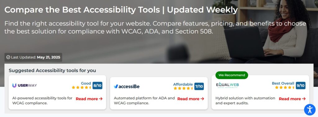
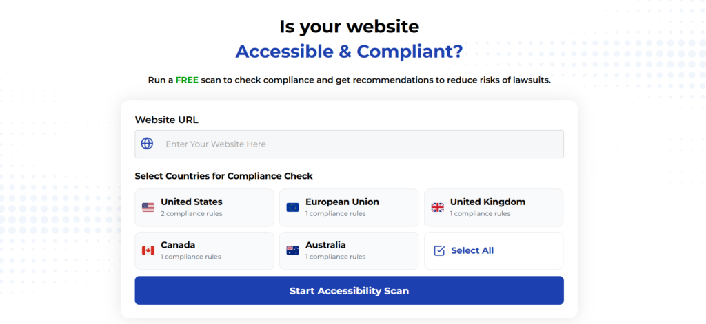
Using Automated Tools for Quick Insights (Accessibility-Test.org Scanner)
Automated testing tools provide a fast way to identify many common accessibility issues. They can quickly scan your website and point out problems that might be difficult for people with disabilities to overcome.
Visit Our Tools Comparison Page!
Run a FREE scan to check compliance and get recommendations to reduce risks of lawsuits
Final Thoughts
Progressive Web Apps offer an incredible opportunity to deliver fast, engaging, and versatile experiences. When we couple the power of PWAs with a deep commitment to accessibility, we’re not just building good applications; we’re building a more inclusive web. From the foundational choices in your PWA manifest to the careful thought put into offline experiences, notifications, and performance, every step counts.
By designing with “mobile accessibility” at its core and focusing on clear “WCAG 2.2 requirements,” we can create PWAs that truly serve everyone. We want people to interact with our digital creations easily, no matter their abilities or how they choose to use their devices.
Want to see how your PWA measures up? Start by testing your PWA with our free website accessibility scanner. It’s a great way to spot common issues quickly and get on the path to making your PWA available to all!
Want More Help?
Try our free website accessibility scanner to identify heading structure issues and other accessibility problems on your site. Our tool provides clear recommendations for fixes that can be implemented quickly.
Join our community of developers committed to accessibility. Share your experiences, ask questions, and learn from others who are working to make the web more accessible.