


Making Your Mobile App Accessible: Meeting EAA and WCAG Rules
With the European Accessibility Act (EAA) enforcement now a reality, businesses are scrambling to get their digital products in order. And a primary target for this enforcement? Mobile applications. If your app isn’t usable by people with disabilities, you’re not just missing out on a huge market segment; you’re facing serious legal and financial risks. The EAA isn’t a suggestion; it’s a legal requirement that binds most businesses serving customers in the EU.
But this isn’t just about avoiding fines. Making your app accessible means creating a better product for everyone. When you design for users with diverse needs, you often create a more intuitive and user-friendly experience across the board. Think about it; features like clear layouts and resizable text help a senior citizen just as much as they help someone with low vision. This is about building digital products that work for people, period.
This article gives you a straightforward checklist to help you align your iOS and Android apps with the Web Content Accessibility Guidelines (WCAG) 2.1 AA, the standard referenced by the EAA. Let’s get your app ready.
The EAA and Mobile Apps: What You Need to Know
The European Accessibility Act is a directive from the EU designed to standardize accessibility rules across member states. It applies to a wide range of products and services, including computers, smartphones, banking services, e-commerce sites, and, importantly, mobile apps. For app developers and owners, the key takeaway is that your applications must be perceivable, operable, understandable, and robust for people with disabilities.
The deadline for compliance has passed, meaning that apps falling under the EAA’s scope must now meet these standards. The law references WCAG 2.1 Level AA as the technical benchmark for digital accessibility. This means your app’s features and content; from buttons and images to navigation menus and forms; need to satisfy specific success criteria.
Ignoring these requirements could lead to significant penalties, which vary by member state but can include hefty fines and market withdrawal orders. More than that, a non-compliant app can damage your brand’s reputation and alienate a large customer base. The EAA effectively makes mobile accessibility a non-negotiable part of doing business in Europe.
Your Mobile Accessibility Checklist
Feeling overwhelmed? Don’t be. Getting started is often the hardest part. The following sections break down some of the most common areas where mobile apps fail accessibility checks. By focusing on these items, you can address the biggest problems first and make meaningful progress toward a truly usable app.
Touch Target Size and Spacing
Have you ever tried to tap a tiny button or link on a mobile screen, only to hit the wrong one by mistake? It’s a frustrating experience for anyone, but for a person with a motor impairment, it can make an app completely unusable. This is why touch target size is so important. When interactive elements are too small or crammed together, you exclude users who lack fine motor control.
WCAG 2.2 introduced a minimum target size of 24 by 24 CSS pixels. However, the major mobile platforms recommend even larger targets for a better user experience. Apple’s Human Interface Guidelines suggest a minimum of 44 by 44 points, while Google’s Android Material Design calls for at least 48 by 48dp. Adhering to these platform-specific recommendations is a good practice.
Equally important is the spacing between targets. Even if buttons meet the minimum size, placing them too close together creates the same problem. Ensure there’s enough inactive space around each interactive element to prevent accidental taps. This simple adjustment dramatically improves usability for everyone, especially on smaller screens.

Full Support for Screen Readers (VoiceOver & TalkBack)
A screen reader is software that vocalizes the content displayed on a screen, allowing blind or low-vision users to interact with a digital interface. On iOS, this is called VoiceOver, and on Android, it’s TalkBack. Your app must be fully operable with these tools. This goes far beyond just having the screen reader read text out loud.
First, all interactive elements; buttons, sliders, toggles, links; must be labeled correctly. An unlabeled button might be read as just “Button,” which tells the user nothing about its function. Labels should be concise and descriptive, like “Add to Cart” or “Profile Settings.” Similarly, images that convey information need alternative text (alt text) that describes their content or purpose. Decorative images should be marked as such so the screen reader can ignore them.
Next, consider the focus order. As a user swipes to move from one element to the next, the screen reader should follow a logical path that matches the visual layout. A jumbled focus order can be incredibly disorienting. You must also ensure that when content changes on the screen, like after an item is added to a cart, the screen reader announces the change. Without this feedback, a user might not know their action was successful.

Dynamic Text and Screen Reflow
Many users need to adjust the text size on their device to read comfortably. Your app must respect these settings. When a user increases the font size in their phone’s operating system, the text in your app should scale accordingly without breaking the layout or becoming unreadable. This capability is often called Dynamic Type on iOS and is a core accessibility feature.
The challenge here is ensuring your user interface can adapt. If you use fixed heights for containers or hard-coded font sizes, increasing the text size can cause words to get cut off or overlap with other elements. Your layout needs to be fluid enough to reflow content gracefully. This means text should wrap to the next line, and containers should expand vertically to accommodate the larger font.
WCAG requires that content can be resized up to 200% without loss of information or functionality. This ensures that users with moderate low vision can read your content without relying on screen magnification, which can be cumbersome. Test your app with the largest font settings enabled to find and fix any layout issues.
Consistent Navigation and Layout
Imagine using an app where the main menu is in a different place on every screen. Or where a familiar icon suddenly has a completely different function. It would be confusing and frustrating, right? For people with cognitive or learning disabilities, this kind of inconsistency can be a major barrier.
A predictable design is an accessible design. Your app’s navigation should be consistent throughout. If you use a tab bar at the bottom of the screen for top-level navigation, that tab bar should be present and behave the same way on all main screens. The placement of recurring elements, like a search bar or a settings icon, should also be uniform.
This principle extends to the language and iconography you use. A “Submit” button shouldn’t be labeled “Go” on one screen and “Send” on another if they all perform the same action. Consistency reduces the cognitive load on users, as they don’t have to constantly re-learn how your app works. It builds a sense of familiarity and confidence, which is a cornerstone of a good user experience for everyone.
Color Contrast and Information
Color is a great tool for creating visually appealing interfaces, but it can also create serious accessibility problems if not used carefully. One of the most common accessibility failures in mobile apps is poor color contrast. When text or important graphics don’t stand out enough from their background, it becomes difficult for users with low vision or color blindness to see them.
WCAG 2.1 AA requires a minimum contrast ratio of 4.5:1 for normal text and 3:1 for large text (18pt and larger, or 14pt bold). For UI components and graphical objects, the ratio is 3:1. You can’t just eyeball this; you need to use an accessibility checker or contrast tool to verify your color choices meet these standards. This applies to everything from body text to button borders and icons.
Furthermore, you should never use color alone to convey information. For example, if you indicate a required form field by making its label red, a color-blind user might miss it entirely. Instead, you should add another indicator, like an asterisk or the word “required,” to the label. Similarly, error messages should include both a distinct color and an icon or text to explain what went wrong.
Managing In-App Notifications and Interruptions
Pop-up modals, toasts, and other notifications are common in mobile apps. They can be useful for conveying time-sensitive information or asking for user input. However, when not handled correctly, these interruptions can be disruptive, especially for screen reader users. An unexpected pop-up can “trap” a user’s focus, preventing them from returning to their previous task.
When an alert or modal appears, the screen reader’s focus should automatically move to it. The user needs to know that a new window has opened and be able to interact with it. The modal should clearly state its purpose and provide obvious controls, like “Confirm” and “Cancel” buttons.
Once the user dismisses the interruption, their focus should return to the exact spot they left off. It’s incredibly disorienting to be sent back to the top of the screen after simply closing a pop-up. Also, avoid notifications that disappear automatically after a few seconds unless you provide a way for the user to adjust the time limit. What’s enough time for one person might not be for another, and disappearing content is a big problem for accessibility.
Clear and Simple Forms
Forms are one of the most interactive parts of any app, whether for signing up, making a purchase, or submitting feedback. They are also a place where accessibility often breaks down. Creating accessible forms means ensuring that every user can understand what’s being asked of them and can easily input the correct information. Have you considered how accessible your forms are?
Every form field needs a clear, visible label that is programmatically associated with it. This allows a screen reader to announce the purpose of each field as the user navigates to it. Placeholder text is not a substitute for a proper label, as it often has poor color contrast and disappears once the user starts typing.
Error handling is another critical area. When a user makes a mistake, the error should be easy to identify, understand, and correct. Don’t just outline the invalid field in red. Provide a clear, text-based message explaining what went wrong (e.g., “Please enter a valid email address”). This message should be programmatically linked to the field and announced by the screen reader. For longer forms, provide a summary of errors at the top with links that take the user directly to the fields that need fixing.
Testing on Real Devices: Why Emulators Aren’t Enough
While simulators and emulators are useful for developers during the initial coding stages, they are no substitute for testing on real, physical devices. When it comes to accessibility, you simply cannot replicate the authentic user experience in an emulated environment. An emulator can’t tell you how difficult it is to use VoiceOver gestures with one hand or whether your touch targets are truly big enough for someone with shaky fingers.
The only way to understand how your app behaves with assistive technologies is to use them yourself. Get an iPhone and an Android phone. Turn on VoiceOver and TalkBack. Try to perform key tasks in your app without looking at the screen. Can you create an account? Browse products? Can you complete a purchase? This kind of manual accessibility test will quickly reveal problems that automated tools miss.
It’s also a good idea to involve people with disabilities in your testing process. Their lived experience provides insights you could never get on your own. They are the true experts and can point out usability barriers you might not even recognize. Real-world feedback is invaluable for creating a product that is not just compliant, but genuinely usable.

Integrating Accessibility into Your Workflow
Accessibility isn’t a final-stage feature you can just tack on before release. To do it right, you need to make it part of your entire product development lifecycle. Thinking about accessibility from the very beginning saves a massive amount of time and money. Fixing a design flaw on a wireframe is easy; re-coding an entire feature after it’s already built is a nightmare.
It starts with design. When creating mockups, designers should be thinking about color contrast, touch target sizes, and logical layouts. They should annotate their designs to provide guidance for developers on things like heading structure and focus order.
During development, programmers should follow platform-specific accessibility guidelines and use accessibility testing tools to catch issues as they code. In the quality assurance phase, accessibility testing should be a standard part of the process, just like functional and performance testing. This includes both automated scanning and manual testing with screen readers and other assistive technologies. Making accessibility a shared responsibility across all teams ensures it becomes an integral part of your company’s culture.
Documenting App Accessibility for Compliance
Meeting accessibility standards is one thing; proving it is another. For EAA compliance and for public sector contracts in many countries (like those requiring Section 508 compliance), you need to formally document your app’s level of accessibility. This is typically done through an Accessibility Conformance Report (ACR) based on the Voluntary Product Accessibility Template (VPAT).
A VPAT is a standardized document that details how your product measures up against each WCAG success criterion. It requires you to state whether your app “Supports,” “Partially Supports,” “Does Not Support,” or is “Not Applicable” for each item, and to provide detailed remarks explaining your reasoning. Filling out a VPAT requires a thorough accessibility audit of your app.
In addition to a formal ACR, it’s a good practice to publish an accessibility statement. This is a public-facing document where you can communicate your commitment to accessibility, describe the features you’ve included, and provide a point of contact for users who encounter problems. This transparency builds trust with your users and shows that you take digital inclusion seriously.
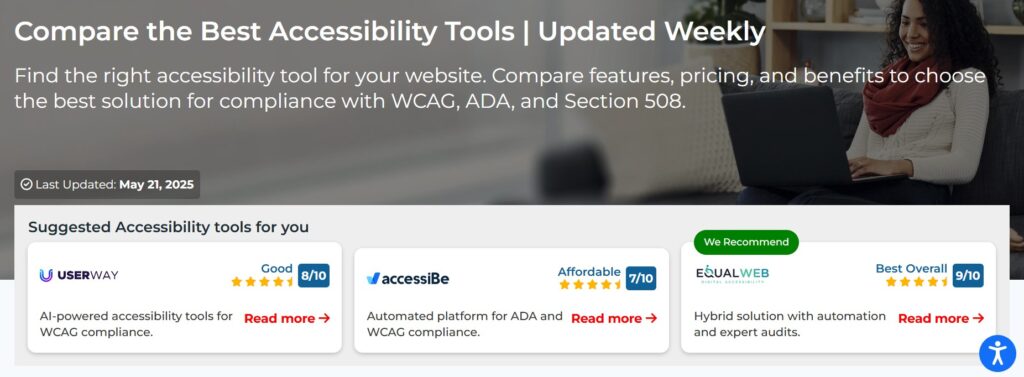
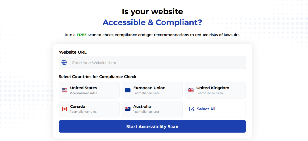
Using Automated Tools for Quick Insights (Accessibility-Test.org Scanner)
Automated testing tools provide a fast way to identify many common accessibility issues. They can quickly scan your website and point out problems that might be difficult for people with disabilities to overcome.
Visit Our Tools Comparison Page!
Run a FREE scan to check compliance and get recommendations to reduce risks of lawsuits
Final Thoughts
Now that you have a better understanding of the key areas of mobile app accessibility, it’s time to see how your own app measures up. Don’t wait for a complaint to force your hand. Be proactive and start your accessibility test today.
Run a Free Scan to Find E-commerce Accessibility Barriers
Curious about where your site stands? An automated scan is a great first step to identify potential accessibility issues on your e-commerce platform. Run a free scan on our website today to get an initial report on your site’s accessibility health.
Want More Help?
Try our free website accessibility scanner to identify heading structure issues and other accessibility problems on your site. Our tool provides clear recommendations for fixes that can be implemented quickly.
Join our community of developers committed to accessibility. Share your experiences, ask questions, and learn from others who are working to make the web more accessible.