


How Broken Product Filters Are Costing You Sales
Have you ever been on a shopping site, trying to narrow down your options, and the filters just… don’t work? Maybe you clicked a checkbox, and the whole page reloaded unexpectedly. Or you tried to use a price slider that was impossible to control. Now, imagine trying to do that without a mouse, or without being able to see the screen at all.
For many people with disabilities, this isn’t a hypothetical. It’s a daily frustration. When product filters and search functions are poorly designed, they don’t just create a clunky experience; they create an impossible one. An estimated nine out of ten users will leave a site if they can’t find what they’re looking for easily. For people who use assistive technologies like screen readers or rely on keyboard navigation, that number is likely even higher.
Inaccessible e-commerce isn’t just a matter of lost sales. It’s about shutting out a whole segment of your customer base. It’s about failing to provide an equal shopping experience for everyone. And with regulations like the European Accessibility Act (EAA) becoming stricter, it’s also a serious legal risk.
This article isn’t about shaming or pointing fingers. It’s about showing you the common pitfalls with product filtering and, more importantly, how to fix them. We’ll look at the issues from the perspective of real users and give you practical steps to make your site’s search and filtering features work for every single customer.
The High Price of Bad Filters
When we talk about e-commerce accessibility, it’s easy to get lost in technical standards and compliance checklists. But what’s the real-world effect of getting it wrong? It boils down to three things: lost money, a damaged brand, and legal trouble.
Let’s start with the money. Every time a customer with a disability abandons your site because they can’t select a size, filter by brand, or sort by price, that’s a lost sale. This isn’t a small group of people. The global population of people with disabilities represents a massive, often-overlooked market with considerable spending power. When your site is unusable, you’re willingly turning away their business. Think about the lifetime value of a loyal customer; it’s not just one sale you’re losing, but all their future purchases, too.
Then there’s your brand’s reputation. Today’s consumers care about inclusivity. A brand that actively excludes a group of people, whether intentionally or not, will be noticed. Word gets around fast, especially within disability communities. Being known as “that site with the impossible filters” is not good for business. On the other hand, a site that works seamlessly for everyone builds incredible goodwill. It shows you care about all your customers, which is a powerful message that resonates with a broad audience.
Finally, there are the legal headaches. Laws like the Americans with Disabilities Act (ADA) in the U.S. and the EAA in Europe require digital properties, including e-commerce sites, to be accessible. A complaint about inaccessible filters isn’t just bad PR; it can lead to expensive lawsuits and forced remediation projects. Fixing these issues proactively is always cheaper and less stressful than being forced to do it by a court order. Getting your site in line with ADA compliance and WCAG compliance isn’t just a good idea; it’s a business necessity.
Where E-commerce Filters Go Wrong
Many of the most frustrating issues with product filters come down to a few common failures. These problems are often invisible to development teams who test with a mouse and a modern browser, but they can bring a shopping trip to a dead stop for someone using assistive technology. Here are some of the biggest culprits.
You Can’t Use It Without a Mouse
One of the first checks for any accessible website is simple: can you use it with just your keyboard? Many people cannot use a mouse due to motor disabilities. Others, including many screen reader users and power users, prefer keyboard navigation. They use the Tab key to move between interactive elements like links, buttons, and form fields.
Inaccessible filters often create “keyboard traps.” This happens when a user can Tab into a filter section but can’t Tab out. They’re stuck. Their only option is to close the tab and leave your site. Another common issue is when filter options, like checkboxes or links, aren’t “focusable” at all. You can see them on the screen, but the Tab key just skips right over them, making them completely unusable. Price sliders are frequent offenders here; many are built in a way that completely ignores keyboard users.
The Page Changes, but No One Tells You
Modern e-commerce sites love dynamic content. You check a box, and poof; the product grid updates instantly without a page reload. It feels slick and fast. But for a screen reader user, it can be deeply confusing.
When a sighted user applies a filter, they see the product results change. They get instant visual feedback. A screen reader user gets… silence. The page has changed, but their software has no idea. They might think the filter is broken. They could be sitting there wondering why nothing happened, while the updated product list is sitting right there on the screen, unannounced. This lack of communication is a major barrier. It breaks the flow of shopping and makes it impossible to know if your choices are having any effect.
What Does This Checkbox Even Do?
Clear labeling is everything. For a sighted user, a checkbox next to the word “Blue” inside a “Color” heading is self-explanatory. But for a screen reader, the context isn’t always so clear. If a checkbox is just labeled “Blue” with no programmatic connection to the “Color” category, the screen reader might just announce “Checkbox, Blue.” Blue what? A blue shirt? A blue car?
This problem gets worse with more abstract filters. Imagine a group of five-star icons for filtering by rating. If they’re not labeled correctly, a screen reader user might just hear “Image, star. Image, star. Image, star.” They have no way of knowing what clicking those stars does or which rating they are selecting. The same goes for unlabeled “Apply” or “Clear” buttons. Without a proper label, a screen reader might just announce “Button,” leaving the user to guess its function. These are classic failures in creating accessible forms and controls.

Sensible Fixes for Annoying Filter Problems
The good news is that most of these issues are fixable. Making filters accessible doesn’t require you to throw out your modern design and start over. It’s about making sure your technology communicates clearly with the assistive technologies your customers use.
Telling Screen Readers What’s Happening
The problem of silent, dynamic updates can be solved with something called ARIA live regions. Think of a live region as a special announcement system for screen readers. You can mark the section of your page that displays the product results as a live region. Then, whenever that section updates; like when a user applies a filter; you can have it send a message to the screen reader.
This doesn’t have to be complicated. When the user filters for “running shoes,” and the grid updates to show 25 results, the live region can simply announce, “25 results found.” That’s it. That one little message changes everything. It tells the user that the filter worked and gives them the confidence to continue shopping. It turns a moment of confusion into a seamless interaction.
Making Buttons and Boxes Make Sense
Every interactive element in your filter section needs a clear, descriptive name that a screen reader can announce. For a checkbox for the color red, a bad label is just “Red.” A good label is “Filter by color: Red.” The context is built right in.
For more visual controls, like color swatches, you can’t rely on the color alone. A small red square needs an accessible name that says “Red.” This way, a screen reader user hears “Color: Red, checkbox,” and a user with color blindness who might not be able to distinguish the red from another shade still knows what they’re selecting.
The same principle applies to all buttons. A button with an “X” icon to clear filters should have an accessible name like “Clear all filters.” A button with a magnifying glass icon should be labeled “Submit search.” The rule is simple: if you can understand what something does just by looking at it, make sure a screen reader can understand it just by reading its name.
Watch Out for These Filter Types
Some types of filters are naturally more difficult to make accessible. While they can look great and offer interesting ways to narrow choices, they often hide accessibility traps. If you use these on your site, they need extra attention.
The Dreaded Price Slider
Price range sliders are everywhere. They seem intuitive: you drag one handle to set a minimum price and another for the maximum. But for someone using a keyboard, they are often a nightmare. Can you get to the handles with the Tab key? Once you’re on a handle, can you adjust it with the arrow keys? Does the screen reader announce the current price as you adjust it?
For many sliders, the answer to these questions is no. A better approach is often to provide simple input boxes. Two small text fields labeled “Min price” and “Max price” are much easier for everyone to use. They work perfectly with keyboards and screen readers, and they offer more precision than a slippery slider. If you absolutely must have a visual slider, make sure it’s built to be fully keyboard-operable, and always provide the input boxes as a fallback.
When Color Swatches Cause Confusion
Filtering by color using visual swatches is a popular feature, especially in fashion and home goods. It’s great for sighted users. But what about users who are blind or have color vision deficiency? A small blue square next to a small navy square might be indistinguishable for some users.
Relying on color alone to convey information is a direct failure of WCAG. The fix is straightforward: each color swatch must have a text label. This could be a visible label next to the swatch (e.g., “Midnight Blue”) or, at the very least, an accessible name that the screen reader can announce. This ensures that all users know exactly which color they are choosing.
The Trouble with Star Ratings
Star ratings are another common visual filter that can be tricky. A row of five yellow stars is easy for a sighted user to interpret. For a screen reader user, it can be ambiguous. Is it a list of five separate images? Is it one single element? How do you select “4 stars and up”?
To make star ratings accessible, they need to be treated as a single interactive element with a clear labeling system. The control should tell the screen reader user its purpose (e.g., “Filter by rating”). As the user interacts with it, it should announce the selected rating (e.g., “4 out of 5 stars”). Providing clear, visible text alongside the stars, like “4+ stars,” is also a great way to make the control more understandable for everyone.
Mobile Commerce and Its Unique Hurdles
With more and more shopping happening on phones, mobile accessibility is not an optional extra. The small screens and touch-based interfaces of mobile devices introduce their own set of challenges for users with disabilities.
Don’t Make Me Pinch and Zoom
The “fat finger” problem is real. When interactive elements like checkboxes, links, or buttons are too small and packed too closely together, they are difficult for anyone to tap accurately. For a user with a motor disability, it can be impossible. This leads to frustration and mistakes, like adding the wrong item to the cart or being unable to apply a filter correctly.
WCAG has specific guidelines for touch target size. Interactive controls need to be large enough and have enough space around them to be tapped easily without accidentally hitting something else. When you’re designing your filters for mobile, think about how they look and work on a small screen. Can you comfortably and accurately tap every single option? If not, they need to be bigger.
How Dynamic Filters Behave on Phones
The screen reader issues we discussed earlier can be even worse on mobile. On a desktop, a user might have more screen real estate to explore and figure out what happened after a silent update. On a phone, the viewport is small. If a filter updates the product grid but the screen reader focus remains on the filter button at the top of the screen, the user has no way of knowing that new products have loaded below.
Using ARIA live regions is just as important on mobile. Announcing that “34 results are now showing” keeps the user oriented. It’s also good practice to manage the user’s focus. After a filter is applied, it can be helpful to move the screen reader’s focus to the top of the updated product list. This saves them the effort of having to swipe through the entire filter section again to get to the results they care about. This kind of thoughtful design makes a world of difference for the mobile shopping experience.
How to Test Your Own Site’s Filters
You don’t need to be an accessibility expert to find the most common problems with your filters. A few simple tests can reveal major issues and give you a starting point for making improvements. You can even use an accessibility checker or other accessibility testing tools for an initial scan, but manual checks are essential.
The 5-Minute Keyboard Test
Unplug your mouse. Seriously. Now, try to shop on your own site using only your keyboard.
- Use the Tab key to move through the page. Can you reach the filter section? Can you get to every single checkbox, link, and button inside it?
- Use the Enter or Spacebar key to activate a control. Does checking a box actually filter the products?
- Try to adjust a price slider with your arrow keys. Does it work?
- Most importantly, can you Tab out of the filter section and get back to the main content? Or are you trapped?
This simple test quickly uncovers any keyboard accessibility problems. If you can’t do it, a significant portion of your users can’t either.
Listen with a Screen Reader
You have a screen reader on your computer or phone right now. For Windows, it’s called Narrator. On macOS and iOS, it’s VoiceOver. On Android, it’s TalkBack. Turn it on and try to use your filters.
- As you navigate to the filter controls, what do they announce? Are the labels clear and descriptive? Does “Checkbox” tell you what you’re checking?
- When you apply a filter, does the screen reader announce that the content has been updated? Or is there just silence?
- Try to use a color swatch or star rating filter. Can you tell what you’re selecting?
Listening to your site is an eye-opening experience. It gives you a direct sense of the journey that blind and low-vision users have on your website.

Success Story: How One Retailer Fixed Its Filters and Won
Let’s talk about a real-world example. A major online fashion retailer was seeing a high rate of cart abandonment, and their customer service team was getting frequent complaints about the website being “clunky.” They hired an accessibility consultant who quickly identified the product filters as a major problem area.
The site used a stylish but inaccessible set of custom controls. The price slider couldn’t be used with a keyboard, color swatches had no text labels, and applying any filter caused a silent update that confused screen reader users.
The retailer’s team got to work. They replaced the slider with simple “min” and “max” input boxes. They added clear, visible text labels to every color swatch. And they implemented ARIA live regions to announce the results of every filter action. The changes weren’t drastic from a visual design standpoint, but they were transformative from a user experience perspective.
The results were stunning. Within three months, they saw a measurable drop in cart abandonment. Their conversion rate for traffic that interacted with the filters went up. Most tellingly, they saw a rise in sales of items in variable sizes and colors, indicating that people who were previously locked out were now able to shop effectively. They also received positive feedback from disability advocates who praised them for their commitment to an inclusive shopping experience. By fixing their filters, they didn’t just check a compliance box; they grew their business.
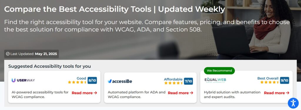
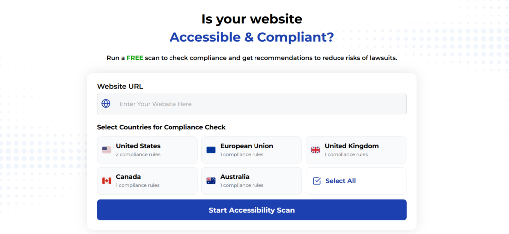
Using Automated Tools for Quick Insights (Accessibility-Test.org Scanner)
Automated testing tools provide a fast way to identify many common accessibility issues. They can quickly scan your website and point out problems that might be difficult for people with disabilities to overcome.
Visit Our Tools Comparison Page!
Run a FREE scan to check compliance and get recommendations to reduce risks of lawsuits
Final Thoughts
Creating an accessible e-commerce site isn’t about achieving perfection overnight. It’s about making a commitment to your customers; all of them. Fixing your product filters is one of the most impactful places to start. It’s where your customers make their most important choices, and getting it right can directly lead to more sales and happier, more loyal shoppers.
Don’t let confusing and unusable filters turn customers away. Take the time to test your site, listen to what your assistive technology users are experiencing, and make the changes that create a truly seamless shopping journey for everyone.
Run a Free Scan to Find E-commerce Accessibility Barriers
Curious about where your site stands? An automated scan is a great first step to identify potential accessibility issues on your e-commerce platform. Run a free scan on our website today to get an initial report on your site’s accessibility health.
Want More Help?
Try our free website accessibility scanner to identify heading structure issues and other accessibility problems on your site. Our tool provides clear recommendations for fixes that can be implemented quickly.
Join our community of developers committed to accessibility. Share your experiences, ask questions, and learn from others who are working to make the web more accessible.