


Making Your Mobile Web Experience Work for Everyone
Most of us have our phones with us constantly. We use them for everything from checking the news in the morning to navigating a new city. This device is our primary link to the digital world. But what if using it was a constant struggle? Imagine trying to tap a tiny button, only to hit the one next to it repeatedly. Or trying to read an article where the text is too small, and zooming in breaks the entire page layout.
For millions of people with disabilities, this isn’t a “what if” scenario. It’s the frustrating reality of using a mobile web that wasn’t built with them in mind. Mobile accessibility is not just about having a site that looks okay on a small screen. It’s about a deep commitment to ensuring that people who use assistive technologies or have different physical or cognitive needs can use your site effectively. When we overlook this, we are not just creating a poor user experience; we are putting up a digital wall that excludes a significant portion of the population from essential online services and information. Getting mobile accessibility right is about opening your doors to every person, on the device they use most.
The Modern Web Is Mobile: Why Accessibility Can’t Be an Afterthought
The idea that the internet is something you access from a desk is long gone. For a huge number of people, a smartphone is their main, and sometimes only, way to get online. This simple fact changes everything. It means that when a website is inaccessible on a mobile device, it might as well not exist for that user. This can have serious consequences, blocking access to vital services like online banking, healthcare portals, and job applications. The mobile experience is the primary experience.
Furthermore, today’s smartphones are packed with powerful assistive technologies. Tools like screen readers (VoiceOver on iOS and TalkBack on Android), screen magnification, voice control, and switch access are built directly into the operating system. People with disabilities depend on these features every day. They expect websites to work with the tools their phones already provide. If your site’s code isn’t structured correctly, a screen reader compatible experience is impossible. A blind user might hear a jumble of disconnected words instead of a coherent webpage, making navigation impossible.
From a business standpoint, ignoring mobile accessibility is a direct path to losing customers. Think about it: if a person tries to buy something from your mobile store but can’t because the form is broken or the buttons are unusable, they won’t wait to get home to their laptop. They will leave and find a competitor whose site just works. In today’s market, a functional and accessible mobile presence is not a bonus feature. It is a core part of customer service and a direct investment in your success and reputation. Good ADA compliance on mobile isn’t just about avoiding lawsuits; it’s about welcoming every potential customer.

Responsive Design Isn’t Enough: The True Foundation of Mobile Usability
When developers talk about responsive design, they are usually talking about a layout that fluidly adapts to different screen sizes. While that is a necessary starting point, true mobile accessibility demands more. It requires a design philosophy that prioritizes readability and functionality on any device, no matter its size or how the user holds it.
Content Reflow: The End of Horizontal Scrolling
One of the most important principles is content reflow. Have you ever been on a mobile site where you had to scroll left and right to read a single sentence? It’s a frustrating experience that can make a page almost unusable, especially for someone with low vision or a motor disability that makes precise scrolling difficult. A properly accessible site reflows its content into a single, easy-to-read column. This ensures the user only has to scroll in one direction, typically vertically, to consume all the content. This isn’t just a nice-to-have; it’s a key requirement under the Web Content Accessibility Guidelines (WCAG).
User-Controlled Sizing: Putting People in Charge
Another critical aspect is allowing users to adjust the text size to their needs. Many people with low vision need to increase the font size significantly to read comfortably. An accessible mobile site allows users to zoom in, often up to 200% or more, without the layout falling apart or content overlapping and becoming unreadable. A common mistake developers make is disabling the “pinch-to-zoom” functionality. This is often done for aesthetic reasons, but it creates a massive barrier for any user who needs to magnify the screen. The goal should always be to give users control over how they view your content.

The Nuances of Touch: Designing for Fingers, Not Pointers
On a desktop computer, we use a mouse or trackpad, which offers a high degree of precision. On a mobile device, our primary input tool is our finger, which is larger and far less precise. This fundamental difference is the source of many mobile usability problems. Designing for touch requires us to think about the physical act of interacting with a screen.
Touch Target Size: How Big Is Big Enough?
Every interactive element, from a link to a button to a menu item, needs to be large enough to be tapped accurately. This is what we call the touch target size. When targets are too small or packed too closely together, users often make mistakes, leading to frustration and abandonment. Think about the classic example of trying to close a pop-up ad by tapping a tiny “X.” For someone with a motor impairment or even just large fingers, this can be an impossible task. WCAG 2.2 introduced specific guidelines for minimum target size, recognizing how important this is for a functional mobile experience. A good starting point is ensuring targets are at least 44 by 44 pixels.
Spacing and Padding: Giving Elements Room to Breathe
Just as important as the size of the target itself is the space around it. If buttons and links are crammed together without adequate spacing, it becomes very easy to tap the wrong one. Proper padding within the element and margins around it create a buffer zone that reduces the chance of errors. This is particularly important for things like navigation menus, lists of articles, or product galleries, where many interactive elements are grouped together.

Gestures and Alternatives: Keeping Interactions Simple
Modern mobile interfaces often use custom gestures, like swiping to delete an item or a complex pinch to open a special menu. While these can feel modern and slick, they can also be inaccessible. Some users may not have the fine motor control needed to perform a complex gesture, or they may be using assistive technology that doesn’t support it. Because of this, accessibility standards require that any functionality that relies on a complex gesture must also be available through a simpler action, like a single tap. You can still have your fancy gestures, but you must provide a straightforward alternative for everyone else.
The Spoken Web: How Mobile Screen Readers Navigate Your Site
For users who are blind or have low vision, screen readers are their primary tool for accessing the web. On mobile, the two main players are VoiceOver for Apple devices and TalkBack for Android devices. These tools read the content of the page aloud, and users navigate by swiping and tapping to move between elements. Designing for this experience requires paying close attention to the underlying structure of your HTML.
The Power of Headings and Page Titles
On a small screen, you can’t just glance at the page to get the lay of the land. Screen reader users rely heavily on a logical heading structure to understand how a page is organized. They can use a feature called the “rotor” (in VoiceOver) or a navigation menu to jump directly from one heading to another. If your page lacks properly structured accessible headings (a single H1 followed by H2s and H3s in logical order), it becomes a flat, unnavigable wall of text. Similarly, clear and descriptive page titles are essential. The page title is often the first thing a screen reader announces, telling the user where they have landed and what the page is about.
Making Interactive Elements Understandable
Images need alt text to describe their content to someone who cannot see them, and this is just as true on mobile as it is on desktop. But this principle extends to all interactive elements. A button that is visually represented by an icon, like a magnifying glass for search, must have an accessible name that says “Search.” A link that just says “Read More” is not helpful. Link text should be descriptive, telling the user where the link will take them. Without these labels, a screen reader user is just guessing what will happen when they activate an element.

Visual Design for Accessibility: More Than Just Looks
Good visual design on mobile is not about winning awards; it’s about ensuring clarity and legibility for everyone, in any environment. A user might be looking at their phone in the bright glare of the sun or in a dark room. Your site’s visual presentation must be flexible enough to work in all these conditions.
Color Contrast in the Wild
The contrast between your text color and its background is hugely important. A color combination that seems fine on a large monitor in an office can become completely unreadable on a phone screen outside. Following WCAG’s color contrast ratio guidelines is the minimum requirement. These guidelines ensure that your text is legible for people with low vision and for those with color vision deficiencies. Using a color contrast checker during the design phase is a simple way to avoid these problems.
The Critical Role of the Focus Indicator
When a person uses a keyboard or a switch device to navigate a website, a visible outline appears around the currently selected element. This is the focus indicator. It is the only way for these users to know where they are on the page. All too often, web designers remove this default browser outline because they don’t like its appearance. This is a major accessibility failure. The focus indicator must be present and clearly visible on all interactive elements.

Mobile Forms: A Frequent Point of Failure
If there is one place where mobile websites consistently fail users, it’s in their forms. Typing information into small fields on a phone can be a chore for anyone. For a person using assistive technology, a poorly designed form can be a complete dead end, preventing them from signing up, making a purchase, or contacting you.
Labels Are Not Optional
Every single input field in a form needs a clear, visible label that tells the user what information to enter. Placeholder text inside the field is not an adequate replacement. This text often has poor color contrast and disappears as soon as the user starts typing, leaving them without context. These labels must also be programmatically linked to their inputs using the for attribute, so a screen reader can announce the correct label for each field.
Error Messages That Actually Help
When a user makes a mistake filling out a form, the site needs to provide clear and helpful feedback. An error message that just says “Error” or highlights a field in red is not enough. A good error message does three things: it identifies which field has the error, it explains what is wrong, and it suggests how to fix it. For example, instead of “Invalid email,” a better message would be, “Please enter a valid email address, like
The Right Keyboard for the Job
A small but impactful detail is using the correct input types for your form fields. By using type=”email”, the user’s phone will automatically bring up a keyboard with the “@” symbol. Using type=”tel” will bring up the numeric keypad. This saves users from the frustrating process of manually switching between keyboard layouts and is a simple way to make your accessible forms much easier to use.
How to Test Your Mobile Site: A Practical Starter Kit
You don’t need to be a seasoned expert to begin checking your site’s mobile accessibility. A few straightforward tests can uncover major issues and provide a clear roadmap for improvements. This is a fundamental part of any web accessibility testing plan.
- Automated Accessibility Scanner: Use an automated tool to get a quick report on your site. Many accessibility checker tools can specifically analyze the mobile version of your site. While these tools can’t catch all accessibility issues (especially those related to user experience), they are excellent for finding common technical problems like color contrast failures, missing alt text, or form label issues. This gives you a great starting point for a more thorough accessibility audit.
- Keyboard-Only Test: This is one of the most revealing tests you can do. Connect a Bluetooth keyboard to your phone. Now, try to use your entire website using only the Tab, Shift+Tab, Arrow, and Enter keys. Can you get to every interactive element? Can you operate every feature? Most importantly, can you always see a visible focus indicator showing you where you are? This test reveals a lot about your site’s underlying structure and operability.
3 More Important Tests
- Screen Reader Test: Turn on your phone’s built-in screen reader (VoiceOver or TalkBack). It can be disorienting at first, so take a few minutes to learn the basic navigation gestures. Then, close your eyes and try to perform a key task on your site. Can you find the contact information? Can you add a product to the cart? Is the experience logical, or are you getting lost? This provides direct insight into the experience of blind and low-vision users.
- Zoom and Reflow Test: Open your website on your phone and use the pinch-to-zoom gesture to magnify the page. Increase the size to at least 200%. Does the text reflow into a single, easy-to-scroll column, or are you forced to pan horizontally to read a line of text? Do any elements overlap or become hidden off-screen? This is a direct test of WCAG’s reflow and resizing requirements.
- Touch Target Check: Simply use your site as you normally would, but pay close attention to the interactive elements. Are buttons, links, and form controls large enough to be tapped easily and accurately? Is there enough space around them to prevent you from making mistakes? This is a simple but effective “fat-finger” test that simulates the experience of many users.
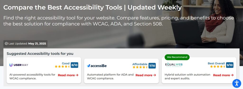
Using Automated Tools for Quick Insights (Accessibility-Test.org Scanner)
Automated testing tools provide a fast way to identify many common accessibility issues. They can quickly scan your website and point out problems that might be difficult for people with disabilities to overcome.
Visit Our Tools Comparison Page!
Run a FREE scan to check compliance and get recommendations to reduce risks of lawsuits
Final Thoughts
Creating a truly accessible mobile web experience is an ongoing commitment. It’s not about checking off boxes on a list; it’s about cultivating a mindset of inclusive design from the very beginning of any project. By focusing on how people with different abilities actually use their devices in the real world, you can build an online presence that is not just compliant, but genuinely useful and welcoming to everyone. Don’t let your mobile site be the reason a potential customer turns away.
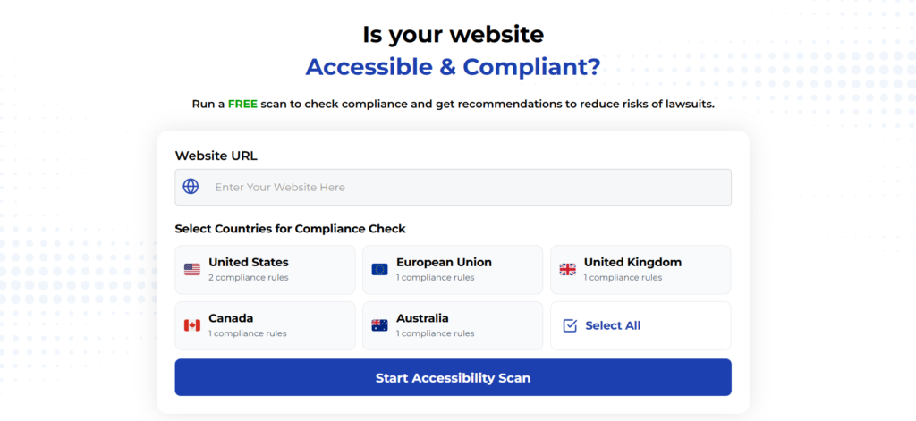
Ready to see how your mobile website measures up? Use our free website accessibility scanner to get instant feedback and identify actionable steps you can take to improve your site today.
Ready to see how your site stacks up? Start by reviewing your most-visited page for clarity, or run a free scan on Accessibility-Test.org to catch common technical issues that also affect users with cognitive differences.
Run a Free Scan to Find E-commerce Accessibility Barriers
Curious about where your site stands? An automated scan is a great first step to identify potential accessibility issues on your e-commerce platform. Run a free scan on our website today to get an initial report on your site’s accessibility health.
Want More Help?
Try our free website accessibility scanner to identify heading structure issues and other accessibility problems on your site. Our tool provides clear recommendations for fixes that can be implemented quickly.
Join our community of developers committed to accessibility. Share your experiences, ask questions, and learn from others who are working to make the web more accessible.