


Is Your Mobile Site Excluding Users? Critical Accessibility Fixes
Mobile accessibility isn’t just nice to have-it’s essential. In 2025, with over 60% of web traffic coming from mobile devices, inaccessible mobile websites create barriers for millions of users with disabilities. WCAG 2.2, released in October 2023, introduced several new success criteria specifically addressing mobile accessibility challenges. This article examines how your mobile site might be excluding users and provides practical, actionable solutions to fix these issues immediately.
The Mobile Accessibility Gap
The shift to mobile-first design has been rapid, but accessibility considerations haven’t always kept pace. Many websites that work reasonably well on desktop become unusable on mobile devices for people with disabilities. This gap creates frustration, exclusion, and potentially legal exposure for website owners.
Unique Challenges of Mobile Accessibility
Mobile interfaces present distinct accessibility challenges compared to desktop environments. Touch screens remove the precision of mouse pointers, making targets harder to hit for users with motor impairments. Screen size limitations mean text is often smaller, creating readability issues for those with visual disabilities. And complex gestures like pinch-to-zoom or swipe actions can be impossible for some users to perform.
Mobile contexts also introduce environmental challenges. Users access content in varied lighting conditions, often one-handed, and frequently while multitasking. These situations amplify accessibility barriers, making disabilities situational rather than permanent for many users.
The touch-based interaction model requires rethinking accessibility approaches. While keyboard navigation serves desktop users well, mobile accessibility demands attention to touch target sizes, gesture alternatives, and simplified interactions that work for everyone regardless of ability.
Impact on Users with Disabilities
For users with disabilities, inaccessible mobile sites create real-world barriers to essential services and information. Consider someone with motor impairments trying to book a medical appointment when buttons are too small to tap accurately. Or think about a blind user unable to complete a form because the fields aren’t properly labeled for screen readers.
According to CDC data, approximately 27% of adults in the United States have some form of disability. For these millions of users, poorly designed mobile interfaces aren’t just inconvenient-they’re exclusionary.
Different disability groups face unique challenges:
- Users with motor impairments struggle with small touch targets and complex gestures
- People with visual impairments need proper screen reader support and text sizing options
- Those with cognitive disabilities benefit from clear layouts and simplified interactions
- Deaf and hard-of-hearing users require alternatives to audio content
When mobile sites fail to address these needs, they effectively shut out a significant portion of potential users-customers, clients, and community members unable to access what others take for granted.

Comprehensive Mobile Accessibility Audit Checklist
Before diving into specific fixes, you need to identify what’s broken. A thorough mobile accessibility audit looks at every aspect of your site through the lens of various disability needs.
Touch Target Size and Spacing Requirements
One of the most common and easily fixable mobile accessibility issues involves touch target sizes-the tappable area of buttons, links, and interactive elements on your site.
WCAG Guidelines for Touch Targets
WCAG 2.2 introduces specific requirements for touch target sizes. Success criterion 2.5.8 (Target Size Minimum) at Level AA requires interactive elements to have a size of at least 24 by 24 CSS pixels.
For Level AAA compliance, criterion 2.5.5 mandates that touch targets must be a minimum of 44 by 44 CSS pixels, with a few exceptions:
- When an equivalent, properly sized alternative exists on the same page
- When the target appears inline within text (like a hyperlink)
- When the target size is controlled by the user agent and not modified by the author
- When a particular presentation is essential to the information being conveyed
These requirements aren’t arbitrary-they’re based on research into human motor control and touch accuracy. Properly sized targets benefit not just users with disabilities but everyone navigating your site on smaller screens.
Testing Touch Target Accessibility
To check if your mobile site meets touch target requirements, you can:
- Use a pixel ruler tool to measure the actual size of interactive elements
- Test with real users who have motor impairments to gather qualitative feedback
- Try navigating your site with a stylus to simulate reduced precision
- Use accessibility testing tools that can identify undersized touch targets
Pay special attention to navigation menus, form controls, and call-to-action buttons-areas where users frequently interact with your site. Remember that visual size doesn’t always match the actual tappable area. An icon might look large enough, but if its clickable region is smaller, users will still struggle.

Gesture Alternatives and Custom Controls
Modern mobile interfaces often rely on complex gestures that create barriers for many users with disabilities.
Providing Multiple Interaction Methods
WCAG 2.2 addresses this challenge with success criterion 2.5.7 (Dragging Movements) at Level AA. This criterion requires that any functionality that uses a dragging motion can also be achieved with a single pointer without dragging.
For example:
- A slider control should also offer buttons to increment/decrement values
- A map that supports pinch-to-zoom should provide zoom buttons
- A swipeable carousel should include next/previous buttons
- Drag-and-drop functionality should offer an alternative selection method
By providing these alternatives, you ensure that users who cannot perform complex gestures can still access all functionality. This approach benefits users with motor impairments, those using screen magnification, and people using your site in situations where precise movement is difficult.
Implementing Accessible Custom Elements
Custom controls present particular challenges for accessibility. Unlike native HTML elements, which have built-in accessibility features, custom widgets require additional work to ensure they’re usable by everyone.
For any custom element, ensure:
- It communicates its role, name, state, and value to assistive technologies
- It can be operated using only a keyboard or single tap
- Its purpose is clear through visual design and labels
- It provides appropriate feedback when activated
When built correctly, custom controls can actually enhance accessibility by offering better user experiences than standard elements. However, they require careful testing with assistive technologies to ensure they work as expected.

Responsive Text and Layout Considerations
Text readability and layout stability are critical aspects of mobile accessibility that impact users with visual and cognitive disabilities.
Font Scaling and Readability
Mobile typography requires careful attention to ensure text remains readable across devices and for users with vision impairments:
- Base font size should be at least 16px for body text
- Line spacing (line height) should be 1.5-1.6 times the font size
- Text should maintain a contrast ratio of at least 4.5:1 for normal text and 3:1 for large text to meet WCAG AA standards
- Responsive design should use flexible units like em or rem rather than fixed pixel sizes
- Support text resizing up to 200% without loss of content or functionality
A mobile-first typography approach doesn’t just benefit users with permanent vision impairments-it helps everyone dealing with small screens, bright sunlight, or other temporary challenges to reading text.
Layout Shifts and Cognitive Load
Unstable layouts create frustration and confusion, particularly for users with cognitive disabilities. When elements move around as the page loads or as users interact with it, it creates an unpredictable experience that increases cognitive load.
To improve layout stability:
- Set explicit width and height attributes for images and media
- Reserve space for dynamic content like ads or lazy-loaded elements
- Be cautious with animations and transitions that change element positioning
- Ensure form fields don’t shift when validation messages appear
A stable, predictable layout helps all users navigate your content more efficiently, reducing errors and frustration.

Three Essential Mobile Accessibility Corrections
If you’re looking for immediate improvements to your mobile site’s accessibility, these three fixes will address some of the most common and impactful issues.
Fix #1: Implement Properly Sized Touch Targets
Undersized touch targets create barriers for users with motor impairments, older adults, and really anyone trying to use your site on a mobile device. Fixing them delivers immediate accessibility benefits.
Code Implementation Guide
To implement properly sized touch targets without actual code examples:
- Identify all interactive elements on your mobile site (buttons, links, form controls)
- Ensure each has a minimum tappable area of 44×44 pixels (for AAA compliance) or at least 24×24 pixels (for AA compliance)
- Add appropriate padding to elements that are visually smaller than the recommended size
- Maintain adequate spacing between adjacent touch targets to prevent accidental taps
- For inline links, ensure the text is large enough to be read and tapped easily
Remember that the visual appearance doesn’t need to match the actual touch target size. You can maintain your design aesthetic while still providing larger touch areas through invisible padding or hit areas.
Testing Your Touch Target Sizes
After implementation, verify your improvements with these testing approaches:
- Use your device in challenging conditions (walking, in bright light, with one hand) to simulate situational limitations
- Test with users who have motor impairments if possible
- Try navigating with a stylus to simulate reduced precision
- Use browser developer tools to measure the actual size of your touch targets
- Conduct an audit using mobile accessibility testing tools
Look for areas where users might still struggle-navigation menus, form elements, or call-to-action buttons that appear too close together or too small for reliable interaction.
Fix #2: Ensure Gesture Alternatives
Complex gestures create barriers for users with motor disabilities, but implementing alternatives makes your site usable by everyone.
Coding Accessible Gesture Alternatives
For each complex gesture on your site, plan and implement an alternative:
- For swipe gestures, add visible next/previous buttons that perform the same function
- For pinch-to-zoom functionality, provide plus and minus buttons
- For drag-and-drop interactions, offer selection menus or buttons to achieve the same result
- For sliders, include increment/decrement controls or numeric input fields
These alternatives should be visible and available to all users, not hidden behind accessibility settings. By making them part of your standard interface, you’ll improve usability for everyone.
User Testing Methodology
To verify your gesture alternatives work effectively:
- Test using only a keyboard or single-finger tap (no dragging, swiping, or multi-touch)
- Verify all functionality remains accessible without complex gestures
- Check that alternative controls are visible and intuitive
- Ask users with disabilities to provide feedback on your implementation
- Test with screen readers to ensure they announce both the gesture-based controls and their alternatives
Listen carefully to feedback and be prepared to iterate. What seems intuitive to you might not work well for users with different abilities or experiences.
Fix #3: Optimize Form Fields for Mobile Input
Forms often present significant barriers on mobile devices. Optimizing them improves completion rates for all users while making them accessible to people with disabilities.
Mobile Form Best Practices
Create accessible, user-friendly mobile forms by following these practices:
- Use native HTML form controls whenever possible for built-in accessibility
- Provide visible, descriptive labels above (not inside) form fields
- Make form fields large enough for comfortable typing (at least 44px tall)
- Group related fields logically and use appropriate fieldset and legend elements
- Ensure adequate spacing between form fields to prevent accidental taps
- Use appropriate input types (email, tel, number) to trigger the right keyboard on mobile devices
- Position labels so they remain visible when the virtual keyboard appears
- Provide clear, specific error messages when validation fails
These practices make forms easier to complete for everyone, including users with motor, visual, or cognitive disabilities.
Input Assistance Features
Additional features can further enhance form accessibility on mobile devices:
- Enable autocomplete for appropriate fields to reduce typing burden
- Provide clear instructions before users begin filling out the form
- Allow users to see password characters temporarily to verify accuracy
- Indicate required fields clearly but don’t rely solely on color
- Support form completion across multiple sessions for longer forms
- Offer alternatives to CAPTCHA or use accessible CAPTCHA solutions
- Include undo functionality for accidental input or deletion
These supportive features reduce cognitive load and physical effort, making your forms more accessible and user-friendly for everyone.

Mobile Accessibility Testing Tools and Techniques
Thorough testing is essential to identify and address mobile accessibility issues before they affect users.
Device Testing Strategies
Effective mobile accessibility testing requires a structured approach:
- Test on actual mobile devices, not just desktop browsers with mobile emulation
- Include a variety of screen sizes, from small phones to large tablets
- Test in portrait and landscape orientations
- Try different interaction methods (touchscreen, keyboard, stylus, voice)
- Test with actual assistive technologies like screen readers, not just simulations
- Combine automated testing with manual inspection and user feedback
- Create test scenarios that reflect real-world usage patterns
This multi-faceted approach helps identify issues that might not be apparent from a single testing method or device.
Emulator vs. Real Device Testing
Both emulators and real devices have roles in mobile accessibility testing:
Real device advantages:
- Provides authentic experience of how users actually interact with your site
- Accurately represents touch sensitivity and screen reader behavior
- Reveals performance issues that might affect accessibility
- Shows how your site works in real-world lighting and usage conditions
Emulator advantages:
- Allows testing across many device types quickly
- Permits testing of devices you don’t physically own
- Often integrates with development workflows
- Makes it easier to debug certain types of issues
The most effective approach combines both methods: use emulators during development for rapid feedback, then validate with real device testing before release.
For screen reader testing specifically, nothing replaces experience with actual mobile screen readers like VoiceOver (iOS) or TalkBack (Android). The way these technologies interpret and announce content can only be fully understood through hands-on testing with the actual tools.

Taking Mobile Accessibility to the Next Level
Moving beyond the basics, these advanced considerations can further enhance your mobile site’s accessibility.
Accessibility in Mobile-Specific Features
Mobile sites often include features not found on desktop versions. Ensure these are also accessible:
- Touch gestures should have clear instructions and alternatives
- Location-based services should work without requiring precise interaction
- Camera and microphone features should offer alternative input methods
- Push notifications should be perceivable through multiple senses
- Mobile-specific navigation patterns like bottom tabs should be screen reader friendly
By addressing these mobile-specific elements, you create a more inclusive experience across all parts of your site.
Performance and Accessibility Connection
Mobile performance directly impacts accessibility, especially for users with older devices or cognitive disabilities:
- Optimize page load times and minimize network requests
- Reduce JavaScript execution time to prevent interface delays
- Prioritize loading critical content first
- Avoid layout shifts that can disorient users
- Test performance on lower-end devices that many users rely on
Fast, responsive sites are more accessible sites. Users with cognitive disabilities particularly benefit from sites that respond quickly and predictably to interaction.
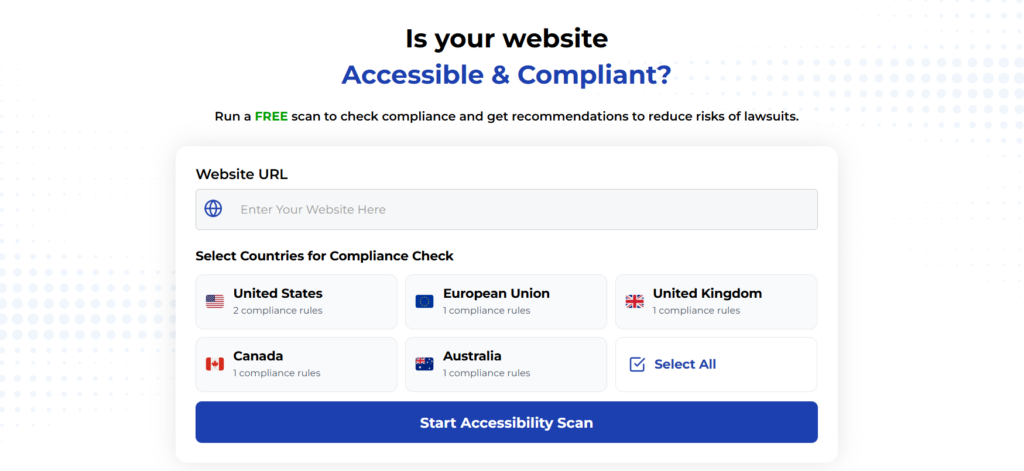
Using Automated Tools for Quick Insights (Accessibility-Test.org Scanner)
Automated testing tools provide a fast way to identify many common accessibility issues. They can quickly scan your website and point out problems that might be difficult for people with disabilities to overcome.
Visit Our Tools Comparison Page!
Run a FREE scan to check compliance and get recommendations to reduce risks of lawsuits
Final Thoughts
Mobile accessibility isn’t just a legal requirement-it’s about ensuring your site works for everyone regardless of their abilities or circumstances. The fixes outlined above address some of the most common and impactful mobile accessibility issues, providing immediate benefits to users with disabilities while improving the experience for all visitors.
By implementing proper touch target sizes, offering alternatives to complex gestures, and optimizing forms for mobile input, you’ll remove barriers that currently exclude millions of potential users. Combined with thorough testing across devices and assistive technologies, these improvements create a more inclusive mobile experience.
Remember that accessibility is an ongoing process, not a one-time fix. As mobile technologies and user expectations evolve, continue testing and improving your site to ensure it remains accessible to everyone. Your users-all of them-will thank you.
Want More Help?
Ready to start improving your mobile site’s accessibility? Begin with an audit focused on these three critical areas, implement the fixes described above, and test with real users whenever possible. Small changes can make a big difference in creating a truly inclusive mobile experience.
Are you experiencing specific mobile accessibility challenges? Share your questions in the comments below, and our accessibility experts will help you find solutions that work for your unique situation.
Try our free website accessibility scanner to identify heading structure issues and other accessibility problems on your site. Our tool provides clear recommendations for fixes that can be implemented quickly.
Join our community of developers committed to accessibility. Share your experiences, ask questions, and learn from others who are working to make the web more accessible.