


The Accessibility Feature 67% of Experts Check First | Keyboard Navigation
Keyboard navigation stands as the foundation of website accessibility, with recent data showing that accessibility specialists prioritize this feature when evaluating a site. For many individuals, using a mouse isn’t possible due to motor limitations, while others rely on screen readers that depend on keyboard commands. When your website fails to support keyboard access, you exclude these users completely.
This article outlines a practical 5-step approach to mastering keyboard accessibility, from evaluating your current implementation to adding advanced techniques that benefit all users. By following these steps, you’ll create more inclusive digital experiences while meeting essential compliance requirements for WCAG, ADA, and Section 508.
Why Keyboard Navigation Is Critical for Accessibility
Keyboard navigation isn’t optional – it’s a fundamental aspect of web accessibility with significant implications for users and organizations alike. When implemented correctly, it allows individuals to access all website functions using only keyboard commands, without requiring a mouse or other pointing device.
The Web Content Accessibility Guidelines (WCAG) emphasize keyboard accessibility as a core requirement. Success Criterion 2.1.1 (Level A) specifies that all website functionality must be operable through a keyboard interface. This requirement appears at the most basic conformance level because of its critical importance.
Beyond compliance, keyboard accessibility directly impacts user experience for millions of people worldwide. When websites lack proper keyboard support, users who rely on keyboards face frustrating barriers that can prevent them from completing essential tasks – from shopping to banking to accessing government services.
The User Demographics Relying on Keyboards
Various user groups depend on keyboard navigation as their primary means of web interaction. Understanding these demographics helps highlight why this accessibility feature deserves priority attention.
People with motor disabilities often find mouse usage difficult or impossible. This includes individuals with conditions like Parkinson’s disease, muscular dystrophy, arthritis, or those who have experienced injuries affecting hand control. For them, keyboard navigation isn’t a preference – it’s a necessity.
Screen reader users, including people who are blind or have severe visual impairments, rely on keyboard commands to navigate websites while their screen reader announces content. According to WebAIM’s Screen Reader User Survey, 25% of respondents listed lack of keyboard accessibility as one of their top three problematic items on the web, highlighting the significance of this issue.
Keyboard navigation also benefits people with temporary limitations, such as injuries, as well as those using specialized adaptive technologies that emulate keyboard functions. Even users without disabilities often prefer keyboard shortcuts for efficiency, especially power users who value speed and productivity.
Connection to Other Assistive Technologies
Keyboard accessibility doesn’t exist in isolation – it’s deeply interconnected with other assistive technologies that millions of people use daily. This interconnection makes keyboard support even more crucial for inclusive web design.
Screen readers like JAWS, NVDA, and VoiceOver fundamentally rely on keyboard commands to navigate web content. When a website lacks proper keyboard accessibility, screen reader users face a double barrier – not only can they not see the content, but they also cannot access it using their primary navigation method.
Many alternative input devices, from head pointers to sip-and-puff systems, function by simulating keyboard inputs. These technologies allow people with significant motor limitations to control computers and access the web. However, they only work effectively when websites properly support keyboard navigation.
Speech recognition software, which many people with motor disabilities use, often works in conjunction with keyboard commands. Users might speak commands that trigger keyboard functions, making keyboard accessibility essential even for those using voice control.

Common Keyboard Navigation Failures
Despite its importance, keyboard navigation often breaks due to common development mistakes. Understanding these failures is the first step toward creating truly accessible websites.
Focus Indicator Issues
Perhaps the most widespread keyboard accessibility problem involves focus indicators – the visual cues that show which element currently has keyboard focus. Without clear focus indicators, keyboard users cannot track their position on a page.
Missing Focus Styles
Many websites remove the default browser focus outline using CSS like outline: none or outline: 0 without providing alternative focus styles. This practice, often done for aesthetic reasons, creates a significant barrier for keyboard users.
When focus indicators disappear, keyboard navigation becomes virtually impossible for sighted users. Imagine trying to navigate through dozens of links when you can’t see which one is currently selected – it’s like trying to find your cursor on a screen when it’s been made invisible.
According to WCAG Success Criterion 2.4.7 (Focus Visible), any interface component that can receive keyboard focus must have a visible focus indicator. This requirement exists precisely because focus visibility is essential for keyboard navigation.
Insufficient Focus Contrast
Even when focus indicators aren’t completely removed, they often lack sufficient contrast to be easily visible. Subtle focus styles might meet aesthetic preferences but fail accessibility needs.
Focus indicators need enough contrast against both the focused element and the surrounding content to be perceivable by users with low vision or color perception limitations. The focus state should be obvious, not just barely noticeable.
Effective focus indicators often combine multiple visual cues – like color changes, outlines, and movement – to ensure they’re perceivable under various conditions and by users with different visual abilities.

Keyboard Traps
Keyboard traps occur when keyboard focus gets stuck within a component, preventing users from navigating to other parts of the page. These traps essentially lock keyboard users into a specific section, making the rest of the content inaccessible.
Modal and Dialog Problems
Modal dialogs and popup windows frequently cause keyboard trap issues. When improperly implemented, a user can tab into the modal but cannot exit it using the keyboard alone, forcing them to either activate an option within the modal or abandon the website entirely.
According to WCAG Success Criterion 2.1.2 (No Keyboard Trap), proper implementation requires that users can move focus both into and out of any component using standard keyboard navigation. For modals, this typically means ensuring the Escape key closes the dialog and returns focus to the triggering element.
The frustration these traps cause cannot be overstated – imagine being unable to exit a popup advertisement without reloading the entire page or closing your browser window.
Complex Widget Issues
Custom widgets like dropdown menus, date pickers, and carousels often create keyboard accessibility problems. These components frequently rely on mouse-specific events without keyboard equivalents.
For example, many dropdown menus open on hover but provide no keyboard method to access the submenu items. Calendar widgets might allow clicking on dates but not navigating between them with arrow keys. Carousels may auto-advance without keyboard controls to pause, resume, or navigate between slides.
These widgets require careful implementation with keyboard interactions in mind, including appropriate event handlers and ARIA attributes to maintain accessibility.

Logical Focus Order Problems
The sequence in which elements receive focus when using the Tab key should follow a logical, intuitive pattern matching how users would naturally progress through the content. When focus order becomes unpredictable or illogical, keyboard navigation becomes confusing and frustrating.
Tab Index Misuse
The tabindex attribute, while potentially useful, often creates problems when misused. Positive tabindex values (greater than 0) are particularly problematic as they remove elements from the natural tab order and create a separate navigation sequence that rarely aligns with logical reading order.
Using tabindex=”0″ appropriately makes non-interactive elements focusable, while tabindex=”-1″ allows programmatic focus without including the element in the navigation sequence. However, arbitrary positive values often result in unpredictable tab order that confuses users.
DOM Order vs. Visual Order
Modern CSS layouts sometimes create discrepancies between the order of elements in the HTML document (DOM order) and their visual presentation on screen. This mismatch can result in tab focus that jumps around the page in ways that seem random to users.
For example, a visually right-aligned sidebar might appear after the main content visually but come first in the HTML structure. This arrangement would cause keyboard focus to move through the sidebar before reaching the main content, creating a confusing navigation experience.
The solution involves structuring HTML to match the desired focus order, using CSS for visual presentation without altering the logical sequence of elements.

5-Step Guide to Perfect Keyboard Navigation
Achieving robust keyboard accessibility doesn’t happen by accident. It requires a systematic approach that addresses all aspects of keyboard interaction. This 5-step process will help you transform your website into one that fully supports keyboard users.
Step 1 | Audit Current Keyboard Accessibility
Before making improvements, you need to understand your website’s current keyboard accessibility status. This assessment provides a baseline and helps identify specific issues to address.
Manual Testing Methodology
The most effective way to test keyboard accessibility is to experience your website as a keyboard user would. Put your mouse aside and navigate your entire site using only the keyboard.
Start by pressing Tab to begin navigation, continuing to use Tab to move forward through interactive elements and Shift+Tab to move backward. Use Enter to activate links and buttons, Space to toggle checkboxes, and arrow keys where appropriate (such as in dropdowns or radio button groups).
As you navigate, ask these questions:
- Can you access all interactive elements?
- Is it clear which element has focus at all times?
- Can you operate all controls and submit all forms?
- Does the focus order make logical sense?
- Are there any places where focus disappears or gets trapped?
Document all issues you encounter, noting the specific pages, elements, and interactions that present barriers.
Automated Testing Tools
While manual testing is essential, automated tools can help identify certain keyboard accessibility issues more efficiently, especially on large websites.
Tools like WAVE, axe, and Accessibility Insights can identify missing or insufficient focus indicators, improper use of tabindex, and other keyboard-related issues. These automated checks provide a starting point but cannot replace manual testing.
Remember that automated tools typically catch only about 30% of accessibility issues. They cannot evaluate the logic of focus order or determine if keyboard interactions make sense in context.

Step 2 | Implement Visible Focus Indicators
Clear focus indicators are essential for keyboard users to understand their current position on a page. Implementing effective visual focus states should be a top priority.
CSS Techniques for Focus Styles
When designing focus indicators, consider using multiple visual cues to ensure they’re perceivable under different conditions. Effective techniques include:
- Outlines that surround the entire element
- Background color changes that provide good contrast
- Border modifications that clearly indicate focus
- Size or position changes (subtle scaling or movement)
- Adding visual elements like underlines or icons
Avoid relying solely on color changes, as these may not be perceivable by users with color vision deficiencies. Instead, combine color with other visual changes for maximum visibility.
Many designers worry that focus indicators will detract from their design. However, well-designed focus styles can actually enhance the user experience while maintaining visual appeal. Consider focus styles as an opportunity for design expression rather than a limitation.
Focus Visibility Best Practices
For optimal focus visibility, ensure your indicators meet these criteria:
- High contrast: Focus indicators should have at least a 3:1 contrast ratio against adjacent colors
- Sufficient size: The indicator should be substantial enough to notice easily
- Consistency: Use similar focus styles throughout your site for predictability
- Persistence: Focus should remain visible for as long as the element has focus
- Non-obscuring: Focus indicators shouldn’t hide or obscure the focused content
Keep in mind that focus styles need to work across different browsers, as default focus indicators vary. Testing your focus styles across multiple browsers and devices ensures consistent visibility for all users.
Step 3 | Ensure Logical Focus Order
A predictable, logical focus order helps keyboard users navigate efficiently and understand the structure of your content. The sequence should generally follow reading order, moving from top to bottom and left to right (in left-to-right languages).
Tab Index Implementation Guide
The tabindex attribute should be used sparingly and with careful consideration:
- tabindex=”0″: Use this to make non-interactive elements focusable when needed, such as custom widgets or elements that need to receive focus programmatically.
- tabindex=”-1″: Apply this to elements that should be focusable via JavaScript but should not be included in the regular tab sequence.
- tabindex=”1+” (positive values): Generally avoid these, as they create a separate tab order that overrides the natural DOM order and is difficult to maintain.
Instead of using positive tabindex values to control focus order, restructure your HTML to match the desired navigation sequence. This approach is more maintainable and typically creates a more intuitive experience.
DOM Restructuring Techniques
When the visual layout doesn’t match the desired focus order, consider these approaches:
- Reorder HTML elements to match the logical reading sequence
- Use CSS Flexbox or Grid to control visual presentation without altering the HTML structure
- For complex layouts, consider using landmark regions (header, main, nav, etc.) with skip links to improve navigation
- Ensure form fields follow a logical progression, especially when using multi-column layouts
Remember that screen reader users also experience your content in DOM order, so aligning visual presentation with HTML structure benefits multiple user groups.

Step 4 | Make All Interactive Elements Keyboard Accessible
Every interactive element on your website must be operable via keyboard. This includes not just standard HTML elements like links and form controls, but also custom widgets and dynamic content.
Converting Click Events to Keyboard Events
Many accessibility issues arise when developers attach functionality only to mouse-specific events like click, mouseover, or mouseout without providing keyboard equivalents.
For maximum accessibility, ensure that:
- Elements that respond to clicks also respond to Enter key presses
- Hover functionality is accessible via keyboard focus
- Drag-and-drop interactions have keyboard alternatives
- Custom scrolling areas can be navigated with keyboard commands
Instead of thinking specifically about mouse vs. keyboard, focus on creating device-independent event handlers that work with multiple input methods.
Custom Control Implementation
When creating custom interactive elements, follow these principles:
- Use appropriate semantic HTML elements as a foundation whenever possible
- Add ARIA roles, states, and properties to communicate the element’s purpose and state to assistive technologies
- Implement keyboard event handlers that match expected behavior (Space for buttons, Enter for links, arrow keys for navigation within components)
- Provide visual feedback for all states and interactions
- Test thoroughly with keyboard alone and with screen readers
Remember that many users rely on expected keyboard behaviors, so custom controls should follow established patterns. For example, users expect to navigate dropdowns with arrow keys and close them with Escape.
Step 5 | Test and Validate Keyboard Functionality
Thorough testing is essential to ensure your keyboard accessibility improvements actually work as intended across different browsers, devices, and scenarios.
Testing Checklist
Use this checklist to verify keyboard accessibility:
- Tab through the entire page to ensure all interactive elements receive focus
- Confirm that focus indicators are clearly visible at all times
- Test operation of all controls using only keyboard commands
- Verify that modals, dropdowns, and other widgets can be opened, used, and closed with keyboard alone
- Check that no keyboard traps exist
- Ensure custom keyboard shortcuts don’t conflict with browser or screen reader commands
- Test with different browsers, as keyboard behavior can vary
- Validate with actual assistive technology like screen readers
Involve users with disabilities in your testing process whenever possible, as they often identify issues that might be missed by developers or automated tools.
Common Failure Resolution
When testing reveals issues, these solutions address common failures:
- For missing focus indicators, add visible focus styles via CSS
- For keyboard traps in modals, ensure Escape key closes the modal and returns focus appropriately
- For inaccessible dropdown menus, implement proper keyboard event handling (up/down arrows, Enter, Escape)
- For illogical tab order, restructure HTML to match the desired focus sequence
- For custom widgets, refer to ARIA Authoring Practices for expected keyboard behaviors
Document your testing results and solutions to build institutional knowledge and prevent similar issues in future development.
Advanced Keyboard Accessibility Techniques
Once you’ve mastered the basics, these advanced techniques can further enhance the experience for keyboard users.
Skip Navigation Links
Skip navigation links (or “skip links”) allow keyboard users to bypass repetitive navigation elements and jump directly to main content. These links typically appear when a user first tabs into a page.
Without skip links, keyboard users must tab through the entire navigation menu on every page before reaching the main content – an extremely tedious process on sites with extensive menus.
Effective skip links should:
- Become visible when they receive focus
- Link to the main content area
- Have descriptive text (e.g., “Skip to main content”)
- Appear before navigation elements in the tab order
- Work consistently across all pages
Consider adding multiple skip links on complex pages, such as “Skip to navigation,” “Skip to search,” or “Skip to footer,” to provide additional navigation options.
Keyboard Shortcuts Implementation
Custom keyboard shortcuts can significantly enhance efficiency for power users and those who rely on keyboard navigation. However, they must be implemented thoughtfully to avoid conflicts with browser commands or assistive technologies.
When adding keyboard shortcuts:
- Provide a way to view all available shortcuts
- Allow users to customize or disable shortcuts
- Avoid conflicts with common browser and screen reader shortcuts
- Use modifier keys (Ctrl, Alt, etc.) to minimize conflict risk
- Ensure shortcuts are discoverable through on-screen instructions
Consider implementing shortcuts for frequently used functions like search, navigation between major sections, or access to specific tools or features.
Remember that WCAG 2.1’s Success Criterion 2.1.4 (Character Key Shortcuts) requires that single-character shortcuts can be turned off, remapped, or only activate when the relevant component has focus.
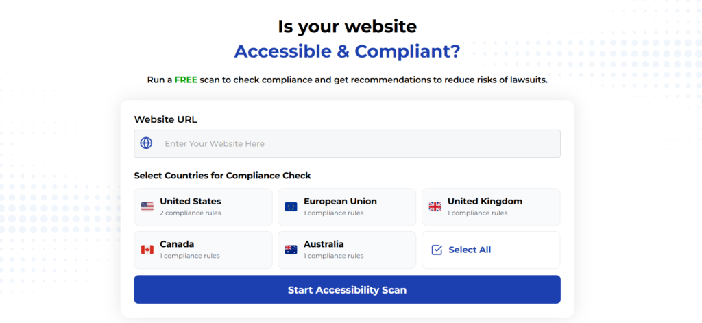
Using Automated Tools for Quick Insights (Accessibility-Test.org Scanner)
Automated testing tools provide a fast way to identify many common accessibility issues. They can quickly scan your website and point out problems that might be difficult for people with disabilities to overcome.
Visit Our Tools Comparison Page!
Run a FREE scan to check compliance and get recommendations to reduce risks of lawsuits
Enhancing Website Navigation for RTL Languages
Right-to-left (RTL) languages like Arabic, Hebrew, Persian, and Urdu require special consideration for keyboard navigation. Ensuring your site works well for RTL users expands your global accessibility.
When implementing keyboard navigation for RTL support:
- Test tab order in RTL mode to ensure it follows right-to-left reading patterns
- Verify that arrow key navigation in components like carousels and menus follows RTL direction
- Ensure focus indicators appear on the appropriate side of elements in RTL mode
- Test with native RTL language users to verify the navigation feels natural
Making your keyboard navigation work well for RTL languages demonstrates a commitment to global accessibility and expands your website’s reach to millions of additional users.
Keyboard Accessibility for Mega Menus and Navigation Systems
Mega menus present unique keyboard accessibility challenges due to their complex structure and rich content. When these navigation elements aren’t properly implemented, they can become significant barriers.
To create keyboard-accessible mega menus:
- Ensure users can open the menu using both mouse and keyboard
- Allow navigation through all menu items using arrow keys
- Provide clear visual focus indicators for the current item
- Implement proper ARIA attributes to convey menu structure to screen readers
- Include a method to close the menu using the Escape key
- Return focus to the appropriate element when the menu closes
Well-implemented mega menus can actually enhance accessibility by making all site sections available with minimal keyboard interaction, but poorly implemented ones can render a site unusable for keyboard-only users.
Economic and Social Impact of Keyboard Accessibility
Improving keyboard accessibility has measurable business benefits beyond compliance. Research shows that accessible websites have better SEO performance, higher user engagement, and increased conversion rates.
Organizations implementing strong keyboard accessibility practices see:
- Expanded market reach to the 15% of the global population with disabilities
- Reduced legal risk from accessibility-related lawsuits
- Improved search engine rankings due to better site structure
- Increased user satisfaction across all demographics
- Enhanced brand reputation for inclusivity and attention to detail
The investment in keyboard accessibility pays dividends not just in compliance but in concrete business outcomes and social impact.
Final Thoughts
ColoKeyboard accessibility forms the foundation of an inclusive website. By implementing the 5-step approach outlined in this article, you’ll create experiences that work for all users, regardless of ability or preferred interaction method.
Remember that keyboard access isn’t just about meeting requirements-it’s about respecting users’ needs and preferences. When you design with keyboard accessibility in mind, you create more robust interfaces that ultimately benefit everyone.
Start by auditing your current site, then systematically address focus indicators, logical order, and interactive element accessibility. With regular testing and refinement, you’ll build a more inclusive digital experience that welcomes all users.
Want More Help?
Try our free website accessibility scanner to identify heading structure issues and other accessibility problems on your site. Our tool provides clear recommendations for fixes that can be implemented quickly.
Join our community of developers committed to accessibility. Share your experiences, ask questions, and learn from others who are working to make the web more accessible.