


Color Contrast Mastery | Beyond WCAG Minimums for Maximum Impact
Color contrast affects how millions of people interact with websites every day, yet many designers and developers still treat it as an afterthought. When you create websites that meet only the bare minimum contrast requirements, you’re missing opportunities to make your content truly accessible and usable for everyone. This article examines how to go beyond basic WCAG AA standards and create visual experiences that work exceptionally well for users with various vision abilities.
Understanding Color Contrast Fundamentals
What Makes Color Contrast Work
Color contrast isn’t just about making text darker or lighter—it’s about creating meaningful visual relationships between foreground and background elements. The mathematical formula that determines contrast ratios compares the relative luminance of two colors, expressed as a ratio from 1:1 (no contrast) to 21:1 (maximum contrast).
When you look at a webpage, your eyes naturally process these luminance differences to distinguish between text and backgrounds. For people with visual impairments, this process becomes more challenging. Color blindness affects approximately 1 in 12 men and 1 in 200 women, while other conditions like low vision create additional barriers that proper contrast can help overcome.
The W3C defines contrast ratio using this formula: (L1 + 0.05) / (L2 + 0.05), where L1 represents the lighter color’s luminance and L2 represents the darker color’s luminance. While you don’t need to calculate this manually, understanding the principle helps you make better design decisions.
Why Minimum Standards Aren’t Always Enough
WCAG 2.2 sets specific contrast requirements: 4.5:1 for normal text and 3:1 for large text at the AA level. However, these represent minimum thresholds, not optimal targets. Research shows that higher contrast ratios often provide better readability for all users, not just those with disabilities.
Think about your own reading experience on different devices and in various lighting conditions. That website you can barely read on your phone in bright sunlight? It probably meets WCAG AA requirements but fails real-world usability tests. This is where going beyond minimums makes a difference.
Many successful websites target AAA contrast levels (7:1 for normal text, 4.5:1 for large text) as their baseline. While AAA compliance isn’t required for most legal frameworks, it demonstrates a commitment to inclusive design that benefits everyone.
The Connection Between Contrast and User Experience
Good contrast choices affect more than accessibility compliance—they impact conversion rates, user satisfaction, and brand perception. When users struggle to read your content, they leave. When they can easily consume your information, they stay engaged and take desired actions.
Consider how color choices affect different user groups. Older adults often experience decreased contrast sensitivity as part of natural aging. Users with cognitive disabilities may rely heavily on visual cues to understand content structure. Even users without disabilities benefit from clear visual hierarchies that high contrast creates.

WCAG AA vs AAA | When to Exceed Minimum Requirements
Decoding the Different Compliance Levels
WCAG guidelines offer three levels of conformance: A, AA, and AAA. Most organizations target AA compliance because it balances accessibility needs with design flexibility. AA requires contrast ratios of at least 4.5:1 for normal text and 3:1 for large text against their backgrounds.
AAA raises these requirements to 7:1 for normal text and 4.5:1 for large text. While this might seem like a small numerical difference, it represents a significant visual improvement that many users notice immediately.
The decision between AA and AAA often comes down to context and audience. Educational websites, healthcare platforms, and government services frequently choose AAA standards because their users include many people with disabilities who rely heavily on accessible design.
Strategic Situations for Higher Standards
Certain website sections and user interactions benefit tremendously from exceeding minimum contrast requirements. Error messages, for example, should always use high contrast because users need to quickly identify and understand problems. Form labels and input field borders also perform better with enhanced contrast ratios.
Navigation elements represent another area where higher contrast pays dividends. Users need to quickly scan and identify clickable elements, especially when using assistive technologies. Making these elements highly visible reduces cognitive load and improves task completion rates.
Text overlay on images presents particular challenges that often require AAA-level contrast to remain readable. Even when images include dark overlays or blur effects, the underlying image content can interfere with text readability in unpredictable ways.
Balancing Design Aesthetics with Accessibility
Designers sometimes worry that high contrast requirements limit creative freedom or make websites look harsh. This concern usually stems from thinking about contrast in terms of pure black and white combinations. Modern design can achieve excellent contrast using sophisticated color palettes that maintain visual appeal.
Consider using darker blues instead of pure black, or warm grays instead of stark whites. These approaches often achieve AAA contrast ratios while feeling more visually comfortable than high-contrast combinations. Color palette tools can help you identify accessible alternatives that preserve your brand aesthetic.
Remember that contrast requirements apply primarily to text and interactive elements. Decorative elements, background images, and purely aesthetic design features have more flexibility, allowing you to balance accessibility needs with creative expression.

Advanced Color Contrast Testing Tools and Techniques
Browser-Based Testing Solutions
WAVE by WebAIM stands out as one of the most reliable browser extensions for contrast testing. Unlike automated scanners that only check predetermined color combinations, WAVE analyzes your actual webpage content and identifies contrast issues in real-time. The tool’s color-coded feedback system makes it easy to prioritize fixes based on severity.
The visual feedback that WAVE provides helps you understand how users with different vision abilities might experience your content. Rather than just flagging failures, it shows you exactly which text elements need attention and explains why certain combinations create readability problems.
For teams working on design systems, browser-based tools offer the advantage of testing contrast across multiple pages simultaneously. This capability proves especially valuable when making site-wide color changes or evaluating the impact of new brand guidelines.
Design Tool Integration
Figma and Adobe XD users have access to several powerful contrast testing plugins that work directly within the design environment. Stark, available for both platforms, provides real-time contrast checking with intelligent color suggestions that maintain design harmony while meeting accessibility standards.
What makes these integrated tools particularly valuable is their ability to suggest alternative colors automatically. When Stark identifies a contrast failure, it doesn’t just point out the problem—it offers specific hex codes that would pass WCAG requirements while staying visually consistent with your design palette.
The Able plugin for Figma focuses specifically on color blindness simulation and contrast testing. It allows designers to keep contrast checking tools open while working, creating a seamless workflow that catches issues before they reach development.
Automated Accessibility Scanning
Free accessibility scanners like the one offered by Accessibility-Test.org can quickly identify contrast issues across entire websites. These tools examine HTML structure, check color combinations, and provide detailed reports showing exactly which elements need attention.
The scanning process typically takes less than two minutes and generates actionable recommendations for fixing identified problems. Rather than simply listing issues, these tools explain why each problem matters and provide specific steps for resolution.
Professional accessibility testing tools often include features for generating compliance documentation. This capability becomes particularly valuable for organizations that need to demonstrate their accessibility efforts for legal or business purposes.
Manual Testing Techniques
While automated tools catch many contrast issues, manual testing remains essential for validating real-world usability. Testing your website in different lighting conditions, on various devices, and with different display settings reveals problems that automated scans might miss.
Screen reader testing provides another layer of validation. Even when text meets contrast requirements, the way screen readers announce color-related information can affect user comprehension. Testing with actual assistive technologies helps identify these subtle but important usability issues.
User testing with individuals who have visual impairments offers the most valuable feedback about contrast effectiveness. These sessions often reveal that technical compliance doesn’t always translate to practical usability, especially in complex interface designs.

Design Strategies for High-Contrast Accessibility
Creating Effective Color Palettes
Building accessible color palettes starts with selecting a limited number of base colors and systematically testing their combinations. Professional designers often begin with high-contrast anchor colors (like dark blue and cream) and then build variations that maintain strong contrast relationships.
Tools like the WebAIM Contrast Checker allow you to experiment with color variations while maintaining accessibility compliance. By adjusting lightness values while keeping hue and saturation relatively stable, you can create palettes with multiple contrast-compliant combinations.
Consider creating color systems with built-in contrast relationships. For example, your primary blue might automatically pair with a specific gray that ensures 7:1 contrast, while your secondary colors maintain 4.5:1 ratios. This systematic approach prevents contrast failures during the design process.
Typography and Contrast Optimization
Font weight and size significantly affect how users perceive contrast, even when mathematical ratios remain constant. Thin fonts require higher contrast ratios to achieve the same readability as bold fonts. This relationship explains why WCAG provides different requirements for large text versus normal text.
Line spacing and letter spacing also influence contrast perception. Text that’s tightly spaced can appear to blur together, effectively reducing perceived contrast even when individual characters meet requirements. Generous spacing improves readability and can make borderline contrast ratios more acceptable.
Font choice matters more than many designers realize. Sans-serif fonts typically perform better at lower contrast ratios because their simpler letterforms create cleaner edges. Serif fonts can work well at high contrast but may become less readable when contrast drops toward minimum thresholds.
Interactive Element Contrast
Buttons, links, and form controls need careful contrast consideration because users must quickly identify and interact with these elements. WCAG 2.1 introduced specific requirements for UI component contrast, mandating 3:1 ratios between interactive elements and their surroundings.
Focus indicators present particular challenges because they must remain visible regardless of background colors. Many designers create focus styles with multiple visual cues—combining outline colors, background changes, and shadow effects to ensure visibility across different contexts.
Hover states and active states also need contrast planning. These temporary visual changes should maintain accessibility while providing clear feedback about user interactions. Testing hover effects with keyboard navigation helps ensure they work properly for all users.
Responsive Design Considerations
Color contrast requirements become more complex in responsive designs where the same content appears on different screen sizes and in various contexts. Mobile devices often display content in bright outdoor lighting that can wash out colors that look fine indoors.
Dark mode implementations require complete contrast strategy reconsideration. Colors that work perfectly in light themes may fail accessibility requirements when inverted for dark themes. Planning for both modes from the beginning prevents accessibility regressions when adding dark mode support.
Image overlays and background videos present special challenges in responsive design. Text that maintains good contrast on desktop may become unreadable when the same image scales to mobile dimensions. Using multiple image breakpoints or dynamic overlay adjustments helps maintain contrast across device sizes.

Common Color Contrast Mistakes and Solutions
The Gray Text Epidemic
One of the most widespread accessibility problems on the web is the overuse of light gray text on white backgrounds. This combination rarely meets even basic AA requirements, yet it appears everywhere from form labels to footer content. The assumption that gray text looks more “modern” or “sophisticated” ignores the reality that many users simply can’t read it.
Testing gray combinations reveals just how poor many common choices actually are. Medium gray (#666666) on white backgrounds achieves only a 5.74:1 ratio—barely passing AA requirements for normal text and failing for large text. Light gray (#999999) drops to 2.85:1, failing all WCAG requirements.
The solution involves either darkening gray text to achieve proper contrast or reconsidering whether gray is necessary at all. Dark gray (#333333) achieves 12.6:1 contrast on white backgrounds, providing excellent readability while maintaining a softer appearance than pure black.
Link Color Confusion
Many websites use blue links that fail contrast requirements, especially when those links appear on colored backgrounds. The traditional “blue link” color (#0000FF) provides only 8.6:1 contrast on white backgrounds—good for accessibility but often poor for brand consistency.
Link contrast becomes more problematic when designers try to maintain brand colors across different background contexts. A blue that works perfectly on white might disappear entirely on a blue-tinted background. This situation requires either multiple link color variations or careful background color selection.
Underlines and other visual indicators can help identify links even when color contrast is borderline, but they shouldn’t be used as substitutes for proper contrast. The goal is making links both identifiable and readable through color alone, with additional visual cues providing backup support.
Form Field Accessibility Failures
Form labels, placeholder text, and input field borders frequently fail contrast requirements. Placeholder text, in particular, often appears in very light gray that users with visual impairments can’t see at all. This creates situations where users don’t understand what information to enter in form fields.
Input field borders present another common problem area. Light gray borders on white backgrounds rarely meet the 3:1 ratio required for UI components. When these borders also serve as the only visual indication of field boundaries, users may struggle to understand form structure.
Error messages and validation feedback need especially high contrast because users must quickly identify and understand problems. Red text on white backgrounds can achieve good contrast, but designers often choose light red or pink colors that fail accessibility requirements when users most need clear communication.
Mobile-Specific Contrast Issues
Mobile devices introduce additional contrast challenges that desktop testing doesn’t reveal. Screen glare, automatic brightness adjustments, and varied viewing angles can significantly reduce perceived contrast even when technical measurements show compliance.
App interfaces often use translucent overlays and blur effects that interfere with text contrast in unpredictable ways. iOS and Android design guidelines suggest contrast ratios, but these recommendations don’t always align with WCAG requirements, creating confusion for designers working across platforms.
Touch target contrast becomes especially important on mobile devices where users need to quickly identify interactive elements. Small buttons with poor contrast can frustrate users and lead to unintended taps, especially for users with motor impairments who need larger, more visible targets.
Implementation Guidelines for Development Teams
CSS Strategies for Maintainable Contrast
Creating maintainable CSS that preserves contrast relationships requires systematic color variable usage and careful inheritance planning. CSS custom properties allow teams to define accessible color relationships once and reuse them consistently across components.
Consider establishing naming conventions that indicate contrast relationships. Variables like –text-high-contrast, –text-medium-contrast, and –background-light make it clear which combinations are safe to use together. This approach prevents accidental contrast failures when developers modify styles.
Media queries for dark mode and high contrast preferences should maintain the same accessibility standards as default styles. Users who enable high contrast mode expect improved readability, not just inverted colors that maintain the same poor contrast ratios.
Testing Integration and Automation
Automated accessibility testing should include contrast checking as part of continuous integration pipelines. Tools like axe-core can catch contrast failures before code reaches production, preventing accessibility regressions in released software.
However, automated testing has limitations that teams must understand. Contrast tools can only evaluate static color combinations—they can’t test dynamic content, image overlays, or user-generated content that might introduce contrast problems.
Regular manual testing schedules help catch issues that automated tools miss. Monthly contrast audits using tools like WAVE can identify problems in content that’s changed since the last automated scan. These audits become especially important for sites with frequently updated content.

Documentation and Design System Integration
Accessibility documentation should include specific guidance about color usage and contrast requirements. Rather than just listing acceptable color combinations, documentation should explain why certain choices work and how to test new combinations properly.
Design systems need built-in contrast validation to prevent component misuse. When designers can only select color combinations that meet accessibility requirements, contrast failures become much less likely throughout the design and development process.
Component libraries should include contrast testing as part of their review process. New components or color variations should undergo accessibility testing before approval, ensuring that the entire design system maintains consistent accessibility standards.
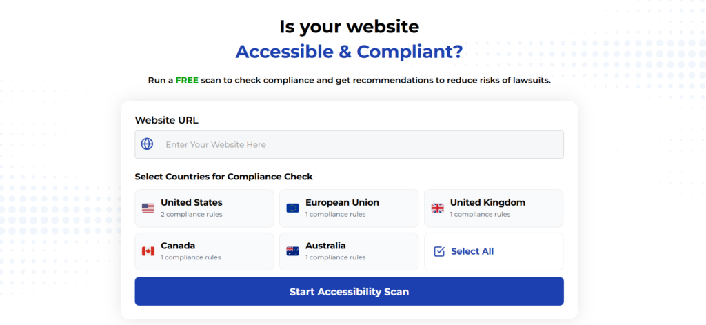
Using Automated Tools for Quick Insights (Accessibility-Test.org Scanner)
Automated testing tools provide a fast way to identify many common accessibility issues. They can quickly scan your website and point out problems that might be difficult for people with disabilities to overcome.
Visit Our Tools Comparison Page!
Run a FREE scan to check compliance and get recommendations to reduce risks of lawsuits
Final Thoughts
Regular training helps team members understand how their decisions affect users with disabilities. Demonstrations using screen readers and contrast simulation tools make abstract accessibility concepts more concrete and memorable.
Code review processes should include accessibility checkpoints that specifically address contrast requirements. Reviewers should verify that new color combinations meet standards and that changes don’t introduce contrast regressions in existing content.
Cross-functional collaboration between design and development teams prevents contrast issues from reaching production. When designers understand technical constraints and developers understand design intentions, teams can work together to find solutions that meet both accessibility and aesthetic goals.
Creating websites with excellent color contrast requires moving beyond minimum compliance toward genuine usability for all users. While WCAG AA standards provide a foundation, the most successful websites often exceed these requirements to create truly inclusive experiences.
The tools and techniques covered in this article provide starting points for teams ready to take their accessibility efforts seriously. Remember that contrast accessibility benefits everyone—from users with visual impairments to people reading on mobile devices in bright sunlight.
Start by auditing your current website using free accessibility testing tools, then systematically address the most critical contrast failures first. Focus on navigation elements, form controls, and primary content areas where contrast problems have the biggest impact on user experience.
Ready to see how your website measures up? Try our free accessibility scanner to identify contrast issues and get specific recommendations for making your content more readable for everyone.
Want More Help?
Try our free website accessibility scanner to identify heading structure issues and other accessibility problems on your site. Our tool provides clear recommendations for fixes that can be implemented quickly.
Join our community of developers committed to accessibility. Share your experiences, ask questions, and learn from others who are working to make the web more accessible.