


ARIA Attributes That Make or Break Your Website’s Accessibility
ARIA (Accessible Rich Internet Applications) attributes play a crucial role in making web content accessible to people with disabilities, particularly those using screen readers and other assistive technologies. When implemented correctly, ARIA can bridge accessibility gaps for dynamic content and custom interface elements. However, poor implementation can actually create more barriers than it solves. This article explores essential ARIA attributes, common mistakes, and best practices that directly impact your website’s accessibility.
Understanding ARIA’s Purpose and Limitations
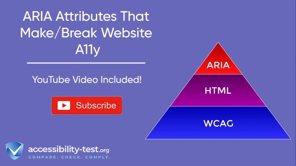
ARIA works as a supplement to HTML, adding semantic meaning to content that might otherwise be unclear to assistive technologies. It’s particularly valuable for dynamic content created with JavaScript and complex interactive elements that don’t have HTML equivalents.
However, ARIA comes with important limitations. It doesn’t change how elements look or function for typical users – it only changes how content is announced to assistive technology users. ARIA also doesn’t add keyboard functionality or focusability to elements that don’t naturally have these features.
As the Web Accessibility Initiative (WAI) notes, ARIA only modifies how browsers communicate with assistive technologies through the accessibility tree. It doesn’t affect the actual behavior, styling, or functionality of elements on the page.
When to Use ARIA (and When Not To)
The decision of when to use ARIA requires careful consideration. You should only use ARIA when native HTML elements can’t provide the necessary semantics or functionality.
For example, if you need a button, use the <button> element instead of a <div> with role=”button”. The native button already has keyboard accessibility, proper role information, and focus management built in.
ARIA becomes necessary when:
- Creating custom widgets not available in HTML (like tree views or complex menus)
- Making dynamic content updates perceivable to screen reader users
- Providing additional context not conveyed through standard HTML
Using ARIA incorrectly can actively harm the user experience. According to WebAim’s survey cited in the MDN documentation, “Home pages with ARIA present averaged 41% more detected errors than those without ARIA”.
The First Rule of ARIA Use
The first and most important rule of ARIA use is straightforward: “If you can use a native HTML element or attribute with the semantics and behavior you require already built in, instead of re-purposing an element and adding an ARIA role, state or property to make it accessible, then do so”.
This rule exists because native HTML elements come with built-in:
- Keyboard accessibility
- Focus management
- Proper role announcements
- Event handling
- Compatibility across browsers and assistive technologies
When you use ARIA, you take on the responsibility of replicating all of these behaviors that come free with native HTML. This is why the saying “No ARIA is better than bad ARIA” has become a mantra among accessibility professionals.
Essential ARIA Roles for Accessible Websites
ARIA roles fall into several categories, each serving specific purposes for different parts of your website. Using these roles correctly helps assistive technology users understand and navigate your content.
Navigation and Landmark Roles
Landmark roles help users navigate to major sections of a page. They act as signposts that allow screen reader users to jump directly to important areas instead of having to navigate through all content sequentially.
Properly Marking Page Regions
The most commonly used landmark roles include:
- banner: Identifies the site header, typically containing logos and site identity
- navigation: Marks navigation sections like menus and links to other pages
- main: Identifies the main content area of the page
- complementary: For supporting content that complements the main content
- contentinfo: Usually identifies the footer with copyright and similar information
- search: Identifies search functionality
- form: For form sections that deserve landmark status (not all forms need this)
Each landmark should have a unique, descriptive name if there are multiple instances of the same landmark type. For example, if your site has both main navigation and footer navigation, you should provide distinct names for each.
Implementation Examples
When using navigation landmarks, many developers forget to add descriptive labels when multiple instances exist. According to search results, this is a common error found during accessibility audits.
For example, when your site has multiple navigation areas, you should distinguish them with descriptive labels:
“When you have multiple navigation landmarks, please specify an accessible name for each one. This is very useful for screen reader users as they know whether they’re accessing primary navigation, footer navigation, or breadcrumb navigation”.

Widget and Composite Roles
Widget roles describe interactive elements on your page. They help assistive technologies understand how users should interact with these elements.
Form-Related ARIA Roles
Form-related ARIA roles help make custom form controls accessible:
- checkbox: For toggle controls that can be checked or unchecked
- radio: For selection controls within a group where only one can be selected
- combobox: For combo boxes that combine text fields with popup lists
- listbox: For lists where users can select one or more items
- slider: For controls that allow setting a value by moving a slider
- spinbutton: For controls that let users select from a range of values
When implementing these roles, remember that they require additional attributes to be fully accessible. For example, a checkbox role requires aria-checked to indicate its state.
Interactive Element Roles
Interactive element roles define UI elements that users can interact with:
- button: For clickable controls that perform an action
- link: For elements that navigate to a new page or location
- dialog: For modal windows that require user interaction
- tabpanel: For tab interfaces
- tooltip: For contextual help or information
- menu and menuitem: For dropdown menus and their options
When implementing these roles, pay special attention to keyboard interactions. For example, a custom dropdown with role=”menu” should respond to the Enter key to open and arrow keys to navigate items.
Live Region Attributes
Live regions allow you to announce dynamic content changes to screen reader users.
Dynamic Content Notifications
ARIA live regions help announce content that updates without a page reload. They’re crucial for things like form validation messages, chat applications, or status updates.
The aria-live attribute accepts three values:
- off: The default. Updates won’t be announced.
- polite: Updates will be announced when the user is idle.
- assertive: Updates will be announced immediately, interrupting whatever the screen reader is currently saying.
Use polite for most updates to avoid interrupting the user unnecessarily. Reserve assertive for critical information like error messages.
Alert Implementation
The role=”alert” automatically has an implicit aria-live=”assertive” attribute, making it useful for important notifications that need immediate attention.
According to HTMHell’s article on ARIA live regions, “The ARIA specification lists five live region roles, according to the type of notification that they announce: alert, status, log, marquee, and timer”.
Each of these roles has its own purpose:
- alert: For time-sensitive notifications requiring immediate attention
- status: For less important notifications
- log: For information where the order is meaningful
- marquee: For non-essential information that changes frequently
- timer: For countdown or elapsed time displays

Critical ARIA Implementation Mistakes
Implementing ARIA incorrectly can create more accessibility problems than it solves. Here are the most common mistakes developers make.
Mistake #1 | Redundant ARIA
Adding ARIA roles to elements that already have those roles natively creates redundancy that can confuse screen readers or create unexpected announcements.
Identifying Unnecessary Attributes
Examples of redundant ARIA include:
- Adding role=”button” to a <button> element
- Adding role=”link” to an <a> element
- Adding role=”heading” to an <h1> through </h1><h6> element
These redundancies add code bloat without providing any benefit, and in some cases might even override useful built-in behaviors.
Clean-up Techniques
To clean up redundant ARIA:
- Audit your code for ARIA attributes on native HTML elements
- Check if the native element already provides the role you’re trying to add
- Remove unnecessary ARIA attributes, keeping only those that add information not provided by the HTML
“The key is to define a suitable role for each component. The role information is baked right in for native HTML elements, but this is not the case for custom components”.
Mistake #2 | Conflicting or Incorrect Roles
Adding conflicting or incorrect roles creates confusion for assistive technology users and can make your site harder to use.
Role Compatibility Issues
Common examples of role conflicts include:
- Assigning multiple roles to the same element
- Using a role that conflicts with the element’s native semantics
- Applying roles to elements where they don’t make sense
For example, putting role=”heading” on a <button> element creates a conflict-is it a heading or a button? Screen readers will be confused about how to announce this element and users won’t know how to interact with it.
Testing for Role Conflicts
You can test for role conflicts by:
- Using automated tools like axe or WAVE
- Testing with screen readers to hear how elements are announced
- Reviewing ARIA specifications to understand role compatibility
SiteLint’s documentation notes: “Ensure that each element has a single, appropriate ARIA role that matches its function”.
Mistake #3 | Missing Required Properties
Many ARIA roles require specific attributes to function properly. Without these required attributes, the role won’t provide complete information to assistive technologies.
Role-Specific Required Attributes
For example:
- Elements with role=”checkbox” require aria-checked
- Elements with role=”slider” require aria-valuemin, aria-valuemax, and aria-valuenow
- Elements with role=”combobox” require aria-expanded
According to Deque University, “Required ARIA attributes must be provided… When required state and property attributes for specific roles (and subclass roles) are not present, screen readers may not be able to convey the widget’s purpose or current state to users”.
Validation Techniques
To validate that required attributes are present:
- Use automated accessibility testing tools
- Follow role specifications in the ARIA documentation
- Test with screen readers to verify that state information is announced correctly
Mistake #4 | Orphaned ARIA References
ARIA often uses ID references to create relationships between elements. When these IDs don’t match or refer to non-existent elements, these relationships break.
Managing ID References
Common ARIA attributes that use ID references include:
- aria-labelledby: Points to an element that labels the current element
- aria-describedby: Points to an element that describes the current element
- aria-controls: Points to an element controlled by the current element
- aria-owns: Indicates ownership relationship with another element
For these to work, the referenced ID must exist on the page and be unique.
Testing Reference Integrity
Check for orphaned references by:
- Using automated tools that verify ID references
- Doing manual code reviews
- Creating automated tests that validate all ARIA references
As one expert notes, “When form errors are displayed inline, it is very important to associate each error text with the respective input field. Assign a unique ‘id’ for the container used for displaying error text and reference it via the aria-described by attribute of the input field”.
Testing ARIA Implementation
Thorough testing is essential to verify that your ARIA implementation actually improves accessibility rather than harming it.
Screen Reader Testing Methodology
Testing with actual screen readers reveals issues that automated tools might miss:
- Test with multiple screen readers since they can handle ARIA differently:
- NVDA or JAWS on Windows
- VoiceOver on macOS
- TalkBack on Android
- Focus on checking:
- Widget identification: Does the screen reader correctly announce the role?
- State announcements: When a state changes, is it properly announced?
- Instructions: Is enough information provided for users to interact with the widget?
- Error reporting: Are errors properly announced?
- Test keyboard interactions specific to each widget type:
- Can users Tab to the element?
- Does it show a visible focus indicator?
- Can it be activated with Enter or Space?
Automated ARIA Validation Tools
While automated tools can’t catch everything, they provide a good starting point:
- Axe by Deque Systems integrates into your development workflow and provides detailed reports on accessibility issues
- Lighthouse by Google evaluates accessibility along with performance and best practices
- WAVE by WebAIM provides visual indicators of accessibility issues directly on your page
These tools can quickly identify common ARIA issues like missing required attributes, invalid values, and orphaned references.
ARIA Implementation Best Practices
Beyond avoiding mistakes, following best practices helps ensure your ARIA implementation is as effective as possible.
Design Patterns Library
Rather than inventing your own patterns, follow established ARIA design patterns:
- The WAI-ARIA Authoring Practices Guide (APG) provides detailed patterns for common widgets like accordions, carousels, dialogs, and tabs
- Each pattern includes expected keyboard behaviors, ARIA attribute usage, and code examples
- Following these patterns ensures consistency with other websites, making your site more predictable for users
When implementing complex widgets like a carousel, consult these patterns: “Head over to ARIA APG – Carousel implementation to check out on how to make this happen!”
Documentation Standards
Documenting your ARIA usage helps maintain accessibility as your site evolves:
- Document the purpose of each custom widget and its accessibility features
- Create an accessibility table for each component showing required ARIA attributes
- Include testing procedures specific to each component
- Document known limitations and planned improvements
For example, a component documentation might include a table like this:
“For each component in your design system, create a table of accessibility properties that developers need to set. This makes it clear which properties are required for accessibility and which are optional”.
By following established patterns and maintaining good documentation, you’ll create a more consistent and maintainable accessible experience.

ARIA in Practice | Real-World Applications
Let’s look at how ARIA applies to specific common website elements and how to implement them correctly.
Making Navigation Menus Accessible
Navigation menus, especially multi-level dropdown menus, often require ARIA to be fully accessible.
The main challenges with navigation menus include:
- Indicating which items have submenus
- Showing when submenus are expanded or collapsed
- Managing keyboard focus within the menu structure
To address these challenges, use:
- aria-expanded to indicate when a submenu is open
- aria-controls to associate a button with the menu it controls
- aria-current to indicate the active page in navigation
A common mistake is using aria-haspopup on navigation links that don’t actually open a popup menu. This confuses screen reader users who expect a popup but instead navigate to a new page.
Accessible Form Validation
Form validation messages need to be linked to their form fields and announced when they appear.
Best practices include:
- Using aria-describedby to link error messages to form fields
- Setting aria-invalid=”true” when validation fails
- Using live regions to announce errors when they occur
“When form errors are displayed inline, it is very important to associate each error text with the respective input field. Assign a unique ‘id’ for the container used for displaying error text and reference it via the aria-describedby attribute of the input field”.
Making Custom Components Accessible
When building custom UI components, focus on these aspects:
- Ensure proper keyboard navigation within the component
- Provide appropriate role information
- Manage focus when content appears or disappears
- Update ARIA states to reflect the current state
For example, when implementing a tab panel, make sure:
- The tab list has role=”tablist”
- Each tab has role=”tab” and aria-selected to indicate the active tab
- Each panel has role=”tabpanel” and is linked to its tab with aria-labelledby
- Only the active tab panel is in the tab order
Balancing ARIA with Performance
While accessibility is crucial, it’s important to consider performance impacts of ARIA implementation.
Minimizing ARIA Overhead
Excessive ARIA attributes can increase page weight and potentially affect performance. To minimize overhead:
- Only use ARIA when necessary
- Avoid redundant attributes
- Use landmarks strategically rather than marking every section
- Group related elements when possible
Progressive Enhancement Approach
Consider a progressive enhancement approach to ARIA:
- Start with semantic HTML that works without JavaScript
- Add JavaScript enhancements that improve the experience
- Add ARIA only where needed to fill accessibility gaps
This approach ensures that your site remains functional even if JavaScript fails or is disabled.
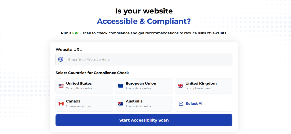
Using Automated Tools for Quick Insights (Accessibility-Test.org Scanner)
Automated testing tools provide a fast way to identify many common accessibility issues. They can quickly scan your website and point out problems that might be difficult for people with disabilities to overcome.
Visit Our Tools Comparison Page!
Run a FREE scan to check compliance and get recommendations to reduce risks of lawsuits
Final Thoughts
ARIA attributes can significantly improve accessibility when used correctly, but they require careful implementation. Start by choosing the right semantic HTML elements, then add ARIA only when needed to provide additional context or functionality. Test thoroughly with assistive technologies to verify that your implementation actually helps rather than hinders users.
Remember the golden rule: “No ARIA is better than bad ARIA.” If you’re unsure about an ARIA implementation, test it with actual assistive technologies or consult with accessibility experts. By avoiding common mistakes and following best practices, you can create web experiences that work well for all users, including those with disabilities. Want to check your site’s current ARIA implementation? Try our free accessibility scanner tool to identify potential issues and get recommendations for improvement.
Want More Help?
Try our free website accessibility scanner to identify heading structure issues and other accessibility problems on your site. Our tool provides clear recommendations for fixes that can be implemented quickly.
Join our community of developers committed to accessibility. Share your experiences, ask questions, and learn from others who are working to make the web more accessible.