WCAG Success Criteria
When navigating a website using only a keyboard, users depend on visual cues to understand their position on the page. WCAG 2.4.7 Focus Visible addresses this need by requiring websites to display clear indicators for elements that receive keyboard focus. These visual markers—whether outlines, color changes, or shadows—enable users with disabilities or those who prefer keyboard navigation to interact with digital content effectively.
Understanding Focus Visible Requirements
Focus indicators act as navigational landmarks, guiding users through interactive elements like buttons, links, and form fields. Their absence creates barriers for individuals who cannot use traditional pointing devices, transforming simple tasks into frustrating challenges.
The Purpose Behind Focus Indicators
Focus indicators bridge the gap between keyboard input and visual feedback. For users with motor impairments, these cues are essential for tasks like form submissions or menu navigation. Screen reader users with partial vision often rely on these indicators to align auditory feedback with visual context, creating a cohesive browsing experience.
Modern design trends sometimes unintentionally remove or obscure focus states. A common example is disabling default browser outlines via CSS without providing alternatives. This practice leaves keyboard users disoriented, particularly when navigating complex interfaces like e-commerce platforms or dynamic web applications.
The consequences of poor focus visibility extend beyond accessibility compliance. Organizations risk legal challenges under laws like the Americans with Disabilities Act (ADA) while alienating users who depend on keyboard navigation. For instance, a study by WebAIM found that 35% of screen reader users also use magnification tools, relying on visible focus states to interact with content.
Minimum Requirements for WCAG 2.4.7 Compliance
WCAG 2.4.7 mandates three core principles for focus visibility. First, every interactive element must display a visible indicator during keyboard navigation. Second, this indicator must maintain a 3:1 contrast ratio against adjacent colors. Third, the focus state must persist until the user moves to another element.
Browser defaults—like Chrome’s blue outline or Firefox’s dotted border—meet basic requirements but often fail in real-world scenarios. A dark blue outline might blend into a similarly colored header, rendering it invisible. Custom focus styles tailored to a website’s color scheme and design language ensure consistent visibility across all components.
Implementation Techniques for Enhanced Focus Visibility
Creating accessible focus indicators involves balancing technical requirements with design aesthetics. While default styles provide a foundation, customization ensures compatibility with diverse user needs and interface complexities.

CSS Solutions Beyond Default Browser Outlines
Modern CSS offers precise control over focus states. The :focus pseudo-class applies styles whenever an element receives focus, regardless of input method. However, this approach affects mouse users, displaying unnecessary outlines during clicks. The :focus-visible pseudo-class resolves this by activating styles exclusively during keyboard navigation, maintaining clean visuals for pointer device users.
Developers often combine outline properties with box shadows to create distinct focus rings. A 3-pixel solid outline with a 2-pixel offset separates elements from their backgrounds, while subtle shadows enhance depth. Transition effects can smooth focus state changes, though rapid animations may disorient users with vestibular disorders.
For backward compatibility, a layered CSS approach ensures broad browser support. Applying base styles with :focus and enhancing them with :focus-visible accommodates older browsers while leveraging modern features where available. This method prevents style conflicts and maintains consistent behavior across platforms.
High Contrast Focus States for Various Elements
High contrast remains critical for focus visibility. A bright orange outline might work on light backgrounds but disappear against similar hues. Testing indicators against all potential backgrounds—including gradients, images, and video content—ensures reliability. Tools like the WebAIM Contrast Checker verify compliance with WCAG’s 3:1 ratio requirement.
Different components demand tailored approaches. Buttons benefit from bold outlines or background shifts, while form fields might combine border changes with inner shadows. Links present unique challenges; replacing default underlines with bottom borders during focus states reduces visual clutter while maintaining clarity. Cards or interactive containers can use scaling transformations or shadow effects to emphasize focus without disrupting layout.
JavaScript Focus Management Patterns
Dynamic interfaces require manual focus control to maintain logical navigation flows. When loading new content—such as search results or modal dialogs—developers must programmatically shift focus to relevant areas. For example, opening a modal should move focus to its first interactive element while trapping navigation within the dialog until closure.
Event listeners for arrow keys, Enter, and Spacebar ensure proper interaction with custom components. Managing focus order from left to right and top to bottom aligns with natural reading patterns, reducing cognitive load. Restoring focus to the last active element after closing a modal preserves user context, enhancing overall usability.

Handling Custom Components and Widgets
Custom-built components often lack inherent accessibility features. A frequent oversight involves using non-semantic HTML elements like divs for buttons without adding ARIA roles or keyboard handlers. Proper implementation requires tabindex attributes to make elements focusable and event listeners to handle interactions.
For example, a custom checkbox built with divs needs role=”checkbox” and aria-checked states to communicate its status. Focus styles should differentiate between checked and unchecked states using border colors or checkmark animations. Complex widgets like dropdowns require arrow key navigation and focus trapping to prevent users from tabbing to inactive page regions.

Using Automated Tools for Quick Insights (Accessibility-Test.org Scanner)
Automated testing tools provide a fast way to identify many common accessibility issues. They can quickly scan your website and point out problems that might be difficult for people with disabilities to overcome.
Visit Our Tools Comparison Page!

Testing Focus Visibility Across Browsers
Consistent focus visibility across browsers and devices remains challenging due to varying default styles and rendering engines. Regular testing identifies issues early, ensuring compatibility with assistive technologies and diverse user preferences.
Common Focus Indicator Failures
Typical failures stem from incomplete CSS overrides. Removing default outlines without replacements renders navigation impossible for keyboard users. Overly subtle styles—like 1-pixel gray borders—may pass automated tests but fail real-world usability checks. Inconsistent styling across components confuses users expecting uniform navigation cues.
Custom components often neglect focus management. Interactive elements built with divs or spans frequently lack tabindex values or keyboard handlers, making them inaccessible. Testing with screen readers like NVDA or VoiceOver reveals these gaps, highlighting areas for improvement.
Browser-Specific Focus Management Issues
Cross-browser differences necessitate targeted strategies. Safari occasionally suppresses focus indicators on form elements, requiring explicit CSS overrides. Firefox’s dotted outlines may lack sufficient contrast against certain backgrounds, demanding custom styling. Mobile browsers handle touch interactions differently, sometimes hiding focus states during hybrid navigation.
Windows High Contrast Mode overrides website styles, potentially hiding custom indicators. Using system colors in CSS ensures visibility regardless of user settings. For example, applying outline-color: Highlight leverages the OS’s selected accent color, maintaining consistency in high-contrast themes.
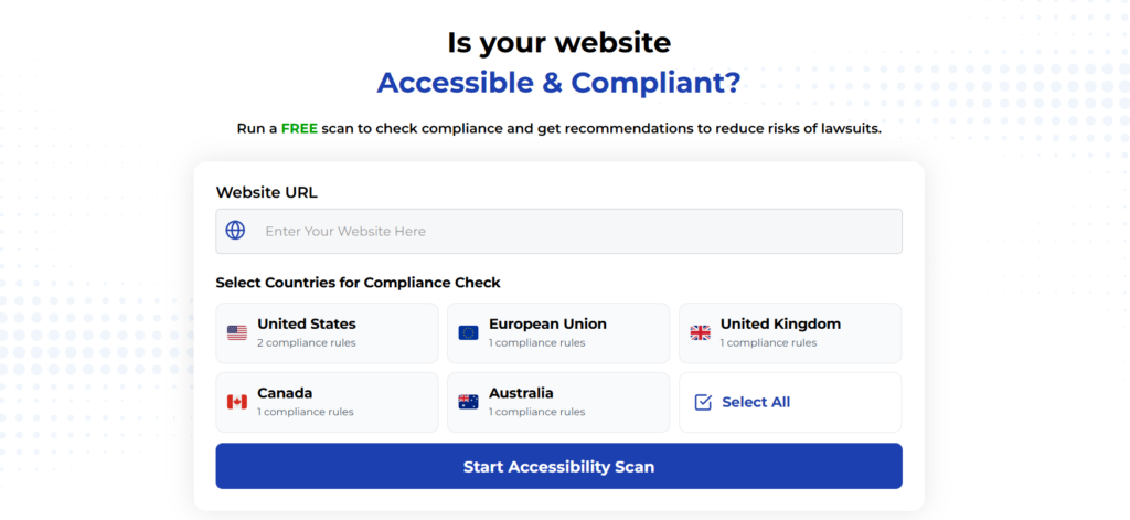
Run a FREE scan to check compliance and get recommendations to reduce risks of lawsuits
Implementing WCAG 2.4.7 Focus Visible transforms keyboard navigation from a basic feature into an inclusive experience. Clear focus indicators empower users with disabilities while enhancing usability for power users and temporary keyboard-only scenarios.
Prioritizing focus visibility demonstrates a commitment to universal design, reducing legal risks and fostering user loyalty. By integrating these practices into development workflows, teams create digital products that are both accessible and aesthetically cohesive.
Run a FREE scan to evaluate your site’s compliance and receive tailored recommendations for improving focus visibility and overall accessibility.


