Why Mobile Accessibility Is Critical in 2025
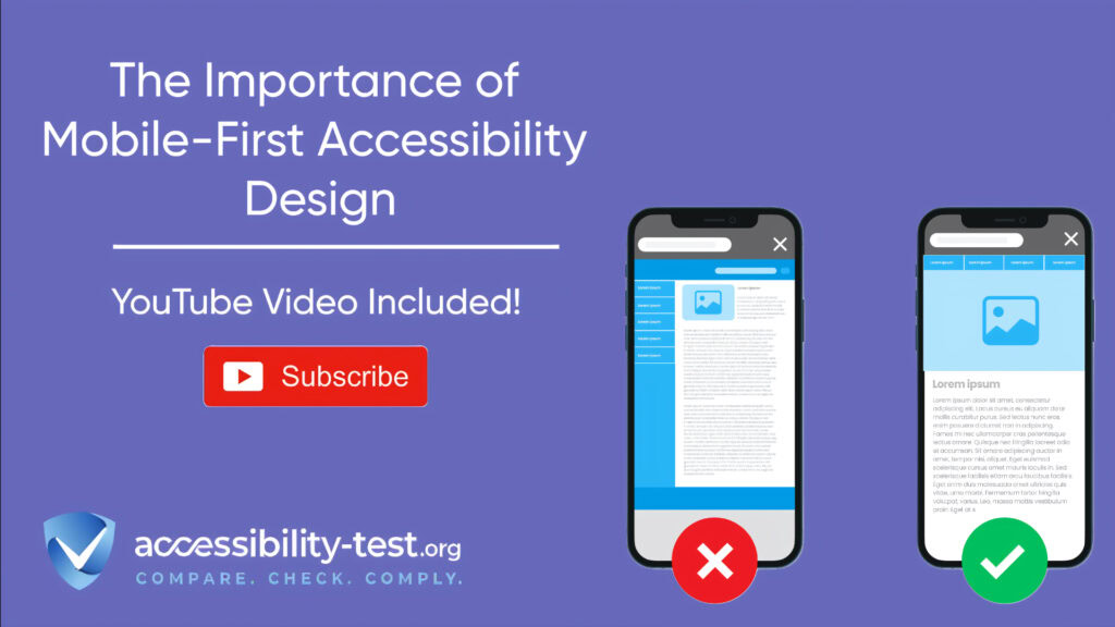
In today’s digital world, most people use their phones to browse the internet. That’s why it’s essential to think about how your website works on mobile devices. Mobile-first accessibility design means building websites that work well for everyone, including people with disabilities, starting with the mobile experience. This approach focuses on creating sites that work perfectly on smaller screens from the beginning, ensuring everyone can use your website regardless of their device or accessibility needs. With over 1 billion people worldwide living with some form of disability, making your site accessible opens your business to a huge market while also helping protect you from potential lawsuits. The number of accessibility lawsuits has increased dramatically in recent years, with many focusing on mobile websites that don’t meet basic standards.
The way people use the internet has changed dramatically in recent years. In 2025, mobile devices are the main way most people get online, and this shift has major implications for website accessibility.
55% of Web Traffic Comes from Mobile Devices
According to the latest data from 2025, between 62.45% and 67.94% of all global internet traffic now comes from mobile devices. This is a huge increase from just a few years ago. Back in 2016, mobile traffic first overtook desktop, and it’s been growing steadily ever since.
The numbers vary depending on where you look. In the United States, mobile traffic accounts for about 56.75% of all web visits. In developing countries, the numbers are even higher – India sees around 80% mobile traffic, and in Sudan, it’s over 90%.
For online stores and e-commerce sites, mobile traffic is especially important, exceeding 70% of all visits. This means that if your website isn’t mobile-friendly, you’re potentially missing out on a large portion of your customers.
This trend isn’t slowing down either. From 2024 to 2025, mobile traffic has grown from 58.7% to nearly 61% of all internet traffic. The message is clear: if you want to reach your audience, you need to focus on mobile.
Common Barriers for Mobile Users (Small Touch Targets, Poor Contrast)
Despite the growing importance of mobile access, many websites still have serious barriers that make them difficult or impossible to use for people with disabilities. Let’s look at the most common problems:
- Small touch targets – This is the number one issue for many users with motor disabilities. When buttons or links are too small (less than 44 pixels), they’re hard to tap accurately. For someone with tremors or limited dexterity, this can make a website completely unusable.
- Poor contrast ratios – Reading text on a mobile screen can be challenging, especially outdoors in bright light. When text doesn’t stand out clearly from its background, it creates problems for people with low vision or color blindness.
- Complex gestures – Some mobile sites require users to pinch, zoom, or use multi-finger gestures. These can be impossible for people with certain physical disabilities.
- Screen-blocking elements – Pop-ups, cookie notices, and sticky headers can take up valuable screen space. When users zoom in, these elements might block important content.
- Missing error messages – When form fields aren’t properly labeled, screen reader users might not know what information is expected or when they’ve made an error.
- Fixed orientation – Some websites only work in portrait or landscape mode. This creates problems for users who have their devices mounted in a fixed position.
- Automatic scrolling and movement – Content that moves or updates automatically can be disorienting and create major barriers for people with cognitive disabilities.
- Content that relies on color alone – Using only color to indicate information (like form errors) makes that information invisible to people who are colorblind.
These barriers affect a wide range of users. Someone with arthritis might struggle with small buttons. A person with low vision might not be able to read text with poor contrast. Someone using a screen reader might miss important information if buttons aren’t properly labeled.
The good news is that all of these problems can be fixed by following established accessibility guidelines. Let’s look at what those guidelines say about creating mobile-friendly websites.ess time on phone calls and paperwork, giving them more time to focus on in-person care.
WCAG 2.2 Guidelines for Mobile Accessibility
The Web Content Accessibility Guidelines (WCAG) 2.2 provide clear rules for making websites accessible. These guidelines are especially important for mobile sites, where screen size and touch interaction create unique challenges.
WCAG 2.2 builds on earlier versions with new requirements that directly affect mobile websites. Many of these updates focus on making sites work better for people using touchscreens, screen readers, and other assistive technologies on mobile devices.
There are three levels of WCAG compliance: A (basic), AA (standard), and AAA (advanced). Most businesses aim for AA compliance, which balances good accessibility with practical implementation. Many countries now legally require at least AA compliance for government and business websites.
Let’s look at some of the most important WCAG 2.2 requirements for mobile sites.
Touch Target Size Requirements (44px Minimum)
One of the most basic but important requirements for mobile accessibility is making sure buttons and links are big enough to tap. According to WCAG 2.2:
- For AA level compliance, interactive elements should be at least 24 x 24 pixels
- For AAA level compliance, they should be at least 44 x 44 pixels
The 44-pixel requirement comes from research about finger size and touch accuracy. Most adult index fingers are about 16-20mm wide, which translates to around 45 pixels on most devices. By making touch targets at least 44 pixels, you ensure that most users can tap them accurately.
This size requirement applies to all interactive elements, including:
- Navigation links
- Form controls (buttons, checkboxes, radio buttons)
- Action buttons
- Dropdown menus
- Close buttons on popups
- Any other element users need to tap
Spacing between touch targets is just as important as their size. WCAG recommends at least 8 pixels of space between targets to prevent accidental taps on the wrong element.
Many designers worry that large touch targets will make their site look clunky, but there are ways to create elegant designs while still meeting the size requirements. For example, you can:
- Make the visual button smaller than the actual tap target
- Use adequate whitespace to separate elements
- Group related actions into menus to save space
- Use gesture controls for secondary actions
Testing touch target size is simple. You can use browser developer tools to measure element dimensions, or try using your site with a touch device to see if buttons are easy to tap.
Voice Navigation Compatibility with TalkBack and VoiceOver
Screen readers are essential tools for blind and low-vision users. On mobile devices, the main screen readers are:
- TalkBack for Android devices
- VoiceOver for Apple iOS devices
These tools read the content of the screen aloud and allow users to navigate using voice commands and gestures. Making your site work well with these screen readers is a key part of mobile accessibility.
Here’s how these screen readers work:
- TalkBack lets users drag a finger across the screen to hear what’s beneath it. Users can then double-tap anywhere to activate the last item read.
- VoiceOver uses specific gestures like three-finger swipes to move between elements, and double-taps to activate items.
To make your site compatible with these tools, you need to:
- Add proper labels to all interactive elements – Every button, link, and form field needs a descriptive text label. This is the most common issue found on mobile sites. Without labels, screen reader users hear generic terms like “button” without knowing what the button does.
- Create a logical reading order – Screen readers move through content in the order it appears in the HTML, not how it’s visually arranged. Make sure your content makes sense when read in this order.
- Use proper heading structure – Headings (H1, H2, H3, etc.) help screen reader users navigate your content. They should follow a logical hierarchy.
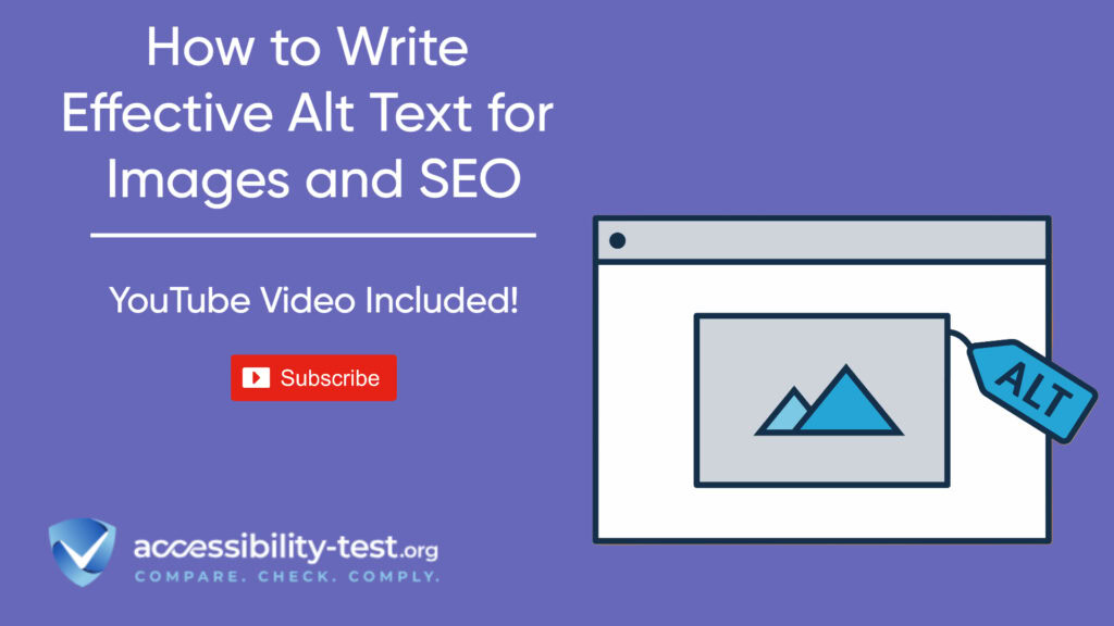
- Describe images with alt text – Any image that conveys information needs a text description that screen readers can read aloud.
- Ensure forms have visible labels – Placeholder text alone isn’t enough, as it disappears when users start typing.
- Test with actual screen readers – The best way to ensure compatibility is to test your site with TalkBack and VoiceOver.
You can turn on TalkBack in Android by going to Settings > Accessibility > TalkBack. On iOS, you can activate VoiceOver in Settings > Accessibility > VoiceOver, or by asking Siri to “turn on VoiceOver.”
Testing with these tools might feel strange at first, but it’s the best way to understand how blind users experience your site. Listen for unclear labels, confusing navigation, or content that doesn’t make sense when read aloud.
Practical Steps to Implement Mobile Accessibility
Now that we understand why mobile accessibility matters and what the WCAG 2.2 guidelines require, let’s look at practical steps you can take to make your mobile site more accessible.
The good news is that you don’t need to rebuild your entire website at once. You can make improvements step by step, starting with the most important issues first.
Here’s a practical approach to improving your mobile site’s accessibility:
- Run an accessibility audit – Start by finding out what issues your site currently has. You can use automated tools like Lighthouse, WAVE, or Axe to identify basic problems.
- Fix the most serious issues first – Focus on problems that completely block access, like unlabeled buttons, keyboard traps, or missing alternative text for important images.
- Create an accessibility statement – Be transparent about your commitment to accessibility and what you’re doing to improve.
- Train your team – Make sure everyone involved in your website understands accessibility basics and how to maintain them.
- Build accessibility into your workflow – It’s easier to create accessible content from the start than to fix it later.
Let’s look at some specific techniques that can make a big difference.
Responsive Design Techniques That Enhance Accessibility
Responsive design is about making websites that adjust to different screen sizes. When done right, it also improves accessibility for all users.
Here are some responsive design techniques that help with accessibility:
- Use relative units instead of fixed pixels – Instead of setting font sizes in pixels (like 14px), use relative units like em or rem. This allows text to resize properly when users zoom in.
/* Avoid this */
p { font-size: 14px; }
/* Do this instead */
p { font-size: 1rem; }
- Create flexible layouts with CSS Grid or Flexbox – These modern CSS tools make it easier to create layouts that adjust to different screen sizes and orientations.
- Set appropriate viewport settings – Make sure your site doesn’t disable zooming, which many users with low vision depend on.
<!– Good viewport setting that allows zooming –>
<meta name=”viewport” content=”width=device-width, initial-scale=1″>
<!– Bad viewport setting that disables zooming –>
<meta name=”viewport” content=”width=device-width, initial-scale=1, maximum-scale=1, user-scalable=no”>
- Use media queries for major layout changes – Adjust your layout at different breakpoints to provide the best experience on each device type.
- Test across multiple devices – Check how your site works on phones, tablets, and desktops with different screen sizes.
Responsive design is more than just making your site look good on mobile – it’s about creating an experience that works well for everyone, regardless of their device or abilities.
Testing Your Mobile Site with Real Users
While automated tests can catch many issues, nothing replaces testing with real people, especially those with disabilities.
Here’s how to set up effective user testing for accessibility:
- Recruit diverse testers – Include people with different disabilities, such as vision impairments, hearing impairments, motor limitations, and cognitive disabilities.
- Create realistic tasks – Ask testers to complete common tasks on your site, like filling out a form or finding specific information.
- Observe without interfering – Watch how testers use your site and note where they struggle.
- Listen to their feedback – Users with disabilities are experts in their own experiences and can provide valuable insights.
- Prioritize fixes based on impact – Focus first on issues that prevent users from completing important tasks.
Some common feedback from users with disabilities includes:
- “Buttons are too small or too close together”
- “I can’t tell which field has an error in this form”
- “The color contrast is too low to read the text”
- “My screen reader doesn’t tell me what this button does”
- “I can’t use this feature because it requires a precise tap”
Don’t worry if you can’t fix everything at once. What’s important is making steady progress and showing that you care about all your users.
Remember that improving accessibility often makes your site better for everyone. Larger touch targets help users with large fingers. Clear error messages help everyone fill out forms correctly. Good contrast helps people using their phones in bright sunlight.
Mobile Accessibility Best Practices Beyond WCAG
While following WCAG 2.2 guidelines is essential, there are many best practices for mobile accessibility that go beyond the minimum requirements. These practices can make your site not just accessible, but truly user-friendly for everyone.
Here are some best practices that will take your mobile site to the next level:
- Provide multiple ways to complete tasks – Give users different options, such as voice input, touch, or keyboard navigation.
- Design for one-handed use – Place important controls within reach of a thumb when someone is holding their phone with one hand.
- Use clear, simple language – Write content that’s easy to understand. Avoid jargon and technical terms when possible.
- Create consistent navigation – Use the same patterns throughout your site so users don’t have to learn new systems on each page.
- Provide feedback for all actions – Let users know when something has happened, through visual cues, sounds, or haptic feedback.
- Respect user preferences – Support system settings like dark mode, text size, and reduced motion.
- Test on real devices – Don’t rely solely on emulators or simulators for testing.
Visit Our Tools Comparison Page!

Designing for Diverse Mobile Input Methods
Mobile users interact with their devices in many different ways. Some tap with their fingers, others use voice commands, and some connect external keyboards or switches. A truly accessible mobile site works well with all these input methods.
Here’s how to support diverse input methods:
- Touch input – Make sure all interactive elements are large enough and well-spaced. Avoid requiring complex gestures like pinch-to-zoom or three-finger swipes for essential functions.
- Voice input – Test your site with voice control features like “Voice Access” on Android or “Voice Control” on iOS. Make sure all actions can be completed with voice commands.
- Keyboard input – Many mobile users connect Bluetooth keyboards or use keyboard cases. Ensure your site works with keyboard navigation, including visible focus indicators and logical tab order.
- Switch control – Some users with severe motor disabilities use switch devices that let them control their phone with just one or two buttons. Test your site with the switch control features built into iOS and Android.
- Screen reader gestures – Screen reader users navigate with specific gestures like swiping left/right or using three fingers. Make sure your site doesn’t conflict with these gestures.
By supporting multiple input methods, you make your site more flexible for everyone. For example, voice input isn’t just for users with disabilities—it’s also helpful for people who are driving, cooking, or simply prefer speaking to typing.
The Importance of Performance for Accessibility
Site performance might not seem like an accessibility issue, but slow-loading pages and jumpy layouts create real barriers for many users, especially those on older devices or slower connections.
Here’s why performance matters for accessibility:
- Cognitive load – Slow sites with jumping layouts can be confusing and frustrating for users with cognitive disabilities or attention disorders.
- Device limitations – Many people with disabilities use older devices because of cost concerns or because their assistive technology works better with certain devices.
- Connection issues – Users in rural areas or developing countries often have slower internet connections.
- Battery concerns – Performance-heavy sites drain batteries faster, which can be a serious problem for users who rely on their device for communication.
To improve mobile performance:
- Optimize images – Use modern formats like WebP and appropriately sized images for different devices.
- Minimize JavaScript – Heavy JavaScript can slow down older devices significantly.
- Reduce layout shifts – Content that jumps around as the page loads is particularly difficult for users with visual or cognitive disabilities.
- Test on low-end devices – Don’t just test on your new iPhone or high-end Android device.
- Monitor Web Vitals – Pay attention to metrics like Largest Contentful Paint (LCP), First Input Delay (FID), and Cumulative Layout Shift (CLS).
Remember that performance optimization and accessibility go hand in hand. Many techniques that make your site faster also make it more accessible, like properly sized images (which help users on slow connections) and minimizing layout shifts (which helps users with cognitive disabilities).
Business Benefits of Mobile Accessibility
Investing in mobile accessibility isn’t just the right thing to do—it’s also good for business. Let’s look at the specific ways that mobile accessibility can benefit your organization.
- Expanded market reach – There are over 1 billion people worldwide with disabilities, representing a huge market. When your mobile site is accessible, you can reach this audience effectively.
- Improved SEO – Many accessibility best practices also improve your search engine ranking. Clear headings, proper alt text, and good site structure help both users with disabilities and search engines understand your content.
- Better user experience for everyone – Features that help users with disabilities often help everyone. Larger touch targets help users with tremors, but they also help users with large fingers or those trying to use their phone while walking.
- Reduced legal risk – The number of digital accessibility lawsuits has increased dramatically in recent years. By making your site accessible, you reduce the risk of costly legal action.
- Cost savings – It’s much cheaper to build accessibility in from the start than to retrofit it later. By considering accessibility early in your design process, you save money in the long run.

Getting Started with Mobile Accessibility Today
Improving your mobile site’s accessibility might seem overwhelming, but you don’t need to do everything at once. Here’s a practical approach to get started today:
- Run a basic accessibility check – Start by understanding where your site currently stands. Use a free tool like Google Lighthouse, which is built into Chrome’s developer tools, to get a quick accessibility score and identify major issues.
- Fix high-impact, low-effort issues first – Some accessibility improvements can be made quickly and have a big impact:
- Add alt text to important images
- Increase font sizes for better readability
- Improve color contrast for text
- Make sure form fields have proper labels
- Create an accessibility statement – Be transparent about your commitment to accessibility and your plans for improvement. This shows good faith and gives users a way to contact you if they encounter problems.
- Set up regular testing – Make accessibility testing a regular part of your development process, not a one-time effort.
- Learn the basics – You don’t need to become an accessibility expert overnight, but learning the fundamentals will help you make better decisions:
- Take a free online course on web accessibility
- Read the WCAG 2.2 guidelines, focusing on mobile-related criteria
- Follow accessibility experts on social media for ongoing tips
If you’re ready to take a more systematic approach, we recommend running a free accessibility scan to check your site’s compliance and get specific recommendations.
Simple First Steps to Improve Your Website
If you’re inspired by these success stories but unsure where to begin, these simple steps can start your accessibility journey:
- Add text descriptions to images so screen readers can describe them to blind users
- Make sure your website works with keyboards, not just mice
- Use headings correctly to create a logical structure
- Make sure text has good contrast against its background
- Provide captions or transcripts for videos
- Write in clear, simple language
- Make forms easy to complete with clear labels and error messages
Even these basic improvements can make a big difference for many users with disabilities. You don’t need to fix everything at once—start with these fundamentals and build from there.
Many businesses begin with an accessibility scan to identify the most pressing issues on their websites. This helps focus efforts on changes that will have the biggest impact.
Accessibility Standards to Follow
Most successful companies align their accessibility efforts with established standards, particularly the Web Content Accessibility Guidelines (WCAG). These internationally recognized guidelines are organized around four principles:
- Perceivable: Information must be presentable to users in ways they can perceive
- Operable: User interface components must be operable
- Understandable: Information and operation must be understandable
- Robust: Content must work with various technologies
WCAG provides three levels of compliance: A (minimum), AA (standard), and AAA (enhanced). Most organizations aim for AA compliance, which balances accessibility with practical implementation.
Other important standards include Section 508 requirements for U.S. federal agencies and the European Accessibility Act for EU countries. Following these standards helps ensure your website meets legal requirements in various places.
Tools and Resources for Testing
Several tools can help you assess your website’s current accessibility level:
- WAVE: A free browser tool that identifies accessibility issues
- Axe: An open-source accessibility testing engine
- Lighthouse: Google’s automated tool for improving web page quality
- Color Contrast Analyzers: Tools that check if your text meets contrast requirements
- Screen readers: Software like NVDA (free) or JAWS that read screen content aloud
Beyond tools, resources like the WebAIM website offer tutorials, articles, and checklists to help you understand and implement accessibility best practices.
Many companies also benefit from adding accessibility statements on their websites, explaining their commitment to accessibility and providing alternative ways for users to access information if they encounter barriers.
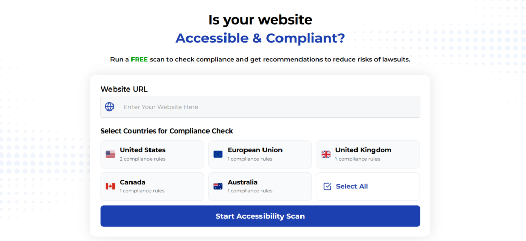
Run a FREE scan to check compliance and get recommendations to reduce risks of lawsuits
Mobile accessibility isn’t just about meeting legal requirements or following guidelines—it’s about creating websites that truly work for everyone. With most internet traffic now coming from mobile devices, it’s more important than ever to ensure your site provides a great experience for all users, including those with disabilities.
The key takeaways from this article include:
- Mobile traffic now accounts for over 60% of all web visits, making mobile accessibility critical.
- Common barriers like small touch targets and poor contrast can make mobile sites unusable for many people.
- WCAG 2.2 provides specific guidelines for mobile accessibility, including requirements for touch target sizes and voice navigation compatibility.
- Implementing responsive design techniques and testing with real users are essential steps in improving mobile accessibility.
- Mobile accessibility benefits businesses through expanded market reach, improved SEO, better user experience, reduced legal risk, and cost savings.
By following the practical steps outlined in this article and running a free compliance scan, you can make your mobile site more accessible to everyone, improve your business metrics, and reduce your legal risk.
The most important thing is to start making improvements today, focusing on changes that will have the biggest impact for your users. Even small improvements can make a big difference for people with disabilities who are trying to use your site.


