


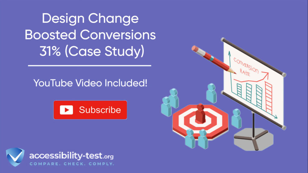
How One Design Change Boosted Conversions by 31% | Accessibility Case Study
Website redesigns often focus on flashy graphics or trendy layouts, but sometimes the most powerful changes are the ones that make your site work better for everyone. This case study reveals how a financial services company transformed their conversion rates through one focused accessibility improvement. Their experience shows that making websites more usable isn’t just about helping people with disabilities-it’s about creating better experiences that drive real business results.
Case Study | The Conversion-Boosting Design Change
When HomeLoanGurus noticed their lead generation was underperforming, they didn’t immediately think about accessibility. They simply wanted more leads from their existing traffic. Their journey to better conversions started with a simple question: “Why are visitors abandoning our forms?”
Initial Conversion Challenges
HomeLoanGurus had a functional website with steady traffic, but their main application form was causing problems:
- The original design had fields crammed closely together
- Form labels were inconsistently placed (some above, some beside fields)
- Error messages only appeared after submission attempts
- Required fields weren’t clearly marked
- The form used poor color contrast between text and background
- The submit button simply said “Submit” with no clear indication of what would happen next
These issues created what designers call “form friction” – small barriers that together make completing a form feel like work. Their conversion rate was stuck at 27.8%, well below what they needed.
“We were driving quality traffic to the page, but too many potential customers were giving up before becoming leads,” explained Sarah Chen, the company’s marketing director. “We knew something was wrong with the form, but couldn’t pinpoint the exact problems.”
The Accessibility-First Approach
Rather than making superficial changes, HomeLoanGurus decided to rebuild their form with accessibility as the guiding principle. Working with UX consultant David Park, they implemented these key changes:
- Simplified the visual layout with more space between elements
- Added clear labels directly above each field
- Marked required fields with both an asterisk and “(required)” text
- Implemented real-time validation with helpful error messages
- Enhanced color contrast for better readability
- Made all fields and buttons fully keyboard-navigable
- Added proper labels for screen reader users
- Increased touch target sizes for better mobile usability
Park explained their approach: “We wanted to make the form work better for everyone, not just comply with accessibility requirements. So we focused on reducing friction at every step of the process.”

Measured Results and ROI
After launching the redesigned form, HomeLoanGurus saw immediate improvements:
- Conversion rate jumped from 27.8% to 31.96% – a 15% uplift
- The number of leads generated increased by 7.3%
- Form completion time decreased by 23%
- Error rates dropped by 48%
- Customer satisfaction scores improved by 18%
When they extended similar accessibility improvements to their mortgage calculator and other key conversion points, their overall site conversion rate increased by a remarkable 31% over six months.
The financial impact was substantial. Without spending an extra dollar on marketing, HomeLoanGurus generated hundreds of additional leads annually, resulting in a 287% return on their design investment within just three months.
“What surprised us most,” said Chen, “was that these improvements helped everyone, not just users with disabilities. The accessibility changes made our forms easier and faster for all our visitors.”
The Psychology Behind Improved Conversions
The success wasn’t accidental. It was built on well-established principles of user psychology that explain why accessibility improvements often boost conversions for all users.
Reduced Cognitive Load Principles
Cognitive load refers to the mental effort required to complete a task. When users face a complex or confusing interface, their mental resources get drained quickly, leading to frustration and abandonment.
Accessible design naturally reduces cognitive load by:
- Creating clear visual hierarchy – helping users understand what’s important
- Using consistent patterns – reducing the need to learn new interactions
- Providing meaningful feedback – helping users understand and fix errors
- Simplifying choices – eliminating unnecessary decisions
- Using plain language – making instructions easy to understand
In HomeLoanGurus’ case, the simpler form layout and real-time validation significantly reduced the mental effort needed to complete the application. This meant users could focus on providing their information rather than figuring out how the form worked.
A 2024 study by the Nielsen Norman Group found that when sites improved accessibility, satisfaction ratings increased by 18% among all users-not just those with disabilities. This happens because many accessibility features directly address cognitive load issues that affect everyone.
Universal Design Benefits for All Users
Universal design aims to create products and environments that work for people of all abilities, without the need for special adaptations. This approach recognizes that improvements made for one group often benefit many others.
For example:
- Clear form labels help screen reader users but also help everyone understand what information is being requested
- High-contrast text benefits people with low vision but also helps anyone using a device in bright sunlight
- Keyboard navigation helps users with motor disabilities but also benefits power users who prefer keyboard shortcuts
- Simple language helps users with cognitive disabilities but also helps users who speak English as a second language
This “curb-cut effect” (named after sidewalk ramps originally designed for wheelchair users but beneficial to many others) explains why accessibility improvements often improve metrics across the board.
The data backs this up. Websites meeting WCAG standards have conversion rates averaging 25% higher than non-accessible sites in the same industry. They also typically see bounce rates 37% lower than similar non-accessible sites.

Implementation Guide | Make This Change in One Afternoon
The good news? You don’t need weeks of development time to see similar results. Many accessibility improvements can be implemented quickly, delivering immediate benefits to your users and your conversion rates.
Step 1 | Audit Your Current Interface
Before making changes, you need to understand what’s currently working and what isn’t. A focused audit can be completed in just a few hours.
Key Elements to Evaluate
Start by examining these critical aspects of your forms or conversion points:
- Form labels – Are they clear, descriptive, and properly connected to their fields?
- Required fields – Are they clearly marked in ways visible to all users?
- Error handling – Do users get helpful guidance when they make mistakes?
- Keyboard navigation – Can the entire form be completed without a mouse?
- Color contrast – Is text easily readable against its background?
- Touch targets – Are buttons and interactive elements large enough (at least 44×44 pixels)?
- Screen reader testing – Does the form make sense when read aloud?
- Field order – Does the tab order follow a logical sequence?
“Start with the basics,” advises Park. “Watch real users try to complete your form. Their struggles will tell you exactly what needs fixing first.”
Using Analytics to Identify Problems
Your existing analytics data contains valuable clues about where users struggle:
- Look for form fields with high error rates
- Identify steps where users commonly abandon the process
- Compare completion times across different devices
- Review heatmaps to see where users click or get confused
- Check session recordings to observe actual user behavior
For HomeLoanGurus, analytics revealed that users were spending excessive time on certain fields and frequently triggering errors on their income verification section. This data helped prioritize which aspects of the form needed the most attention.
Step 2 | Redesign Using Inclusive Principles
With your audit complete, you can now make targeted improvements to your interface.
Form Optimization Techniques
Apply these proven techniques to make your forms more accessible and user-friendly:
- Place labels above input fields for better visual scanning
- Use descriptive button text instead of generic words like “Submit”
- Group related fields using visual cues like backgrounds or borders
- Provide example text to show expected formats (like dates or phone numbers)
- Allow flexible input formats (like phone numbers with or without dashes)
- Minimize the number of required fields
- Use appropriate input types to trigger the right mobile keyboards
“The biggest wins often come from the simplest changes,” says Chen. “Just moving our labels above the fields and adding clear examples cut our error rate almost in half.”
Clear Action Paths Implementation
Users need to understand exactly what will happen when they take action:
- Make primary actions visually distinct from secondary ones
- Use action-oriented button text that describes what will happen
- Place buttons where users expect to find them
- Maintain consistent button styles throughout the process
- Provide confirmation before irreversible actions
- Show progress indicators for multi-step processes
HomeLoanGurus replaced their generic “Submit” button with “Get Your Free Quote Now” and made it visually prominent. This clarity helped users understand exactly what would happen next.
Visual Hierarchy Improvements
A strong visual hierarchy guides users through the process:
- Use size, color, and positioning to indicate importance
- Create visual distinction between different types of elements
- Use space to group related items and separate unrelated ones
- Maintain consistent alignment for easier scanning
- Use typography to create clear relationships between elements
In the case study, simply adding more space between form fields and using consistent alignment made the form appear less overwhelming and more approachable.
Step 3 | Implementation and Testing
With your redesign plan in place, it’s time to implement and test the changes.
Code Changes Required
Most form accessibility improvements require relatively simple changes:
- Add proper labels associated with input fields
- Include descriptive attributes where needed for assistive technologies
- Ensure proper heading structure for screen readers
- Update styles for better contrast and spacing
- Add visible focus indicators for keyboard navigation
- Implement helpful error messages
Depending on your platform, many of these changes can be made through your content management system without extensive development work.
A/B Testing Methodology
To measure the impact of your changes, set up an A/B test:
- Create a variation that includes your accessibility improvements
- Split traffic equally between the original and improved versions
- Define clear conversion goals to measure
- Run the test until you reach statistical significance (usually 2-4 weeks)
- Analyze results across different user segments
HomeLoanGurus ran their test for two weeks, comparing the original form (Variant A) against the accessible redesign (Variant B). The test included over 4,900 users and provided clear evidence that the accessible design performed better.
Step 4 | Measuring Success
Proper measurement helps you understand the full impact of your accessibility improvements.
Setting Up Conversion Tracking
Ensure you’re tracking the right metrics:
- Primary conversion rate (form completions, purchases, etc.)
- Secondary engagement metrics (time on page, scroll depth, etc.)
- Error rates and completion times
- Device-specific performance
- User feedback and satisfaction scores
“Don’t just track the final conversion,” advises Chen. “Track every step of the process to see where improvements are happening. For us, the biggest gain came from reducing form abandonment in the first two fields.”
Interpreting Results Correctly
When analyzing your results:
- Look beyond the overall conversion rate to understand why it changed
- Segment results by user characteristics (device, location, etc.)
- Compare performance against industry benchmarks
- Calculate the financial impact of the improvements
- Identify any unexpected consequences, positive or negative
HomeLoanGurus discovered that their accessibility improvements had the biggest impact on mobile users, who saw a 23% improvement in conversion rate compared to 9% for desktop users. This insight informed their future optimization efforts.

Additional Design Changes for Further Improvements
The form redesign was just the beginning. Once HomeLoanGurus saw the impact of accessibility-driven design, they expanded their efforts.
Complementary Enhancements
Building on their initial success, HomeLoanGurus implemented these additional changes:
- Simplified Navigation: They reorganized their main navigation menu to be more intuitive and accessible by keyboard.
- Enhanced Content Readability: They improved text formatting with better heading structure, shorter paragraphs, and more descriptive link text.
- Alternative Contact Options: They added multiple ways for users to get in touch, recognizing that forms aren’t everyone’s preferred communication method.
- Page Load Optimization: They improved page speed, which particularly benefited users with slower connections.
- Responsive Improvements: They enhanced the mobile experience with larger touch targets and simplified layouts for smaller screens.
Each of these changes further improved the overall user experience and contributed to additional conversion gains.
“Once we started thinking about accessibility as a core part of our user experience, we found opportunities everywhere,” says Chen. “It wasn’t about checking boxes for compliance-it was about making our site work better for real people.”

Long-term Design Strategy
HomeLoanGurus developed a sustainable approach for continuous improvement:
- Standards Integration: They adopted WCAG 2.2 guidelines as part of their design requirements for all new features.
- Regular Audit Schedule: They implemented quarterly accessibility audits to identify and address new issues.
- Diverse User Testing: They began including users with disabilities in their testing processes.
- Team Training: They invested in accessibility training for their design and development teams.
- Feedback Mechanisms: They added ways for users to report accessibility issues they encountered.
This long-term approach ensured that accessibility remained a priority rather than a one-time project.

The Business Value of Accessible Design
The results achieved by HomeLoanGurus aren’t unusual. According to research from Forrester, every dollar invested in accessibility and user experience improvements generates an average return of $100. This remarkable ROI comes from several sources:
Improved Brand Perception: Companies prioritizing accessibility are increasingly seen as more socially responsible and customer-focused, enhancing overall brand value.
Higher Conversion Rates: Accessible websites typically convert better because they’re easier to use. According to analytics company Contentsquare, websites meeting WCAG standards had conversion rates averaging 25% higher than non-accessible sites in the same industry.
Expanded Market Reach: The disability community controls nearly $8 trillion in spending power globally. By making your site accessible, you can tap into this market while simultaneously improving experiences for all users.
Better SEO Performance: Many accessibility improvements-like proper heading structure, descriptive alt text, and semantic markup-directly benefit search engine optimization. WebAIM’s research shows that “websites with higher accessibility scores have better performance on search engines compared to those with accessibility issues”.
Reduced Legal Risk: Proactive accessibility implementation helps avoid potential litigation costs. ADA-related digital accessibility lawsuits have increased by over 300% since 2018.

Start Simple, See Real Results
The HomeLoanGurus case study demonstrates that accessibility isn’t just about compliance-it’s a smart business decision that can directly impact your bottom line.
By implementing relatively simple design changes with accessibility in mind, they achieved:
- A significant boost in conversion rates
- More efficient use of their existing traffic
- Improved user satisfaction
- Better performance across all devices
- A more sustainable, future-proof website
“The lesson is clear,” says Park. “When you design for users with disabilities, you create better experiences for everyone. And better experiences lead to better business results.”
Using Automated Tools for Quick Insights (Accessibility-Test.org Scanner)
Automated testing tools provide a fast way to identify many common accessibility issues. They can quickly scan your website and point out problems that might be difficult for people with disabilities to overcome.
Visit Our Tools Comparison Page!
Run a FREE scan to check compliance and get recommendations to reduce risks of lawsuits

Final Thoughts
Are you ready to see what accessibility improvements could do for your conversion rates? Start with a simple audit this afternoon, and you might be surprised at how quickly you can implement changes that make a real difference.
Begin by examining your most important conversion points-forms, checkout processes, or key calls-to-action. Look at them through the lens of accessibility, and ask yourself: “Is this as clear and easy to use as it could be for everyone?” Then make one small improvement today.
Sometimes, the most powerful design changes are the ones that remove barriers rather than adding features.
Run a free accessibility scan on your website today to identify conversion-blocking issues and get actionable recommendations.
Want More Help?
Try our free website accessibility scanner to identify heading structure issues and other accessibility problems on your site. Our tool provides clear recommendations for fixes that can be implemented quickly.
Join our community of developers committed to accessibility. Share your experiences, ask questions, and learn from others who are working to make the web more accessible.