


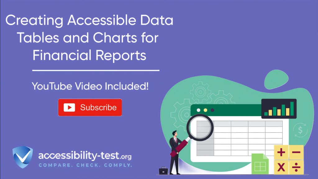
Financial Reports
Financial reports often contain complex data tables and charts that can be difficult for screen reader users to navigate and understand. Making these elements accessible is not just about following standards—it’s about ensuring everyone can access critical financial information regardless of ability. Research shows that 60-70% of digital platforms have accessibility barriers that prevent equal access to information. This article provides practical steps to make your financial data tables and charts accessible, helping you create more inclusive financial reports while reducing legal risks.
Table Accessibility Fundamentals
Tables serve a clear purpose in financial reporting: they organize data in rows and columns to make it easier to understand. While visual users can quickly scan a table, screen reader users navigate line by line, which can make interpreting table data challenging without proper structure.
The foundation of an accessible table is proper semantic markup. This structure helps assistive technologies correctly interpret the relationships between headers and data, allowing users to understand the context of each piece of information.
Header Cell Implementation

Header cells provide context for the data in a table. Properly marking up these headers is essential for screen reader users to understand your financial data.
To implement accessible table headers:
- Use the <caption> element to provide a title for your table. This helps screen readers announce what the table contains before reading its content.
- Mark column headers with <th scope=”col”> and row headers with <th scope=”row”>.
- Ensure each header is unique and descriptive, helping users understand what data each column or row contains.
Here’s an example of properly structured table headers for a financial report:
<table>
<caption>Quarterly Revenue by Department</caption>
<thead>
<tr>
<th scope=”col”>Department</th>
<th scope=”col”>Q1 2025</th>
<th scope=”col”>Q2 2025</th>
<th scope=”col”>Q3 2025</th>
<th scope=”col”>Q4 2025</th>
</tr>
</thead>
<tbody>
<tr>
<th scope=”row”>Sales</th>
<td>$2,500,000</td>
<td>$2,700,000</td>
<td>$3,100,000</td>
<td>$3,400,000</td>
</tr>
</tbody>
</table>
This structure tells screen readers that “Department” is a column header and “Sales” is a row header, providing necessary context for the revenue figures.
Multi-level Header Relationships
Financial tables often have complex structures with headers spanning multiple rows or columns. These relationships must be properly coded to maintain accessibility.
For multi-level headers:
- Use the id attribute on header cells to give them unique identifiers.
- Use the headers attribute on data cells to associate them with their corresponding headers.
- For merged cells, ensure proper relationships are maintained so screen readers understand which headers apply to which data.
For example, a table showing revenue by product category and region might have this structure:
<table>
<caption>Revenue by Product Category and Region</caption>
<tr>
<th id=”empty”></th>
<th id=”north” colspan=”2″ scope=”colgroup”>North Region</th>
<th id=”south” colspan=”2″ scope=”colgroup”>South Region</th>
</tr>
<tr>
<th id=”category” scope=”col”>Product Category</th>
<th id=”northQ1″ headers=”north” scope=”col”>Q1</th>
<th id=”northQ2″ headers=”north” scope=”col”>Q2</th>
<th id=”southQ1″ headers=”south” scope=”col”>Q1</th>
<th id=”southQ2″ headers=”south” scope=”col”>Q2</th>
</tr>
<tr>
<th id=”hardware” scope=”row”>Hardware</th>
<td headers=”north northQ1 hardware”>$250,000</td>
<td headers=”north northQ2 hardware”>$275,000</td>
<td headers=”south southQ1 hardware”>$230,000</td>
<td headers=”south southQ2 hardware”>$260,000</td>
</tr>
</table>
This approach ensures screen reader users understand that “$250,000” is Hardware revenue for North Region in Q1.
Data Cell Association Techniques
For tables to be truly accessible, screen readers must understand the relationships between header cells and data cells. This is especially important for complex financial tables with multiple levels of headers.
Key techniques for proper data cell association:
- Ensure all header cells use appropriate <th> tags with correct scope attributes.
- For complex tables with both row and column headers, use id and headers attributes to establish clear relationships.
- Test with screen readers to verify that these relationships are properly understood.
In Acrobat Pro, you can set these attributes by:
- Right-clicking a header cell in the Tags panel
- Selecting “Properties”
- In the Tag tab, entering a unique ID in the ID field
- Right-clicking related data cells
- Adding the header’s ID in the Headers field
For tables with merged cells or very complex structures, consider simplifying their design or breaking them into multiple simpler tables when possible. This makes the data more digestible for all users, not just those using assistive technology.

Chart Accessibility Solutions
Charts and graphs are common in financial reports but present unique accessibility challenges. Unlike tables, visual charts don’t have built-in semantic structures that screen readers can interpret.
SVG Chart Annotation
SVG (Scalable Vector Graphics) is often used for creating interactive charts in financial reports. To make SVG charts accessible, you need to add semantic information that screen readers can interpret.
One effective approach is to add ARIA table semantics directly to the SVG structure:
- Use a <g> element with role=”table” to represent the table structure of your data.
- Add role=”row” to elements that represent rows of data.
- Use role=”columnheader” for elements that represent column headers.
- Apply role=”cell” to elements containing data values.
Here’s an example of how to structure an SVG line graph with ARIA roles:
<svg>
<title>Monthly Revenue Trends 2024-2025</title>
<g role=”table”>
<g role=”row”>
<text role=”columnheader”>Month</text>
<text role=”columnheader”>Revenue 2024</text>
<text role=”columnheader”>Revenue 2025</text>
</g>
</g>
</svg>
This approach gives screen reader users a structured way to access the data behind the visual chart.
Alternative Data Representations
Beyond making the chart itself accessible, it’s important to provide alternative ways to access the same information:
- Include a text summary of the chart’s key findings directly below the visualization.
- Provide a data table alternative that contains the same information in tabular format.
- Use the <figcaption> element to provide a brief description of what the chart shows.
- For complex financial charts, consider including analysis that highlights key trends or notable data points.
The alt text for the chart should then guide users to the text summary and data table, giving them easy access to the full context.
For example, a chart showing quarterly revenue might include:
<figure>
<img>
<figcaption>Quarterly Revenue Trends 2024-2025</figcaption>
</figure>
<p>Key finding: Revenue increased by 17% year-over-year, with the strongest growth in Q3 2025.</p>
<table>
</table>
This approach ensures all users can access the information, whether they can see the chart or not.

Dynamic Chart Interactions
Many financial charts are interactive, allowing users to hover over data points for more details or toggle between different views. These interactions must also be accessible:
- Ensure all interactive elements are keyboard accessible. Users should be able to tab to data points and trigger the same interactions that mouse users get through hovering.
- Use ARIA live regions to announce dynamic changes when users interact with the chart.
- Provide clear instructions on how to interact with the chart for keyboard and screen reader users.
For example, if your chart shows additional data when users hover over a data point, ensure this functionality also works when users tab to that point and press Enter. The additional information should be announced by screen readers using ARIA live regions.
Financial Reporting Specifics
Financial reports have unique requirements and typically contain specialized tables and charts. Making these accessible requires understanding their specific structures and purposes.
Earnings Statement Tables

Earnings statements contain critical financial information that must be accessible to all users. These tables often have multiple sections and complex relationships between values.
To make earnings statement tables accessible:
- Clearly mark different sections of the statement with appropriate headers.
- Use proper table markup with column and row headers correctly identified.
- Ensure that relationships between items (like totals and subtotals) are programmatically clear.
- For PDF financial statements, ensure tables are properly tagged as table elements with appropriate header cells marked with <TH> tags and data cells with <TD> tags.
For example, in PDF earnings statements, you can:
- Open the Tags panel in Acrobat Pro
- Find the table structure in the tag tree
- Right-click on header cells and select “Properties”
- Set the Type to “TH” for header cells
- Add scope attributes (Row, Column) as appropriate
Interactive Budget Visualizations
Budget visualizations help stakeholders understand financial allocations and spending. These are often highly interactive and visual, presenting special accessibility challenges.
For accessible budget visualizations:
- Provide multiple ways to access the data, including interactive charts and accessible data tables.
- Ensure all visualizations have clear text descriptions explaining their purpose and key findings.
- Make interactive elements fully keyboard accessible with clear focus indicators.
- Provide options to download the data in accessible formats like CSV for users who prefer to analyze it using their own tools.
Budget Visualization Platforms (BVPs) can display current data of approved and adjusted budgets, as well as history and current status of spending. When implementing such systems, focus on:
- User comfort when searching and working with data
- Availability of various visualization tools (interactive graphs, spreadsheets, diagrams)
- Open Data principles for data downloading
- User-friendly and intuitive environment
Best Practices for Financial Data Accessibility
Beyond the specific techniques for tables and charts, there are several best practices that apply to all financial data presentations:
Clear Structure and Hierarchy
Financial reports benefit from a clear structural hierarchy that helps users navigate through complex information:
- Use proper heading levels (H1-H6) to organize content logically.
- Provide a table of contents for lengthy financial reports.
- Use descriptive headings that clearly indicate what information follows.
This structure helps all users, but particularly benefits screen reader users who navigate by headings.
Consistent Design Patterns

Consistency helps users learn how to interact with your financial data:
- Use the same table structure throughout your reports.
- Apply consistent color coding and visual design across similar charts.
- Position explanatory text, legends, and alternative representations in consistent locations.
This consistency reduces cognitive load and helps users know where to find information.
Color and Contrast Considerations
Many financial charts rely heavily on color to distinguish between data series. To make these accessible:
- Ensure sufficient color contrast between different data points, as well as between text and background colors (minimum 4.5:1 contrast ratio).
- Never rely on color alone to convey information. Include additional visual indicators like patterns, shapes, or labels.
- Test your charts in grayscale to ensure they remain understandable without color.
These practices help users with color blindness or low vision, and they also improve readability for everyone.
Testing Accessibility of Financial Data
Creating accessible financial tables and charts is only half the battle—you also need to test them to ensure they actually work for users with disabilities.

Screen Reader Testing
The most authentic way to test table and chart accessibility is with actual screen readers:
- Navigate through your tables using standard screen reader commands.
- Verify that headings, data relationships, and table structure are properly announced.
- Check that charts provide meaningful alternative content.
Common screen readers to test with include:
VoiceOver (built into macOS and iOS)
JAWS (Job Access With Speech)
NVDA (NonVisual Desktop Access)
Keyboard Navigation Testing
Many users with disabilities rely on keyboard navigation:
Test that keyboard shortcuts work correctly for chart interactions.
Ensure all interactive elements in charts can be accessed and activated using only the keyboard.
Verify that focus is visible and follows a logical order.
User Testing with Personas
Testing with representative personas helps ensure your financial data works for actual users:
- Create personas representing different disabilities, such as:
- Jamie: A blind financial analyst using a screen reader
- Alex: A user with ADHD who benefits from clear structure
- Morgan: A user with motor limitations using voice recognition
- Test complete user journeys with these personas, such as:
- Finding specific financial data in a table
- Comparing trends in a chart
- Understanding key financial metrics
This testing approach identifies barriers that might be missed in technical testing alone.
Improving SEO with Accessible Financial Data
Making your financial tables and charts accessible doesn’t just help users with disabilities—it can also improve your search engine rankings.
When you build accessibility into your financial data presentations, you’re also making them more understandable to search engines:
- Proper table structure with semantic HTML helps search engines understand your content.
- Alt text for charts helps search engines index your visual content.
- Clear headings and logical content flow improve content organization, which helps search engines better understand and index your content.
Accessible websites get 37% more traffic from search engines and keep visitors engaged longer, with bounce rates 41% lower than less accessible sites.
Tools for Creating Accessible Financial Data
Several tools can help you create and test accessible financial tables and charts:
Accessibility Checkers
Automated tools can identify many common accessibility issues:
- Adobe Acrobat Pro Accessibility Checker for PDF financial reports
- Axe or WAVE for web-based financial data
- PDF Accessibility Checker (PAC) for PDF compliance
These tools can quickly find issues like missing alt text, improper table structure, or contrast problems.
Accessible Charting Libraries
Some charting libraries have built-in accessibility features:
- Highcharts offers strong accessibility support for financial charts
- Google Charts includes accessibility features
- D3.js can be made accessible with proper implementation
When selecting a charting library for financial data, prioritize those with strong accessibility features.
Data Table Components
For web-based financial reports, consider using accessible data table components:
- React Table includes many accessibility features
- Angular Material tables support screen readers
- jQuery DataTables can be configured for accessibility
These components handle many accessibility requirements automatically, saving development time while improving the user experience.
The Business Case for Accessible Financial Data
Making financial data accessible isn’t just about compliance—it makes good business sense:
- Expand your audience by making financial information available to everyone, including the 61 million adults in the US with disabilities.
- Every dollar invested in web accessibility generates an average return of $100, representing a 99% ROI.
- Accessible financial reports improve SEO performance, leading to better visibility in search results.
- Reduce legal risks associated with inaccessible financial information.
Organizations that implement accessibility solutions report improvements in customer acquisition costs, conversion rates, and customer lifetime value.

Next Steps for Implementation
Ready to make your financial tables and charts accessible? Here’s how to get started:
- Audit your current financial reports to identify accessibility gaps in tables and charts.
- Prioritize fixes based on impact and complexity, starting with critical financial data.
- Implement the techniques discussed in this article, beginning with proper table structure and alternative representations for charts.
- Test with actual assistive technologies to ensure your solutions work in practice.
- Train your team on creating accessible financial data from the start, rather than retrofitting accessibility later.
Making your financial data accessible creates better experiences for all users while helping you meet legal requirements and improve SEO performance.
Using Automated Tools for Quick Insights (Accessibility-Test.org Scanner)
Automated testing tools provide a fast way to identify many common accessibility issues. They can quickly scan your website and point out problems that might be difficult for people with disabilities to overcome.
Visit Our Tools Comparison Page!
Run a FREE scan to check compliance and get recommendations to reduce risks of lawsuits

Final Thoughts
Accessible data tables and charts are essential for creating inclusive financial reports. By implementing proper table markup, providing alternative representations for charts, and ensuring dynamic interactions are accessible, you can make your financial data usable for everyone—including individuals with disabilities. Accessibility is not just a legal obligation; it’s a commitment to transparency, inclusivity, and better user experiences.
When financial information is presented in an accessible way, it empowers all users to make informed decisions, whether they’re investors, stakeholders, or employees. Accessible financial data also enhances your organization’s reputation, improves SEO performance, and reduces the risk of costly lawsuits.
Accessibility is an ongoing process that requires regular testing and updates. By prioritizing accessibility from the start, you can future-proof your financial reports and ensure compliance with standards like WCAG and ADA.
Don’t let accessibility barriers hold your financial reports back. Run a FREE scan today to check your compliance and receive actionable recommendations to improve accessibility. Protect your organization from legal risks while creating a more inclusive experience for all users. Start making your financial data accessible now!