


Accessible Design System
Design systems help teams create consistent user experiences across websites and apps. When we build accessibility into these systems from the start, we make sure everyone can use our products, including people with disabilities.
An accessible design system includes reusable components, clear rules, and testing methods that follow accessibility standards. This helps teams create websites and apps that work for people with different abilities without having to solve the same problems over and over.
Core Components
The building blocks of your design system need accessibility features built right in. These core components form the foundation that teams will use to create accessible experiences.
Button State Definitions
Buttons are some of the most common interactive elements in any interface. To make buttons accessible, you need to define how they appear and behave in different states, including:
- Default state: How the button looks normally
- Hover state: How the button changes when someone moves their mouse over it
- Focus state: How the button shows it has keyboard focus
- Active state: How the button appears when it’s being clicked or tapped
- Disabled state: How the button looks when it’s not available for interaction
For each state, consider not just how it looks, but how people using different assistive technologies will understand the button’s state.
For example, a focus state needs a visible outline with good color contrast so keyboard users can see which button they’re about to activate. But it also needs proper ARIA attributes so screen reader users hear that the button has focus.
Disabled State Contrast
Disabled buttons present a special challenge. They need to look disabled so users understand they can’t interact with them, but they must still have enough contrast to be visible.
Many designers make disabled buttons very light or low contrast, which can make them invisible to people with low vision. Instead, use other visual cues like removing the button’s border or changing its pattern while keeping good color contrast.
Remember that disabled elements should explain why they’re disabled when possible. A screen reader user might not know why a button isn’t working unless your design system includes a way to communicate this information.
Form Field Templates
Forms are often where accessibility problems happen. Your design system should include accessible form templates that developers can use without having to figure out accessibility for each new form.
Good form field templates should include:
- Labels that are properly connected to their inputs
- Error messages that are announced to screen reader users
- Clear focus states for all interactive elements
- Instructions that appear before people need them
- Required field indicators that don’t rely only on color
- Grouping related fields with proper markup
By building these considerations into your form templates, you make it easy for teams to create accessible forms without needing to become accessibility experts themselves.

Navigation Systems
Navigation is a key part of any design system. Accessible navigation systems should:
- Work with keyboard, mouse, touch, and voice control
- Make the current location clear visually and to screen readers
- Provide ways to skip repeated navigation
- Include proper landmark roles
- Scale properly at different zoom levels
- Provide clear focus indicators
Navigation patterns like dropdown menus need special attention to ensure they work with keyboards and screen readers. Your design system should include tested patterns that teams can implement without creating barriers.
Color System
An accessible color system is the foundation of visual accessibility. Your design system should include:
- A color palette with sufficient contrast ratios (minimum 4.5:1 for regular text and 3:1 for large text)
- Rules for text colors against different backgrounds
- Alternative visual indicators beyond color
- Consideration for color blindness
- Testing tools for checking contrast
By building accessibility into your color system, you help ensure that text and interactive elements are visible to people with various vision conditions.
Documentation Standards
A great accessible design system needs more than just well-built components. It needs clear documentation that helps teams use those components correctly.

Accessibility Props Table
For each component in your design system, create a table of accessibility properties that developers need to set. This makes it clear which properties are required for accessibility and which are optional.
For example, a modal dialog component might have these accessibility properties:
| Property | Required? | Purpose | Default Value |
| ariaLabel | Yes | Provides a name for the dialog | None |
| ariaDescribedby | No | Points to element explaining the dialog’s purpose | None |
| autoFocus | Yes | Sets which element gets focus when dialog opens | First focusable element |
| returnFocus | Yes | Returns focus to trigger element when dialog closes | true |
This table helps developers understand what they need to set for each component to be accessible without having to research accessibility requirements themselves.
Usage Guidelines
Even the most accessible components can be used in ways that create barriers. Your design system should include clear usage guidelines that explain how to use components in accessible ways.
Good usage guidelines should include:
- Examples of correct use
- Examples of incorrect use
- Accessibility considerations for different contexts
- Tips for testing the component for accessibility
These guidelines help teams avoid common mistakes that would make otherwise accessible components create barriers for users.
For example, guidelines for a tooltip component might explain that tooltips shouldn’t contain essential information since they may be difficult or impossible to access on mobile devices or with some assistive technologies.
Accessibility Acceptance Criteria
Each component should have clear accessibility acceptance criteria that teams can use to verify their implementations:
- Keyboard testing steps: Specific actions to test keyboard accessibility
- Screen reader testing steps: What to listen for with popular screen readers
- Magnification and zoom testing steps: How to test with screen magnifiers
- High contrast mode testing steps: How the component should behave in high contrast
- Voice control testing steps: Ensuring components work with voice commands
These criteria help teams know when their implementation meets accessibility requirements without guessing or relying solely on automated tests.
Language Guidelines
The words we use in interfaces matter for accessibility. Your design system should include language guidelines that promote clarity and inclusivity:
- Using plain language
- Avoiding idioms and figures of speech
- Creating clear button and link text
- Writing helpful error messages
- Using inclusive terminology
- Maintaining consistent labels
These guidelines help content creators and developers write text that works well for people with cognitive disabilities, non-native language speakers, and screen reader users.
Maintenance Processes
Creating an accessible design system is only the beginning. You also need processes to maintain accessibility as the system grows and changes.
Versioning Strategy
As you update your design system, you need a clear versioning strategy that respects accessibility. Breaking changes to accessibility features should trigger a major version update to signal teams that they need to test their implementations.
Your versioning strategy should:
- Clearly define what counts as a breaking change for accessibility
- Provide migration guides that explain accessibility impacts of updates
- Include accessibility fixes in release notes
- Tag urgent accessibility fixes that should be adopted quickly
This approach helps teams using your design system understand when and how accessibility changes might affect their products.
Audit Scheduling
Regular accessibility audits help ensure your design system continues to meet accessibility standards as it evolves. Schedule these audits as part of your maintenance process, not just as one-time events.
Consider these approaches to audit scheduling:
- Automated testing with each pull request
- Manual testing before each major release
- Expert review quarterly or biannually
- User testing with assistive technology users annually
Document the results of these audits and use them to prioritize accessibility improvements in your roadmap.
Accessibility Champions Program
Creating a network of accessibility champions across teams helps spread knowledge and ownership of accessibility:
- Training program for champions: Equipping people with accessibility skills
- Regular check-ins and knowledge sharing: Keeping knowledge fresh
- Recognition for accessibility contributions: Valuing accessibility work
- Resources for continued learning: Supporting ongoing education
These champions become important advisors for the design system team and help ensure accessibility remains a priority across the organization.
Feedback Channels
Creating clear channels for feedback on accessibility issues helps improve the design system over time:
- Bug reporting process for accessibility issues
- User feedback mechanisms
- Regular accessibility-focused office hours
- Tracking and prioritization system for accessibility issues
Make it easy for teams to report accessibility problems they find and provide a clear process for addressing these issues in future releases.
Implementation Strategies
Building an accessible design system is one thing, but getting teams to use it effectively is another challenge. These strategies can help with successful implementation.
Component Adoption Plan
Create a clear plan for how teams will adopt accessible components:
- Prioritize which components to implement first
- Create migration paths from old components
- Set clear timelines for adoption
- Track adoption across teams
- Celebrate successful implementations
This planned approach prevents haphazard adoption that could leave accessibility gaps in the user experience.
Education and Training
Teams need education to use an accessible design system effectively:
- Training on accessibility basics
- Component-specific accessibility workshops
- Testing techniques for different disabilities
- Resources to learn more about accessibility
- Office hours for accessibility questions
This education helps teams understand not just how to use the components, but why accessibility matters and how to test their work.
Success Metrics
Define what success looks like for your accessible design system:
- Component adoption rates
- Reduction in accessibility issues
- User satisfaction among people with disabilities
- Time saved on accessibility remediations
- Improved accessibility scores in testing
Measuring these metrics helps demonstrate the value of your accessible design system and identify areas for improvement.
Testing Methods
An accessible design system needs thorough testing to ensure it actually works for everyone.
Automated Testing
Automated tests catch many accessibility issues early:
- Integration with design tools to catch issues before development
- Unit tests for component accessibility
- Integration tests for keyboard navigation flows
- Visual regression tests for contrast issues
- CI/CD pipeline integration for continuous testing
While automated tests can’t catch everything, they provide a valuable first line of defense against accessibility regressions.

Manual Testing
Human testing catches issues automated tests miss:
- Keyboard navigation testing
- Screen reader testing
- Magnification testing
- Testing with different browsers and devices
- Testing color contrast in different environments
Create testing protocols for each component that developers and QA specialists can follow to verify accessibility.
User Testing
Nothing replaces testing with real people with disabilities:
- Recruit users with different disabilities
- Create representative tasks to test
- Observe real usage patterns
- Gather feedback on pain points
- Apply learnings to improve components
User testing often reveals unexpected issues that neither automated nor manual testing caught.
Building for Different Needs
Different disabilities require different approaches in your design system.
Vision Accessibility
For people with low vision, blindness, or color blindness:
- High contrast modes
- Screen reader compatibility
- Resizable text without breaking layouts
- Color independence (not relying solely on color for information)
- Support for screen magnifiers
These features ensure that visual information is accessible to people with different vision abilities.
Motor Accessibility
For people with mobility impairments:
- Large touch targets
- Keyboard accessibility
- Voice control compatibility
- Reduced motion options
- Forgiving timing (no quick-disappearing elements)
These features make your interfaces usable for people who may not be able to use a mouse or have precise motor control.
Cognitive Accessibility
For people with cognitive disabilities:
- Clear, simple language
- Consistent navigation and patterns
- Progress indicators
- Error prevention
- Remember user preferences
These features help people who process information differently to use your interfaces successfully.
Language Accessibility
For people who speak different languages or have limited English proficiency:
- Support for right-to-left languages
- Text that translates well
- Avoiding idioms and complex phrases
- Language tags for proper pronunciation by screen readers
- Clear iconography that works across cultures
These features make your interfaces more usable for people from different language backgrounds.
RTL Support in Design Systems
Supporting right-to-left (RTL) languages like Arabic, Hebrew, Persian, and Urdu is an important part of creating a truly accessible design system. Many components need special handling for RTL contexts.
Direction-Aware Components
Make your components aware of text direction:
- Use CSS logical properties instead of physical ones (margin-inline-start instead of margin-left)
- Test all components in RTL context
- Create mirrored versions of directional icons
- Ensure dropdowns and popovers appear from the correct side
- Check that scrolling behaviors work correctly
Components that adapt automatically to text direction create a more natural experience for RTL language users.
Testing RTL Implementations
Thorough testing is necessary for successful RTL support:
- Test with native RTL language users
- Verify keyboard navigation flows logically
- Check screen reader announcements in RTL mode
- Test dynamic content and AJAX-loaded components
- Verify forms and input fields handle RTL text correctly
These testing practices help ensure your components work as expected in RTL contexts.
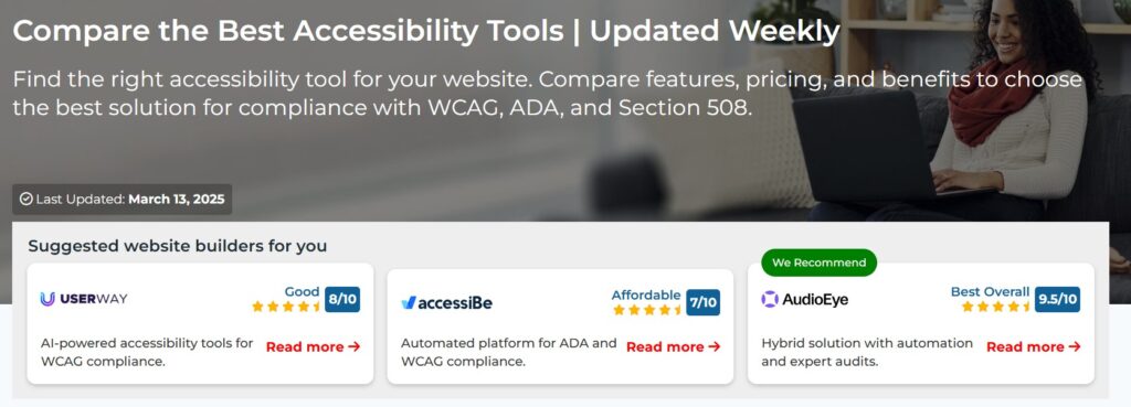
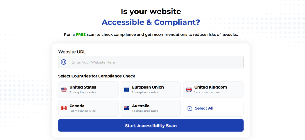
Using Automated Tools for Quick Insights (Accessibility-Test.org Scanner)
Automated testing tools provide a fast way to identify many common accessibility issues. They can quickly scan your website and point out problems that might be difficult for people with disabilities to overcome.
Visit Our Tools Comparison Page!
Run a FREE scan to check compliance and get recommendations to reduce risks of lawsuits
To Conclude Our Accessible Design System Implementation Guide
Building accessibility into your design system from the start creates better experiences for everyone. It saves time, reduces legal risks, and ensures your products work for all users.
By focusing on accessible core components, clear documentation, and good maintenance processes, you can create a design system that helps teams build accessible products without having to become accessibility experts themselves.
Remember that accessibility is an ongoing commitment—keep testing, learning, and improving your design system to ensure it continues to meet the needs of all users.
Run a FREE scan to check compliance and get recommendations to reduce risks of lawsuits.