


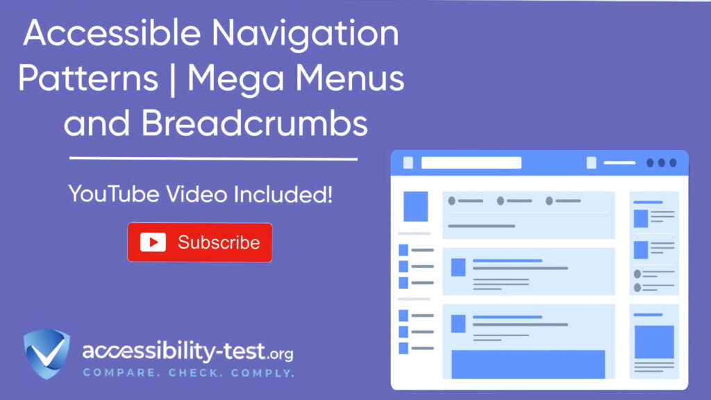

Accessible Navigation Patterns
RTL accessibility has become increasingly important as websites cater to global audiences who use right-to-left languages such as Arabic, Hebrew, Persian, and Urdu. Creating truly inclusive digital spaces means ensuring your website works effectively for users regardless of their language directioNavigation directly impacts how all users access your website content. For users with disabilities, poorly designed navigation can create barriers that make your website virtually unusable. This article focuses on two key navigation patterns—mega menus and breadcrumbs—and how to make them accessible for all users, including those relying on keyboards, screen readers, or other assistive technologies.
Mega Menu Implementation
Mega menus have become a popular choice for content-rich websites and online stores. Unlike standard dropdown menus, mega menus display multiple columns of options simultaneously, providing users with a complete view of available content categories without requiring multiple clicks.
When designed with accessibility in mind, mega menus improve user experience by offering clear pathways to content. However, many implementations create significant barriers for users with disabilities.
Keyboard Trapping Prevention
Keyboard traps occur when keyboard focus gets stuck within an element, preventing users from navigating away using standard keyboard commands. This issue frequently appears in mega menus when focus management isn’t properly implemented.
To prevent keyboard traps in mega menus:
- Ensure users can navigate into the menu using Tab or arrow keys
- Allow navigation through all menu items using keyboard commands
- Provide a clear way to exit the menu (typically using the Escape key)
- Maintain a logical tab order that follows the visual layout
According to WCAG Success Criterion 2.1.2 (No Keyboard Trap), users must be able to navigate to and from all components using a keyboard interface alone. If keyboard focus can move to a component, it must also be possible to move away from that component using only a keyboard.
A correctly implemented mega menu allows users to:
- Navigate out of the menu when reaching the last item
- Use arrow keys to move between items at the same level
- Use Tab to move through all interactive elements
- Press Escape to close the menu and return focus to the trigger element
Column Navigation Flow
Mega menus typically contain multiple columns of options, which can disorient keyboard users if navigation flow isn’t logically structured. Planning a clear navigation path through these columns is essential for accessibility.
For effective keyboard navigation through columns:
- Implement left/right arrow keys to navigate between main categories
- Use up/down arrow keys to navigate within a category’s options
- Ensure tab order flows logically from left to right, top to bottom
- Maintain consistent behavior across all menu sections
Remember that keyboard users experience the menu sequentially, one element at a time, unlike mouse users who see the entire structure at once. This makes predictable navigation patterns even more important.
When implementing multi-level mega menus with subcategories, the disclosure navigation menu pattern often works better than the ARIA menu pattern. The disclosure pattern is more widely supported across different screen readers and provides a more consistent user experience.
Visual Focus Indicators
Clear visual focus indicators are essential for keyboard users to track their position within a mega menu. WCAG 2.4.7 (Focus Visible) requires that any keyboard-operable user interface has a mode of operation where the keyboard focus indicator is visible.
Effective focus indicators in mega menus should:
- Have sufficient contrast with background colors (at least 3:1 ratio)
- Be at least 2 pixels wide to ensure visibility
- Completely surround the focused element without overlapping it
- Remain visible throughout the entire interaction
- Apply consistently across the menu system
Many designers remove default focus outlines for aesthetic reasons without providing adequate alternatives. This creates significant barriers for keyboard users who can no longer track which element has focus.
Consider using multiple visual cues for focus states:
- Background color changes
- Border highlights
- Underlines or other indicators
- Text color changes
Combining multiple visual cues ensures focus states remain perceivable under various conditions and by users with different visual abilities.
Secondary Navigation Elements
While primary navigation handles the main content structure, secondary navigation provides additional context and pathways. Two key secondary navigation patterns are breadcrumbs and skip links.
Breadcrumb Structure
Breadcrumbs are a secondary navigation pattern that shows users their current location within a website’s hierarchy. They provide context and allow quick navigation to higher-level pages.
There are three primary types of breadcrumbs:
- Location-based breadcrumbs: Show the hierarchical position of the current page
- Path-based breadcrumbs: Display the exact path the user took to reach the current page
- Attribute-based breadcrumbs: Show categories related to the current page (common in e-commerce)
For accessible breadcrumb implementation:
- Mark up breadcrumbs using ordered lists to represent their hierarchical nature
- Add proper ARIA labeling to identify the navigation as breadcrumbs
- Use CSS to create visual separators rather than including them in the HTML
- Ensure sufficient color contrast for all breadcrumb text and separators
- Make the current page visually distinct but non-clickable
- Place breadcrumbs consistently across the site, typically at the top of the main content area
Breadcrumbs are particularly valuable for screen reader users, giving them immediate context about their location in the site structure without navigating through the entire page.

Skip Link Optimization
Skip links allow keyboard users to bypass repetitive navigation elements and jump directly to main content or other important sections. They’re essential for keyboard and screen reader users who would otherwise need to tab through numerous navigation items on every page visit.
For effective skip link implementation:
- Position the skip link as the first focusable element on the page
- Ensure it becomes visible when it receives keyboard focus
- Link to main landmarks on the page (main content, search, footer)
- Use descriptive link text clearly indicating the destination
- Verify the link target receives keyboard focus when activated
- Consider multiple skip links for complex pages
A common implementation problem is that skip links remain visually hidden even when focused. This makes them unusable for sighted keyboard users. Ensure your skip links have a visible focus state that appears when the link receives keyboard focus.
Another frequent issue is that skip links don’t actually move keyboard focus to the target element. Make sure the target element is focusable and that keyboard focus moves to it when the skip link is activated.
Mobile Adaptations
As mobile usage continues to grow, creating accessible navigation for smaller screens becomes increasingly important. Mobile navigation presents unique challenges and opportunities for accessible design.
Hamburger Menu Patterns
The hamburger icon (☰) has become standard for collapsed navigation on mobile devices. While this pattern saves space, it can create accessibility barriers if not thoughtfully implemented.
For accessible hamburger menus:
- Ensure the hamburger icon is recognizable, with adequate size (at least 44×44 pixels) and contrast
- Include the word “Menu” alongside the icon for clarity
- Use appropriate ARIA attributes to communicate the menu’s state
- Manage focus correctly when the menu opens and closes
- Provide touch targets large enough for users with motor impairments
- Ensure the menu can be closed via Escape key, tapping outside the menu, or a visible close button
While hamburger menus work well on mobile screens, avoid using them as the primary navigation on desktop screens where there’s adequate space for visible navigation. Research shows that hidden navigation leads to lower discoverability and use.
“Do not use the hamburger menu (or any form of hiding the navigation categories under a single menu) for desktop websites and apps. Out of sight means out of mind,” notes Nielsen Norman Group research. styling automatically. This prevents formatting issues when users switch between languages or paste content from different sources.

Touch Gesture Support
Mobile users primarily navigate through touch, which presents different accessibility considerations than keyboard or mouse navigation.
For accessible touch navigation:
- Provide adequate touch target size (minimum 44×44 pixels)
- Allow sufficient spacing between touch targets to prevent accidental activations
- Avoid relying solely on complex gestures like pinch-zoom or multi-finger swipes
- For essential gestures, provide alternative methods to accomplish the same tasks
- Ensure touch interactions don’t require precise timing or fine motor control
- Test with users who have motor impairments
Remember that many users with motor impairments use touchscreens with assistive devices like styluses or tap with knuckles or other parts of their hands. Design touch interactions that accommodate these diverse interaction methods.
Testing Navigation Accessibility
Creating accessible navigation requires thorough testing with different devices, browsers, and assistive technologies.
Keyboard Testing
Thorough keyboard testing is essential for ensuring accessible navigation. Try using your website exclusively with a keyboard:
- Tab through the entire navigation structure
- Activate menus and sub-menus using Enter or Space
- Navigate within menus using arrow keys
- Close menus using Escape
- Use skip links to bypass navigation
- Verify that focus is visible at all times
- Confirm that focus moves logically through the content
Pay special attention to mega menus, which often have complex interaction patterns that can be difficult to navigate with a keyboard alone.
Screen Reader Testing
Screen reader testing reveals how your navigation works for users who can’t see the screen. Test with multiple screen readers (like NVDA, JAWS, and VoiceOver) as they may interpret your code differently.
When testing with screen readers:
- Verify that menu items are announced correctly
- Check that menu state changes (open/closed) are properly announced
- Ensure the heading structure provides proper navigation context
- Confirm that breadcrumbs communicate clearly
- Verify that skip links work as intended
The experience should be intuitive and efficient, allowing screen reader users to understand the navigation structure and move quickly to their desired content.
Mega Menu Semantic Structure
The underlying HTML structure of your mega menu significantly impacts its accessibility. A proper semantic structure ensures that assistive technologies can interpret and present the menu correctly.
Buttons vs. Links
One of the most common accessibility issues in mega menus is the incorrect use of HTML elements:
- Use <button> elements for controls that open/close submenus
- Use <a> (link) elements for items that navigate to new pages
- Never use non-semantic elements like <div> or <span> for interactive elements
This separation follows a fundamental principle: links take users to new pages or locations, while buttons perform actions like toggling menu visibility. Using the right element communicates the expected behavior to assistive technology users.
ARIA States and Properties
When native HTML semantics aren’t sufficient, ARIA attributes can enhance the accessibility of complex mega menus:
- Use aria-expanded to indicate when a submenu is open or closed
- Apply aria-controls to associate a button with the menu it controls
- Consider aria-current to indicate the active page in navigation
- Use appropriate ARIA landmark roles to identify navigation sections
A correctly implemented mega menu button might look like this in its collapsed state:
“Toggle Dropdown” button with aria-expanded=”false” and aria-controls=”megamenu-products”
When expanded, the button’s aria-expanded attribute would change to “true,” signaling to screen readers that the submenu is now visible.
Navigation Consistency
Consistent navigation patterns create predictable experiences that benefit all users, especially those with cognitive disabilities or those using assistive technologies, technical details beyond basic styling. From framework selection to testing methodologies, each decision affects the final user experience.
Pattern Recognition
Users develop mental models of how websites work based on their experiences. Consistent navigation patterns across your site help users build accurate mental models, reducing cognitive load and improving usability.
For consistent navigation:
- Place navigation elements in the same position across all pages
- Use consistent visual design for navigation elements
- Implement consistent keyboard shortcuts and interaction patterns
- Maintain consistent terminology throughout navigation
- Ensure breadcrumbs follow the same format on all pages
This consistency is particularly important for users with cognitive disabilities, who may struggle with unpredictable interfaces, and for screen reader users, who rely on consistent patterns to navigate efficiently.
Visual Hierarchy
Clear visual hierarchy helps users understand the relationship between different navigation elements:
- Use consistent styling to distinguish between primary, secondary, and tertiary navigation
- Apply visual emphasis to indicate the current section
- Group related navigation items visually
- Use white space to create logical separation between navigation sections
- Maintain consistent sizing and spacing throughout the navigation system
These visual cues help users understand the site structure at a glance and make informed navigation choices.
Common Navigation Accessibility Mistakes
Understanding common mistakes can help you avoid them in your own implementations.
Hover-Only Activation
One of the most frequent accessibility issues in mega menus is relying solely on mouse hover to open submenus. This approach completely excludes keyboard users and creates problems for many mobile users.
Always ensure menus can be activated via keyboard and touch, not just hover. The best approach is to make menus activate on both click/keyboard activation and hover (after a short delay).

Missing Focus Management
Poor focus management in mega menus creates a confusing and frustrating experience for keyboard users:
- Focus gets lost when menus open or close
- Focus moves to unexpected locations
- Focus is trapped within the menu with no way to exit
- Focus isn’t moved to the submenu when it opens
Proper focus management ensures keyboard users can predict where focus will go and can navigate efficiently through the menu system.
Insufficient Contrast
Navigation elements with poor color contrast make menus difficult or impossible to use for people with low vision. Ensure all navigation text meets WCAG AA contrast requirements (4.5:1 for normal text, 3:1 for large text).
This applies not just to menu text but also to:
- Separators between menu items
- Icons used in navigation
- Focus indicators
- Background colors used to indicate current section
Over-Complicated Structures
Complex mega menus with multiple levels and columns can overwhelm users, particularly those with cognitive disabilities or those using screen readers.
Consider these alternatives:
- Limit navigation to 2-3 levels when possible
- Use clear category labels
- Group related items logically
- Consider using landing pages rather than deep menu structures
- Provide search as an alternative to navigating complex menus

Advanced Navigation Accessibility
Beyond the basics, several advanced techniques can further enhance navigation accessibility.
Responsive Mega Menu Alternatives
On smaller screens, mega menus often become unwieldy. Consider these accessible alternatives:
- Accordion menus that expand and collapse sections vertically
- Tabbed interfaces that allow users to switch between categories
- Progressive disclosure that reveals options as users navigate deeper
- Full-screen overlay menus that provide adequate space for touch targets
Whichever pattern you choose, maintain consistent keyboard accessibility and focus management across all screen sizes.
Personalization Options
Allow users to customize their navigation experience:
- Options to simplify navigation for users with cognitive disabilities
- Ability to increase text size and spacing for users with low vision
- Settings to adjust contrast or color schemes
- Options to modify menu behavior (e.g., requiring clicks vs. hover)
- Ways to save frequently accessed pages for quick reference
These personalization options benefit not just users with disabilities but all users by giving them control over their experience.
Navigation Search Integration
For sites with complex structures, search functionality can serve as an alternative navigation method:
- Place search in a prominent, consistent location
- Ensure the search input is properly labeled and keyboard accessible
- Consider predictive search to help users with spelling difficulties
- Provide filters to help narrow results
- Ensure search results are keyboard navigable
Search particularly benefits users with cognitive disabilities who may struggle with complex navigation hierarchies, and screen reader users who prefer to search rather than navigate through multiple levels of menus.

Navigation and WCAG Compliance
The Web Content Accessibility Guidelines (WCAG) include several requirements specifically relevant to navigation.
Keyboard Accessibility Requirements
WCAG 2.1 includes multiple success criteria related to keyboard accessibility:
- 2.1.1 Keyboard (Level A): All functionality must be operable through a keyboard interface
- 2.1.2 No Keyboard Trap (Level A): Keyboard focus must not become trapped in any element
- 2.1.4 Character Key Shortcuts (Level A): If a keyboard shortcut uses only letter, punctuation, number, or symbol characters, users must be able to turn it off or remap it
These requirements ensure that users who can’t use a mouse can still navigate your website effectively.
Focus Visibility Requirements
WCAG also addresses how focus should be indicated:
- 2.4.7 Focus Visible (Level AA): Any keyboard operable user interface must have a mode where the keyboard focus indicator is visible
- 2.4.11 Focus Appearance (Level AAA): The focus indicator must have sufficient size and contrast
These requirements ensure that keyboard users can track their position on the page.
Structure and Context Requirements
Other WCAG success criteria relate to navigation structure and context:
- 2.4.4 Link Purpose (In Context) (Level A): The purpose of each link should be clear from the link text or context
- 2.4.5 Multiple Ways (Level AA): More than one way must be available to locate a webpage
- 2.4.8 Location (Level AAA): Information about the user’s location within a set of web pages must be available
These requirements help users understand where they are and how to get where they want to go.
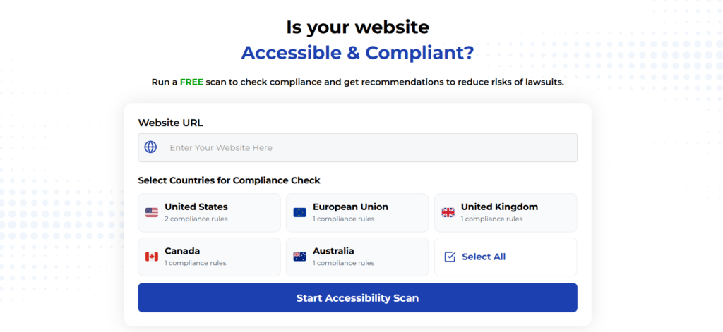
Using Automated Tools for Quick Insights (Accessibility-Test.org Scanner)
Automated testing tools provide a fast way to identify many common accessibility issues. They can quickly scan your website and point out problems that might be difficult for people with disabilities to overcome.
Visit Our Tools Comparison Page!
Run a FREE scan to check compliance and get recommendations to reduce risks of lawsuits
To Conclude The Accessible Navigation Patterns
Creating accessible navigation patterns isn’t just about compliance—it’s about ensuring all users can access your content efficiently and independently. By implementing accessible mega menus and breadcrumbs, you create a more inclusive experience that benefits everyone.
Remember that accessibility isn’t a one-time project but an ongoing commitment. As your website evolves, continue testing and improving your navigation to ensure it remains accessible to all users.
The techniques in this article will help you create navigation systems that work for everyone, regardless of ability or how they interact with your website. By prioritizing navigation accessibility, you create better experiences for all users while reducing legal risk and expanding your audience.
Run a FREE scan to check compliance and get recommendations to reduce risks of lawsuits.