
JavaScript Framework Accessibility
In 2025, creating accessible React applications is no longer optional—it’s essential. With over one billion people worldwide living with disabilities, building React components that everyone can use effectively isn’t just good practice—it’s a business necessity. This article explores how to build React components that work for all users, including those using assistive technologies like screen readers or keyboard navigation.
Core Accessibility Patterns
The foundation of accessible React applications starts with understanding and implementing core patterns that support users with different abilities. These patterns help ensure your components work correctly with assistive technologies and provide a seamless experience for all users.
Accessible Hooks Implementation

React’s hooks system offers powerful ways to add accessibility features to your components without complex class implementations. When properly utilized, hooks can transform how we handle accessibility concerns in React applications.
The React ecosystem includes several accessibility-focused hooks that make implementing accessible components easier. For instance, hooks can help manage focus states, handle keyboard interactions, and control ARIA attributes dynamically based on component state.
Custom hooks can extract repetitive accessibility logic, making it reusable across your application. For example, you might create a hook that handles keyboard event listeners for navigation components, ensuring consistent keyboard access throughout your application.
When implementing custom hooks for accessibility, remember to:
- Keep the hook focused on a single responsibility
- Ensure the hook works with the component lifecycle correctly
- Test the hook with various assistive technologies
- Document how the hook enhances accessibility
Many libraries like React Aria provide pre-built accessible hooks. React Aria offers a collection of behavior hooks that handle accessibility concerns like focus management, keyboard interactions, and proper ARIA attribute implementation. These hooks save development time while ensuring compliance with accessibility standards.
useRef for Focus Management
Focus management is critical for creating accessible React applications, especially for users navigating with keyboards or screen readers. The useRef hook provides a direct way to manage DOM element focus.
When users navigate between pages or interact with dynamic content, maintaining proper focus helps them understand where they are in the application. Without proper focus management, keyboard users can become disoriented when components appear, disappear, or change.
After route changes in single-page applications, users can become disoriented if focus isn’t managed correctly. One effective approach is moving focus to the main heading (h1) of the new page content. This technique:
- Relocates focus to relevant new content
- Avoids leaving focus on non-existent elements
- Prompts screen readers to announce the new page title
Creating a reusable component that handles focus management can standardize this behavior across your application. When implementing focus management:
- Consider focus needs during component mount/unmount
- Maintain focus within modal dialogs and other overlay components
- Ensure focus returns to a logical place when components disappear
- Avoid focus traps except in specific components like modals
Focus management becomes especially important when developing form components, notification systems, and any component that appears or disappears dynamically. Planning your focus strategy early in development prevents accessibility issues later.
ARIA Role Propagation
ARIA (Accessible Rich Internet Applications) attributes provide contextual information about component behavior to assistive technologies. Properly implemented ARIA roles, states, and properties help bridge the gap between visual interactions and how they’re communicated to assistive technology users.
When designing React components, ensure ARIA attributes correctly propagate through your component hierarchy. Components should receive and properly handle ARIA attributes passed as props, ensuring they reach the appropriate DOM elements.
Some key considerations for ARIA implementation in React:
- Use semantic HTML elements whenever possible before reaching for ARIA attributes
- Ensure dynamic ARIA states (like aria-expanded) update with component state changes
- Maintain relationships between elements using aria-labelledby, aria-describedby
- Test ARIA implementations with screen readers to verify they work as expected
Remember that improper ARIA implementation can worsen accessibility rather than improve it. Always start with semantic HTML elements, which have built-in accessibility features, before adding ARIA attributes.
For example, instead of creating a button using a div with onClick handlers, use the native button element. If you must use a div for styling reasons, add role=”button” and ensure it receives keyboard focus and responds to keyboard events.

Complex Component Solutions
Building accessible complex components requires addressing unique challenges beyond basic patterns. Let’s examine how to handle more sophisticated components while maintaining accessibility.
Modal Dialog Patterns
Modal dialogs present particular accessibility challenges because they temporarily block interaction with the rest of the application. For users with assistive technologies, this requires special handling to communicate the state change effectively.
An accessible modal dialog implementation requires:
- Proper role attribution – The modal container should have role=”dialog” to indicate its purpose
- Focus management – Focus must move into the modal when opened and return to the trigger element when closed
- Focus trapping – Keyboard focus must remain inside the modal while it’s open
- Aria attributes – Using aria-modal=”true” and aria-labelledby to reference the modal title helps screen readers understand the content
When implementing modal dialogs in React:
- Create a visually distinct overlay that indicates the main content is inactive
- Ensure the modal can be closed via the ESC key, as well as through explicit close buttons
- Prevent screen readers from accessing background content while the modal is open
- Maintain proper heading hierarchy within the modal
Search result highlights the importance of making modals accessible by adding the proper aria attributes:
<div>
<h3>{title}</h3>
<div>
{children}
<div>
</div>
While the search results provide this code example, remember that we’re focusing on explaining the concepts rather than providing code snippets. The key takeaway is that proper role and aria attributes are essential for making modals accessible.
Dynamic Content Updates
React excels at updating content dynamically, but these updates can create accessibility barriers if not handled properly. When content changes without page navigation, users of assistive technologies need appropriate notifications.
Key considerations for accessible dynamic content updates:
- Use ARIA live regions to announce important content changes
- Maintain focus appropriately when content is added or removed
- Provide visual indicators that complement screen reader announcements
- Ensure loading states are communicated to all users
For instance, when implementing a filtering system that dynamically updates a list, include a live region that announces how many items are now displayed. This helps screen reader users understand what changed without visual reference.
Similarly, when implementing infinite scrolling or “load more” patterns, ensure new content is properly announced to screen reader users and that keyboard focus remains in a logical position.

Form Validation Feedback
Forms present unique accessibility challenges, particularly around error handling and validation feedback. React’s state management makes it possible to create highly accessible form experiences.
When designing accessible form validation:
- Associate error messages with specific form fields using aria-describedby
- Change aria-invalid state when validation errors occur
- Ensure error messages are announced to screen readers at appropriate times
- Provide clear, actionable feedback about how to fix errors
Rather than only showing errors after form submission, consider inline validation that provides immediate feedback as users complete fields. This benefits all users but especially helps those with cognitive disabilities who may struggle to remember and fix multiple errors at once.
Color alone should never indicate validation status—always pair color cues with text and, where appropriate, icons. This ensures users with color blindness can perceive validation feedback.
Form labels deserve special attention in accessible React applications. Always use explicit labels associated with form controls, rather than placeholder text alone, which disappears when users begin typing.
Testing and Optimization
Accessibility isn’t a “set it and forget it” feature. Testing and continuous improvement are essential parts of maintaining accessible React applications.
Jest Accessibility Tests
Automated testing plays a crucial role in maintaining accessibility as your React application evolves. Jest, combined with accessibility testing tools, helps catch issues before they reach production.
Jest-axe is a powerful tool that integrates with Jest to perform automated accessibility testing on your React components. This approach allows you to:
- Add accessibility checks to your existing test suite
- Catch common accessibility violations automatically
- Prevent accessibility regressions when components change
- Create accessibility standards that every pull request must meet
To implement Jest-axe effectively:
- Add accessibility tests alongside other component tests
- Test components in different states to ensure accessibility in all scenarios
- Use the test results to educate team members about accessibility requirements
- Integrate accessibility testing into your CI/CD pipeline
While automated testing catches many issues, it can’t replace manual testing with assistive technologies. Use automated testing as a first line of defense, not the only line.
React Testing Library Patterns
React Testing Library promotes accessibility by encouraging developers to test components the way users interact with them. This approach naturally leads to more accessible component designs.
The library’s guiding principle—testing behavior rather than implementation details—aligns perfectly with accessibility goals. When you test components based on what users can see and interact with, you naturally consider accessibility needs.
React Testing Library prioritizes queries that rely on accessible attributes. For example, using getByRole to find elements encourages developers to use proper semantic HTML and ARIA roles. If these queries can’t find elements in your tests, it suggests that assistive technologies might struggle with your component too.
Some key patterns for accessible testing with React Testing Library:
- Use getByRole queries to find elements by their ARIA roles
- Test keyboard navigation through interactive elements
- Verify that form labels are properly associated with inputs
- Ensure dynamic content changes are perceivable to all users
Testing Library helps reveal accessibility problems during development. For example, if you try to test a custom button implemented as a div without the proper role, the getByRole(“button”) query will fail. This immediately signals an accessibility issue that needs addressing.
Keyboard Navigation and Focus Indicators
Proper keyboard navigation is fundamental to accessibility. Many users rely exclusively on keyboards due to motor disabilities or personal preference.
In React applications, ensure all interactive elements:
- Receive focus in a logical order matching visual layout
- Display clear focus indicators when selected
- Can be activated using standard keyboard interactions
- Support expected keyboard shortcuts for complex components
Focus indicators—the visual cues showing which element has keyboard focus—should be clear and high-contrast. Never remove these indicators through CSS (outline: none) without providing an enhanced alternative, as they’re essential for keyboard users.
Custom components should mimic expected keyboard behavior of native HTML elements. For example, custom dropdown components should support the same arrow key navigation as native select elements.
Accessible Route Changes
Single-page applications built with React often struggle with accessibility during route changes. Without proper handling, keyboard focus can become lost when routes change, confusing users of assistive technologies.
When implementing routing in React applications:
- Announce page changes to screen reader users
- Move focus to the main heading or a skip link after navigation
- Maintain focus position when users navigate back
- Ensure the page title updates to reflect the new content
Libraries like Reach Router provide built-in focus management for route changes, but if you’re using React Router or another routing solution, you’ll need to implement focus management yourself.
Color Contrast and Visual Accessibility
Visual accessibility extends beyond screen reader compatibility. Users with low vision, color blindness, or other visual disabilities rely on well-designed interfaces with proper contrast and clear visual cues.
When designing React components:
- Maintain WCAG-recommended contrast ratios between text and background
- Don’t rely solely on color to convey information
- Ensure text can be resized up to 200% without breaking layouts
- Support operating system high-contrast modes
React’s component-based architecture makes it easier to ensure consistent visual accessibility across your application. Create design system components that have accessibility built-in, then reuse these components throughout your application.
Supporting Screen Readers
Screen readers transform visual interfaces into audio experiences. Supporting screen readers effectively requires careful component design and testing.
Key considerations for screen reader support:
- Use semantic HTML elements that communicate their purpose
- Add descriptive alt text to all images and icons
- Create visible labels for all form controls
- Ensure reading order matches visual order
Test your React components with multiple screen readers, as their behavior can vary. At minimum, test with NVDA or JAWS on Windows and VoiceOver on macOS to catch compatibility issues.
Performance and Accessibility
Performance and accessibility are closely related. Slow or resource-intensive React applications create barriers for users with older devices or those using assistive technologies, which often require additional processing power.
To optimize performance for accessibility:
- Implement code splitting to reduce initial load times
- Minimize unnecessary re-renders of complex components
- Ensure animations are subtle and can be disabled
- Test performance with assistive technologies enabled
React’s virtual DOM can help create performant accessible experiences, but only when used thoughtfully. Large component trees, excessive state updates, or heavy third-party libraries can negate these benefits.

Responsive Design and Mobile Accessibility
Accessible React applications must work across devices, including mobile phones and tablets. Many users with disabilities rely on mobile devices with built-in accessibility features.
When implementing responsive design:
- Ensure touch targets are large enough (at least 44×44 pixels)
- Support both landscape and portrait orientations
- Test with mobile screen readers like VoiceOver and TalkBack
- Verify that pinch-to-zoom isn’t disabled
React’s component model supports responsive design through props and conditional rendering. Create components that adapt to different screen sizes while maintaining accessibility features.

Using Automated Tools for Quick Insights (Accessibility-Test.org Scanner)
Automated testing tools provide a fast way to identify many common accessibility issues. They can quickly scan your website and point out problems that might be difficult for people with disabilities to overcome.
Visit Our Tools Comparison Page!

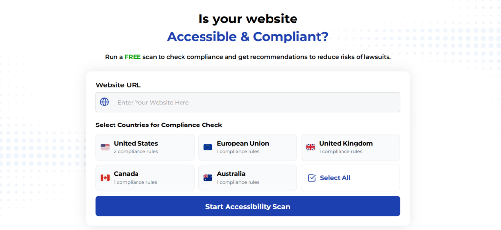
Run a FREE scan to check compliance and get recommendations to reduce risks of lawsuits
To Conclude The React Component Best Practices
Building accessible React components isn’t just about following rules—it’s about creating inclusive experiences that work for everyone. By implementing the patterns and practices outlined in this article, you can ensure your React applications serve all users effectively.
Remember that accessibility is an ongoing process. Technologies change, standards evolve, and user needs vary. Test regularly with real users and assistive technologies, and stay updated with new accessibility techniques specific to React development.
The investment in accessible React components pays dividends in broader reach, legal compliance, and improved user experience for everyone. Start implementing these practices today to create truly inclusive React applications.
Run a FREE scan to check compliance and get recommendations to reduce risks of lawsuits.


