


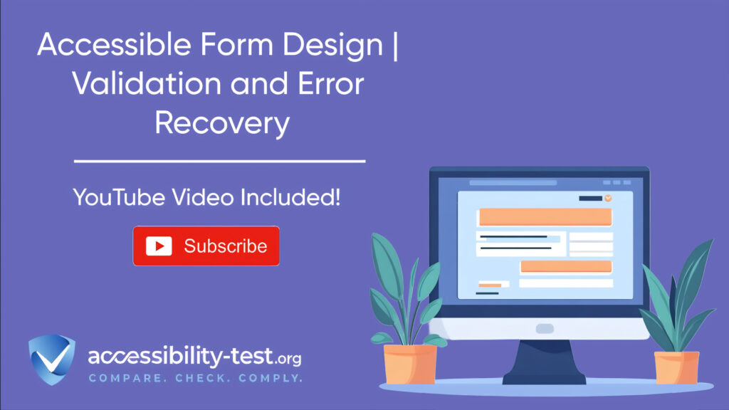

Accessible Form Design | Validation and Error Recovery
Forms are a key part of many websites, letting users sign up, buy things, or share information. But poorly designed forms can stop many people from using your website, especially those with disabilities. This article shows you how to build forms everyone can use, with clear steps on how to set up proper validation and ways to help users fix mistakes.
The Anatomy of Accessible Form Fields
Creating forms that work well for everyone starts with building each form field correctly. Each part of a form field plays an important role in helping users understand what information they need to provide.
Label Association Techniques
Every form field needs a proper label that clearly tells users what information they should enter. Without clear labels, users with screen readers might not understand the purpose of a field.
There are two main ways to connect labels with form fields:
- Using the “for” attribute: This links the label to the form control using matching ID values.
<label for=”username”>Username</label>
<input id=”username” type=”text”>
- Nesting the input inside the label: This creates an automatic connection between the label and the form control.
<label>
Email address
<input type=”email”>
</label>
Both methods work well, but the first option often creates cleaner code and better layout options. When using either method, make sure the label text clearly describes what information is needed.
Labels should not disappear when a user starts typing. This means you shouldn’t rely only on placeholder text as your label, since this text goes away once a user begins entering information.

Input Field Accessibility Attributes
Beyond just having labels, form fields need several other features to work well for all users:
Required Field Marking
When some fields are required, you need to clearly show which ones users must fill in. The most clear way to mark required fields is to add “(required)” directly in the label text:
<label for=”email”>Email address (required)</label>
This approach is better than just using an asterisk (*) because it’s clearer to all users, including those using screen readers.
Help Text
Many form fields need extra information to help users understand what to enter. This help text should be connected to the form field using the aria-describedby attribute:
<label for=”password”>Password (required)</label>
<input type=”password” id=”password” aria-describedby=”password-help”>
<p>Use at least 8 characters with a mix of letters, numbers, and symbols.</p>
This connection ensures screen readers will announce the help text when a user focuses on the field.
Input Types and Attributes
Using the right HTML input types helps browsers provide the right keyboard and validation for different kinds of information:
<input type=”email”>
<input type=”tel”>
<input type=”number”>
Adding the autocomplete attribute helps users by filling in information they’ve entered before:
<input type=”text” autocomplete=”name”>
<input type=”email” autocomplete=”email”>
<input type=”tel” autocomplete=”tel”>
This feature is especially helpful for users with memory or motor difficulties, as they won’t need to type the same information repeatedly.
Implementing Accessible Form Validation
Form validation checks that users have filled in all the required information correctly. When done right, validation helps users complete forms successfully without frustration.
Client-Side Validation Best Practices
Client-side validation happens directly in the browser, providing quick feedback to users. However, there are important rules to follow when implementing it:
When to Validate
The best time to validate a form is when the user tries to submit it by clicking the submit button – not while they’re still typing. Showing errors while someone is in the middle of typing can be frustrating and confusing, especially for:
- People who type slowly
- Users with cognitive disabilities
- People using screen readers
- Anyone using voice input software
This approach lets users complete their thoughts before seeing any error messages.
Clear Error Messages
Error messages should be specific and helpful, telling users exactly what went wrong and how to fix it:
❌ “Invalid input” (too vague)
✅ “Please enter a valid email address, such as name@example.com“
Good error messages use plain language and avoid technical jargon that might confuse users.
Using ARIA to Communicate Validation States
ARIA (Accessible Rich Internet Applications) attributes help screen readers understand the state of form fields, including whether they have errors:
Marking Invalid Fields
When a field has an error, add the aria-invalid=”true” attribute to tell screen readers that something is wrong:
<input type=”email” id=”email” aria-invalid=”true” aria-describedby=”email-error”>
<p>Please enter a valid email address.</p>
The combination of aria-invalid and aria-describedby ensures users will know both that there’s an error and what the error is.
Error Message Connection
Every error message must be connected to its field using aria-describedby:
<div>
<label for=”phone”>Phone number</label>
<input type=”tel” id=”phone” aria-invalid=”true” aria-describedby=”phone-error”>
<p>Please enter a 10-digit phone number.</p>
</div>
This setup ensures screen readers will announce the error message when a user focuses on the field with the error.
Server-Side Validation Error Handling
Server-side validation happens after the form is submitted, checking the data on the server. This type of validation is important for security, but needs to be implemented with accessibility in mind.
When a form fails server-side validation, the page typically reloads with error messages. To make this process accessible:
- Display clear error messages at the top of the form
- Keep all the information the user already typed in the form
- Focus the user’s keyboard on either the error summary or the first field with an error
- Make sure all error messages are properly connected to their fields
Server-side validation should work together with client-side validation to create a smooth experience for all users.

Maintaining Form Data After Submission Errors
One of the most frustrating experiences for users is losing all their information after submitting a form with errors. This is especially difficult for users with motor or cognitive disabilities who may have spent significant time filling out the form.
Always keep the user’s input when returning an error:
<input type=”text” name=”username” value=”<?php echo htmlspecialchars($submitted_username); ?>”>
This approach respects users’ time and effort by not forcing them to re-enter information they’ve already provided.
Error Recovery Patterns for Maximum Usability
Even with the best form design, users will sometimes make mistakes. Good error recovery helps all users understand and fix these mistakes easily.
Error Summary Implementation Techniques
When a form has multiple errors, a summary at the top of the page helps users understand all the issues at once. According to best practices from the search results:
For Multiple Errors
When there’s more than one error, create a summary at the top of the form that:
- Uses a heading like “There were problems with your submission”
- Lists each error with a link to the corresponding field
- Has a distinctive appearance (using color, borders, and icons)
- Gets keyboard focus when the page loads
Example HTML for an error summary:
<div>
<h2>There were problems with your submission</h2>
<ul>
<li><a href=”#email”>Please enter a valid email address</a></li>
<li><a href=”#password”>Password must be at least 8 characters long</a></li>
</ul>
</div>
The links in the summary should jump directly to the corresponding field when clicked, making it easy for users to find and fix each error.
For Single Errors
When there’s only one error, you don’t need a summary. Instead, focus the keyboard directly on the field with the error so users can fix it right away.
ARIA Live Regions for Dynamic Error Messages
Live regions are special areas of a page that can announce changes to screen reader users, even when their focus is elsewhere on the page. They’re perfect for dynamically updating error messages without requiring a full page reload.
Types of Live Regions
There are different types of live regions for different situations:
- Status messages (role=”status” or aria-live=”polite”): For non-urgent information like validation feedback. These wait until the screen reader finishes what it’s currently saying before announcing the update.
- Alert messages (role=”alert” or aria-live=”assertive”): For urgent information like critical errors. These interrupt the screen reader to announce the message immediately.
Example implementation for form validation feedback:
<div>
<label for=”username”>Username (required)</label>
<input type=”text” id=”username” required aria-describedby=”username-status”>
<div></div>
</div>
<script>
// When validation runs:
document.getElementById(‘username-status’).textContent = ‘Username is available!’;
// Screen readers will announce this message
</script>
The role=”status” attribute creates a live region that will announce updates to screen reader users in a non-intrusive way.

Best Practices for Live Regions
To use live regions effectively:
- Create the live region in the HTML before you need it (don’t add it dynamically)
- Update only the text content inside the region, not the region itself
- Keep messages clear and concise
- Use polite for most form validation messages and assertive only for critical errors
- Test with actual screen readers to make sure the announcements work as expected
Live regions are particularly useful for instant feedback during form interactions, such as checking if a username is available or validating a credit card number without a full page reload.
Form Accessibility Testing
Testing is an important step in making sure your forms work for everyone. Here are key things to check:
Keyboard Navigation Testing
Try completing your form using only the keyboard (no mouse):
- Can you reach all fields using the Tab key?
- Can you activate buttons with Enter or Space?
- Do error messages get announced properly?
- Can you navigate between fields with errors easily?
Screen Reader Testing
Test your form with at least one screen reader:
- Do all fields have clear labels?
- Are required fields announced as required?
- Are error messages read out when they appear?
- Does the error summary work properly?
Visual Testing
Check that your form is visually clear:
- Do error states stand out visually (not just with color)?
- Is there enough contrast between text and background?
- Are required fields clearly marked?
- Is the form layout clear and consistent?
Regular testing with real users, especially those who use assistive technologies, will help you find and fix issues before they affect your visitors.
Building Accessible Forms | A Step-by-Step Approach
Let’s put everything together into a step-by-step process for creating accessible forms:
- Start with proper HTML structure
- Use semantic elements like <form>, <fieldset>, and <legend>
- Group related fields together
- Follow a logical tab order
- Add clear labels and instructions
- Connect labels to fields using for attributes
- Mark required fields clearly in the label text
- Provide help text for complex fields
- Implement proper validation
- Validate when the user submits the form, not while typing
- Use both client-side and server-side validation
- Connect error messages to their fields
- Create helpful error recovery
- Show a summary for multiple errors
- Use ARIA live regions for dynamic updates
- Maintain user input after submission errors
- Test with real assistive technologies
- Check keyboard navigation
- Test with screen readers
- Ensure all states and errors are properly announced
Following these steps will help you create forms that work well for all users, including people with disabilities..

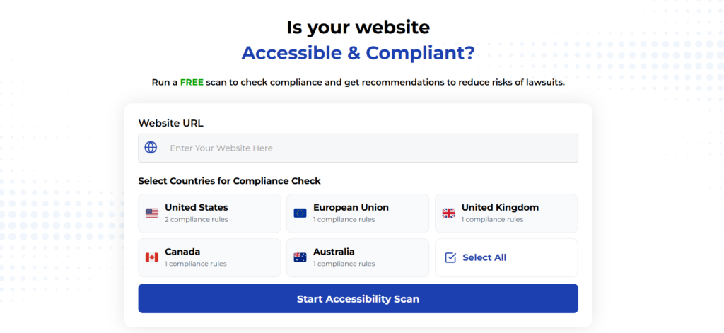
Using Automated Tools for Quick Insights (Accessibility-Test.org Scanner)
Automated testing tools provide a fast way to identify many common accessibility issues. They can quickly scan your website and point out problems that might be difficult for people with disabilities to overcome.
Visit Our Tools Comparison Page!
Run a FREE scan to check compliance and get recommendations to reduce risks of lawsuits
Creating accessible forms isn’t just about following rules—it’s about making sure everyone can use your website. By paying attention to details like proper labels, clear error messages, and helpful validation, you build forms that work better for everyone.
Remember these key points:
- Connect labels properly to form fields
- Tell users clearly which fields they must fill in
- Check form information when users submit, not while they’re typing
- Show helpful error messages that explain how to fix problems
- Keep users’ information when they need to fix mistakes
- Use ARIA to make sure screen readers announce important updates
By applying these practices, you’ll create forms that more people can use successfully, leading to better outcomes for both your users and your website goals.
Run a FREE scan to check compliance and get recommendations to reduce risks of lawsuits.