


Accessibility and Its Importance
Web accessibility refers to the practice of designing and developing websites that can be used by all individuals, regardless of their abilities or disabilities. This concept extends to various physical, cognitive, and perceptual disabilities, ensuring that everyone has equal access to information and functionality on the internet. In an increasingly digital world, the importance of accessibility cannot be overstated, as it directly influences the ability of a significant portion of the population to engage with online content effectively.
Access barriers can manifest in numerous ways, including inadequate navigation, poor text contrast, or the absence of alternative text for images. These obstacles hinder individuals with disabilities from fully experiencing the web, often resulting in exclusion from crucial online resources, services, and opportunities. Studies indicate that approximately 15% of the global population experiences some form of disability, emphasizing the necessity of web designers and developers to prioritize accessibility in their projects.
Creating an inclusive online environment is not only a moral obligation, but it is also increasingly becoming a legal requirement. Various regulations, such as the Americans with Disabilities Act (ADA) in the United States and the Web Content Accessibility Guidelines (WCAG) internationally, underline the need for websites to be accessible. Non-compliance with these guidelines can lead to legal repercussions and damage a company’s reputation.
Moreover, fostering a culture of accessibility can enhance user experience for all visitors, not just those with disabilities. By acknowledging and addressing the unique needs of diverse users, organizations can create more engaging, user-friendly sites that cater to a broader audience. In light of these factors, it is essential to recognize the ethical and legal implications of web accessibility and strive towards making the internet a more equitable space for everyone.

Mistake 1 | Poor Use of Alternative Text
Alternative text, commonly referred to as alt text, serves as a textual replacement for images on the web. This feature is vital for conveying the content and function of images to users who are visually impaired or utilize screen readers. When alternative text is either omitted or poorly executed, it not only hinders accessibility but also affects user experience and search engine optimization. Therefore, understanding the appropriate use of alternative text is essential for anyone involved in web design and content creation.
One prevalent mistake is the practice of using generic phrases such as “image” or “picture” as alt text, which fails to provide meaningful context. For instance, an image depicting a sunset over the ocean should have alt text that summarizes its content more effectively, such as “A vibrant sunset casting orange and pink hues over a serene ocean.” This detailed description allows users with visual impairments to visualize the image, thereby enhancing their overall browsing experience.
Effective alt text should be concise but descriptive, ideally consisting of 125 characters or less, to ensure it is easily processed by screen reader technology. It should convey the essential message while omitting unnecessary details, such as “this is a picture of.” Furthermore, it’s important to consider the function of the image. If it serves as a link, the alt text should describe the action the link performs rather than outlining the image itself.
In summary, the proper use of alternative text is a critical component in creating an inclusive web environment. By following these guidelines and using clear, descriptive language for alt text, web creators can significantly improve accessibility, benefiting not only visually impaired users but also enhancing overall usability and search engine performance.
Mistake 2 | Inadequate Color Contrast
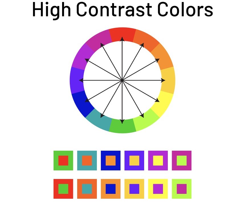
One of the most pervasive accessibility mistakes is inadequate color contrast between text and background elements on a webpage. Insufficient contrast is problematic, particularly for users with visual impairments, including color blindness, who may struggle to discern text from its background. This issue can significantly hinder readability and overall user experience. According to the Web Content Accessibility Guidelines (WCAG), a minimum contrast ratio of 4.5:1 for normal text and 3:1 for large text should be maintained to ensure accessibility.
To address this issue, it is essential to evaluate the color contrast of your site’s text and backgrounds. Various online tools can be utilized to test color contrast effectively. Tools such as the Contrast Checker or WebAIM’s Color Contrast Checker allow users to input color hex codes and determine if they meet the necessary guidelines. These tools typically provide feedback on the contrast ratio and its compliance with WCAG criteria, thereby aiding in identifying colors that may need adjustment.
Enhancing color contrast doesn’t merely involve selecting darker text on a lighter background; it requires a thoughtful approach to color selection and combinations. When designing, consider using high-contrast colors and avoid combinations known to create confusion, such as green text on a red background, which can be particularly problematic for individuals with red-green color blindness. Additionally, employing patterns or texture variations alongside color can help convey information in a more accessible manner, further assisting users who may have difficulty differentiating color variations.
By prioritizing adequate color contrast, you are not only enhancing accessibility for visually impaired users but also improving overall readability for all visitors. This simple adjustment does not require extensive resources or time, yet it holds the potential for profound impacts on inclusivity and user satisfaction.
Mistake 3 | Lack of Keyboard Navigation
One of the most significant oversight in web accessibility is the failure to implement proper keyboard navigation. Many users, especially those with mobility impairments, depend exclusively on a keyboard to interact with digital content. This reliance stems from various conditions, including limited hand dexterity or the inability to use standard input devices such as a mouse. Consequently, when web developers neglect keyboard accessibility, they inadvertently exclude a substantial group of users from fully engaging with their sites.
Ensuring that all interactive elements of a website can be navigated using only a keyboard is paramount. Universal design principles dictate that every component, from buttons and links to forms and menus, should be operable without mouse input. This can be achieved by following established web standards, such as the Web Content Accessibility Guidelines (WCAG), which provide comprehensive instructions on creating a keyboard-friendly interface.
To implement effective keyboard navigation, developers should first ensure that every functional element is reachable through standard keyboard keys, particularly the Tab, Enter, and Escape keys. It is also essential to maintain a logical tab order, enabling users to navigate through elements in a predictable manner. Avoiding keyboard traps—where a user becomes stuck in an interactive element—should be a key consideration in the design process.
Common pitfalls to avoid include placing essential navigation elements in unexpected locations or relying solely on mouse events for functionality. Additionally, providing visual indicators for focused elements, such as outlines or background changes, can greatly enhance the user experience, allowing keyboard users to discern their current position within a webpage.
By addressing keyboard navigation as a core aspect of accessibility, website owners can create an inclusive environment that caters to all users, ensuring a seamless browsing experience regardless of their physical abilities.
Mistake 4 | Insufficient Headings Structure
Inaccessible content often stems from poor heading structures, which can considerably impair user experience, particularly for individuals utilizing screen readers. An effective heading hierarchy is crucial for guiding users through content, enabling them to quickly locate relevant sections. Without a logical framework, users may struggle to decipher the organizational flow or context of the information presented. A disorganized heading structure can lead to confusion, as screen reader users depend on headings to navigate and understand the document’s layout.
Proper heading usage begins with a clear hierarchy. The top-level heading should utilize <h1> tags, typically appearing once on a page, followed by <h2> for major sections and <h3> for subsections. This tiered approach not only benefits screen reader users but also improves overall SEO, as search engines reward well-structured content. Conversely, incorrect heading usage, such as skipping levels or utilizing headings solely for stylistic purposes, can result in a disjointed reading experience.
Consider the following examples to illustrate proper versus improper heading usage:
- Proper Usage:
<h1>Understanding Accessibility</h1><h2>Common Accessibility Mistakes</h2><h3>Insufficient Headings Structure</h3> - Improper Usage:
<h2>Mistake 4</h2><h1>Accessibility Issues</h1><h3>Consequences of Poor Headings</h3>
In these examples, the first showcases a logical hierarchy, while the second disrupts the cohesive flow of information. Adhering to these guidelines fosters improved accessibility, ensuring that all users can effectively navigate and comprehend the content presented.
Mistake 5 | Non-Descriptive Link Text
One of the most prevalent accessibility mistakes in web design is the use of non-descriptive link text. This issue arises when links are labeled with phrases like “click here” or “read more,” which fail to provide context regarding the linked content. Such generic texts do not inform users about the purpose or destination of the link, thereby reducing usability, particularly for individuals using assistive technologies such as screen readers.
For users who rely on assistive devices, descriptive link text plays a crucial role in navigating web content effectively. When screen readers encounter link text, they typically read out the text along with a contextual description. If the link text is vague, users may become disoriented, leading to frustration and a decreased ability to access important information. Instead of aiding navigation, non-descriptive links may inadvertently act as barriers, isolating users from the content.
To improve accessibility, it is vital to adopt link text that conveys explicit information about the target page or action. For example, instead of using “click here,” consider using “download the annual report” or “view our services.” These alternatives provide clear guidance regarding what readers can expect upon following the link, enhancing both usability and the overall user experience.
Furthermore, a good practice is to ensure that each link is unique within its context. Repeating link texts throughout a page or site can lead to confusion as users might struggle to recall the specific content associated with each link. Therefore, the objective should be to articulate descriptive link texts that succinctly promise value to the user.
In conclusion, prioritizing descriptive link text not only improves accessibility for users of assistive technologies but also enhances the overall user experience. By implementing these practices, website owners can ensure clearer navigation and increase engagement across their digital platforms.
Testing and Tools for Accessibility Compliance
Ensuring that websites meet accessibility standards necessitates a thorough evaluation using a combination of automated tools and manual testing methods. Automated accessibility evaluation tools are designed to quickly identify common issues that could hinder users with disabilities. Some of the most popular tools include WAVE, Axe, and Lighthouse. These tools analyze web pages and highlight potential accessibility errors, such as missing alternative text for images or poor color contrast. Utilizing these tools helps developers and designers get an initial assessment of their site’s compliance with accessibility standards like WCAG (Web Content Accessibility Guidelines).
However, while automated tools are invaluable, they cannot identify all accessibility issues. This is where manual testing techniques play a crucial role. Manual testing involves real users interacting with the website, whether they have disabilities or not. Observing how users navigate can reveal insights that automated tools may miss, such as unclear labeling of buttons or ineffective site navigation. Engaging with individuals who have diverse disabilities during user testing scenarios is essential to understanding real-world challenges they encounter.
Regular testing and refinement are integral to maintaining accessibility compliance. Websites are dynamic and continuously evolving, which makes it imperative to revisit accessibility audits periodically. This should include both automated scans and manual testing sessions. Documentation of any identified issues and subsequent corrective actions is essential for maintaining ongoing compliance.
Finally, conducting user testing with individuals with disabilities should be an ongoing effort. Not only does this yield feedback directly from users, but it also fosters a collaborative approach to refining the user experience. By integrating both automated and manual testing into your accessibility strategy, you can create a truly inclusive web environment that enhances the experience for all visitors.
Case Studies | Improving Accessibility
Accessibility on the web is crucial for fostering inclusivity, and several organizations have successfully addressed common accessibility mistakes. These case studies exemplify practical solutions and their positive impacts on the user experience. One notable example is the redesign of the website for a large nonprofit organization dedicated to disability rights. Initially, their site suffered from improper HTML markup and inadequate alt text for images, making navigation challenging for users with screen readers. By collaborating with accessibility experts, they implemented semantic HTML headings, improved contrast ratios, and provided descriptive alt text for all images. As a result, the organization reported a significant increase in engagement from their audience, highlighting the importance of an accessible online presence.
Another impactful case is a popular e-commerce platform that previously lacked keyboard accessibility across its site, making it difficult for users with mobility impairments to use their service. Addressing this issue, the developers conducted a comprehensive audit and focused on improving navigation through keyboard-only commands. They also added ARIA (Accessible Rich Internet Applications) landmarks for clearer section identification. Following these changes, customer feedback reflected a more positive shopping experience, with increased sales and lower abandonment rates during checkout.
Finally, an educational institution faced challenges related to color blindness among its website users. Their original design featured a color scheme that provided insufficient contrast and relied heavily on colors to convey important information. After gathering feedback from students, the team revamped the design by incorporating patterns and textual indicators in addition to colors. They also ensured that the contrast met the WCAG (Web Content Accessibility Guidelines) standards. The revamp led to improved user satisfaction, allowing students of all abilities to access vital academic resources effectively. These case studies demonstrate that thoughtful improvements in accessibility not only help meet legal standards but also enhance the overall experience for all users.
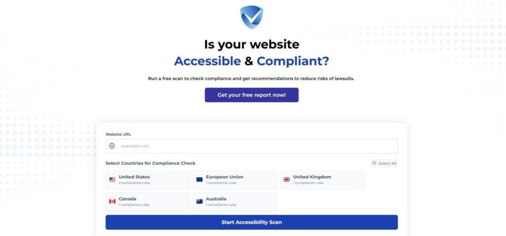
Try Our Free Website Accessibility Scanner
In addressing the top five common accessibility mistakes, it is crucial to recognize the significant impact these issues have on user experience. A website that does not prioritize accessibility can alienate a substantial portion of its audience, particularly individuals with disabilities who rely on accessible design for interaction. From inadequate use of semantic HTML to the lack of alternative text for images, each identified mistake not only hinders usability but also contravenes the principles of inclusivity and equal access to information.
Correcting these accessibility oversights—such as ensuring keyboard navigation, color contrast compliance, and providing transcripts for audio content—can greatly enhance the usability of a website. These modifications improve navigation and engagement for all users, not just those with disabilities. The broader goal here is to create an environment where information is readily available and comprehensible, fostering a more inclusive digital landscape.
As we move forward, it is essential for developers, designers, and content creators to prioritize accessibility in their workflows. This should not be viewed as a mere checklist to complete; instead, it should be embraced as an ongoing commitment that evolves alongside changing technologies and user expectations. Continuous education, user feedback, and iterative design processes should guide these efforts, ensuring that accessibility remains at the forefront of web development strategies.
Ultimately, commitment to accessibility can yield profound benefits not only in enhancing the user experience but also in cultivating a brand reputation centered on inclusivity and respect for diverse audiences. By acknowledging and actively addressing these common accessibility mistakes, the journey toward a more accessible web can continue, fostering innovation and participation for all users.