


What Is Colour Contrast
Colour contrast is a fundamental concept in web design that refers to the difference in brightness or luminance between two elements, primarily foreground text and background surfaces. This relationship significantly affects readability and user experience, making it essential for effective digital communication. High colour contrast enables distinct separation between various elements on a webpage, which is particularly crucial for individuals with visual impairments, including those with color blindness.
In practice, colour contrast is measured using a mathematical formula that assesses the luminance of the foreground and background colors to determine the ratio between them. The Web Content Accessibility Guidelines (WCAG) outline specific contrast ratios that should be adhered to in order to meet accessibility standards. For example, a contrast ratio of at least 4.5:1 is recommended for normal text, while a 3:1 ratio is acceptable for large text. Meeting these guidelines ensures that content is legible to a wider audience and promotes inclusivity on the web.
The significance of colour contrast extends beyond aesthetics; it serves a critical function in web accessibility. Users with varying degrees of vision, including low vision and color blindness, often rely on high contrast to navigate websites effectively and comprehend content without straining their eyes. When colour contrast is neglected, businesses and organizations may inadvertently exclude a significant portion of potential users, limiting their access to information and services. Thus, thoughtful application of colour contrast in web design not only enhances visual appeal but also ensures that all users, irrespective of their abilities, can access and engage with the content provided.
WCAG Contrast Ratio Requirements (AA vs. AAA)
The Web Content Accessibility Guidelines (WCAG) serve as a fundamental framework for promoting online accessibility, and one of the key components of these guidelines is the specification of contrast ratios. Specifically, there are two levels of compliance: AA and AAA, each with its own contrast ratio requirements that are vital for ensuring visually impaired users can effectively navigate web content.
For level AA, the minimum contrast ratio is set at 4.5:1 for normal text (typically defined as text smaller than 18 pt or 14 pt bold) and a higher standard of 3:1 for large text (defined as text that is at least 18 pt or 14 pt bold). These contrast ratio specifications are crucial as they help to enhance readability for users who rely on screen readers or have low vision. Ensuring that text meets these requirements aids in conveying information effectively and reduces the risk of misinterpretation.
In contrast, level AAA raises the bar for accessibility even further by requiring a contrast ratio of 7:1 for normal text and a ratio of 4.5:1 for large text. This level of compliance is aimed at providing the highest degree of accessibility but is broader in its application. It is important to note that while aiming for AAA compliance can offer optimal usability, it may not always be feasible across all design elements, which is why the AA standard often serves as the practical benchmark for many projects.
Utilizing appropriate contrast ratios not only benefits users with vision impairments but also creates a more inclusive online environment overall. By adhering to the WCAG guidelines, web designers can contribute significantly to the enhancement of digital accessibility, ensuring that their content is accessible to as many users as possible.
Tools to Measure Colour Contrast
Effective web design necessitates an understanding of colour contrast, particularly as it relates to accessibility. Several tools have emerged to assist designers in measuring colour contrast against the standards set by WCAG (Web Content Accessibility Guidelines). These tools not only offer functionality but also play a crucial role in ensuring compliance with accessibility standards.
One of the most widely used tools is the WebAIM Contrast Checker. This user-friendly web application allows designers to input foreground and background colours to instantly calculate the contrast ratio. It provides a clear indication of whether the selected colours meet the WCAG guidelines, making it a staple for accessibility-focused web design.
Another valuable tool is ColorZilla, a browser extension adept at both providing color sampling and measuring contrast ratios. ColorZilla is beneficial for quick designs, helping users extract colours from web pages while also delivering insight on how those colours will interact in terms of contrast.
Venngage’s accessible color palette generator is tailored for designers looking to create infographics and visual content. It organizes colour choices into accessible palettes, ensuring that chosen colours maintain a visually appealing yet compliant contrast ratio.
For a more comprehensive analysis, the WAVE tool offers an evaluation of web content beyond just contrast. While primarily an accessibility checker, it highlights areas where colour contrast may fall short, providing users with actionable insights to enhance usability.
Lastly, the Stark plugin integrates with design tools such as Adobe XD and Sketch, making it convenient for designers to assess colour contrast while they work. This real-time feedback aids in aligning design choices with accessibility standards seamlessly.
Incorporating these tools can significantly enhance the capability of web designers to create accessible and visually appealing websites. By leveraging the right tools, designers can improve their workflow while ensuring adherence to essential accessibility guidelines.

Tips for Improving Colour Contrast
Enhancing colour contrast is a fundamental aspect of creating accessible websites that cater to varying visual needs. The first practical tip for achieving effective colour contrast is to select distinct light and dark colours. This approach not only improves visibility but also assists users in navigating the website with ease. It is crucial to ensure that the chosen colours are sufficiently different from each other; for instance, using a dark blue against a light yellow can offer a striking contrast that promotes readability.
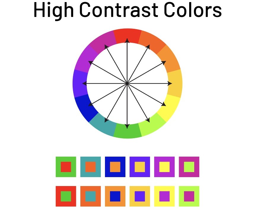
Another important consideration is to avoid combinations of colours that belong to similar hues. When designers use colours that are analogous on the colour wheel, the necessary distinction can be lost, making content difficult to read for those with colour vision deficiencies. Instead, aim for complementary colours that stand out against each other and contribute to a more accessible design. Testing your designs in various lighting conditions is also essential, as screens can appear differently depending on the environment. Simulating these conditions, such as bright sunlight or dimmed room light, can reveal potential contrast issues that may not be apparent in typical viewing conditions.
Incorporating non-colour indicators is an effective method to improve accessibility. This could involve using shapes, patterns, or textures in conjunction with colour to convey information. For instance, instead of exclusively relying on shaded areas to represent a feature, implementing icons or bold outlines can provide an additional layer of clarity for users. Lastly, simulating user experiences is beneficial in identifying accessibility shortcomings. Seeking feedback from individuals with varying degrees of visual impairment allows designers to adjust their choices to meet diverse needs effectively.
By embracing these fundamental tips, designers can contribute significantly to creating web experiences that prioritize inclusivity and ensure accessibility for all users. reveal potential accessibility concerns, ensuring that the app evolves to meet users’ changing needs.
Common Mistakes to Avoid in Colour Contrast Design
In the realm of web design, ensuring sufficient colour contrast is paramount for accessibility. However, there are several common mistakes that designers may inadvertently make, which can hinder the usability of a website for individuals with visual impairments or colour blindness. One prevalent pitfall is insufficient contrast between text and background colours. Designers often underestimate the importance of contrast, leading to areas where text becomes nearly invisible against similar-toned backgrounds. To mitigate this, it is essential to consult contrast calculators that adhere to established accessibility standards, ensuring that all users can comfortably read content.
Another frequent mistake is the overuse of vibrant colours. While bold palettes may seem visually appealing, excessive brightness can cause discomfort and strain for users, particularly over prolonged viewing periods. Striking a balance between vibrancy and readability is crucial. Designers should opt for a limited colour palette, ensuring that any vibrant hues are strategically applied, rather than overwhelming the viewer.
Ignoring real user testing is yet another error that can significantly impact design effectiveness. Relying solely on personal preferences or theoretical knowledge may lead to overlooking vital nuances in user experience. Involving real users in the testing phase helps identify problematic areas that may affect accessibility, allowing for necessary adjustments before finalizing the design. Similarly, solely using colour to convey information can alienate users who are colour-impaired. Providing textual alternatives or patterns alongside colour cues is essential to ensure that all users can interpret the content accurately.
By being aware of these common mistakes, web designers can proactively avoid them and create more effective and inclusive designs that cater to a broader audience.

The Role of User Testing in Colour Contrast Evaluation
User testing is a fundamental aspect of evaluating colour contrast in web design, particularly when considering accessibility for individuals with visual impairments. Engaging real users who navigate the internet with visual challenges provides invaluable insights that automated tests cannot replicate. This direct feedback is crucial to ensure that chosen colour schemes are not only aesthetically pleasing but also functional and inclusive.
To conduct effective user tests, it is essential to first identify a diverse group of participants with varying degrees of visual impairment. This can include individuals with complete blindness, low vision, and colour blindness. By incorporating a range of perspectives, designers can better understand how their colour contrast effectiveness resonates with users. Creating a test plan that focuses on specific tasks can help assess whether users are able to read content, differentiate between elements, and interact with the interface smoothly.
Once testing is underway, collecting qualitative feedback is vital. Asking users to describe their experiences can uncover issues that may not be evident through simple, quantitative measures. Consider employing methods such as think-aloud protocols, where participants verbalize their thought processes as they interact with the design. This feedback can pinpoint specific strengths and weaknesses in colour choices, allowing designers to iteratively refine their work to enhance accessibility.
Moreover, continuous engagement with users throughout the design process fosters a user-centric approach, which is fundamental in creating inclusive web environments. Desirable colour contrast is not merely about compliance with standards; it is about enriching user experience for everyone. Consequently, integrating user testing into colour contrast evaluation is not just beneficial but essential in striving to create an inclusive web design that meets the needs of all users. In conclusion, prioritizing user feedback throughout the design lifecycle serves as a guiding principle for effective accessibility in web design.
Future Trends in Colour Contrast Accessibility
As the digital landscape continues to evolve, the importance of colour contrast for accessibility in web design is increasingly recognized. Emerging trends indicate a shift towards more inclusive design practices that not only adhere to established guidelines but also actively promote accessibility as a core component of user experience. One significant trend is the integration of artificial intelligence (AI) tools that assist designers in evaluating and optimizing colour palettes for maximum contrast. These tools leverage machine learning algorithms to analyze visual elements, ensuring that the design accommodates users with different visual impairments.
In tandem with technological advancements, there is a growing philosophy among design communities to prioritize inclusivity from the outset of the design process. The concept of Universal Design is gaining traction, encouraging designers to create products that cater to a diverse range of user needs. This approach emphasizes the importance of considering colour contrast in the early stages of web development, rather than retroactively adjusting designs for compliance. Designers are increasingly encouraged to utilize resources and tools that promote best practices, such as accessibility checklists and online contrast analyzers, as part of their workflow.
Guidelines from major organizations, such as the World Wide Web Consortium (W3C), are also evolving to reflect the increasing urgency of colour contrast accessibility. New recommendations focus not only on the technical aspects of colour usage but also on the emotional and psychological impacts of colours on users. This broader understanding can inform more effective and empathetic design choices. As web designers adapt to these trends, they must remain vigilant and flexible, continuously educating themselves on new tools, guidelines, and strategies aimed at enhancing colour contrast for all users. By embracing these developments, designers can create web experiences that are better suited to meet the diverse needs of the modern internet demographic.obile apps across diverse audiences.
Case Studies | Successful Examples of Colour Contrast
In the realm of web design, effective use of colour contrast plays a pivotal role in enhancing accessibility, enabling users to navigate websites with ease, regardless of visual impairments. Several notable case studies exemplify how the right application of colour contrast can significantly improve user experience and accessibility.
An exemplary case is the redesign of a leading e-commerce website that prioritized accessibility. The design team conducted thorough research to understand the needs of users with varying visual abilities. They implemented high-colour contrast ratios, ensuring text stood out against backgrounds. For instance, they opted for dark text on a light background, achieving a contrast ratio exceeding the recommended 4.5:1 for normal text. User feedback showed a marked improvement in comprehension and navigation, leading to increased sales and customer satisfaction.
Another successful example is a non-profit organization’s website that aimed to engage users with cognitive disabilities. The design incorporated the use of complementary colours that not only appealed aesthetically but also provided clear differentiation between crucial navigational elements. Using variations of hue and saturation, the designers ensured that buttons and call-to-action elements were prominent and easily distinguishable. Post-launch studies indicated that users, particularly those with visual impairments, found it easier to complete desired actions, significantly increasing engagement metrics.
Additionally, a prominent news website adopted a unique approach by employing dark mode as an option for its users. The contrast between light text and a dark background was carefully calibrated to ensure readability, catering to users who preferred this feature for reduced eye strain. As a result, user surveys indicated a satisfaction boost among readers who appreciated the choice, highlighting the importance of offering contrast variations.
These case studies illustrate the tangible benefits of effective colour contrast in web design. By addressing accessibility needs thoughtfully, designers can create inclusive experiences that empower all users, setting a benchmark for best practices in the industry.
Try Our Free Website Accessibility Scanner

In today’s increasingly digital world, web design accessibility is crucial to ensure that all users, regardless of their abilities, can engage effectively with content. One of the key components of accessible web design is colour contrast, which plays a significant role in enhancing the user experience for individuals with visual impairments or those who may experience difficulties in distinguishing colours. Throughout this blog post, we have explored the importance of adequate colour contrast, highlighting its impact on readability and usability.
Implementing the principles of colour contrast can significantly improve navigation and interaction on websites. By ensuring that text and background colours are sufficiently distinct, designers can create a more inclusive environment that caters to the needs of all users. This approach not only benefits individuals with disabilities but also enhances the overall user experience for everyone. Good colour contrast helps to eliminate ambiguity in design and allows users to focus on the essential content without frustration.
We have also discussed various tools and best practices that assist in evaluating colour contrast effectively. Utilizing these resources can aid web designers in achieving the necessary accessibility standards, thereby fostering an inclusive online space. Furthermore, it is essential to remain informed about updates to accessibility guidelines, as this ensures adherence to best practices and improves compliance with legal standards.
Ultimately, embracing accessible web design, with a specific focus on colour contrast, should be viewed as a shared responsibility. By prioritizing these considerations, we can create more navigable and user-friendly websites that accommodate the diverse needs of our global audience. Accessible web design is not merely a choice; it is a fundamental requirement for fostering inclusivity in our digitally connected society.