


As we step into 2025, making marketing campaigns that everyone can use is not just nice to have—it’s essential for business success. According to recent findings, 1 in 4 people globally live with a disability, making accessibility a critical factor in reaching your full audience. Accessible marketing improves user experience, builds trust with customers, and gives your brand an edge over competitors who ignore these practices. When you make your marketing accessible, you’re opening doors to millions more potential customers who might otherwise miss your message entirely. Many businesses are still ignoring this opportunity, giving you a chance to stand out by doing better.
This article will show you practical ways to make your marketing accessible to everyone, from adding simple text descriptions to images to creating fully inclusive campaigns that boost your reach and conversion rates. We’ll cover everything from social media posts to email campaigns, websites, and digital ads, giving you the tools you need to reach everyone in your target audience.
Why Accessibility Matters in Marketing
When your marketing excludes people with disabilities, you’re missing out on connecting with a huge potential customer base. Think about it: if 25% of the global population has some form of disability, that’s a massive audience you could be failing to reach. For a medium-sized business, this could mean thousands of missed opportunities each year just because your marketing isn’t set up for everyone to access.
Beyond just expanding your audience, accessible marketing brings several benefits to your business. When you make your campaigns accessible, you show that your company values all customers equally. This builds trust and loyalty among not just people with disabilities but also their friends and families who notice your inclusive approach. Many consumers today actively choose to support brands that demonstrate these values through actions, not just words.
Accessible marketing also protects your business from potential legal issues. In many countries, failing to make your digital presence accessible can lead to costly lawsuits. Small businesses are increasingly being targeted with accessibility lawsuits, with some facing penalties of thousands of dollars for non-compliance. By making your marketing accessible from the start, you avoid these risks entirely.
Another benefit that many marketers don’t expect is that accessible marketing often improves the experience for all users. For example, captions on videos help people who are deaf or hard of hearing, but they also help people watching in noisy environments or those who prefer reading to listening. Similarly, clear, simple language helps people with cognitive disabilities but also makes your message clearer to everyone else too.
There’s also a strong connection between accessibility and search engine optimization. Many of the changes you make for accessibility, like adding alt text to images and using proper heading structures, also help search engines understand your content better. This often results in better rankings and more organic traffic to your website or social media pages.
Finally, accessible marketing typically leads to higher engagement rates and better conversion numbers. When more people can easily use your marketing materials, more people will take the action you want them to take. Several studies have shown that websites meeting accessibility guidelines have lower bounce rates and higher conversion rates compared to inaccessible competitors.
The Legal Side of Marketing Accessibility
Creating accessible marketing isn’t just good business—it’s increasingly a legal requirement in many places around the world. Understanding the legal landscape can help you avoid costly problems down the road and give you another compelling reason to prioritize accessibility in your marketing strategy.
In the United States, the Americans with Disabilities Act (ADA) has been interpreted by courts to apply to websites and digital marketing. While the ADA doesn’t specifically mention websites in its original text, legal precedents have established that digital properties are considered “places of public accommodation” under the law. This means businesses of all sizes need to ensure their online presence, including marketing materials, is accessible to people with disabilities.
Section 508 requirements set another legal standard in the U.S., primarily affecting government agencies and their contractors. If your business works with the government in any capacity, you may need to meet these accessibility requirements as part of your contract obligations. Even if you don’t currently work with government clients, being Section 508 compliant opens the door to these opportunities in the future.
In Europe, the EU Accessibility Act creates a comprehensive framework for digital accessibility, affecting businesses operating in European markets. This act specifically addresses many aspects of digital marketing and requires businesses to make their websites, mobile apps, and electronic communications accessible. The penalties for non-compliance can be significant, making this an important consideration for companies with European customers.
Across the globe, the Web Content Accessibility Guidelines (WCAG) 2.2 provide the technical standards that most laws reference for compliance. These guidelines are organized into three levels: A, AA, and AAA, with most laws requiring at least AA compliance. Understanding these guidelines gives you a practical framework for making your marketing accessible no matter where your business operates.
The legal landscape is always changing, with accessibility laws becoming more common and enforcement getting stricter. In recent years, the number of accessibility-related lawsuits has grown dramatically, with many targeting marketing materials specifically. Small businesses are not exempt—in fact, they’ve become common targets for accessibility-related legal claims because they often have fewer resources dedicated to compliance.
Who Benefits from Accessible Marketing?
Accessible marketing helps more people than you might think, extending far beyond the audiences that might first come to mind. Understanding who benefits can help you see the full value of making your marketing accessible to everyone.
People with visual impairments, including those who are blind, have low vision, or are color blind, benefit greatly from accessible marketing. They often use screen readers to navigate digital content, making alt text for images and proper heading structures essential. Color blind users, who make up about 8% of men and 0.5% of women, need more than just color to understand important information in your marketing.
People with hearing disabilities, including those who are deaf or hard of hearing, rely on captions and transcripts to access audio and video content. Without these features, your podcast ads, video marketing, and multimedia presentations remain completely inaccessible to this large audience. Even people with mild hearing loss benefit from having text alternatives to audio content.
People with mobility issues who may not be able to use a mouse rely on keyboard navigation to interact with digital content. If your marketing campaigns include interactive elements like forms or clickable features that don’t work with keyboard navigation, these users can’t engage with your content. Making sure all interactive elements are keyboard accessible ensures these users can fully participate.
People with cognitive disabilities, including those with conditions like dyslexia, ADHD, or autism, benefit from clear, simple language and consistent layouts. Breaking information into manageable chunks, using plain language, and maintaining a consistent design helps these users process your marketing messages more effectively. Features like adjustable text size and spacing can also make reading much easier for people with dyslexia.
Older adults often experience changes in vision, hearing, and cognitive abilities as they age. By 2025, this demographic represents a huge market with significant purchasing power. Accessible marketing ensures you can effectively reach older consumers who might struggle with small text, low contrast designs, or complicated user interfaces.
Accessibility benefits extend far beyond people with permanent disabilities. Temporary situations like a broken arm, eye surgery recovery, or ear infection can make standard marketing temporarily inaccessible. Similarly, situational limitations like trying to read marketing emails on a phone in bright sunlight, watching a video ad in a noisy coffee shop, or browsing a website while holding a baby create accessibility challenges for everyone at various times.
People with slow internet connections or older devices benefit from accessible marketing that loads quickly and works without requiring the latest technology. When you optimize images, provide text alternatives, and create simpler designs for accessibility, you also make your marketing work better for users in rural areas, developing countries, or those who simply can’t afford the newest devices.
Making Digital Ads Accessible
Digital ads appear everywhere online, from search results to social media feeds. Making them accessible ensures your message reaches all potential customers and maximizes the return on your advertising investment. When ads aren’t accessible, you’re essentially paying for impressions that some users can’t actually engage with.
The basics of accessible digital ads include using readable fonts, ensuring strong color contrast, writing clear and simple copy, and including alternative text for images. But truly accessible advertising goes beyond these fundamentals to create a seamless experience for everyone who encounters your ads online.
Search ads often form the foundation of digital marketing campaigns. Making these accessible starts with writing clear, descriptive headlines and ad copy that communicates your value proposition without relying on visual elements alone. Using proper punctuation helps screen readers interpret your ads correctly, and avoiding obscure abbreviations ensures everyone understands your message.
Display ads present more accessibility challenges because they rely heavily on visual elements. For these ads, consider how they would be understood by someone who can’t see the images. Does the text alone convey your main message? Is there alternate text available when the ad is implemented? Testing your display ads with screen readers can reveal whether they communicate effectively to visually impaired users.
Many advertisers are now using rich media ads with interactive elements, animations, and videos. These features can create serious barriers for users with disabilities if not implemented thoughtfully. Ensure any interactive elements work with keyboard navigation, provide pause buttons for animations that last longer than five seconds, and always include captions or transcripts for audio content.
Adding Alt Text for Social Media Graphics
Alt text (alternative text) describes images for people who can’t see them. Screen readers read this text aloud to users with visual impairments. Without alt text, these users miss out on important visual information in your marketing graphics. Adding this simple feature makes your content available to millions more potential customers.
Creating good alt text is simple once you understand the basics. The key is to describe what’s in the image clearly and briefly while focusing on the elements that matter most to your marketing message. Don’t waste words on obvious details, but make sure to capture the essence of what makes the image important to your content.
For example, rather than writing alt text that says “Our new product,” provide specific details: “Woman smiling while using our one-handed kitchen tool with text ‘Cooking made easier’ visible.” This description gives users the same information they would get from seeing the image, including both the visual content and any text overlay that’s part of the graphic.
When writing alt text, be sure to include any text that appears in the image since screen readers can’t detect text within images. This ensures users don’t miss important messages or calls to action that appear as text overlays on your graphics. If an image contains a lot of text, consider whether that text could be better placed in the main body of your post instead.
Most social platforms now make adding alt text easy when posting. On Instagram, look for the “Advanced Settings” option when creating a post and then select “Write Alt Text.” On Facebook, the alt text option appears when you upload an image. Twitter has a similar feature labeled “Add description” that appears after uploading an image. LinkedIn provides an alt text field in its post creation interface too.
For marketing teams managing multiple social accounts, some social media management platforms now include alt text fields for all supported networks. This allows you to add appropriate descriptions when scheduling posts, ensuring accessibility across all your social channels without extra steps during publication.
Remember that different platforms have different alt text length limitations. Twitter allows up to 1,000 characters, while Facebook limits alt text to 100 characters. When planning your social graphics, keep these limitations in mind and prioritize the most important visual information if you’re working with strict character limits.
Captioning Video Ads
Videos without captions exclude deaf and hard-of-hearing users, who make up a significant portion of your potential audience. They also miss people watching in noisy places or those who prefer not to use sound. In fact, many people browse social media with the sound off regardless of their hearing ability, making captions essential for reaching the widest possible audience.
Good video captions should accurately match what’s said in the video without paraphrasing or summarizing. They should include important sounds like doorbells ringing or phones buzzing when those sounds are relevant to understanding the content. Timing is crucial—captions should stay in sync with the audio so viewers don’t get confused by misaligned text.
The visual design of captions matters for accessibility too. They need good contrast against the background, which sometimes means adding a semi-transparent background behind the text or a thin outline around the letters. The font should be easy to read, usually a sans-serif typeface like Arial or Helvetica, and large enough to read on mobile devices.
For short marketing videos, you have several captioning options. Open captions are permanently embedded in the video and can’t be turned off. They ensure everyone sees the captions regardless of the platform or settings. Closed captions can be turned on or off by the viewer and are supported by most major video platforms including YouTube, Facebook, and Instagram.
For longer marketing videos or webinars, consider including a full transcript below the video. This helps not only people with hearing disabilities but also improves SEO by making all your spoken content searchable. Transcripts also allow users to quickly scan content to find the parts most relevant to them.
While auto-captioning technology has improved dramatically by 2025, machine-generated captions still make mistakes, especially with industry jargon, product names, or unusual terms. Always review and edit auto-captions before publishing your marketing videos. The small amount of time this takes pays off in accuracy and professionalism.
Some video editing software now includes captioning features, making it easier to add captions during the editing process. Alternatively, you can use dedicated captioning services or tools to add captions after production. For marketing teams creating regular video content, developing a captioning workflow saves time and ensures consistency.
Creating Accessible Ad Copy
The words you use matter enormously for accessibility. Even the most visually accessible ad can fail if the copy itself creates barriers to understanding. Following best practices for accessible copy makes your ads more effective for everyone, not just people with disabilities.
Using simple, clear language should be your starting point. Avoid jargon, complicated terms, and acronyms unless they’re widely understood by your specific audience. When you must use technical terms, consider briefly explaining them. Remember that simple language doesn’t mean dumbing down your message—it means communicating clearly so everyone gets your point.
Sentence and paragraph length affect readability too. Short sentences are easier to process, especially for people with cognitive disabilities or those using screen readers. Similarly, breaking text into short paragraphs gives readers visual breaks and makes the content less intimidating. For digital ads where space is limited, this approach works well for everyone.
Structure your content logically, using bullet points for lists and clear headings for sections when the format allows. This organization helps all readers follow your message, but it’s especially helpful for people with cognitive disabilities or those using assistive technologies. Screen readers can navigate well-structured content more effectively, helping users find the information they need.
Don’t rely only on color to convey information in your ad copy. For example, instead of saying “click the red button” or “items in green are on sale,” provide additional identifying information. This ensures color blind users don’t miss important details. Similarly, avoid instructions that rely solely on location (like “click the button on the right”) since screen reader users experience content linearly.
Text contrast is crucial for readability. The WCAG guidelines recommend a contrast ratio of at least 4.5:1 for normal text and 3:1 for large text. Many free online tools can check whether your text and background colors meet these requirements. Poor contrast might look stylish to some designers, but it makes your ads harder to read for many people, including those with low vision or color blindness.
When writing calls to action, be specific about what will happen when users engage. Instead of vague phrases like “click here” or “learn more,” use descriptive text like “sign up for our free workshop” or “see pricing plans.” This specificity helps all users, but it’s particularly valuable for screen reader users who often navigate by scanning links and buttons.
Finally, test your ad copy with readability tools that analyze complexity and reading level. Aiming for around an 8th-grade reading level makes your content accessible to the widest audience. This doesn’t mean talking down to customers—it means removing unnecessary complexity that gets in the way of your message.
Testing Ads for Accessibility
Before launching, test your ads to make sure they’re truly accessible to everyone in your target audience. Testing identifies issues you might have missed and gives you a chance to fix them before your campaign goes live. Even small changes can make a big difference in how many people can effectively engage with your ads.
Try using your ads with a screen reader to experience them as visually impaired users would. Free screen readers like NVDA (NonVisual Desktop Access) for Windows or VoiceOver for Mac and iOS make this testing possible without specialized equipment. Listen for whether all the important information comes through clearly and in a logical order.
View videos without sound to ensure they make sense with just captions and visuals. This simple test mimics how many users will experience your video ads on social media platforms where videos often play silently until activated. If your message doesn’t come through without audio, you need to rethink your approach.
Check color contrast using free online tools like the WebAIM Contrast Checker or the Colour Contrast Analyser. These tools tell you whether your text and background colors meet accessibility standards. If they don’t, adjust your color choices to improve readability while maintaining your brand identity.
Navigate your interactive ads using only a keyboard to ensure all features are accessible without a mouse. Try using the Tab key to move between elements and Enter to select them. If you can’t access all features this way, keyboard-only users won’t be able to fully engage with your ad.
Enlarge text to 200% to ensure readability for users with low vision who increase text size in their browsers. If your ad becomes unusable when text is enlarged, reconsider your layout to accommodate variable text sizes. Responsive design principles help address this challenge.
Many accessibility testing tools are available online, many of them free and easy to use. Tools like WAVE (Web Accessibility Evaluation Tool) and axe can automatically identify many common accessibility issues. While automated tools can’t catch everything, they provide a good starting point for accessibility testing.
Consider testing with actual users with disabilities for the most valuable feedback. User testing reveals real-world issues that automated tools might miss and provides insights into how people actually interact with your ads. Even testing with just a few users can uncover important accessibility barriers.
Accessible Website Marketing
Most marketing campaigns lead people to your website. If your site isn’t accessible, you’ll lose the customers you worked hard to attract through your marketing efforts. An inaccessible website creates a frustrating dead end for users with disabilities who clicked on your accessible ads or emails only to find they can’t use your site.
Website accessibility requires attention to both technical details and user experience. Technical elements include proper HTML structure, keyboard navigation, ARIA labels for dynamic content, and compatibility with assistive technologies. User experience considerations include clear navigation, readable content, logical form design, and consistent layout patterns.
A truly accessible website follows WCAG 2.2 guidelines, which cover four main principles: perceivable, operable, understandable, and robust. Perceivable means users can identify content through sight, sound, or touch. Operable means users can navigate and interact with all features. Understandable means content is clear and functions work as expected. Robust means the site works with current and future technologies, including assistive devices.
Regular accessibility audits help identify issues with your website. These can range from simple checks using automated tools to comprehensive evaluations by accessibility experts. Many businesses start with automated testing to catch obvious problems, then progress to more detailed testing as they improve their accessibility practices.
Creating Accessible Landing Pages
Landing pages need special attention because they’re often where conversions happen. A beautifully designed landing page that’s inaccessible to some users creates an immediate barrier to conversion. By making your landing pages fully accessible, you ensure everyone who arrives can take the action you want them to take.
Use a clear heading structure with proper hierarchy (H1, H2, H3) in the correct order. Your main headline should be an H1, with section headings as H2s, and subsection headings as H3s. Never skip levels for visual styling reasons. This structure helps screen reader users navigate your page easily and understand the relationship between different sections.
Ensure good color contrast between text and backgrounds throughout the page. This applies not just to body text but also to buttons, form fields, and other interactive elements. Poor contrast might look modern or minimalist, but it creates real usability problems for many visitors, including older adults and people with low vision or color blindness.
Make sure all images have appropriate alt text, especially those that convey important information. Decorative images can have empty alt text (alt=””) to indicate they don’t add meaningful content. For complex informational graphics like charts or infographics, provide a text description that captures the key data and insights.
Design forms that work with screen readers and keyboard navigation by using proper labels, logical tab order, and clear error messages. Each form field should have a visible label positioned above the field rather than placeholder text that disappears when typing begins. Group related fields with fieldset and legend elements to provide context for screen reader users.
Create simple layouts that load quickly and adapt well to different screen sizes and zoom levels. Complex multi-column layouts with floating elements often cause accessibility problems. A cleaner, more straightforward design usually works better for all users, including those with cognitive disabilities who may find cluttered layouts overwhelming.
Test your landing pages on mobile devices to ensure responsive design works well at all screen sizes. Mobile accessibility is crucial as more users browse on smartphones and tablets. Ensure touch targets are large enough (at least 44×44 pixels), text is readable without zooming, and all functions work properly on touchscreens.
Consider providing multiple ways to contact your business on landing pages. While a form might be your preferred conversion method, some users with disabilities find forms challenging. Adding a phone number, email address, or chat option gives these users alternative ways to reach you.
Accessible landing pages typically convert better for all users because they’re clearer and easier to use. The simplicity and clarity required for accessibility benefit everyone, not just users with disabilities. Many businesses report improved conversion rates after making their landing pages more accessible, proving that accessibility and marketing effectiveness go hand in hand.
Making Forms Accessible
Forms are often where marketing campaigns succeed or fail. An inaccessible form can prevent conversions even if the rest of your marketing is perfectly accessible. Whether it’s a newsletter signup, contact form, or checkout process, accessible form design ensures everyone can complete your conversion goals.
Label each form field clearly with descriptive text that explains what information is needed. Associate these labels with their fields programmatically using the HTML “for” attribute matched to the field’s ID. This connection ensures screen readers announce the label when a user focuses on the field.
Position labels above fields rather than inside them as placeholder text. Placeholder text disappears when a user starts typing, which can create problems for people with memory impairments who may forget what information the field requires. If you do use placeholders for additional guidance, make sure they supplement visible labels rather than replace them.
Mark required fields in ways beyond just color, such as using an asterisk (*) along with the word “required” in the label or at the beginning of the form. A red asterisk alone isn’t accessible to color blind users, and the meaning of symbols isn’t always clear to people with cognitive disabilities unless explicitly explained.
Provide clear error messages that explain exactly how to fix problems when a form is submitted with errors. Position these messages near the relevant fields and make them programmatically associated with the fields they reference. Generic messages like “Please fix the errors below” without specific guidance create frustration for all users, especially those with cognitive disabilities.
Allow enough time to complete forms without timing out, particularly for longer forms like registrations or applications. If security concerns require session timeouts, warn users before the timeout occurs and give them an option to extend their session. This helps users who type slowly due to physical disabilities or those who need more time to process information.
Test forms with keyboard navigation to ensure all fields and buttons can be accessed and operated without a mouse. The tab order should follow a logical sequence, usually from top to bottom and left to right. Focus indicators should be clearly visible so keyboard users always know which element they’re currently on.
Consider the mobile experience when designing forms. Mobile users, including those with disabilities, should be able to complete forms easily on smaller screens. Use appropriate input types (like email, tel, or number) to trigger the right keyboard on mobile devices, and ensure buttons are large enough to tap accurately.
A form that’s hard to complete is a barrier between you and your customers. Accessible forms remove that barrier, making it easier for everyone to convert. The time invested in creating accessible forms pays off in higher completion rates and better user satisfaction.
Accessible Call-to-Actions
Your CTA buttons need to work for everyone. Call-to-action buttons are central to marketing success—they’re where interest converts to action. Making these elements accessible ensures all potential customers can take the next step in their journey with your brand.
Use descriptive text that clearly states what will happen when the button is clicked. “Start your free trial” or “Download the guide” is much more informative than generic phrases like “Click here” or “Learn more.” Specific CTA text helps all users make informed decisions, but it’s especially important for screen reader users who may navigate a page by scanning interactive elements.
Make buttons large enough to easily click, with a minimum size of 44×44 pixels. This size accommodates users with motor control difficulties who might struggle to accurately click smaller targets. On mobile devices, larger buttons also improve usability for everyone, especially when using a phone one-handed or in motion.
Ensure high color contrast between the button and its background, as well as between the button text and the button itself. Buttons often use brand colors that might not have sufficient contrast with the text. Testing these combinations with contrast checkers helps identify problems before launch.
Add hover and focus states so users know when they’re on a button. The hover state shows desktop users when their mouse is over a clickable element, while the focus state shows keyboard users which element is currently selected. These visual indicators should be obvious without relying solely on color changes.
Position CTAs where they’re easy to find, usually following the content that motivates the action. Placing CTAs in consistent locations across your marketing materials creates predictability that helps users with cognitive disabilities. Avoid hiding important CTAs in unexpected locations or below too much scrolling.
For important CTAs, consider providing keyboard shortcuts that allow quick access. Including these shortcuts in the button’s accessible name (through aria-label or similar) helps screen reader users discover them. Not all users will use shortcuts, but they can significantly improve accessibility for power users with disabilities.
Test your CTAs with various assistive technologies to ensure they work as expected. A button that looks clickable but doesn’t function with a screen reader or keyboard creates a frustrating dead end for users. This testing should be part of your regular quality assurance process before launching any marketing campaign.
Accessible CTAs often perform better for all users because they’re clearer, easier to find, and more intuitive to use. The principles that make buttons accessible—clear labeling, good contrast, adequate size—also make them more effective marketing tools for your entire audience.
Visit Our Tools Comparison Page!
Accessible marketing isn’t just about doing what’s right—though that’s important too. It’s about reaching every potential customer with your message. In 2025, when marketing channels are more crowded than ever, accessibility gives you an edge by connecting with audiences other brands miss.
Start with small steps—add alt text to images, caption videos, check color contrast. Each improvement makes your marketing available to more people. Don’t feel overwhelmed by trying to fix everything at once. Begin with the most important elements of your marketing and build from there.
Then build more accessible practices into your complete marketing strategy. Train your team on accessibility basics, include accessibility requirements in creative briefs, and build testing into your workflow. When accessibility becomes part of your routine, it stops feeling like extra work and starts feeling like just how you do business.
The tools and knowledge exist to make this achievable for businesses of any size. Many accessibility improvements cost nothing but a little time and attention. Others require minimal investment compared to their potential return in expanded audience reach and reduced legal risk.
Remember that accessibility is a journey, not a destination. Standards evolve, technologies change, and there’s always room to improve. The most important step is to begin making your marketing more accessible today, then continue learning and adapting as you go.
By reaching every user with accessible marketing campaigns, you’ll build a stronger brand, avoid legal issues, and create marketing that truly works for everyone. Your efforts will not only help people with disabilities but also improve the experience for all your customers, leading to better engagement, higher conversion rates, and stronger brand loyalty.
Ready to see how accessible your marketing is? Run a FREE scan to check compliance and get recommendations to reduce risks of lawsuits.
Run a FREE scan to check compliance and get recommendations to reduce risks of lawsuits
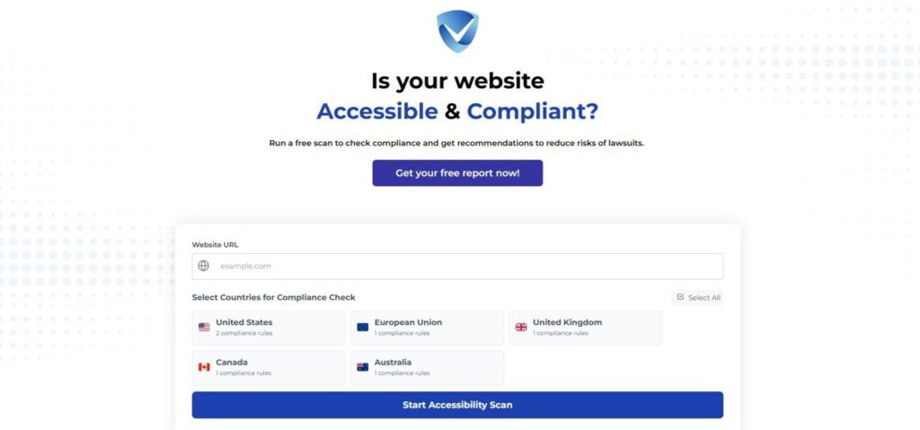
Don’t wait to take action—audit your site’s SEO-accessibility health today with our free tool! Identify gaps, implement fixes, and ensure compliance with the latest guidelines to dominate SERPs while creating an inclusive experience for all users. Take the first step toward accessibility success now!