
Accessibility Guides
Our mission is to help dev Teams and website owners on their digital accessibility journey through awesome content and free apps
Colour Contrast for Accessibility | Tools and Tips
Learn how to improve color contrast for web accessibility with actionable tips and tools. Ensure your designs meet WCAG compliance standards for inclusivity.
Read More
Creating Accessible Forms | Best Practices for UX Designers
This blog post highlights the importance of creating inclusive forms that consider the diverse needs of users with disabilities. It discusses best practices for designing accessible forms, including clear labeling, keyboard navigation, and effective error messages. Additionally, it emphasizes the importance of testing for accessibility issues and avoiding common pitfalls in form design. By prioritizing accessibility, UX designers can enhance usability for all users and contribute to a more inclusive digital environment.
Read More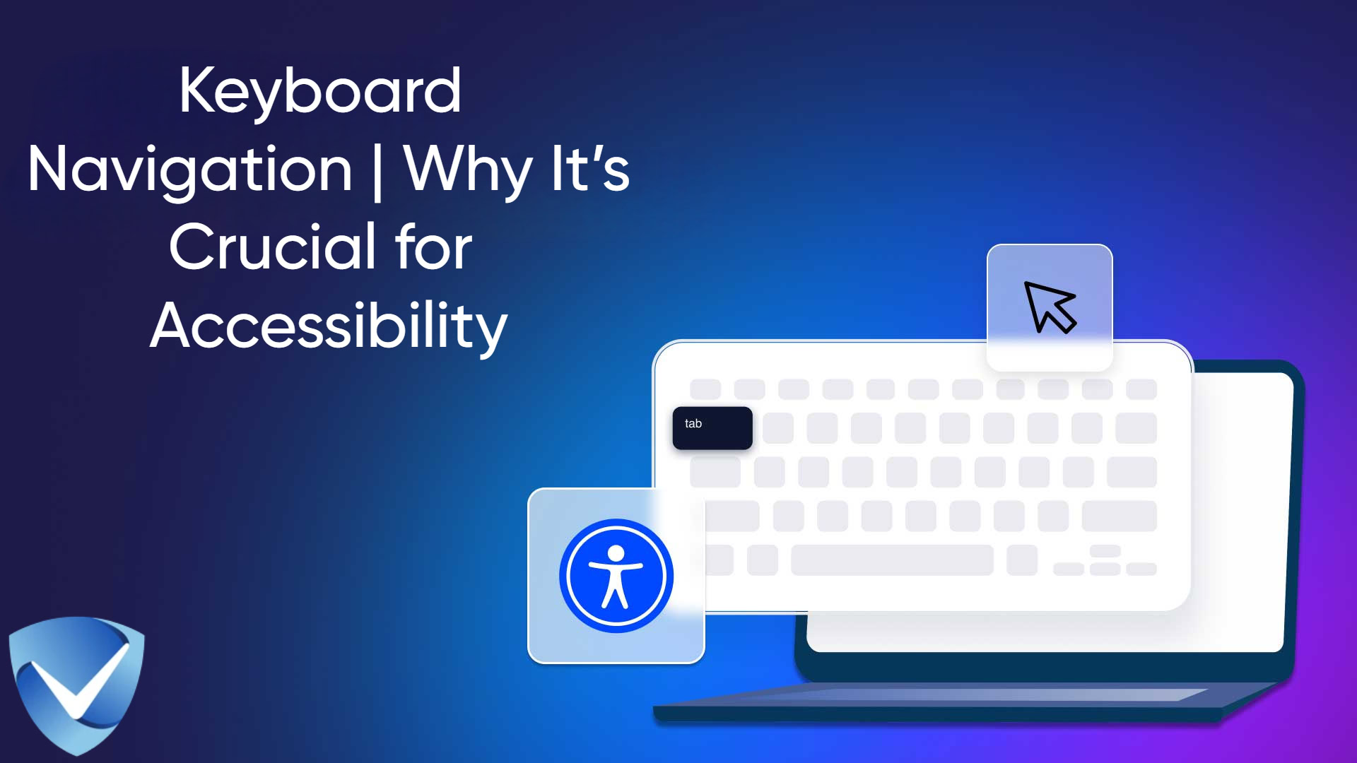
Keyboard Navigation | Why It’s Crucial for Accessibility
Discover the importance of keyboard navigation in enhancing web accessibility for all users, especially those with disabilities. This article covers best practices, compliance with WCAG guidelines, and manual and automated testing methods. Learn how effective keyboard navigation can create a more inclusive digital environment, improve user experience, and fulfill legal obligations.
Read More