


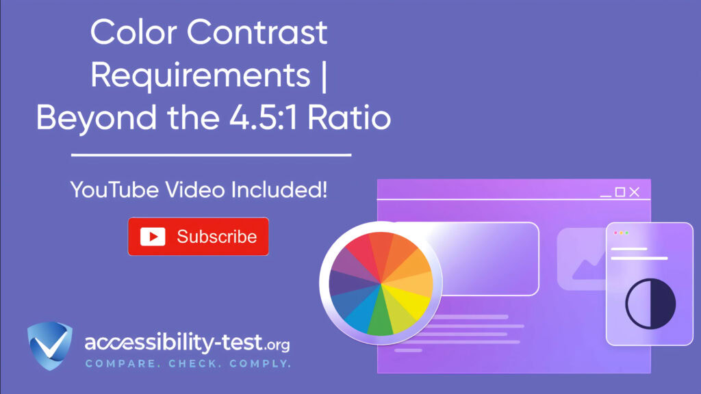

Color Contrast Requirements
Color contrast plays a vital role in making websites accessible to everyone, including those with visual impairments. While most designers and developers have heard about the 4.5:1 ratio requirement, color contrast accessibility extends far beyond this basic number. This article explains what color contrast means for accessibility, outlines the specific requirements for different content types, and provides practical tools and strategies to implement accessible color systems in your websites and applications.
Understanding WCAG Color Contrast Requirements
Color contrast refers to the difference in brightness or luminance between two elements, primarily text and its background. This difference significantly affects readability and user experience, making it essential for effective digital communication. High color contrast enables distinct separation between elements on a webpage, which is particularly important for individuals with visual impairments, including those with color blindness.
The Web Content Accessibility Guidelines (WCAG) measure contrast using a mathematical formula that assesses the luminance of foreground and background colors to determine the ratio between them. This ratio ranges from 1:1 (no contrast, like white text on a white background) to 21:1 (maximum contrast, like black text on a white background).
The important thing to remember is that color contrast isn’t just about aesthetics – it serves a critical function in web accessibility. Users with varying degrees of vision often rely on high contrast to navigate websites effectively and understand content without eye strain. When color contrast is neglected, businesses may unintentionally exclude a significant portion of potential users, limiting their access to information and services.
Different Contrast Ratios for Different Text Sizes
WCAG guidelines establish different minimum contrast requirements based on text size, recognizing that larger text is generally easier to read even with slightly lower contrast. The standards are divided into two compliance levels: AA and AAA, with AAA representing the highest level of accessibility.
For level AA compliance (the level most websites aim for):
- Normal text (smaller than 18pt or 14pt bold) requires a minimum contrast ratio of 4.5:1
- Large text (at least 18pt or 14pt bold) requires a minimum contrast ratio of 3:1
For level AAA compliance (the highest standard):
These requirements matter because many people cannot read text that doesn’t have sufficient contrast with its background. The 4.5:1 ratio specified in WCAG accounts for the loss in contrast that affects users with moderately low visual acuity or color deficiencies.
In practical terms, this means dark text on light backgrounds or light text on dark backgrounds typically works best. For example, black text (#000000) on a white background (#FFFFFF) has a contrast ratio of 21:1, far exceeding the minimum requirements. However, pure red text (#FF0000) on a white background has a ratio of only 4:1, just below the minimum requirement for normal text.

Non-Text Content Contrast Requirements
With the introduction of WCAG 2.1, contrast requirements expanded beyond text to include non-text elements. This addition recognizes that user interface components and graphical objects also need sufficient contrast to be perceivable by all users.
For non-text content, WCAG requires a minimum contrast ratio of 3:1 between:
- Visual information needed to identify user interface components (like form fields, buttons, and controls)
- Graphical objects required to understand the content (like icons, charts, and infographics)
This requirement ensures that users with low vision can perceive important elements that aren’t text but are still crucial for accessing and understanding content. Without sufficient contrast on buttons, users may not be able to distinguish them from the background. Similarly, users who cannot distinguish lines in a graph or slices in a chart cannot interpret the information they present.
It’s worth noting there are exceptions to these requirements. Inactive components (like disabled buttons), purely decorative elements, and content where a particular presentation is essential to the information being conveyed (like flags, photographs, or heat maps) are exempt from these contrast requirements.
Implementing Accessible Color Systems in Design
Creating accessible websites isn’t just about checking contrast ratios after the design is complete. Building accessibility into your color systems from the start makes the process more efficient and effective. Let’s explore how to implement accessible color systems in your design process.
Creating Color Palettes with Accessibility Built-In
When developing color palettes for websites or applications, accessibility should be a foundational consideration rather than an afterthought. Start by selecting distinct light and dark colors that provide clear visual separation. This approach improves visibility and helps users navigate websites with ease.
A key practice is avoiding combinations of colors with similar hues. When colors belong to similar areas of the color wheel, the necessary distinction can be lost, making content difficult to read for those with color vision deficiencies. Instead, aim for complementary colors that stand out against each other and contribute to a more accessible design.
Testing your designs in various lighting conditions is also essential, as screens can appear differently depending on the environment. Simulating conditions like bright sunlight or dimmed room light can reveal potential contrast issues that may not be apparent in typical viewing conditions.
When creating accessible color palettes, consider these practical tips:
- Establish a base set of colors that meet contrast requirements for text against common backgrounds
- Test all color combinations systematically rather than individually
- Document accessible combinations for your team to reference
- Create separate palette sets for interactive elements, data visualization, and content areas
Many designers find it helpful to start with a limited palette of 5-7 colors and then create lighter and darker variations of each. This approach allows for design flexibility while maintaining accessibility standards.
Using Color Contrast Algorithms in Design Systems
As design systems grow more sophisticated, teams are turning to algorithms to automatically generate accessible color combinations. These algorithms can standardize color progression and ensure that all colors meet accessibility requirements without manual checking.
One notable example is Lyft’s ColorBox algorithm. This open-source tool allows designers to produce color sets with accessible contrast ratios that meet WCAG standards. The algorithm standardizes the progression of lightness-to-darkness across color hues, ensuring that every color in specific ranges is accessible on black or white backgrounds.
Using the ColorBox algorithm, Lyft created a system where every color from 0-50 is accessible (4.5:1) on black and every color from 60-100 is accessible (4.5:1) on white. This approach removes dependencies on individual designers or specific tools, ensuring consistent accessibility regardless of who is working on the project.
Other algorithmic approaches include:
- Creating color scales with mathematically consistent contrast steps
- Automatically generating accessible color variations based on a primary brand color
- Using color theory rules to create harmonious palettes that also meet contrast requirements
These algorithmic approaches are particularly valuable for large organizations with multiple products or teams, as they ensure consistency while maintaining accessibility standards across projects.
Accessible Color Usage for Various Visual Impairments
Different visual impairments affect color perception in various ways, requiring diverse approaches to ensure accessibility. Beyond meeting contrast ratios, it’s important to consider how different users perceive color combinations.
One key principle is to never rely solely on color to convey information. Always incorporate non-color indicators like shapes, patterns, or text labels to ensure information is accessible to everyone. For example, instead of using only color to indicate errors in a form, add an icon or text description that communicates the same information.
When designing data visualizations like charts and graphs, consider using textures along with colors to distinguish different elements. Line charts can use different patterns (solid, dashed, dotted) alongside colors, while bar charts can incorporate different fills or patterns to distinguish between categories.
Remember that many users access websites in environments that affect color perception – from bright outdoor light to dimly lit rooms. Test your designs across different lighting conditions to ensure they remain accessible in real-world scenarios.
Accommodating Color Blindness and Low Vision
Color blindness affects approximately 8% of men and 0.5% of women worldwide, with red-green color blindness being the most common type. To accommodate these users, avoid color combinations that can be problematic for people with color vision deficiencies, particularly red-green combinations.
For users with low vision, high contrast becomes even more critical. In addition to meeting the minimum contrast ratios, consider offering contrast enhancement options like:
- A high-contrast mode that users can toggle on
- The ability to invert colors or switch to a dark mode
- User controls to adjust contrast levels according to personal preference
Testing your designs with color blindness simulators can help identify potential issues. Tools like the Colour Contrast Analyser from The Paciello Group not only measure contrast ratios but also show how contrast varies with different types of color blindness.
When designing for color blindness, remember these key points:
- Avoid red-green combinations for conveying important information
- Use patterns, shapes, or labels alongside color
- Ensure sufficient brightness contrast even when hue differences may not be perceivable
- Test designs with color blindness simulation tools
Testing Color Contrast Effectively
Creating accessible designs is only the first step; testing is essential to ensure your implementation actually works for all users. A combination of automated tools and manual testing provides the most thorough assessment of color contrast accessibility.
Tools and Methods for Automated Contrast Checking
Numerous tools exist to help test color contrast against WCAG standards. These range from simple online checkers to sophisticated desktop applications and browser extensions.
One widely used tool is the WebAIM Contrast Checker, which allows designers to input foreground and background colors to instantly calculate the contrast ratio. It clearly indicates whether the selected colors meet WCAG guidelines, making it a valuable resource for accessibility-focused web design.
The Colour Contrast Analyser (CCA) from The Paciello Group is another powerful option. This desktop application works on both Mac and Windows, allowing users to select colors from anywhere on their screen using an eyedropper tool. It displays contrast ratio results according to WCAG 2.0, 2.1, and 2.2, and includes sliders to adjust colors until they meet the required contrast levels.
For those who prefer browser-based tools, options include:
- WAVE: A comprehensive accessibility checker that highlights contrast issues along with other accessibility concerns
- Coolors.co contrast checker: A quick and intuitive web app with a “click to fix” feature that suggests accessible color alternatives
- Tanaguru Contrast Finder: A tool that not only measures contrast but suggests alternative colors if your combination fails accessibility standards
Browser extensions like ColorZilla can sample colors from webpages and check contrast ratios, while design tool plugins like Stark integrate directly into software like Adobe XD and Sketch, providing real-time feedback on accessibility as designers work.
For mobile app testing, specific tools are available:
- Color Contrast for iOS: An app that allows testing colors of apps, websites, or screenshots on iOS devices
- Android Accessibility Scanner: An app from Google that scans Android apps for accessibility issues, including contrast problems
Automated testing tools should be part of your regular workflow, not just used at the end of a project. Integrating these tools into your design and development process helps identify and address contrast issues early, saving time and effort in the long run.

Manual Testing Scenarios for Real-World Validation
While automated tools are valuable, they can’t replace manual testing in real-world scenarios. Manual testing involves checking how your colors appear in different contexts and on various devices.
Start by testing your website under different lighting conditions. Colors may appear differently in bright sunlight versus a dimly lit room, affecting perceived contrast. Testing on different devices is also important, as screens vary in how they display colors. What looks accessible on your design monitor might not maintain sufficient contrast on an older device or a different brand of screen.
Simulating user experiences is another crucial aspect of manual testing. Try viewing your website through the lens of different visual impairments using tools like:
- Grayscale mode to check if content is distinguishable without color
- Screen brightness at minimum and maximum settings
- Color blindness simulators to see how content appears to users with different types of color vision deficiencies
When conducting manual testing, involve actual users whenever possible, especially those with visual impairments. Their feedback provides insights that automated tools cannot capture. Ask testers to complete specific tasks on your website and observe any difficulties they encounter related to color contrast.
Common scenarios to test manually include:
- Form completion: Can users identify form fields, labels, and error messages?
- Navigation: Are menu items and buttons clearly visible against their backgrounds?
- Content consumption: Is text readable throughout the site, including footer information and sidebar content?
- Interactive elements: Can users identify clickable elements and understand their current state (active, hover, disabled)?
Document your testing process and findings to track improvements over time and share knowledge with your team. This documentation can also serve as evidence of your commitment to accessibility if needed for compliance purposes.
Common Mistakes to Avoid in Color Contrast Design
Even with the best intentions, designers and developers often make several common mistakes when implementing color contrast. Being aware of these pitfalls can help you avoid them in your projects.
Insufficient Contrast Between Similar Elements
One prevalent mistake is providing insufficient contrast between text and background colors. Designers sometimes underestimate the importance of contrast, leading to text that becomes nearly invisible against similar-toned backgrounds. This is particularly problematic for small text or text placed over images or gradients.
To avoid this issue, always use contrast calculators that adhere to established accessibility standards. Don’t rely on your own perception of what seems readable, as your vision may differ from that of your users. Remember that what looks clear on your screen might not be perceivable to someone with low vision or color blindness.
Overreliance on Color to Convey Information
Another frequent error is using color as the only means to convey important information. This approach excludes users who are color-blind or have low vision. For example, using only red text to indicate errors or only green to show success states creates barriers for users with color vision deficiencies.
Instead, always pair color with other visual cues like icons, patterns, or text labels. Form errors should include both color and text explaining the issue. Charts and graphs should use patterns or labels alongside color coding to ensure all users can interpret the data correctly.
Neglecting Real User Testing
Many designers rely solely on automated tools or personal preferences when evaluating color contrast. While tools are helpful, they don’t capture the full user experience. Different users have different visual abilities, and what works for one person may not work for another.
Involve real users in your testing process, particularly those with visual impairments. Their feedback can reveal issues that automated tools miss and help you create truly inclusive designs. Consider forming an accessibility testing group that can provide regular feedback on your products.
Ignoring Color Contrast in Responsive Design
As websites adapt to different screen sizes, color contrast can sometimes be overlooked. Text that has sufficient contrast on desktop screens may become problematic on mobile devices, where elements might be smaller or viewed in varied lighting conditions.
Make sure to test color contrast across all breakpoints in your responsive design. Pay special attention to navigation elements, buttons, and form fields that might change appearance on smaller screens. Remember that mobile devices are often used outdoors, where glare can further reduce perceived contrast.
Tools and Resources for Better Color Contrast
Implementing good color contrast doesn’t have to be difficult with the right tools and resources. Here’s a collection of valuable resources to help you create accessible color combinations for your websites and applications.
Color Contrast Checkers and Analyzers
Several tools can help you check if your color combinations meet WCAG requirements:
- WebAIM Contrast Checker: A simple online tool that calculates contrast ratios and indicates WCAG compliance levels
- Colour Contrast Analyser: A desktop application that includes color picking functionality and simulation of different types of color blindness
- WAVE: A comprehensive accessibility evaluation tool that includes contrast checking among other features
- Contrast app for Mac: A lightweight, aesthetic tool for checking color combinations
- Polypane Color Contrast Checker: A tool that not only checks contrast but also suggests alternative colors with sufficient contrast
For more automated workflow integration, consider browser extensions like the WCAG Color Contrast Checker, which evaluates all text elements on a page against WCAG 2.2 standards. It can also simulate color blindness to help you understand how your site appears to users with different visual abilities.
Color Palette Generators with Accessibility in Mind
Creating entire color palettes that meet accessibility standards from scratch can be challenging. These tools can help:
- Coolors: An online color palette generator with built-in contrast checking and the ability to lock in certain colors while generating others
- Leonardo Color: A powerful tool for creating accessible color systems with contrast ratio targets in mind
- Accessible Color Palette Generator by Venngage: A tool designed specifically for creating infographics and visual content with accessible color combinations
- Lyft’s ColorBox: An open-source tool that uses algorithms to generate accessible color sets automatically
These tools allow you to start with brand colors and create expanded palettes that maintain accessibility standards, making the process more efficient and reliable.
Case Studies | Successful Examples of Color Contrast
Looking at real-world examples of accessible color contrast implementation can provide inspiration and practical insights for your own projects.
E-commerce Website Redesign
One notable case involved the redesign of a leading e-commerce website that prioritized accessibility. The design team conducted thorough research to understand the needs of users with varying visual abilities. They implemented high-color contrast ratios, ensuring text stood out against backgrounds by using dark text on light backgrounds with a contrast ratio exceeding the recommended 4.5:1 for normal text.
The results were impressive: user feedback showed significant improvement in comprehension and navigation, particularly among visually impaired users. This enhanced usability led to increased sales and higher customer satisfaction, demonstrating that accessibility improvements can directly impact business metrics.
Non-profit Organization Website with Cognitive Accessibility Focus
Another successful example came from a non-profit organization’s website designed to engage users with cognitive disabilities. The design incorporated complementary colors that provided clear differentiation between crucial navigational elements while maintaining visual appeal.
The designers used variations of hue and saturation to ensure buttons and call-to-action elements were prominent and easily distinguishable. Post-launch studies indicated that users, particularly those with visual impairments, found it easier to complete desired actions, significantly increasing engagement metrics.
News Website with Dark Mode Option
A prominent news website took a unique approach by implementing a dark mode option for its users. The contrast between light text and a dark background was carefully calibrated to ensure readability, catering to users who preferred this feature for reduced eye strain.
User surveys indicated a satisfaction boost among readers who appreciated having the choice, highlighting the importance of offering contrast variations to accommodate different user preferences and needs. This approach acknowledged that while contrast standards provide a baseline, offering options can further enhance the user experience for various groups.
Implementing Color Contrast Best Practices | A Step-By-Step Approach
To help you implement effective color contrast in your websites and applications, here’s a practical step-by-step approach:
Step 1 – Audit Your Existing Colors
Begin by evaluating your current color usage. Use automated tools like WAVE or the Colour Contrast Analyser to identify elements that don’t meet WCAG contrast requirements. Document all issues, categorizing them by severity and impact on user experience.
Step 2 – Define Your Core Color Palette
Based on your audit, establish a core color palette that meets accessibility standards. Start with your primary brand colors and create variations that maintain sufficient contrast with common background colors. Document which color combinations are acceptable for text, buttons, and other UI elements.
Step 3 – Create Consistent Implementation Guidelines
Develop clear guidelines for your team on how to use colors accessibly. Include:
- Approved text and background color combinations
- Specific contrast ratios required for different types of content
- Alternative approaches for conveying information beyond color
- Examples of both acceptable and problematic color usage
Step 4 – Test with Real Users
Conduct usability testing with participants who have various visual abilities, including low vision and color blindness. Ask them to complete typical tasks on your website and gather feedback about any color-related difficulties they encounter. Use this feedback to further refine your color system.
Step 5 – Monitor and Maintain
Accessibility is an ongoing process, not a one-time fix. Implement regular color contrast checks as part of your quality assurance process. Train your team to use contrast checking tools and consider automating some checks in your build process to catch issues early.
By following these steps and leveraging the tools and resources mentioned throughout this article, you can create websites and applications that are not only visually appealing but also accessible to the widest possible audience.
Using Automated Tools for Quick Insights (Accessibility-Test.org Scanner)
Automated testing tools provide a fast way to identify many common accessibility issues. They can quickly scan your website and point out problems that might be difficult for people with disabilities to overcome.
Visit Our Tools Comparison Page!
Run a FREE scan to check compliance and get recommendations to reduce risks of lawsuits
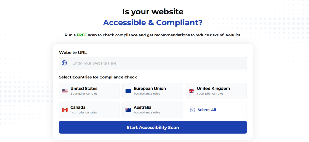
Are you wondering if your website meets color contrast accessibility standards? Want to identify potential issues before they become barriers for your users or legal liabilities for your business?
Run our FREE accessibility scan to check your website’s compliance with WCAG contrast requirements and other essential accessibility standards. Our tool will analyze your site and provide actionable recommendations to reduce the risk of accessibility-related lawsuits.
Don’t wait until users complain or legal issues arise. Take the first step toward a more accessible website today by running our free scan!
Run a FREE scan to check compliance and get recommendations to reduce risks of lawsuits.