


Intro to Accessible Website Design
In today’s digital era, the design and functionality of a website play a crucial role in ensuring that content is available to all users, regardless of their abilities or disabilities. Accessible website design is fundamental to creating an inclusive digital environment, where diverse user needs are taken into account during the development process. It is essential that web developers and designers not only consider the aesthetics of a website but also its usability for individuals with varying levels of accessibility needs.
The importance of accessibility cannot be overstated, as it aligns with principles of fairness and equality, ensuring that everyone has the opportunity to engage with online content. Organizations are increasingly adopting accessible design practices, in part due to legal mandates and guidelines that stipulate the need for compliance with accessibility standards, such as the Web Content Accessibility Guidelines (WCAG). These standards serve as a framework for improving web accessibility, allowing developers to create experiences that cater to all users, including those with disabilities, aging populations, and individuals using assistive technologies.
This guide will delve into the top ten features that contribute to accessible website design. Each feature will be explored in the context of best practices and practical implementations that promote accessibility. Through understanding these essential elements, web designers and content creators can take proactive steps toward ensuring compliance with accessibility standards, thereby enriching the user experience for everyone. The following sections will provide in-depth insights into each feature, highlighting the significance of accessibility in fostering an inclusive digital landscape for the year 2025 and beyond.
Essential Accessibility Features
In order to create an inclusive online experience, it is crucial to integrate essential accessibility features into website design. In 2025, a modern website should not only be visually appealing but also cater to a diverse audience, including individuals with disabilities. One key feature is the utilization of descriptive alt text for images. This allows screen readers to convey the content of visual elements to users with visual impairments, ensuring they can fully engage with the site.
Another important aspect is keyboard navigation. Users who may have mobility impairments often rely on their keyboards rather than a mouse. Implementing a logical tab order and ensuring all functionalities can be accessed via keyboard shortcuts is vital. Additionally, ensuring that interactive elements are clearly defined through visual cues, such as focus outlines and hover effects, significantly enhances usability.
Furthermore, websites should employ sufficient color contrast between text and background to assist those with color blindness and low vision. Guidelines suggest a contrast ratio of at least 4.5:1 for normal text and 3:1 for large text to facilitate readability. Additionally, implementing responsive design techniques ensures that content is functional across various devices, thereby accommodating users who may depend on different screen sizes.
Captions and transcripts for multimedia content are another essential feature. They benefit not only individuals with hearing impairments but also enhance comprehension for all users. Implementing clear headings and labels throughout the site also promotes better navigation and understanding of the content’s structure. Lastly, offering user-controlled font size adjustments enhances readability, allowing users to customize their experience according to their needs.
Integrating these accessibility features is not merely a compliant practice but a commitment to inclusivity, ensuring that all users can access and benefit from the digital experience your website provides.
Keyboard Navigation and Focus
Keyboard navigation plays a crucial role in creating an accessible website design. For many individuals with disabilities, especially those who rely on screen readers or have limited mobility, keyboard navigation provides the primary means to interact with web content. Implementing effective keyboard navigation involves ensuring a logical tab order, visible focus indicators, and the inclusion of skip navigation links.
Tab order implementation is essential for guiding users through interactive elements on a webpage, such as forms, links, and buttons. The tab order must follow a logical flow, typically from top to bottom and left to right, enabling users to navigate seamlessly. Poorly structured tab orders can lead to confusion, making it difficult for users to reach essential content. A common pitfall occurs when some elements are skipped altogether or when the tab focus moves randomly across the page, disrupting the user experience.
Focus indicators are another key aspect of keyboard accessibility. These indicators visually signal which element is currently selected when navigating via the keyboard. They are often represented by outlines or color changes. A lack of visible focus can leave users guessing, hampering their ability to determine where they are within the site. Designers should ensure that these indicators are prominent and consistent across all elements of the website.
Skip navigation links can further enhance keyboard navigation by providing direct access to main content, bypassing repetitive navigation menus. This feature is particularly beneficial for users who may become fatigued from repeatedly traversing lengthy menus. When implemented properly, skip navigation links can save time and provide a more user-friendly experience.
In conclusion, incorporating effective keyboard navigation techniques is paramount for creating accessible websites. By paying attention to tab order, focus indicators, and skip links, web designers can enhance usability for users who depend on keyboard interactions, fostering an inclusive online environment.

Visual Accessibility
Visual accessibility is a fundamental aspect of website design, aiming to create an inclusive digital environment for users with visual impairments or specific preferences for text customizability. One of the primary considerations in this area is color contrast. It is imperative that text has sufficient contrast against its background to ensure readability. The Web Content Accessibility Guidelines (WCAG) recommend a minimum contrast ratio of 4.5:1 for normal text and 3:1 for large text. Tools such as the Color Contrast Analyzer can help designers assess compliance with these requirements effectively.
Dynamic text resizing capabilities further enhance visual accessibility. Users should be able to adjust the size of the text without losing content or functionality. Implementing relative units such as em or rem for font sizes is a best practice, as it allows content to scale appropriately based on the user’s preferences. Additionally, incorporating features such as a built-in font size adjustment tool or the capability to increase line height can significantly improve user experience for those with visual impairments.
Font selection also plays a crucial role in visual accessibility. It is advisable to choose sans-serif fonts, as they are generally easier to read on screens. Moreover, maintaining a clear hierarchy with variations in weight and size helps users navigate content more efficiently. Careful consideration of letter spacing and line height should also be prioritized, as these can drastically impact readability for individuals with visual challenges.
In terms of best practices, incorporating user testing with individuals who have visual impairments can provide valuable insights into the effectiveness of the accessibility measures in place. By utilizing recommended tools and practices, designers can foster a more inclusive environment, ultimately benefiting not only users with disabilities but enhancing overall user experience.
Technical Implementation of Accessibility Features
Creating an accessible website design requires a thoughtful approach to technical implementation, ensuring that all users, including those with disabilities, can navigate and interact with the site effectively. A key aspect of this implementation is the incorporation of alternative input methods, which cater to diverse user preferences. Among these methods, voice navigation support plays a pivotal role, enabling users to control their browsing experience using voice commands. This feature is particularly beneficial for individuals with limited mobility or visual impairments, as it allows them to interact with web content without relying solely on traditional input devices.
Another critical aspect of accessibility is touch-target sizing. Ensuring that interactive elements, such as buttons and links, have adequately sized touch targets is essential for users who may have difficulty accurately tapping smaller areas on screens, particularly on mobile devices. By adhering to recommended touch-target sizes, web designers can facilitate easier navigation, ultimately improving the user experience for all visitors, regardless of their physical abilities.
In addition to these enhancements, gesture alternatives provide another layer of accessibility. Gesture-based controls, which allow users to perform actions through specific movements on touch screens, can significantly aid individuals who find traditional methods challenging. For instance, implementing swipe gestures or pinch-to-zoom functionalities empowers users to explore content seamlessly and naturally without the need for a mouse or keyboard.
The technical implementation of these accessibility features not only supports users with disabilities but also contributes to a more versatile website, catering to a broader audience. As web design evolves, prioritizing accessibility will ensure that all users can engage with web content meaningfully, thus fostering an inclusive online environment that recognizes and accommodates diverse needs.
Content Structure and Its Importance
Content structure plays a vital role in enhancing the accessibility of a website. A well-organized layout, implemented through semantic HTML, ARIA landmarks, and a proper heading hierarchy, ensures that users, particularly those utilizing screen readers, can navigate and comprehend the information effectively. Semantic HTML, which involves using HTML elements according to their intended purpose, contributes significantly to this goal. For instance, using <header>, <article>, <nav>, and <footer> allows assistive technologies to better interpret the content, thus providing users with a clearer understanding of the website’s structure.
Moreover, ARIA (Accessible Rich Internet Applications) landmarks further enhance navigation by allowing screen readers to skip to specific sections of the page, making it easier for users to find relevant content. By leveraging ARIA roles, such as role="navigation" or role="main", web designers can optimize the user experience for those reliant on assistive technologies. This becomes especially crucial for users with disabilities who depend on these tools to access information efficiently.
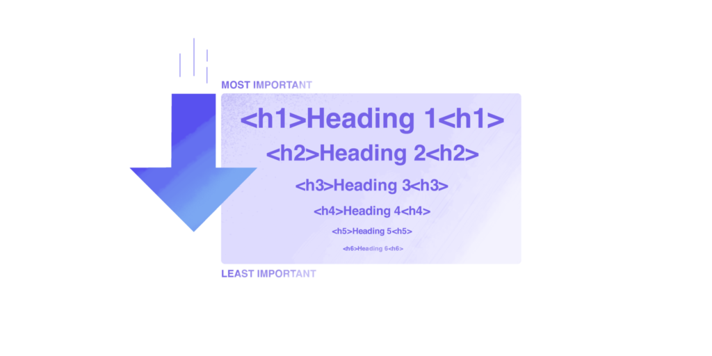
The hierarchy of headings, established through appropriate usage of <h1> to <h6> tags, is another critical component of content structuring. A clear heading hierarchy not only improves the readability of the content but also enhances navigability for users with screen readers. When headings are organized logically, users can understand the flow and relationship between different sections, facilitating a smoother reading experience.
Best practices for structuring content involve maintaining a logical flow, avoiding excessive jargon or complex terminology, and ensuring that important information is prominently displayed. It is also essential to ensure that all interactive elements are accessible via keyboard navigation. By implementing these strategies, web developers can create a more inclusive environment, allowing all users to engage with the website’s content effectively.
Media Accessibility Features
Creating an accessible website design is crucial for ensuring that all users, including those with disabilities, can effectively interact with multimedia content. Media accessibility features play a significant role in enabling users with auditory or visual impairments to engage with images and videos, which are foundational elements of modern web design.
One of the primary requirements for images is the inclusion of alt text, which serves as a textual substitute for visual content. Alt text provides a description of the image, allowing users with visual disabilities who utilize screen readers to understand the context and significance of the visual material. This feature is essential in delivering equivalent access to the information conveyed through images, as it ensures that all users receive the same educational or informative benefits.
Video content also necessitates the integration of captions, an important accessibility feature that benefits users who are deaf or hard of hearing. Captions provide a textual representation of spoken dialogue as well as other relevant audio cues, thereby enhancing comprehension and engagement with the video material. Furthermore, captions improve the overall user experience, even for individuals who might not have hearing impairments but who prefer consuming content without sound, such as in a quiet environment.
In addition to captions, audio descriptions can significantly enhance the accessibility of video content. These descriptions offer supplementary audio narration that conveys essential visual information about the video, which is particularly beneficial for users who are blind or have low vision. By outlining visual elements such as actions, gestures, and scenery, audio descriptions ensure a more inclusive understanding of the multimedia experience.
Incorporating these features—alt text for images, captions for videos, and audio descriptions—into website design is not merely a compliance measure; it is a commitment to inclusivity. By prioritizing media accessibility, web designers can help make information universally available, fostering a more equitable online environment for all users.
Interactive Elements | Ensuring Clarity and Usability
Interactive elements are paramount in guaranteeing an accessible and user-friendly website design. Effective interactive elements include form labels, error prevention measures, and informative status messages. These components enhance user experience, particularly for individuals utilizing assistive technologies. It is imperative that forms feature clear and descriptive labels, as they help users understand the required input. This clarity is vital for individuals with visual impairments who rely on screen readers to navigate online forms efficiently.
Implementing error prevention measures is another best practice. Websites should inform users of potential mistakes while they are completing forms, such as disallowed characters or incomplete entries. Employing inline validation can significantly reduce frustration; this allows users to receive immediate feedback instead of waiting for submission results. Additionally, highlighting what went wrong directly next to the error fosters a smoother correction process, enhancing usability for everyone, especially those using accessibility tools.
Status messages serve as a crucial line of communication between the user and the interface. They inform users about the success of their actions or prompt them to make necessary adjustments. For instance, after a form submission, a clear success or error message should be displayed. These messages must be unambiguous and concise, avoiding jargon that might confuse users. Providing visible status updates ensures that all users, regardless of their abilities, remain informed about their interactions on the site.
Common mistakes in designing interactive elements include unclear labeling, inadequate error messages, and failure to provide feedback. These oversights can significantly hinder accessibility. To prevent such issues, designers should conduct comprehensive testing involving diverse user groups, particularly individuals who utilize assistive technologies. Engaging with these users during the design phase helps highlight potential barriers and provides opportunities to create a more inclusive experience. Through careful consideration and implementation of these practices, websites can ensure that interactive elements are both clear and highly usable for all visitors.
Mobile Accessibility Guidelines
As more users access the internet through mobile devices, it is crucial for website designers to adopt mobile accessibility guidelines that ensure all individuals, including those with disabilities, have an equitable experience. One of the foremost considerations in this context is the implementation of responsive design, which allows websites to adapt seamlessly to various screen sizes and orientations. A responsive design ensures that content is displayed in an optimal format, regardless of device, thus enhancing usability and user satisfaction.
Another critical aspect of mobile accessibility is the ability to zoom in on content. It is recommended that websites support 200% zoom capability without loss of functionality. This feature is particularly beneficial for users with visual impairments, as it allows them to better engage with the website’s content. Therefore, ensuring that all text, images, and interactive elements remain accessible at higher zoom levels contributes to a more inclusive mobile experience.
Furthermore, appropriate touch target sizes must be taken into account when designing mobile interfaces. Touch targets, such as buttons and links, should have a minimum size of around 44 x 44 pixels to facilitate easy interaction. This minimizes the likelihood of errors when users attempt to navigate a site, especially those with motor impairments. By providing ample space around touch targets, designers can prevent frustrations that may arise from unintentional clicks on adjacent elements.
Orientation support is also vital; users may prefer either portrait or landscape orientations, and a well-designed website should maintain usability across both. To create a seamless experience, it is vital to rigorously test the website across various devices and screen configurations. By doing so, designers can identify and rectify any accessibility barriers, ensuring that all users can navigate the site effectively and efficiently, thus fostering inclusivity in the digital environment.
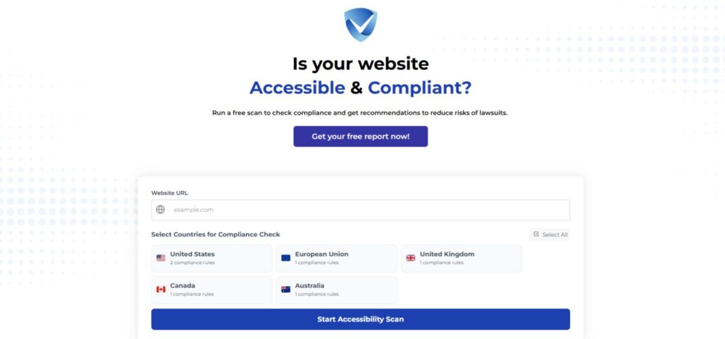
Try Our Website Accessibility Scanner
In conclusion, accessible website design is not just a legal requirement, but a vital component in creating an inclusive online environment. The essential features we’ve highlighted, such as keyboard accessibility, alternative text for images, clear contrast, and intuitive navigation, play a pivotal role in ensuring that all users, regardless of their abilities, can interact with digital content effectively. By implementing these features, you not only enhance the user experience but also expand your audience reach and demonstrate a commitment to social responsibility.
To assess the accessibility of your own website, we encourage you to utilize a free accessibility checker. These tools can help identify areas for improvement, guiding you to enhance compliance with established web accessibility standards, such as the Web Content Accessibility Guidelines (WCAG). Addressing these aspects not only helps in creating a better experience for users with disabilities but also serves to boost your website’s overall usability and search engine optimization.
Key takeaways from our exploration of accessible website design include a focus on user-centered design principles, the importance of clear visual presentations, and the need for ongoing evaluation and updates to maintain accessibility standards. The digital landscape is continually evolving, and it is essential to stay informed about best practices for accessibility.
As we progress further into the digital age, proactive engagement with website accessibility is crucial for all web developers and businesses. By prioritizing these essential features, you contribute to a more inclusive web, enhancing your reputation while ensuring that your content reaches everyone, regardless of their abilities. Let us work together towards a future where web accessibility is the norm, not the exception. Stay informed and take action today!